Displaying Charts and Spreadsheets
Displaying Charts and Spreadsheets
Microsoft Office Specialist: Create and modify diagrams and charts
| |
You can add a watermark image that is not clip art or create a text watermark. On the Format menu, click Background and then Printed Watermark. To insert a graphic, select the Picture watermark option and click Select Picture. Select the picture you want to use, and click Insert. To insert a text watermark, select the Text watermark option, and then insert the text you want. Change other options as necessary, click Apply, and then click Close.
| |
In addition to conveying information through the use of text and graphics, you might want to include numeric information or other data that is best presented in a charts or spreadsheet. You can import charts or spreadsheets created in other applications into your Word documents, and you can also create them directly in Word.
Creating a Chart from a Table
You can create charts (also called graph s) in Word by using the Microsoft Graph program, which can quickly generate visual representations of your data. For example, suppose you want to insert a chart in the sales memo that visually displays the sales for Glacier sleeping bags. Let s experiment using part of the table you created in the memo in Chapter 4. Follow these steps:
-
Open the Sales Memo document, and save it as Sales Memo2 .
-
Click to the left of the paragraph mark below the table, press Enter twice to add some space, and then press the Up Arrow key.
-
Select rows two through eight of the table ”everything but the title, total, and average rows ”and click the Copy button.
-
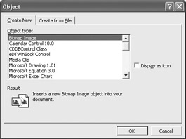
On the Insert menu, click Object .
Word displays the dialog box shown in this graphic:
-
Scroll the list of object types, which reflects the programs installed on your computer.
-
Click Microsoft Graph Chart, and click OK .
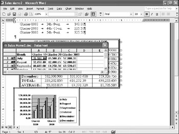
Word starts Graph, which creates a datasheet file from the copied table data and plots it in the default Column Chart format, as shown in the graphic on the next page.

Creating charts using Excel or Access data To create a chart using Excel data, you can copy the appropriate cells in the Excel spreadsheet and then paste them into the Graph datasheet, or import them into the datasheet. You can also create the chart in Excel and then import it. To use Access data, you can either import the data as a table and then plot it as a chart, or you can export it as a comma-delimited text file and then import it into the Graph datasheet. To import the data as a table, click an insertion point where you want the table to appear, display the Database toolbar, and click the Insert Database button. Click Get Data, select the data you want to use, and then click Insert Data. In the Insert Data dialog box, specify the data you want to include, and click OK. You can then use the table to create a chart.
Importing an Excel chart To import an existing MicrosoftExcel chart into a Word document, the chart must be saved in its own file or as the active worksheet in a spreadsheet file. On the Insert menu, click Object, and then click the Create from File tab. Click theBrowse button, navigate to the chart file you want to open, and double-click it. Then click OK.Word inserts a copy of the file in your document. To edit the chart, double-click it to open anExcel window within the Word document.
Graph s menu bar and toolbars have replaced Word s at the top of the window.
-
Click the datasheet s Close button.
Changing the Chart Type
If you need to edit a chart, double-click it to open it in Microsoft Graph, where you can change data values in the datasheet, add and remove elements, and change the chart type. The chart type determines how the data is displayed ”for example, as twodimensional or three-dimensional columns or bars, as lines, or as pie slices. Different types are best suited for different types of data, and choosing the right type is often a matter of trial and error to determine which presents the data in the clearest light.
The chart of the sales data is a little crowded. Switching to a different chart type might simplify it, so follow these steps:
-
If you have clicked outside the chart since the previous procedure, double-click the chart to reselect it and reactivate the Graph program.
-
To change the type, on Graph s Standard toolbar, click the Chart Type button s down arrow to display a palette of options.
-
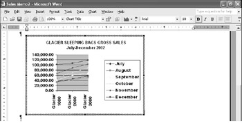
Click the Line Chart button in the fourth row to change the chart from a column chart to a line chart.
-
Click anywhere outside the chart to return to Word.
The results are shown in this graphic:
Sizing and Moving a Chart
Graph does a pretty good job of graphing the selected data, but you will usually need to make some adjustments. For example, the chart now on your screen is too small to display all the category (x) axis labels, and it has been inserted below the table, but not exactly where you want it. Follow these steps to make the chart s window a little larger and adjust its position:
-
Click the chart to select it.
-
Point to the lower-right corner of the chart. When the pointer changes to a double-headed arrow, drag the border down and to the right until the chart measures 4 inches wide by 2 ½ inches high and all the labels are displayed.
-
If necessary, scroll the window until you see the blank paragraph marks below the chart.
-
Point to the chart, hold down the mouse button, and drag the shadow insertion point to the left of the first paragraph mark below the chart. Then release the mouse button.
The chart moves down to its new position, and a paragraph mark now separates it from the table.
-
To align the chart with the table above, make sure the chart is still selected, and then drag the Left Indent marker on the horizontal ruler to the ¼-inch mark.
| |
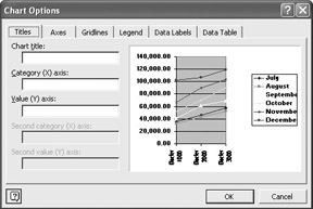
In addition to adding a title to a chart, you can also add and format many other chart elements through the Chart Options dialog box. On the Axes tab, you can turn off the display of one or both axes. On theGridlines tab, you can change the display of gridlines. Click theLegend tab to turn off the legend or change its placement. On theData Labels tab, you can display data labels for each data point in the chart. And on the DataTable tab, you can select the Show data table check box to display the chart s underlying data as a table below the chart.
| |
Formatting a Chart
You can format charts in various ways. Follow these steps to add a title and subtitle to the sales chart and to set it off with a border that matches the one around the table above it:
-
Double-click the chart to activate Graph, and then close the datasheet.
-
On the Chart menu, click Chart Options .
With the Titles tab selected, Graph displays the options shown in this graphic:
-
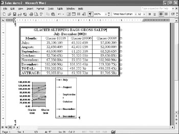
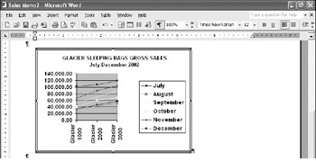
Click an insertion point in the Chart title text box, type GLACIER SLEEPING BAGS GROSS SALES , and click OK .
-
Click the title to select the title area, select the title text, and change the font size to 10 so that the title fits on one line.
-
Click an insertion point at the end of the title, press Enter , and type July-December 2002 .
The chart s new title is shown in this graphic:
Formatting and design To clearly identify the information displayed in charts, you can add titles, subtitles , axis labels, or borders. A well-formatted table can greatly improve its readability, but if done poorly it can be distracting or confusing to a reader. A general rule of thumb is to not use more than two or three fonts or font sizes, to place labels and graphic elements on an invisible grid so that alignment is pleasing to the eye, and to use the space within a chart so that the overall effect is one of balance.
-
Click outside the chart frame to close Microsoft Graph and update the chart in the Sales Memo 2 document.
-
Click the chart once to select it, and on the Format menu, click Borders and Shading .
-
In the Setting area, click Box , click the double-line Style option, click 1 ½ pt in the Width drop-down list, and then click OK .
The results are shown in this graphic:
-
Save your work to safeguard it.
Importing a Spreadsheet File
Microsoft Office Specialist: Use Excel data in tables
With Word you can easily create impressive tables and perform simple calculations, but Word can t handle complex formulas and functions. On the other hand, with a spreadsheet program you can perform almost any calculation, but these types of programs lack the word processing and formatting capabilities needed to put together dynamic reports .
Suppose you have gone to a lot of trouble to create a spreadsheet and you want to include the spreadsheet s data in a document. It would be frustrating to have to reenter all that information into a Word table for presentation. Fortunately, you don t have to. With Word 2002, you can combine the best of both worlds ”the numeric know-how of a spreadsheet program with the word processing proficiency of Word.
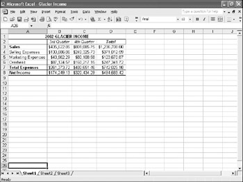
To demonstrate , let s import a spreadsheet into the Sales Memo 2 document. We ll use a spreadsheet that we created with Microsoft Excel 2002, shown in the graphic on the next page.
| |
To add a border to any object, select the object, and then on the Format menu, click Borders and Shading. Depending on the object type, Word either displays the Borders tab of the Borders and Shading dialog box (where you can format the type, style, color, and width of the border), or it displays the Colors andLines tab of the Format Picture dialog box (where you can change the color , line style, and line weight).
| |
Because you might want to import a spreadsheet that was created in another program, we ll show you the method that works for any spreadsheet programs. Follow these steps with your own spreadsheet file (or you can quickly create a version like ours):
-
Click an insertion point to the left of the second blank paragraph mark below the chart in the Sales Memo2 document.
-
On the Insert menu, click File .
Word displays the Insert File dialog box.
-
In the Files of type drop-down list, click All Files . Then move to the folder in which the spreadsheet file you want to import is stored, and double-click its file name .
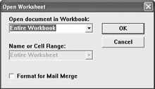
Word displays the dialog box shown in this graphic (you might be prompted to install this feature):
-
Either accept the default Entire Workbook option, or click the down arrow at the right end of the Open document in
Inserting a new Excel worksheet To add a new Excel spreadsheet to a document, you can click theInsert Microsoft Excel Worksheet button on the Standard toolbar, select the number of rows and columns you want, and enter your data. The worksheet looks like aWord table, but you can double- click it at any time to access the full functionality of Excel.
Workbook text box and select a worksheet from the drop- down list.
-
If you select a worksheet, specify the range you want to import in the Name or Cell Range text box.
For example, we selected Sheet1 and specified A1:D11 as the range.
-
Click OK to start the conversion process.
When Word finishes the conversion, the spreadsheet is inserted as a table at the insertion point.
-
Format the spreadsheet using the table-formatting techniques described in Chapter 4.
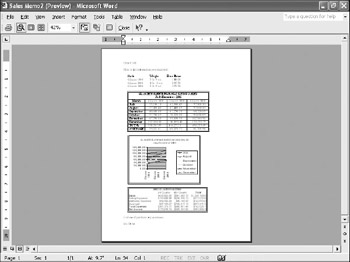
To give the table a finished look, we added a border, indented the table, adjusted its size, and made one or two other adjustments so that the memo fits on one page. The results are shown in Print Preview in this graphic:
Information about: Formatting tables, page 129
Linking data from other applications You can create a dynamic link between spreadsheet or database information and a Word document either by embedding the information as an object in the Word document or by linking the information to the Word document. To use the embedding technique, click Object on the Insert menu, and on the Create from File tab, select the file. Click Link to file, and then click OK. To use the linking technique, open the information in the source application, and copy it to the Clipboard. Then switch to the Word document, click Paste Special on the Edit menu, click Paste Link, specify the type of link in the As list, and click OK. If the linked information changes in its source document, Word automatically updates the Word document when you open it. If the document is already open, you can update the information in the document by clicking the Links command on the Edit menu.
EAN: N/A
Pages: 74