A Basic Style Sheet
| Despite their intimidating power, style sheets can be simple to create. Consider the web pages shown in Figure 12.1 and Figure 12.2. These pages share several visual properties that could be put into a common style sheet:
Figure 12.1. This page uses a style sheet to fine-tune the appearance and spacing of the text and background.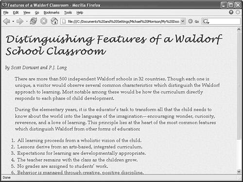 Figure 12.2. This page uses the same style sheet as the one shown in Figure 12.1, and therefore maintains a consistent look and feel. Some of these properties, such as text color, background image, and centered small print, are possible to achieve with ordinary (deprecated) HTML tags. Others, such as line spacing and wide margins, are beyond the scope of standard HTML/XHTML. All of them can now be achieved easily with style sheets. Listing 12.1 shows how a style sheet that specified these properties would look. Listing 12.1. A Single External Style Sheet Can Specify the Properties of Any Number of Pages body { font-size:12pt; font-family:Book Antiqua; color:maroon; line-height:16pt; margin-left:10pt; margin-right:10pt; background:url(parchment.gif); } p { margin-left:24pt; margin-right:24pt; } h1 { font:24pt Prose Antique, Lucida Handwriting; font-weight:bold; line-height:30pt; } h2 { font:18pt Prose Antique, Lucida Handwriting; font-weight:bold; line-height:22pt; } a { text-decoration:none; } a:link { color:red; } a:visited { color:red; } a:active { color:black; } div.byline { font-style:italic; } div.footnote { font-size:9pt; line-height:12pt; text-align:center } This may initially appear to be a lot of code, but if you pay close attention you'll see that there isn't a lot of information on each line of code. It's fairly standard to place individual style rules on their own line to help make style sheets more readable. Speaking of code readability, perhaps the first thing you noticed about this style sheet code is that it doesn't look anything like normal HTML code. CSS uses a language all its own to specify style sheets. Of course, there are some familiar HTML tags in there. As you might guess, body, p, h1, h2, a, and div in the style sheet refer to the corresponding tags in the HTML documents to which the style sheet will be applied. In curly braces after each tag name are the specifications for how all content within that tag should appear. In this case, all body text should be rendered at a size of 12 points, in the Book Antiqua font if possible, and with the color maroon and 16 points between lines. The page should have 10-point margins, and the background should be the image found at the relative URL parchment.jpg.
Any paragraph starting with a <p> tag will be indented an additional 24 points on both sides (the margins). Any text within <h1> or <h2> tags should be rendered in boldface Prose Antique at a size of 30 points and 22 points, respectively. If a user doesn't have a font named Prose Antique installed, the Lucida Handwriting font is used instead. The pt after each measurement in Listing 12.1 means points (there are 72 points in an inch). If you prefer, you can specify any style sheet measurement in inches (in), centimeters (cm), pixels (px), or widths-of-a-letter-m, which are called ems (em). You might have noticed that each style rule in the listing ends with a semicolon (;). Semicolons are used to separate style rules from each other. It is therefore customary to end each style rule with a semicolon so that you can easily add another style rule after it.
To link this style sheet to HTML documents, you include a <link /> tag in the <head> section of each document. Listing 12.2 is the HTML code for the page shown in Figure 12.1. It contains the following <link /> tag: <link rel="stylesheet" type="text/css" href="styles.css" /> This assumes that the style sheet is stored under the name styles.css in the same folder as the HTML document. As long as the web browser supports style sheets, and all modern browsers do, the properties specified in the style sheet will apply to the content in the page without the need for any special HTML formatting code. This confirms the ultimate goal of XHTML, which is to provide a separation between the content in a web page and the specific formatting required to display that content. Listing 12.2. The Page Shown in Figure 12.1 Contains Virtually No Formatting Code Because All of That Is Left to the External Style Sheet<?xml version="1.0" encoding="UTF-8"?> <!DOCTYPE html PUBLIC "-//W3C//DTD XHTML 1.1//EN" "http://www.w3.org/TR/xhtml11/DTD/xhtml11.dtd"> <html xmlns="http://www.w3.org/1999/xhtml" xml:lang="en"> <head> <title>Features of a Waldorf Classroom</title> <link rel="stylesheet" type="text/css" href="styles.css" /> </head> <body> <h1>Distinguishing Features of a Waldorf School Classroom</h1> <div > by Scott Dorwart and P.J. Long </div> <p> There are more than 500 independent Waldorf schools in 32 countries. Though each one is unique, a visitor would observe several common characteristics which distinguish the Waldorf approach to learning. Most notable among these would be how the curriculum directly responds to each phase of child development. </p> <p>During the elementary years, it is the educator’s task to transform all that the child needs to know about the world into the language of the imagination—encouraging wonder, curiosity, reverence, and a love of learning. This principle lies at the heart of the most common features which distinguish Waldorf from other forms of education:</p> <ol> <li>All learning proceeds from a wholistic vision of the child.</li> <li>Lessons derive from an arts-based, integrated curriculum.</li> <li>Expectations for learning are developmentally appropriate.</li> <li>The teacher remains with the class as the children grow.</li> <li>No grades are assigned to students’ work.</li> <li>Behavior is managed through creative, positive discipline.</li> <li>The classroom provides a cooperative social environment.</li> </ol> <div > <hr /> <span style="font-style:italic">Scott Dorwart is a carpenter and father of two children who attend the Green Mountain Waldorf School. P.J. Long is a psychotherapist and mother of two.</span> <hr /> <a href="http://netletter.com/GMWS/HHH.htm">Head, Heart, Hands: A Waldorf Family Newsletter</a><br /> Published by <a href="http://netletter.com/GMWS/GMWS.htm">The Green Mountain Waldorf School</a> <hr /> </div> </body> </html>
The code in Listing 12.2 is interesting because it contains no formatting of any kind. In other words, there is nothing in the HTML code that dictates how the text and images are to be displayedno colors, no fonts, nothing. Yet the page is carefully formatted and rendered to the screen thanks to the link to the external style sheet, styles.css. The real benefit to this approach is that you can easily create a site with multiple pages that maintain a consistent look and feel. And you have the benefit of isolating the visual style of the page to a single document (the style sheet) so that one change impacts all pages. |
EAN: 2147483647
Pages: 345
- Step 1.1 Install OpenSSH to Replace the Remote Access Protocols with Encrypted Versions
- Step 1.2 Install SSH Windows Clients to Access Remote Machines Securely
- Step 3.3 Use WinSCP as a Graphical Replacement for FTP and RCP
- Step 4.1 Authentication with Public Keys
- Step 4.3 How to Generate a Key Pair Using OpenSSH