Make Videos for the Web
| Pundits make much of the "convergence" of media, and the fact that people are increasingly using their computers as media centers. There are still significant differences between broadcast media and the Webmost significantly that the Web is interactive, and people want to be in control and move around it. Make sure to produce and edit videos so they're tailored for online use. Since users dislike sitting through long video clips on the Web, break them up into small, compelling segments. Videos made for broadcast tend to be too long and can contain too many distracting visuals for small computer screens. People don't sit passively in front of their computers, as they would in front of a television set; they want to click on things and drive their experiences. Most audio and video clips should be less than a minute long; very rarely should they last more than five minutes. The data from our eye-tracking study shows that even after a short 24 seconds, people's attention is diverted to other elements, especially if the subject is boring. For example, on a news site, people's eyes rested on the news anchor for a short time, but then wandered to mundane objects in the background, such as the trashcan or stop sign. Even more interesting, people's attention focused outside the video window on elements such as alternative headlines and options.
Eye-tracking diagram of a user watching a video clip on CNN. Red indicates the parts of the screen that were viewed the most; yellow and blue indicate areas that were viewed less. Even though the user only watched this video clip for 24 seconds, his attention soon drifted from the person being interviewed to other things. 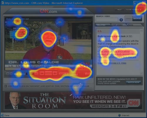 www.cnn.com |
EAN: 2147483647
Pages: 107