Overcoming Barriers to Multimedia
| Multimediaor to use the more current term, rich media can be instructive and engaging in ways static HTML pages cannot. Audiences appreciate audio on music sites, configurators on automotive sites, videos on entertainment sites, and virtual tours on hotel and real estate sites. Music and movie sites benefit particularly, because users can sample their products online. To use them wisely, you must take into account your users' equipment and needs. Accommodate Low-Tech UsersIn field studies where we visited people's homes, workplaces, and school environments, we discovered that many people work on old hand-me-downs or donated equipment that runs slowly and doesn't have the required plug-ins and applications to take advantage of advanced features. For example, many sites designed for children and teens offer multimedia and interactive features, but because young people often use old or borrowed computers, they don't benefit from these features. For this reason, make sure to provide alternative content for your users who lack access to the multimedia. Also, use sound to complement your site, not as a primary way to deliver content. In almost all teen homes that we visited, teens didn't have speakers attached to the computer or they had them turned off so they could listen to the radio. If you're going to have a demonstration that uses sound, make sure it has a text version as well, so students can follow along without having to depend on the audio.
Design for Your Audience's Connection SpeedStatistics show that almost half of Web users still have dial-up Internet access, especially at home. While this proportion is dropping as more and more users get broadband access, it's important to keep in mind that many of your site's users still have slow connection speeds. Connections may be slow even in broadband situations, such as in wireless connections, or in educational institutions, where response times can be slow due to factors such as bandwidth sharing, servers, and filters. Many media files are big and take a long time to download. Even with broadband connections, participants in our studies complained about slow download times and often abandoned a site or video because it took too long to load. Bottom line: Optimize file sizes and minimize loading time. Even if you have designed a useful and intuitive interface, long response times can doom your project.
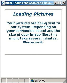
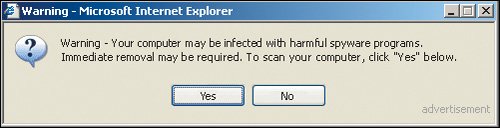
Optimize file sizes and minimize loading time. Even if you have designed a useful and intuitive interface, long response times can doom your project. Provide a Simple and Accurate Loading-Status IndicatorYou can often minimize people's impatience during long downloads simply by having a status indicator to provide visual feedback. A well-designed indicator reduces the perceived loading time because people see the progress and know what to expect. Keep it simple. It's most helpful to show the actual percentage of data transferred (for example, "50% loaded") so that users can assess how much more time the download will take. Impatient users leave sites that don't provide adequate feedback, often assuming the site is down because the page appears frozen. If they can see that the site is working, they tend to wait longer. The Audi site has an appropriate counter that runs quickly and tells people the percentage of data loaded. 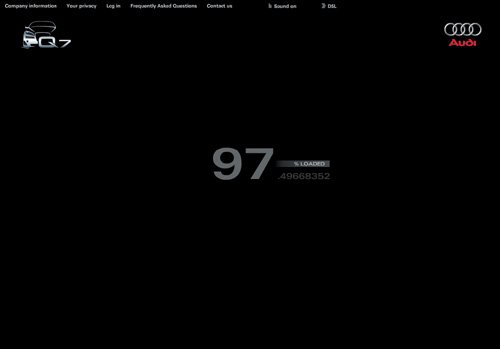 www.audi.com The information in this dialog box is vague and there's no animation or status indicator to let people know the system is working. It's impossible to tell how long the process will take or if the pictures are actually loading. www.ebay.com Travelocity doesn't have a status indicator. It's difficult to tell how long the process will take, but the twinkling stars give people some hope that the system is working. This is not a huge problem if the process is relatively quick. However, for long wait times, having an accurate indicator would minimize the perceived time, and people would be more likely to continue waiting.  www.travelocity.com Underestimate Your Users' Technical KnowledgePeople are much more apprehensive about technology than you might think. Most people veer away from downloading plug-ins and clicking on unknown elements for fear of viruses, and because they dislike the long downloads. Don't count on people to download new plug-ins. Adults fear viruses, spyware, and spam. Some schools actually block students from accessing multimedia content or downloading plug-ins. Parents warn their children against downloading anything on the family computer, for fear of contaminating it. Some users also automatically assume that there is a charge to download plug-ins, even when they're free. If there's a compelling reason to require a specific plug-in or software, choose one that's common on most machines. It takes time for people to upgrade their system to the latest versions of software. Pick a version that's one iteration behind in order to capture a broad audience. The best solution is to provide non-multimedia content alternatives to people who don't have the proper plug-ins. Deceptive dialog boxes such as these make it difficult for people to distinguish between a legitimate and unscrupulous security message. With virus scares proliferating, it's not surprising that people are fearful of downloading anything from the Web. (Did you notice the subtle word "advertisement" in the lower right? Most users don't.)
People are bewildered by security messages such as these. They're concerned about installing anything harmful but aren't sure whether the warning pertains to them. Some might install it in the hopes that nothing bad will happen; others might not take the chance and abandon the feature altogether. 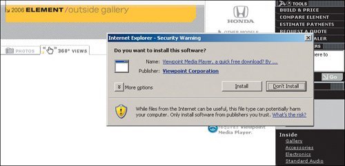 http://automobiles.honda.com (Facing page, bottom) People don't understand what messages like this mean. When people selected Play in the original window, they expected that the video would play automatically, not require them to commit to additional steps. To avoid messages like this getting in the way of your content, it's best to use file formats that are one or two versions behind the newest versions of the popular media players. 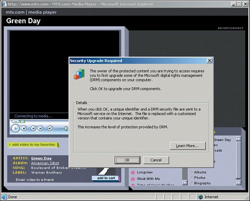 www.mtv.com Detect Users' BandwidthDon't require your users to select the bandwidth; many don't know what that means or how to find out, or they're using a borrowed computer and don't know the system's bandwidth. Asked to select the player or bandwidth speed appropriate for the media they want to play, many participants simply guess. Take the guesswork out of the equation by measuring the user's connection speed in the back end and setting a cookie value accordingly. Give people with slow connections functionality geared toward low-bandwidth users. People who have faster load times can better handle the more robust version. Unfortunately, automatic bandwidth detection is still difficult with current technology, so in most cases, you're still best off aiming for a lower common denominator. But in two instanceswhen download delays would pose a major problem for narrowband users, or when you'd gain substantial additional benefits from a "fat" version of the application for broadband usersit's worth the additional effort. Most users don't know the difference between QuickTime and Windows Media Player. Even worse, this site abbreviates these terms, making them more obscure. It's better to remove the guesswork from the interface and let people see videos without having to select mysterious settings.  www.bellagio.com The video options on this page are overwhelming and too technical for average users, who don't know what 480p, 720p, and 1080p mean or how those numbers pertain to them. The "p" stands for progressive scan video, but this is too technical for people to know. The file size indicators might give people a clue, but they still don't tell people which format works best on their system. 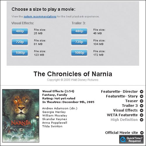 www.apple.com People expect videos to play without them having to choose between options that are meaningless to them. If you offer different video sizes, it's best to identify them with simple words such as "big" and "small" because they refer to a concrete and observable aspect of making the choice. It also helps to tell users that the small version downloads the quickest. This splash page reminds viewers that they must have a specific screen resolution setting and have pop-up blockers disabled in order to access the site. This implementation is problematic for several reasons. First, most users won't even notice the message (as the instructions are in tiny letters and difficult to read). If they do notice it, they probably won't understand what it means. Then, too, many people don't know how to change their settings. Finally, a majority of people have pop-up blockers installed and won't even be able to access this site. Better to have a flexible design that works on most reasonable settings. 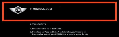 www.miniusa.com |
EAN: 2147483647
Pages: 107