Satisfy Your Users Expectations
Satisfy Your Users' ExpectationsAs the Web matures, commonalities emerge across Web sites that shape people's expectations of yours. For example, links to corporate information are commonly found at the top and bottom of the homepages. Placing them anywhere else can cause unnecessary confusion. The advantage in understanding people's expectations is that you can give them what they need exactly the way they want it. There's no need to over-design for fear of it not being noticed. Simply placing items where people expect them ensures that they will see them.
(Facing page) Even though the Learn More area on this site is emphasized with boldface and a highlighted box, people bypassed it because it was placed in the wrong area. They didn't think these links were important because main navigational elements are commonly on the left side of the screen, not the right. Also, having a box around the links made them appear secondary. Boxed areas are commonly associated with advertising, especially when they're placed in the periphery. 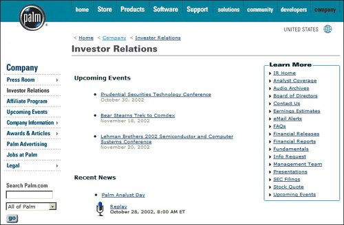 www.palm.com The checkout button is in a peculiar place. Checkout buttons are typically found at the bottom of the shopping cart, not at the top. It's natural for people to review their order from top to bottom, then see the checkout button at the end of the list. Disrupting a user's mental model creates a jarring experience, requiring people to look harder than they should. 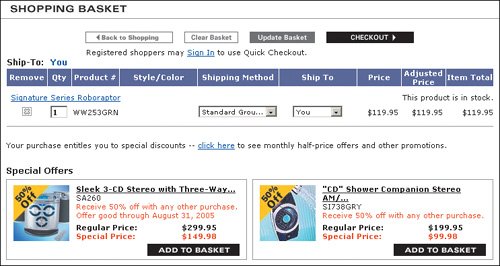 www.sharperimage.com Placing the Add to Wish List button where people expect to see the Add to Shopping Bag button makes this layout error-prone. Also, the blue Shopping Bag button blends in with the other blue text on the page, making the gray Wish List button stand out even more. So although it is slightly smaller and lighter in color than the Add to Shopping Bag button, it has more prominence.  www.ae.com The placement of the Add to Shopping Bag button is better here. The Add button, which is the highest-priority action button here, is placed immediately after the last selection, followed by the less-important Add to Wish List and E-Mail a Friend buttons. The order and stacked layout of the buttons make it less likely that people will accidentally click on the wrong one. 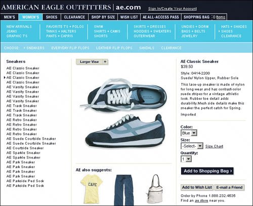 www.ae.com |
EAN: 2147483647
Pages: 107