How Search Should Work
| In user testing, people generally tell us that they want the Search on Web sites and intranets to work like that of their favorite major search engine. Fortunately Google, Yahoo!, and MSN all work the same: with a Search box and button, and a linear, prioritized results page. In fact, the top search engines comply with all the main usability guidelines, which is one major reason why they're on top.
The new usability guidelines aren't just for designing good Search; they are for designing expected Search. Deviating from the expected design almost always causes problems. So the new usability guidelines aren't just for designing good Search; they are for designing expected Search. Deviating from the expected design almost always causes usability problems.
Given how ingrained Search is, avoid invoking a user's mental model of search for other interactions. For example, don't use a Search button for a parametric search, in which the user defines certain parameters of the search. A parametric search can be helpful on e-commerce sitessearching a shoe site by specifying shoe size, width, color, brand, or style is certainly more useful than doing a keyword search. But these searches don't fit the design pattern for Search, however, so you should call them something else to avoid confusing users. Advanced Search that combines keyword searching with other search forms can also be helpful for users, but it should be a secondary option that's only displayed when they ask for it. Users are now forming mental models that they expect to apply across the Web, and even on their intranets. This is good. Assumptions about common tasks let users focus on their goals, not on learning the mechanics of operating the interface. All this breaks down, however, if your design conflicts with users' preconceived mental models. Don't commit this sin. The shoe finder boxes above the photos of shoes on Zappos.com are a great example of parametric search: Why look at shoes that are not available in your size? A small quibble is that the button for the keyword search should be labeled something other than "Go!" in order to differentiate it from the parametric search button. Having a "go" button for the parametric search is great, but the Search button should be labeled Search. In our experience, when users see a Search button, they're likely to frantically look for a box where they can enter keywords. Currently there is no single winning label for non-keyword search, but Find and Retrieve seem to work well. For winnowing, you can use labels like "Refine Results." 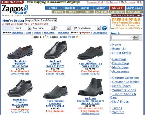 www.zappos.com |
EAN: 2147483647
Pages: 107