Working with Pastels, Chalk, Charcoal, and Pen
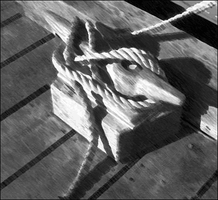
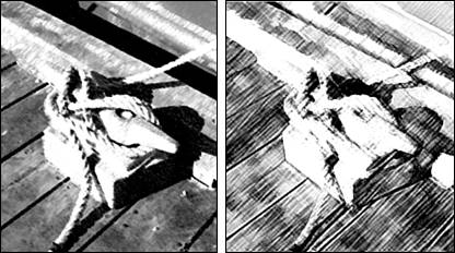
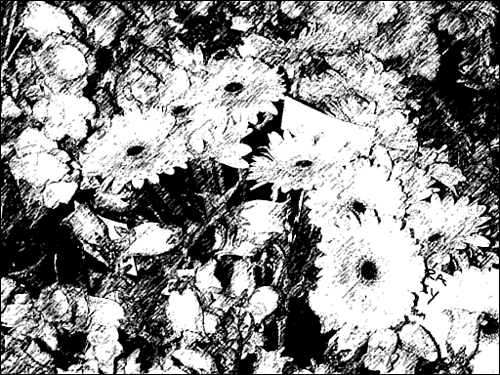
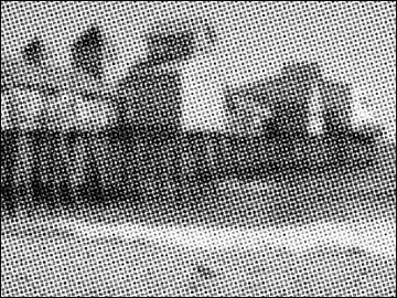
| The next category of art media that we'll consider are pastels, chalks, and charcoals. (It would be convenient if these tools were at least lumped into the same category. Because they aren't, you will have to go hunting for them.) These are all drawing or sketching materials rather than painting materials, so the look is completely different. The image is created from lines rather than blocks of color . Thus, these media lend themselves to pictures with delicate detail rather than areas of flat color. They are good for portraits, because the level of abstraction they provide disguises small flaws and makes anybody look good. Rough PastelsRough Pastels simulates the look of chalky pastels on a rough surface, such as canvas. With this filter, you'll see more texture in the dark areas than you will in the light. It's on the Filter, Artistic menu. You can adjust the Stroke Length. Pastels are brushed on the surface using the edge of the pastel stick and long, smooth strokes. You can also adjust the contrast as well, and make the strokes more apparent by adjusting the Stroke Detail. Like the Underpainting filter we looked at earlier, the Rough Pastels filter allows you to change the texture of the surface on which the pastels are applied. Smudge StickSmudge Stick is smoother than the Rough Pastels and makes the image look as if it has been carefully rendered in soft crayon or pastel, and then the dark areas carefully smudged with a soft cloth or fingertip in a suede glove. See a close-up in Figure 25.22. Figure 25.22. Smudge Stick is a nice soft look that reveals textures and details. Choose Filters, Artistic, Smudge Stick. A smudge stick is used in a manner similar to a hard pastel, in long stokes whose length you can adjust using the Stroke Length slider. Adjust the range of values to be lightened with the Highlight Area slider. The higher the value, the broader this range of values. To brighten the values defined by the Highlight Area value, drag the Intensity slider. Chalk & Charcoal, CharcoalChalk & Charcoal (Filters, Sketch, Chalk & Charcoal) works with whatever colors you have set as the foreground and background colors. Chalk, the background color, is used to render the light areas of your image. Charcoal, the foreground color, is used to render the dark areas. The medium tones in the image are not rendered, but are displayed as a simulated medium gray paper. Being somewhat traditionally oriented, I usually choose to use a combination of black and white, though you could just as well use pink and green or any other colors you want. After displaying the Chalk & Charcoal dialog box, widen the range of dark values rendered with charcoal (the foreground color) by raising the Charcoal value. Lowering this value narrows the dark range. Adjust the range of light values rendered with chalk (the background color) by dragging the Chalk slider. Adjust the Stroke Pressure as desired. More pressure leaves more of the foreground/background color on the paper, increasing or decreasing the contrast. The Charcoal filter (Artistic, Sketch, Charcoal) is not as effective as the Chalk & Charcoal filter unless you're looking for lots of contrast. When rendering your image in charcoal, Elements draws the edges of high contrast with a strong, bold stroke. Areas filled with midtones are drawn with a lighter, diagonal stroke. The color of the charcoal is the same as the foreground color. The paper used with this filter is not a medium gray; instead, it's the same as the background color. In the Charcoal dialog box, adjust the thickness of the stroke using the Charcoal Thickness slider. The Detail slider controls the range of values rendered in charcoal. By default, only the dark tones in an image are rendered; with a high Detail value, more of the midtones will be rendered as well. Light values are left unrendered, and are filled with the background color. The Light/Dark Balance slider controls how strong a stroke is used ”a strong, dark stroke or a light, medium stroke. Figure 25.23 shows examples of the same image, rendered with both filters. Figure 25.23. On the left, the Chalk & Charcoal filter. On the right, plain Charcoal. Cont CrayonCont Crayon (Filters, Sketch, Cont Crayon) is a soft, compressed chalk-and-graphite crayon, typically used on medium gray or brown paper in earthy colors. Like the Chalk & Charcoal filter described previously, the Cont Crayon filter uses the foreground color to render the dark tones in an image, and the background color to render the light ones. For an authentic look, use a dark iron oxide (blood red), black, or sienna brown crayon for your foreground color. As your background color, use white, another earthy color, or a light-toned version of the foreground color. After displaying the Cont Crayon dialog box, adjust the range of dark values rendered with the foreground color using the Foreground Level slider. Lowering this value narrows the dark range. Adjust the range of Background Level values rendered with the background color by dragging the Chalk slider. You can also change the texture of the background from canvas to something else, in a manner similar to the Rough Pastels dialog box: Choose the texture to use from the Texture list, or select a texture file you've created. Adjust the size of the texture with the Scaling box. Change the roughness of the texture by adjusting the Relief value. Change the direction of the light source with the Light Dir setting. To reverse the direction of the light, click Invert. Graphic Pen and Halftone PatternThese two filters (both located on the Filter, Sketch submenu) do very similar things. Both reduce the image using whatever foreground and background colors you set. Graphic Pen then renders the image in slanting lines, whereas Halftone Pattern renders it in overlapping dots. On the proper subject, the Graphic Pen filter can be very effective, though I can't decide whether it looks more like an etching or a pen-and-ink drawing. Take a look at Figure 25.24 and see what you think. Halftone Pattern, shown in Figure 25.25, looks like a bad newspaper photo. Figure 25.24. It's a drawing. No, it's an etching. Figure 25.25. Create the " high-quality " look of real newspaper! To use the Graphic Pen filter, set the foreground color to the color of the ink you want to use; set the background color to the color of the paper you want to draw on. Next, choose Filters, Sketch, Graphic Pen. Adjust the Stroke Length as desired. Adjust the range of tones that the pen renders by dragging the Light/Dark Balance slider. If you drag it left toward the light side, the pen will render more light tones; drag it to the right to narrow the range. Finally, select a direction for the pen strokes ”choose a direction in which your eye seems to move through the picture. To use the Halftone Pattern filter, choose it from the Filters, Sketch submenu. The pattern is rendered in newspaper photo style, using dots of various shades of gray. Change the pattern to concentric circles or horizontal lines by selecting that option from the Pattern Type list. Adjust the size of the dots, circles, or lines using the Size slider. Adjust the range of tones rendered by the pattern using the Contrast slider.
Sumi-eSumi-e is the very old Japanese art of brush painting. As few strokes as possible are used to convey the subject, which is typically rendered in black ink on white rice paper. A carefully chosen photo should be an ideal medium for sumi-e. You want something that has textures, but is not too complicated (not too much detail, not too many edges) and not too dark. Because a lot of sumi-e art is black and white or uses only muted colors, you might want to adjust the hues in your image (the filter will not replace them). The filter will blur areas of similar colors together, while adding dark strokes along edges of different colors, and within dark areas.
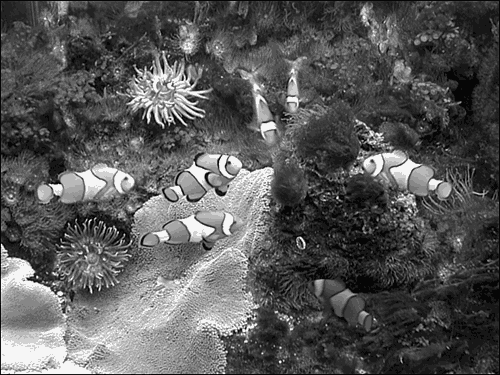
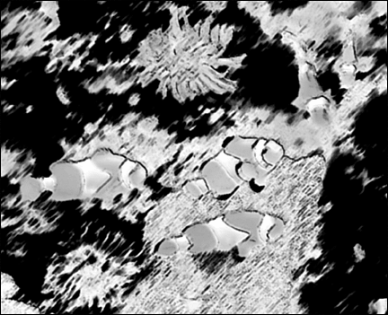
I shot these clownfish (see Figure 25.26) at an aquarium. As shown in Figure 25.27, the filter softened the shapes, as if a big, wet brush had painted them. It intensified the colors and turned the shapes just abstract enough to make them interesting. Figure 25.26. Send in a couple more clowns . Figure 25.27. Adding the Sumi-e filter produced exactly what I wanted. To use the Sumi-e filter yourself, choose Filters, Brush Strokes, Sumi-e. Select the width of the brush strokes with the Stroke Width slider. Adjust the Stroke Pressure as well; a greater pressure will increase the darkness of the brush strokes. The Contrast slider adjusts the level of contrast in the image. Typically, you'll want to lower the contrast to achieve the soft look found in sumi-e paintings. SpongeBefore closing this discussion of artistic filters, I'd like to mention the Sponge filter (Filter, Artistic, Sponge). With it, you can create a kind of watercolor effect that looks as if it were done with a sponge rather than a paintbrush. This filter blends areas of color, but retains the edges to give some detail to the image. Adjusting the Brush Size slider changes the size of the individual areas of color used to render the image. The Definition slider adjusts the darkness of the paint used on the sponge ”from light gray to dark gray. With the Smoothness slider, you can change the amount of blending between the areas of color that make up the image, and the gray spots left by the sponge. |
EAN: 2147483647
Pages: 349