Flylib.com

Books Software


Using the Type Mask Tools


Using the Type Mask Tools

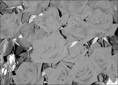
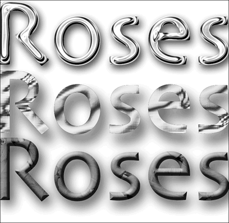
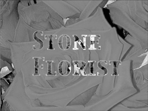
Photoshop's Type Mask tools are fun to use and can create some really cool effects. Unlike the horizontal and vertical Type tools, which create type that you can fill with color , the Type Mask tools create a selection in the shape of the type, which you can fill with an image or pattern. You can also use the Type Mask tools to punch type out of a picture (leaving a blank area in the shape of the type) or to mask the rest of the picture (leaving nothing but letters filled with the picture). Half the battle is finding a picture to work with. The other half is finding a nice fat typeface that leaves plenty of room for your picture to show through. Let's try filling some type.

To use the Type Mask tool, first select it. Set your font, size, and any other options you like. Faux Bold is often useful here, as big bold letters work best as cutouts . When you position the cursor and start to place the letters, something surprising happens. The screen goes into Mask mode and turns pink. As you enter the letters, they appear to be in a contrasting color, but when you finish typing and deselect the Type Mask tool, they turn into paths and the temporary mask goes away. Figure 23.42 shows how this looks onscreen. Don't forget that this is essentially another selection tool, rather than a Type tool, so you won't be working on a type layer. Your letters appear on whatever layer is selected.

Figure 23.42. Now you have the letters as selection outlines.

graphics/23fig42.gif

What you do with your text selection from this point on is up to you. You can fill it with a pattern or stroke it just like any other selection. You can use the selection to cut the letters out of the image on which it was typed, essentially " punching out" the letters. You can invert the selection and cut the image away from the text, leaving the text filled with a portion of the image ( assuming that you typed the text onto an image layer). Regardless of how you fill the selection, you can add some layer effects as I have in Figure 23.43. I applied the Wow Chrome, Shiny Edge layer effect and the Drop Shadow, Hard Edge layer effect to the top text, the Drop Shadow, High and Complex, Molten Gold effects to the middle text, and Bevel, Simple Pillow Emboss and Drop Shadow, Soft Edge to the bottom text. Be sure to check these out in the color plate section, too. (You can also add layer effects to horizontal or vertical type, by the way.)

Figure 23.43. Don't be afraid to experiment.

graphics/23fig43.gif

You can group two layers (one with the type mask, the other with an image) and cut out letters to reveal a picture that's actually on the layer behind them, as I have in Figure 23.44. I placed the image on one layer, and the text or a text selection on another, and then grouped them as described in earlier in this chapter. By using two layers instead of typing the text directly on the image with a Type Mask tool and cutting it out, I gave myself a bit more room in which to grab the exact portion of the image I wanted to cut into letters. After cutting out the text, I applied an Outer Glow, Simple layer style to them. Again, please see this in color. If you're thinking, "Wow! I want to try that!" don't worry ”you'll get your chance in an upcoming task.

Figure 23.44. I added a glow to help define the letters.

graphics/23fig44.gif


Working with Layer Styles and Text

Layer styles might not have been exclusively meant for working with type, but they do it so well that I nearly always use at least one, and sometimes more. That's why, although I intend to come back to using layer styles in Chapter 26, I want to tell you a bit about them here.

A layer style is a special effect such as a shadow or glow that affects all the objects on a layer. You can combine layer styles, such as an outer glow and chrome, to create a complex effect. If you want to use a layer style to format just the type in an image, that type must be on its own layer. With the horizontal and vertical Type tools, that's not a problem, since Elements creates a new layer whenever you use the tool. But if you use the Type Mask tools to create a type selection, make sure you first create a new layer to put it on.

Once you have some type or a type mask on a layer, to apply a layer style, open the Layer Styles palette. If it's not in the palette well, you can display it by choosing Window, Layer Style. Open the drop-down list and select a category such as Drop Shadow. The palette displays a list of layer styles for that category. Click a style to apply it to the text on that layer.

When you apply a style, it shows up in the Layers palette as a cursive letter f to the right of the layer name , as shown in Figure 23.45. Because the Undo History palette only tells you that you've applied a style, and not which one, you'll need to pay attention to what you are doing. Also, if you select another layer style, it's added to the first style. Thus, it's easy to get confused about which styles you've added. To remove all styles from a layer, click the Clear Style button at the top of the Layer Styles palette. (It looks sort of like an aspirin tablet.)

Figure 23.45. I suppose it's meant to be a "stylish" f.

graphics/23fig45.gif

The most effective layer styles to use with text include Drop Shadows, Bevel (which provides bevel and emboss styles), Wow Chrome, and Wow Neon, to name a few. For example, you can improve the appearance of most type with a drop shadow, which adds dimension. Just don't overdo it. In Figure 23.46, you can see what a difference a simple shadow makes.

Figure 23.46. This is the preset shadow, called Low.

graphics/23fig46.gif

You can vary the effect of these layer styles by changing the blending modes and varying the opacity. As always, the best way to see what they do is to experiment with different settings.

Editing Layer Styles

If a layer style gives you almost, but not quite what you want, you can go back and edit the settings. You can reach the Style Settings dialog box either by choosing Layer, Layer Style, Style Settings, or by double-clicking on the style symbol (the cursive f ) on the Layer palette. The Style Settings box is shown in Figure 23.47. You can change the position of the light, which determines the direction in which shadows are dropped, glows are cast, textures are lit, and so on.

Figure 23.47. Items that don't relate to a particular setting are grayed out and can't be changed.

graphics/23fig47.gif

You can also apply global light, which is a very clever way of keeping your shadows in line. Global light dictates that the light setting (in degrees) that you make here, or in any of the other dialog boxes that deal with light or shadow direction, will remain constant. If you put type with a drop shadow on another layer, the new shadow will match the old one. If you add a shape with a reflected glow, it will be lit from the same source. This is more important than it sounds at first. We live on a planet that has a single sun as its main light source. One light source produces one shadow, and that's what we are used to seeing. When you come inside and turn on a couple of lamps plus maybe the overhead fluorescent bulb, you've complicated things. Now there are several possible directions in which the shadow can go. The strength of the brightest light determines what you actually see. Designating a global light in your composition forces all the shadows you apply to fall in line. With the Style Settings dialog box, you can also change the height and size of a bevel, glow, or shadow.

Task: Applying Layer Styles to Text

  1. Start with a new image. Use the default size, with a white background and RGB color .

  2. Click the Horizontal Text tool. Using the Options bar, select a serif font and set the point size to 128. Set the font color to blue by clicking the color swatch at the end of the Options bar and choosing blue from the Color Picker.

  3. Click along the left side of the image and type your name. Click the check mark button to indicate when you have finished typing. (If your name is too long to fit, change the text size using the Options bar.)

  4. Open the Layers palette. Notice that Elements creates a new text layer for you, as indicated by the T thumbnail on the left.

  5. Make sure that the text layer is active, and then open the Layer Styles palette. Select Drop Shadow from the list. Click the Soft Edge icon to apply a soft shadow.

  6. Select Glass Buttons from the list, and click the Yellow Glass icon. Notice how the text changes to green when the yellow color is placed on top of blue. Some layer styles completely override the text color, while others add to it.

  7. Click the Clear Style button to remove all layer styles.

  8. Select Outer Glows, and click the Heavy icon. Hmmm. Nothing seems to have happened .

  9. Open the Layers palette, and change to the background layer. Use the Paint Bucket tool to fill the layer with red paint. Ahhh. Now we can see the glow. It just needed something to contrast with.

  10. Open the Layers palette and change back to the text layer. Choose Layer, Layer Style, Style Settings. Reduce the Outer Glow Size to 10.

  11. Save the image with the filename Glowing Name.psd and close it.