Using the Type Tools
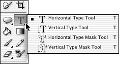
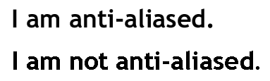
| The Type tool is actually four tools in one. As you can see in Figure 23.38, the toolbox holds both horizontal and vertical Type tools in both letter and mask modes. The masks allow you to do some very cool tricks with type and photos. Figure 23.38. There are four Type tools. To use the Type tool, simply select it and click on the page where you want the type to begin. Before you do, however, you'll probably need to adjust the settings on the Options bar (see Figure 23.39). Figure 23.39. Set your type options before you begin typing. The first choice on the bar, which kind of type to set, is the same as in the toolbox: horizontal or vertical, masked or not. Next, a drop-down menu offers type styles. This will change according to the font you have selected, but generally you can choose from regular and italic, and often light, bold, or demibold, as well. The next drop-down menu displays a list of fonts installed, and the one after that offers a selection of point sizes. If you don't see the size you want, enter numbers into the window. The next button, which looks like two a 's, is important. It determines whether to antialias the type. Antialiasing smoothes out jagged type. It's important to apply antialiasing if your work will be seen onscreen. Few things look worse , or less professional, than jagged type. Figure 23.40 shows the difference. Figure 23.40. Notice the curves in the nonantialiased type. They appear lumpy, as if made of bricks . If your type is to be printed, however, turn off antialiasing. The same process that makes it look better onscreen adds a blur when the page is printed. The next four choices give you false (or faux ) bold, italic, underlined , and strikethrough type. The bold and italic options can be used to enhance a plain font or to increase the boldness and/or slant of already bold or italic faces. Strikethrough and underline have very limited uses, as far as I can see. Underlining was a way of indicating emphasis, back in the days of the typewriter, but it was always understood to be read as italic. Since you now have lots of options for italics, underlining isn't typographically correct. Nor is strikethrough, since the invention of the Delete key. Use them if you think you must, but don't tell me about it. The little stacks of lines indicate alignment: flush left, centered, or flush right. Justified type, set flush left and right, is unfortunately not an option in Elements. Elements isn't a word processing program, after all. Its type functions are mainly intended to add a few words to a picture, not to typeset a newsletter or advertisement. The color swatch, black by default, lets you choose a type color independent of the foreground and background colors. Just click it to open the usual Color Picker. The sort of twisted letter with the curved line under it takes you to one of the more interesting aspects of setting type in Elements: warped type. I'll come back to it later on. But first, let's finish off the Options bar. The final button lets you change horizontally set type to vertical type, or vice versa. It's most useful if you tend to use type as a design element rather than a means of communication. Simply click it to change a selected string of letters or symbols from reading left-right to up-down . Adding Horizontal and Vertical TypeHorizontal type is what we're used to seeing in the English-speaking world. Other cultures use different alphabets and different typographic styles. Outside of short words on neon signs, we rarely see English, French, or similar horizontal languages intended to be read vertically. It's unnecessarily difficult, which doesn't mean you can't do itjust that you might want to think before you do. To set type vertically, follow these steps.
To set type horizontally, do the following:
Type is always set on its own layer. Each time you position the cursor and start typing, you create a new type layer. You can edit the type and apply layer commands to it. You can change the orientation of the type, apply or remove antialiasing, and warp the type into a variety of shapes . You can move, copy, and change the position or layer options of a type layer just as you would with a normal layer. To change the type's font size or color, or to edit the message, activate the type layer and click within the type to edit, or select all the type by dragging over it, and then make your changes. You can also select all the text in the text layer by clicking on the layer in the Layers palette, and double-clicking the T thumbnail icon. After editing text, be sure to click the check mark button on the Options bar to let Elements know you're done.
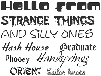
Choosing FontsLiterally hundreds of thousands, if not millions, of fonts are available. And, that's before we start adding styles and special effects to them. But when you install Elements, the only fonts you'll see are the ones you've already installed. You can find fonts all over the Internet, as well as in your local computer store, catalogs, and so on. Some you can get for free; others cost money. I've found several CDs full of useful fonts advertised in the back pages of computer magazines, at very reasonable prices. And of course, there's Adobe, with everything from the classics to fonts made of bones or kids on skateboards. Figure 23.41 shows a few of the stranger examples. Figure 23.41. Not all of these are right for all occasions. How many fonts do you need? That depends on what you intend to use them for. Certainly, you already have some useful ones, including classic serif fonts such as Palatino or Times New Roman. ( Serifs are short lines that finish the ends of letters, like this: T. They make it easier to read small type.) You probably have one or two sans serif faces such as Helvetica or Arial. ( Sans serif means without serifs , and looks like this: T.) You have something like Courier, which imitates a typewriter, and you probably have one or two script fonts, such as Chancery or Dom Casual. Beyond that, why not wait and see what you need? Adding dozens of fonts can actually make your computer run more slowly. |
EAN: 2147483647
Pages: 349