South of the Border: Corralling content with margins and positioning
|
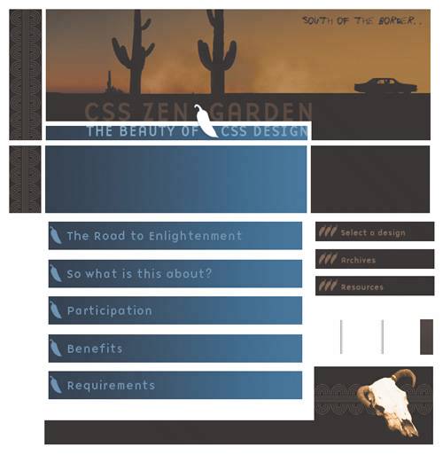
| Rob Shields, Designer www.csszengarden.com/093 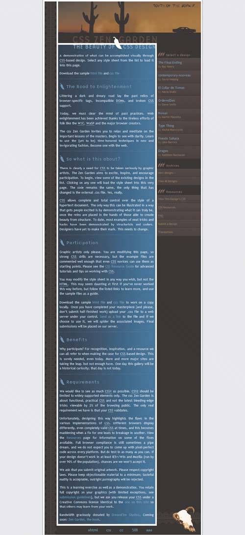 A LARGE DOSE OF CAFFEINE is just the thing to get the creative juices flowing. In this case, Rob Shields's ideas were fueled by hot tea. Whatever was in his brew, it stimulated 50 initial ideaseach a series of keywords to help him define the site's overall theme. Shields finally settled on his third idea, which was a Southwestern theme. Instead of limiting his image selections, he chose any he thought would be useful and fired up Adobe Photoshop to work with the images until he found a composition that he liked (FIGURE 1). With a bit more refinement in Photoshop, Shields went on to code the CSS that finalized the strongly themed South of the Border. Figure 1. Imagery used in South of the Border. Beginning BasicOne interesting aspect of Shields's design is its color scheme, which was inspired by a brown suit with blue pinstripes. He set the stage for his design with a light blue background in the body, light brown and darker blue for links, and white primary text that will later appear against a darker blue background: body { font: 83%/150%; color: #fff; background: #EDEDED url(background.gif) repeat-y fixed bottom Shields specifically chose to use percentages for his fonts, ensuring that they would scale. You can see the font treatments and backgrounds on the next page. Styling the ContainerWith the basics covered (you can see the CSS we skipped over by viewing the complete CSS for the design online), the #container div is next up for styling. Included in this declaration are the styles for the container's background image, its margins, and width: #container { position: relative; background: url(bg-central.gif) repeat top left; margin: 0px auto 0px auto; width: 655px; } Of course, the #container element's position is set to relative, and because top and left properties are not defined, the #container div remains in the normal flow. Many newcomers to CSS design are easily fooled by the term relative, believing it to mean that a relatively positioned element is one that is positioned in relation to another element. This is a completely reasonable interpretation of the word, but it's incorrect. Note Normal flow is the term used to describe the way a browser normally interprets elements that aren't positioned. If you remove all the styles from any of the CSS Zen Garden designs, you'll see that all text and headers flow from left to right, top to bottom, adjusting the flow to accommodate different screen resolutions or browser resizing. Relative positioning helps a designer position an element without taking it out of the normal flow. This is very distinct from what a browser will do with elements using other positioning types, such as absolute. You'll see the difference very clearly in just a bit. For now, the goal is to create a container that visually holds the other elements within it. When we add the #container styles (available in the original CSS file), elements within it are now ready for additional styling (FIGURE 2). Figure 2. Position, width, margins, and a background have been added to the #container div.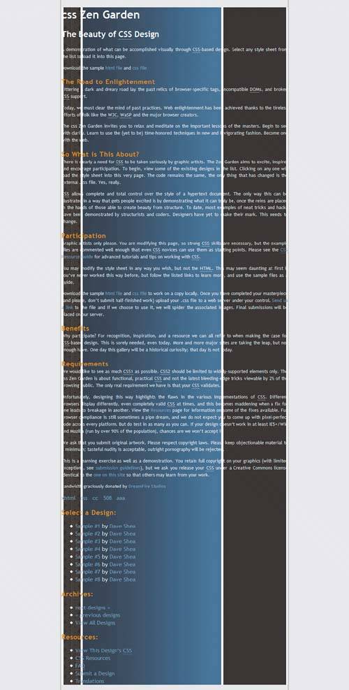 Reining In the TextOf course, now the primary text, while contained within the #container element, must be pulled away from the sides of it. This is achieved by setting margins for each of the various div elements within the #container: #intro { margin:0px; } #quickSummary, #preamble { margin: 0px 200px 0px 68px; } #pageHeader { margin: 0px; } #supportingText { margin:0px 200px 0px 68px; } These margins pull the text into position (FIGURE 3). Figure 3. Defining the margins for the body text.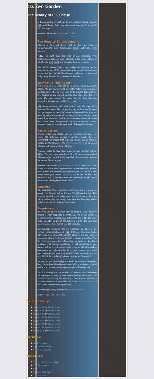 Head 'em UpAdding the graphic headersespecially the #pageHeader h1and bringing them into balance with the text helps further define the overall look: #pageHeader h1 { margin: 0px 0px 0px 0px; background: transparent url(top.gif) no-repeat top left; width: 655px; height: 206px; } FIGURE 4 shows how the #pageHeader h1 style brings in the thematic imagery. Figure 4. The #pageHeader imagery sets the theme and overall tone of the design.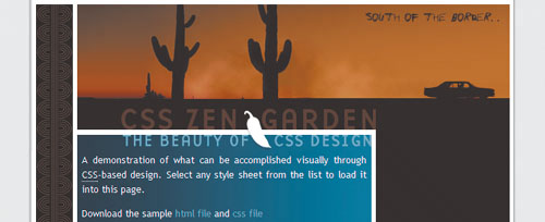 A few noteworthy header examples extracted from the main CSS will help demonstrate how the headers are styled with margins, background images, and widths and heights to effectively contain the associated imagery and text: #preamble h3 { background: transparent url(ch1.gif) no-repeat top left; margin: 10px 0px 5px 0px; width: 388px; height: 44px; } #benefits h3 { background: transparent url(ch4.gif) no-repeat top left; margin: 10px 0px 5px 0px; width: 388px; height: 44px; } #requirements h3 { background: transparent url(ch5.gif) no-repeat top left; margin: 10px 0px 5px 0px; width: 388px; height: 44px; } The headers are now nicely in sync with the rest of the design (FIGURE 5). Figure 5. The header images sport a chili pepper, building on the southwestern theme.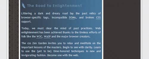 At this point, we also see the appearance of the blue border styles: #benefits { border-bottom: 1px dashed #8095AF; } #preamble { border-bottom: 1px dashed #8095AF; } The borders add a dash of visual contrast, and act as separators for the text sections (FIGURE 6). Figure 6. Adding borders to the benefits div separates the text sections. Now for the FooterWhile the central portion of the design has progressed nicely so far, the footer needs to be pulled into place. The contents are simple: just the validation links, and a background image containing the cow's skull and more decorative flourishes: #footer { text-align: center; background: transparent url(bottom.gif) no-repeat top left; height: 37px; margin: 0px -200px 0px -68px; padding-top: 88px; } #footer a:link, #footer a:visited { margin-right: 20px; } Notice the use of negative margins to the right and left, which help to hold the footer effectively within its containing element (FIGURE 7). Figure 7. Bringing the footer into the fold.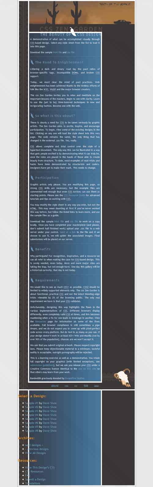 Absolute ContainmentRemember how the #container div is relatively positioned? Well, the link list is absolutely positioned within the relatively positioned div: #linkList { position: absolute; top: 207px; right: 6px; width: 181px; } This brings the list of links up to sit alongside the primary text. Unlike relative positioning, absolute positioning places the element in relation to its containing element. If there is no parent element, the position will be in relation to the root element, html. One way to envision the issue is to remove the relative positioning from the #container div (FIGURE 8). Figure 8. The positioned #linkList loses its relationship to the #container div.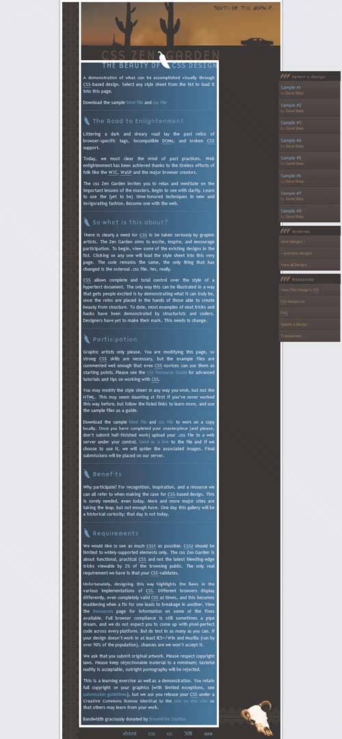 The nature of absolute positioning is such that an absolutely positioned element will always be positioned in relation to its containing element, or to the html element if there is no other defined containing element. But with the relative positioning in place, the absolutely positioned #linkList is positioned within the element's container. Once the relative value is reinstated, the layout comes together as intended. Rounding Up the LinksWith the #linkList properly positioned, the additional link styles are worth examining. The first important concern is to set the list margins and padding to 0: #linkList ul { margin: 0px; padding: 0px; } This allows for the navigation to be precision-built. Continuing on, you'll find the remaining link styles, including those that manage the individual list items: #linkList li { list-style-type: none; background: transparent url(li-bg.gif) repeat top center; padding:8px 6px 8px 6px; margin:0px; border-top: 1px solid #5D4831; border-bottom: 1px solid #221609; display: block; } Additional styles for the link headers, colors, margins, and padding round out the design, all available in the original CSS. Tip This feature of the positioning model is useful for layout purposes because it allows you to specify your absolute-positioning starting points. If the parent isn't positioned, absolute positioning starts from the edges of the html element, which by default fills the browser window. However, if it is positioned, the starting points are the edges of that particular element. How do you take advantage of this feature if the parent isn't positioned? Apply position: relative; to it without top or left values, which won't affect its actual position but will trigger the change in starting points. For more on this feature, read Doug Bowman's elucidating article "Making the Absolute, Relative," at Stopdesign (www.stopdesign.com/articles/absolute). Move'em OutText and images are most efficiently controlled through the use of margins. Relative positioning assists you in corralling headstrong elements, as it can be used to create a more controlled container within which you can add absolutely positioned elements for precision. South of the Border is an excellent demonstration of a design that has both a strong theme and a straightforward approach to realizing that theme in CSS. |
 center; margin: 0px; padding: 0px; }
|
 Visual Enlightenment for the Web")
EAN: N/A
Pages: 117