Radio Zen: A radio dial made possible with a fixed background image
|
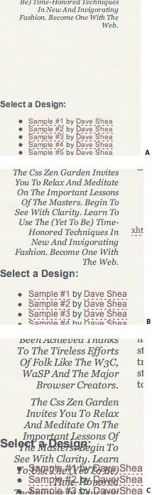
| Marc van den Heuvel, Designer www.csszengarden.com/058 TAKING A CUE from his older-model radio, Marc van den Heuvel tapped into the effect of a fixed background image to create a radio dial complete with a moving needle for Radio Zen. The layout flowed from the header, and due to the horizontal movement of the needle across the radio dial, a horizontally scrolling design was almost inevitable. The classic look was complemented by a strong retro font, photographs of the old-style radio from which van den Heuvel found his inspiration, and a yellow color scheme that suggests aged material. 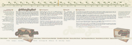 Setting the StageAside from header images, Radio Zen uses very little imagery to great effect (FIGURE 1). This horizontally scrolling layout strongly relies on CSS positioning for its unique look. Figure 1. The images that make up Radio Zen. To begin, van den Heuvel also hid the text of the two main page headers. Since these were later used for background imagery purposes, it makes sense to get them out of the way for the time being: #pageHeader h1 span, #pageHeader h2 span { display: none; } Other basic formatting was appliedit isn't listed here, but remains available in the design's actual CSS file (FIGURE 2). Before adding the scrolling radio dial to the top, room needs to be made for it. Figure 2. Radio Zen with basic text formatting. Layout SkeletonAbsolute positioning is the method used to place most elements within Radio Zen, which means that the positioned elements are also removed from the document flow. Because other elements within the document flow will not be aware of the starting or ending points of absolutely positioned elements, overlapping is inevitable. The issue is sidestepped for now by having a few elements positioned at once that complement each other's edges, in order to avoid the overlap. The relevant positioning rules are listed below. #quickSummary { position: absolute; right: 0px; text-align: left; width: 165px; height: 340px; top: 95px; padding-top: 40px; } #preamble { position: absolute; left: 10px; text-align: right; width: 165px; top: 95px; } #supportingText { position: absolute; width: 1230px; padding: 95px 0 0 185px; text-align: justify; z-index: 3; } #linkList { font-family: Arial, Helvetica, sans-serif; position: absolute; top: 0; padding-top: 480px; text-align: justify; z-index: 1; } And that plan works, if the viewer's font size is still 10px, as was specified earlier (FIGURE 3). Since many browsers allow users to resize their text, larger font sizes may still overlap (FIGURE 4). We'll come back to this problem shortly. Figure 3. Basic positioning has been applied. Figure 4. Larger font sizes cause overlap. Layering and AttachmentIf you haven't loaded the original design and scrolled it horizontally, we recommend doing so now (FIGURES 5A and 5B). Contrary to what you may guess upon seeing the effect, there is no scripting going on. Radio Zen cleverly makes use of layering and the fixed value for the background-attachment attribute. Attaching a static image of the numbered FM radio dial to the body element causes any scrolling within the page to leave the image in place, and the rest of the page scrolls over the top of it. Going back to the style rule for the body element, an extra line containing properties like background-image and background-position is added as one big shorthand rule: Figure 5A and 5B. Scrolling the page moves the needle across the radio dial.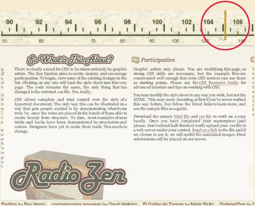 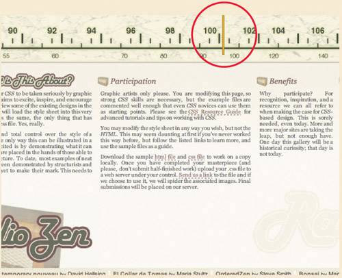 Note In Microsoft Internet Explorer for Windows, fixed background attachment is supported only when applied to the body element. body { font: 10px Georgia, Arial, Helvetica, sans-serif; color: #353638; background: #F8F8EE url(schaal.jpg) no-repeat fixed top center; margin: 0px; } ... and the needle is placed by adding it to the #supportingText element: #supportingText { position: absolute; width: 1230px; padding: 95px 0 0 185px; text-align: justify; background: url(naald.gif) top center no-repeat; z-index: 3; } It should now be more obvious why #supportingText has been assigned such a large width value; not only is it about to be filled with horizontally stacked paragraphs, but it forces a horizontal scroll bar, which in turn gives the needle a large enough track so that its movement to the left is unmistakable. Column PositioningThe body text is a series of ultra-wide paragraphs at this point, which is fixed by stacking them horizontally across the browser window: #preamble { position: absolute; left: 10px; text-align: right; width: 165px; top: 95px; } #supportingText h3 { margin: 0 8px 0 3px; } #explanation, #participation { float: left; width: 290px; } #benefits { float: left; width: 150px; } #requirements { float: left; width: 500px; } That seems to be a better fit (FIGURE 6). Let's revisit the scalable-text issue. Figure 6. Columns space out the horizontally stacked paragraphs.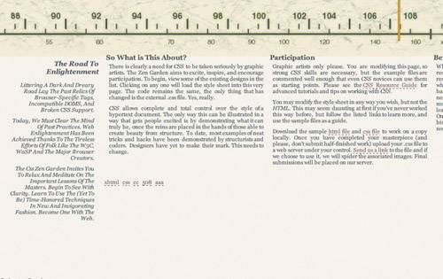 A Text-Scaling ConundrumIn some scenarios text that is too long for the area in which it has been placed will overlap other elements, since absolute positioning removes items from the regular document flow. We can see this in action by viewing the design so far in a browser that allows scaling of px-based text, like Firefox, and watching what happens to the design list at the bottom as text scales (FIGURES 7A-7C). Figure 7A-7C. Scaling text causes overlap. This area is obviously not fully styled yet, but it will continue to be an issue if not addressed now. You may have noticed earlier that the #linkList element was absolutely positioned at the top of the page with a top value of 0, but bumped down with a padding-top value of 480px. The padding keeps the design list below the rest of the page during the construction of the design, but ultimately it's irrelevant because each of the div elements it contains will be absolutely positioned within the element anyway, which the padding does not influence: #lselect, #larchives, #lresources { position: absolute; text-align: left; padding: 5px; } #lselect { width: 1590px; top: 46em; background-color: #E8E9CF; } #larchives { width: 300px; top: 49em; left: 75px; } #lresources { width: 800px; left: 400px; top: 49em; } Because each div is positioned with an em-based rather than px-based top value, the top position of each will scale along with the font size, and avoid overlapping problems. And with the extra style shown below, the design list and archives at the bottom of the page should end up looking like that shown in FIGURE 8. Figure 8. The styled footer links.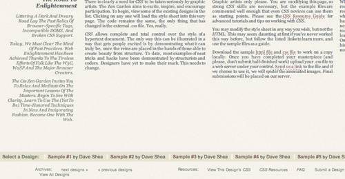 #lselect ul, #larchives ul, #lresources ul { margin: 0px; padding: 0px; } #lselect h3 { margin: 0 10px 0 0; color: #555F44; font-size: 8pt; float: left; font-weight: bold; } #lselect li { color:#000000; list-style-type: none; float: left; border-left: 4px solid #F8F8EE; padding: 0 5px; } #lselect a:link, #lselect a:visited { border: none; text-decoration: none; font-size: 8pt; font-weight: bold; } #lselect a:hover, #lselect a:active { text-decoration: underline; } #lselect a.c, #lselect a:link.c , #lselect a:visited.c { color: #422222; font-weight: normal; } Tip Using em-based values with absolute positioning will cause the position to adjust based on the font size. Using px-based values, on the other hand, will leave the position rigid and unchangeable within the browser window, even if it means text overlaps. Note The last outstanding issue at this point is that many of the final image-based embellishments aren't applied, such as the header images and the two radio images in the footer. Applying these is left as an exercise for the reader, but all remaining style is available for study in the Radio Zen CSS file. Exploring the PossibilitiesSeemingly simple CSS elements can lead to interesting interactions when thoroughly explored; fixed background images applied to the body element offer an interesting contrast between the static background and the moving content area. Radio Zen exploits this for a remarkable effect, but the many potential CSS properties leave the door wide open for further experimentation. |
|
 Visual Enlightenment for the Web")
EAN: N/A
Pages: 117