White Lily: Principles and process for designing effective layouts
|
| Jens Kristensen, Designer www.csszengarden.com/036 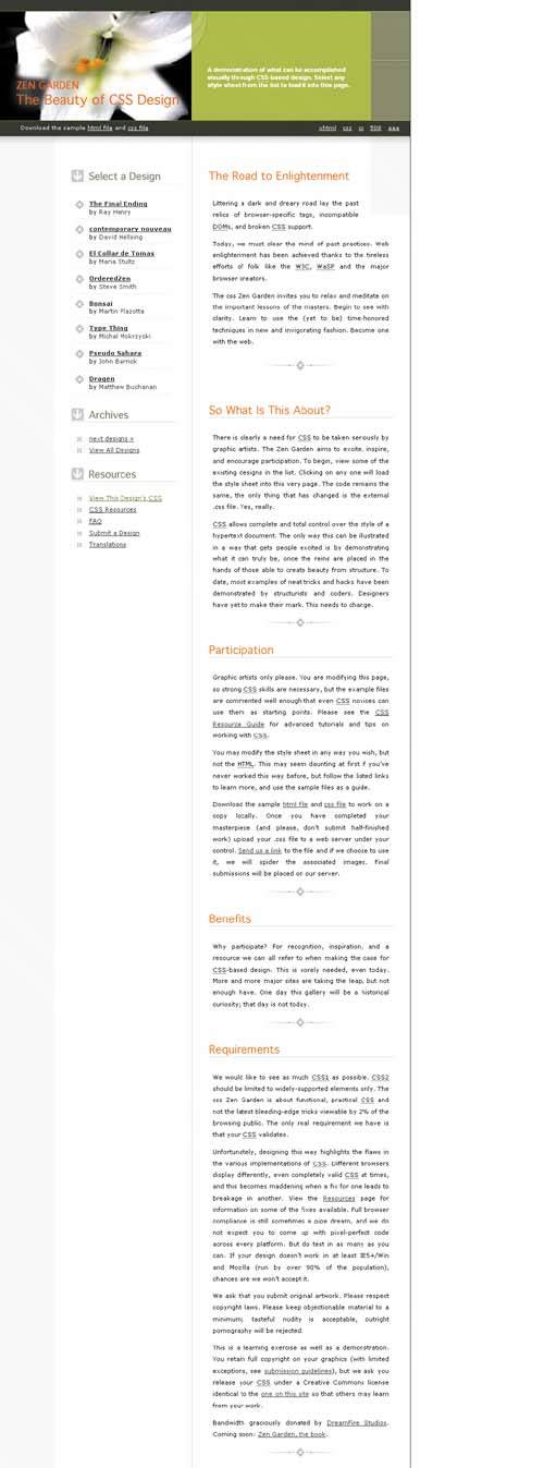 DESPITE THE FREEDOM of no specific visual requirements for Zen Garden submissions, Jens Kristensen determined that there are four clear keywords that command attention: visual, CSS, Zen, and Garden. This provided him with an overall identity for his work, which he felt should be relaxing and calming with a strong botanical theme. After establishing the theme, he went on to study the content and sketch layouts that would be appropriate to the goals he defined. In this methodical way, White Lily emerged as a practical, useful layout that has served as an inspiration for many sites around the globe. Layout Principles for the WebWe often bandy about the word layout and simply mean the number of columns we want on a page. People learning CSS frequently approach layout that way, asking, "How do I create a three-column layout?" or "How do I create a layout with a header and a footer?" These are good questions, and important ones, but before even getting to the CSS, we should carefully study the principles behind why we might choose a given layout. Note Readers familiar with other forms of graphic arts, such as print and package design, will quickly see that there are unique challenges when creating onscreen layouts. Newcomers to the study of Web design rapidly learn that laying out a page, while sharing some common techniques with print, is decidedly different than print. Techniques that assist with designing effective layouts are rooted in principles that have been around long before the Web. While certainly modified for the Web, these principles are a necessary foundation for creating layouts that not only look great, but also function well. Layout in all forms of graphic art serves a primary purpose: to organize content in an effective way. How that pans out visually is going to differ, depending upon your medium, content, and audience. A secondary concern with layout for the Web arises from the fact that the layout must support function, too. Links, menu systems, and forms are all examples of functionality that must be integrated effectively into any successful layout. Finally, layout is a cornerstone of a Web site's consistency, which is essential for usability and human comprehension. Look Before You LeapOne of the most beneficial processes that later aided Kristensen during his creation of White Lily was his attempt to first organize the content with which he would be working. Organizing content serves several purposes. Most immediately, you get a clear overview of what must be dealt with, which naturally leads to prioritization of the material. This spurs further thinking about the layout and various approaches that might work to achieve the goals of form and function. Kristensen first grouped the CSS Zen Garden content into three categories:
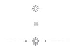
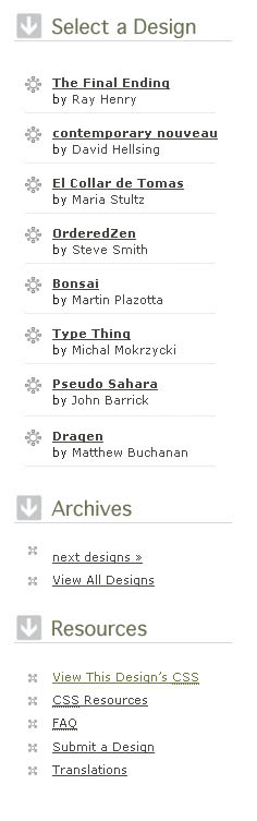
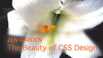
Using this specific information, he began to work on page composition. He now had two very specific goals: to meet his thematic ideas, and to present the content in three distinct sections. Several iterations were necessary to decide on a final style (FIGURE 1). Figure 1. An alternate style for White Lily.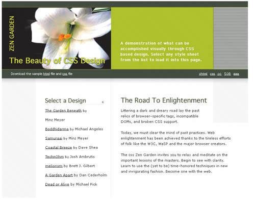 Finally, he settled on what he submitted as the completed White Lily. It's important that your layout choices are based on content and visual requirements, and not made at random or because a specific layout happens to be trendy. Layout Solutions in White LilyWith a clear idea of how to proceed, Kristensen made his choices regarding management of theme and content. Kristensen determined that the photo of the lily would set the stage for the botanical feel he wanted. From the photo, he drew inspiration for his color scheme. He also took additional care in choosing embellishments that extended the botanical concept (FIGURE 2). Figure 2. Three metaphorical floral symbols used within White Lily to enforce the botanical theme. Kristensen's work really shines when it comes to content. Because his goal was so clearly defined, it was easy to determine the content's priority and how to effectively address it via the layout. By placing the general garden information in the header, he achieved two important goals: representing the "brand" (in this case, the flower and CSS Zen Garden page title) and clarifying the reason for the page. Also included in this section are the sample HTML and CSS files, along with the validation links (FIGURE 3). Figure 3. Addressing one of the explicit needs: to group related content effectively. This frees up the remaining layout to address two significant concerns: navigation and primary content. For navigation, Kristensen made use of the left-hand column, which works very well because it's an expected location for navigation. The right-hand column is used for the primary content. Both sections are styled lightly and remain crisp and clean. Altogether, the header and two-column layout suited the goals and needs well, resulting in an uncomplicated design that simply works. Layout Inspiration and GuidelinesOnce you have an idea of your overall goals, you can take advantage of helpful information to guide you while refining the layout. This section explores some of the primary concerns when working on layouts for the Web. Two main disciplines offer guidelines for designing great Web layoutsuser interface (UI) design and usability. User Interface DesignUnlike print design, a Web page offers interaction, which means that it no longer contains just a passive message. User interface design is a relatively mature field due to the many aspects of computer technology that require interactive interfaces: Operating systems and software applications are both examples. Some of the fundamental principles of user interface design:
Interface designers are also very interested in aesthetics as they relate to function. Notice the arrows within the link headers in White Lily. Each of them is the same size, and each serves to provide both an aesthetically pleasing and helpful orientation to the visitor (FIGURE 7). Figure 7. The arrows used with primary headers in the link lists are both aesthetically pleasing and functional, leading the viewer's eye toward the content below. UsabilityWhile conceptually related to user interface design (and having similar historical roots), usability has a different focus. User interface design is naturally concerned with usersthe primary study involves how developers and engineers work to address user needs. Note A great resouce for user interface design and interactivity design is Boxes and Arrows (www.boxesandarrows.com). The study of usability, however, places its focus on the final user experience and how the user works with a developed user interface. Both studies are integrated in the sense that usability concerns work their way into UI design techniques and processes, and that user interfaces are presented to users for testing and, ultimately, improvements and modifications. As with UI design, the study of usability, which also emerged from other areas within computer technology, has been around for a long time. Web usability is a subset of usability, and comes with its own set of suggestions and guidelines. Some usability concerns related to layout design:
Note In many layouts, footers are used to manage copyright, privacy, licensing, and related information. This is a common convention and useful when designing sites where this type of information is critical to the function of the organization or company. Of course, there's a lot more to usability, but incorporating these techniques while working with your layout will help flesh out important details relating to function and form, and, ultimately, to the user's experience of your design. Follow a ProcessWhite Lily demonstrates how following a distinct process can result in many of a layout's needs being addressed. Of course, design process is different for individual designers and design teams, and your process will likely vary in some significant ways. No matter what your process, it's clear that in this case, by first determining theme and then analyzing content, Jens Kristensen was able to follow a very clear-cut path to reach the end result: an attractive layout that users enjoy and understand. |

|
 Visual Enlightenment for the Web")
EAN: N/A
Pages: 117