Prt--porter: Exploring horizontal lines in a vertical world
|
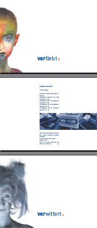
Prêt-à-porter: Exploring horizontal lines in a vertical worldMinz Meyer, Designer www.csszengarden.com/037 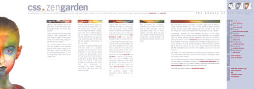 ONE OF THE MOST COMMON QUESTIONS asked by new designers is "where do I find inspiration?" Many novice designers are taught to look to a number of places for guidance. Nature, for example, offers many unusual landscapes, filled with shape and movement, that it can be an enormous source of inspiration and refreshment. Another source of inspiration is the human character and form. The human form has always had a special place in the arts: Students of the visual arts spend countless studio hours studying the layout of bodieshow they are uniquely shaped, the lines of faces, and the many distinct aspects of the human character. prêt-à-porter by Minz Meyer combines aspects of nature and character, resulting in an overall design as unique as the layout that drives it. Print Design as InspirationWeb designers who have been in the field for a while have often heard Web design thought leaders and instructors tell them, "The Web is not print." While that is obviously true, one of the more compelling issues prêt-à-porter sets in front of us is that even though we should not think of the Web as a printed page, there is no reason why print design cannot inspire Web design. In this case, it wasn't only a print design that inspired prêt-à-porter, but a print design about print that did so (FIGURE 1). Figure 1. A portion of a printed brochure was used as the inspiration for prêt-à-porter. In Meyer's original brochure for a print shop, a combination of imagery and words was used to create visual tension. On the left of the original design, a vertical series of photosall conceptualized for the brochure and shot in a dayshows variations of a female face with unusual painting and coloration. On the right, the images are countered with words and phrases such as the German word for "discolored." The resulting brochure promotes the quality of the print shop's work through strong images and clear terminology, reaching a conclusion that the print shop won't make mistakes in the coloration of printed images. Notably, the original brochure is landscaped, meaning that it is horizontal rather than vertical. And herein lay one of the most intriguingand challengingaspects of the layout when it came time to adapt it to the Web. Breaking the RulesWhile the landscape format can work extremely well in print, and is therefore used frequently, Web designers have long been encouraged to avoid such designs. The reasons for this are mostly usability-related. Horizontal designs typically force the browser to place a scroll bar along the bottom of the document, requiring the site visitor to scroll horizontally. This has long been considered problematic, because most users are not inclined to make more physical movement than necessary to get to the information. And for individuals with certain physical disabilities, moving a horizontal scroll bar is especially difficult. As a result, most Web designers have avoided horizontal designs except in special cases, such as experimental useor, sadly, they've created such designs by mistake when they've made poor decisions about screen resolution. One unusual, early exception to this was a Web site launched in 1998 for Circle of Friends, a community dedicated to those suffering from or interested in spinal cord injuries. The organization, championed by the late Christopher Reeve among others, chose to design a site that was horizontal because so many people with severe spinal cord injuries have to view the world that way. At the time, this was a revolutionary design concept, and one that was most certainly inspired by the human experience (FIGURE 2). Figure 2. The Circle of Friends Web site, launched in 1998 but no longer in existence, is an early example of breaking the rules by using a horizontal design.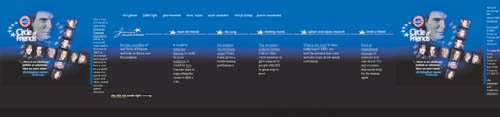 Challenged by the idea that a landscape design might have impact on the Web, Meyer decided to try and create a compelling version of the print design that not only worked on the Web, but also used aspects of CSS to make the design Web-worthy. The Horizontal ChallengeIn the process of mixing the high-impact communication in the original brochure with a CSS layout, one of the primary roadblocks encountered was the inevitable browser support issue. In order to make the design useful and beautiful in a variety of browser scenarios, workarounds were needed to make it compatible across browsers and operating systems. Exploring Fixed PositioningThe compelling image of the woman inspired Meyer to ensure that the image remained static within the design, allowing the text to scroll behind it. This effect provided a refreshing approach to making the design Web-friendly that simply isn't possible in print. While CSS allows a designer many options for implementing background graphics, applying the photo of the woman as the body background image would cause the text to scroll over it, basically destroying the power of the image and reducing the text's readability to nil. Tip Use z-index to define the stacking order of positioned boxes. The highest z-index value will appear on top of other boxes in the stack. One way to address this concern would be to consider using a fixed position div and attaching an image to it. Fixed positioning allows whatever element you're defining as fixed to remain completely attached to its position on the page; therefore it does not itself scroll, no matter what else is happening to other elements on that page. So you could conceivably set up a selector with the following declarations to accomplish this: div#static-image { background-image: url(bg_face.jpg); background-repeat: no-repeat; background-position: left bottom; position: fixed; left: 0; bottom: 0; height: 594px; width: 205px; z-index: 2; } In a truly CSS-compliant browser, the fixed position of this div would remain intact, allowing other elements on the page to be positioned underneath it (FIGURE 3). Figure 3. In Mozilla, which supports the fixed-position scheme, the image remains fixed while allowing the content to be styled to flow beneath the image.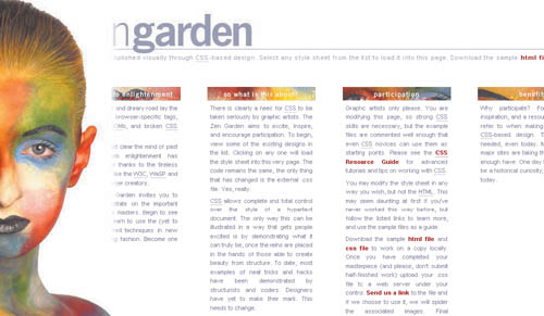 Exploiting Browser FlawsAs is often the case in managing cross-browser concerns, it's wise to create the ideal and then degrade back to those browsers that for some reason do not support a given effect. In order to achieve this, you can create different designs and use JavaScript to sniff out browsers; however, some consider this to be ineffective for several reasons, including the fact that a number of people turn off JavaScript in their browsers. Note Despite being introduced with the rest of the CSS2 specification in 1998, the fixed value for the position property lacks support in certain browsersmost significantly Microsoft Internet Explorer. So while the rules created for this scenario will work fine in a more compliant browser, the image will scroll off the page when viewed in Internet Explorer, ruining the effect. In the case of prêt-à-porter, the tack was to create an alternative design for Internet Explorer that looked good and rendered smoothly despite the fact that the face image would scroll off the screen. To accomplish this, an alternate design that would look acceptable in that environment was created. Along with lacking support for fixed positioning, Internet Explorer also does not support child selectors, which allow us to select a specific child of a given element. Child selectors use the angle bracket (>) to express this. Thus, the selector p>strong signifies that only strong elements that occur inside of paragraphs will be styled with the ensuing declaration. Exploiting the fact that Internet Explorer lacks support for fixed positioning and for child selectors, a series of rules were created to deliver the optimal design to browsers that comply with the rules of CSS, and to deliver the alternate design to Internet Explorer: body#css-zen-garden>div#extraDiv2 { background-image: url(bg_face.jpg); background-repeat: no-repeat; background-position: left bottom; position: fixed; left: 0; bottom: 0; height: 594px; width: 205px; z-index: 2; } The following CSS is applied only in browsers that don't understand the previous rule, in this case Internet Explorer. Because the child selectors imply greater specificity, the former rule takes precedence, but only if the browser understands it. div#extraDiv2 { background-image: url(bg_face_ie.jpg); background-repeat: no-repeat; background-position: left bottom; position: absolute; left: 0; bottom: 0; height: 600px; width: 265px; } While the fixed-position image scrolls off the page in Internet Explorer 6.0, the design is still attractive and acceptable (FIGURE 4). Figure 4. In the Internet Explorer 6.0 alternative layout, the figure scrolls off the screen, but the basic integrity of the design remains intact. Managing OperaAnother issue that arose during the creation of prêt-à-porter had to do with support issues in Opera Software's Opera browser. Even if browser developers are very concerned with implementing standards, as is the case with Opera, for various reasons the implementations aren't always perfect. In Opera versions prior to 7.5, the horizontal scroll bar for prêt-à-porter didn't appear. Of course, this made the design completely unusable in those versions (FIGURE 5). Figure 5. Prêt-à-Porter viewed in Opera 7.0. In versions of Opera prior to 7.5, no scroll bar appeared, disabling much of the design. Fortunately, Opera has fixed the problem, and the design not only works, but works in its ideal form, with the fixed-positioned image remaining in place just as it does in other completely CSS-compliant browsers. Lessons LearnedFrom where we find inspiration to how that inspiration evolves as a complete design is a process as unique to the individual designer as is its outcome. Meyer's exploration of a layout inspired by a horizontal print design resulted in both possibilities and challenges. By using clever workarounds, Meyer achieved a remarkably beautiful design that not only teaches us to think in clever terms about how unique layouts might be inspired, but also demonstrates how to implement them effectively. |
|
 Visual Enlightenment for the Web")
EAN: N/A
Pages: 117