Reality Show Advertising
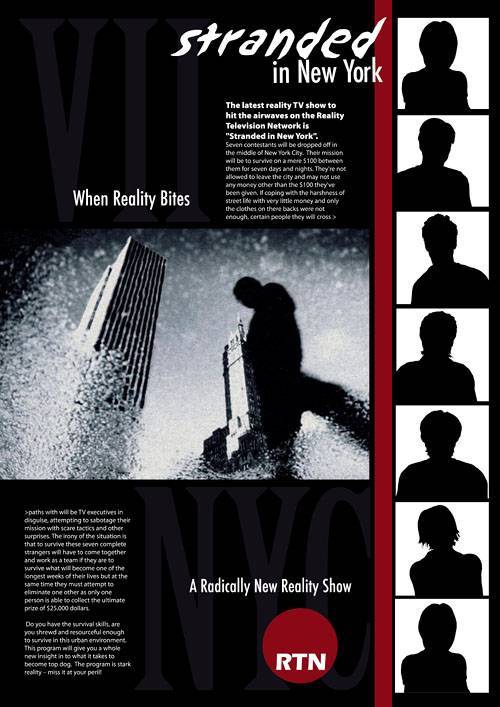
| Every ad has the goal of communicating a brand, and it can be done in a number of creative and effective ways that depend on the medium, existing brand familiarity, viewing environment, and other variables. Your goal in this exercise will be to develop an ad to announce a new TV show in a men's magazine. That's the primary goal; the secondary goal is to communicate a brand in your magazine ad. Your client requires his company's logo and product's logo in the ad, and he expects you to follow his style guidelines. Project Brief: Stranded in New YorkThe latest reality TV show to hit the airwaves is Stranded in New York, airing this fall on RTN, the Reality Television Network. The premise of the show is that seven strangers will be dropped off in New York City with just $100 between them. With that $100, they'll have to figure out how to manage for one full week. They're not allowed to leave the city in that week, and they may not use any money other than the $100 they've been given. Doesn't sound too badexcept that certain people they meet will be TV executives in disguise, attempting to sabotage their mission with scare tactics and other surprises. Any contestant who can't take it can quit, but any contestant who makes it through the full week will win $25,000. The network wants this show to be a megahit so they can try it in additional cities every season, and they expect it to be most successful with men ages 18 to 30. They'd like their campaign to begin with a full-page ad in the summer issues of various upscale and mass-market men's magazines around the country. Figure 8.17. The client has provided these logos for you along with specifications on how they can be used.
The client will provide you with an RTN logo and the following strict style requirements for its use (common when working with any established brand):
You will also be supplied with a logo for the TV program with the following style requirements:
You may use any imagery you choose to accompany your designphotos of New York City, people, illustrations, and so on. Project Summary
STUDIO SESSIONS www.studiosessions.net/portfolio Post this chapter's project online for feedback from professional designers. access code: STUDIOp Project StepsBefore you begin, download the RTN logo and Stranded in New York logo from the online download site. 1. Research the AudienceThe client gave you some brief but important information about the demographic that should be targeted in the ad you're creating. You know the age and sex that you should design for, and where the ad will be placed. With this information, you should do some research on the audience. Learn what colors and images trigger a response from this group. Identify trends by researching ads in similar locations. In men's magazines, is there a trend toward black-and-white photos, stark simplicity, humorous copy, bold colors and patterns, or dramatic statements? Look at how print ads promoting TV shows differ from ads for tangible products like coffee or MP3 players, and pay attention to how company and product brands are communicated in the ads you see. 2. Conceptualize the DesignSketch out some design ideas for your full-page magazine ad based on your own research and creative ideas. The client has left the design open to youyou could do a very minimal, text-only design, or add complexity with various images and detailed copy. As you plan your ad, consider some of the following questions:
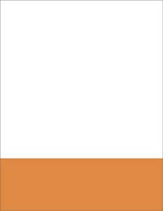
3. Begin the Ad LayoutThe software you choose to work with for this project will depend on your preferences and the type of imagery you plan to have in your ad. If you will be using only type, or type and illustrations, you may want to work solely in Illustrator. If you are including photographs, you might work on those in Photoshop and bring them into Illustrator when they are the way you like them, or work solely in Photoshop. Start with a document 8.5 inches wide by 11 inches high in CMYK color mode in the program you plan to complete your layout in. If using only Photoshop, the document resolution (set in Image > Image Size) should be 300 dots per inch. (Remember, Illustrator is vector-based and therefore independent of resolution issues.) To help in your composition, show the rulers on your document (View > Show Rulers in Illustrator, View > Rulers in Photoshop) and drag guides from the rulers to represent your margins and other areas you want to block out for your design. Fill your document with the background color you want, or use another background like a pattern or gradient. If you've planned any geometric background elements such as circles or lines, add them now. If you're using only Photoshop for your layout, work carefully with your drawing tools to make sure those geometric items are the right size; resizing them later will reduce their quality. In Illustrator, you don't have to worry about thisresize your vector shapes at will! Figure 8.18. Those composition rules you learned for poster design should come in handy as you plan your layout. Here, I'm balancing the large white area with a smaller orange bar. Though I'll be adding images and text, a balanced start is the best strategy for a balanced end.
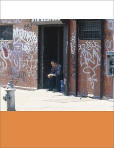
4. Edit and Place the Main ImageUnless you're dealing with a type-only design, your next step is to prepare your design's main image. If this is a photograph, open it in Photoshop and apply any edits needed. For example, you'll probably want to crop the image to the size and shape you want, and accentuate the point of interest. Then you may need to retouch problem spots, apply color modifications, and use a filter or special effect to get the desired appearance. Now's a good time to revisit the notion of form following function. As fun as special photo effects can be, they are best used only when they suit the goal of the adhelping to draw attention to the message, deliver it, and persuade the viewer to perform an action (in this case, watch the show). If you're considering an effect just for art's sake, it's probably not the best approach. Save a .psd copy of your edited photo in case you want to go back and make changes later. If you're laying out your ad in Photoshop, use the Move tool to drag your photo onto your ad document, and rearrange your layers as needed. Figure 8.19. I'm going for a mostly dramatic ad, though in a moment it will have a touch of humor, so I went with a photo that sets up the city as a gritty, rough place to be.
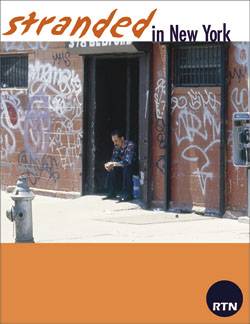
If you are laying out your ad in Illustrator, use File > Place to bring the .psd file into your Illustrator document. If it overlaps other elements, send it back using Object > Arrange, or move the layer down in the Layers palette. If your main image is an illustration, work in Illustrator to create it, and then save a copy and simply copy and paste it onto your layout document. 5. Place the BrandingRegardless of what program you're using for your layout, open the RTN and Stranded in New York logos in Illustrator. Here you can make any color and sizing changes you'd like, easily and without fear of losing quality. Remembering the client's guidelines for the use of type, apply your chosen colors to the logos and make any other changes necessary for your design. To make color changes, select the elements you'd like to modify with the Selection tool (holding down Shift to select multiple items), and adjust the fill color in the Color palette. Save a copy of each logo as an .eps or .ai file in case you'd like to go back and make changes later. Now you can copy and paste your logos into your layout document in either Illustrator or Photoshop. Select and move them to the appropriate place in the hierarchy of your design. Figure 8.20. I felt that the show logo was more important than the RTN logo in my design, so I gave it top billing and colors that match my orange bar and photo. The RTN logo is smaller but still carries plenty of weight.
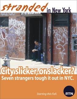
6. Set the Type and Additional ImagesNow that the background, main image, and branding is in place, you can apply the remaining (but very important) components of your ad. If you have additional photos or illustrations to place in your design, add them to your layout now and follow the same process for working with them as above. Figure 8.21. Here's my final design, where that touch of humor is finally added with text. Now the viewer has a good sense of what the show is aboutand hopefully plans to watch!
Many successful ads have just one image or none at all, but compositions using multiple images can work well too, as long as they help communicate and persuade without making the layout too confusing. The final step is to set the type. You should already have come up with the copy and thought about where it will go on the page, but presenting it isn't always as simple as it sounds. Keep the following in mind as you make your typography decisions:
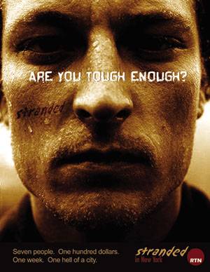
Review your layout carefully and make any final tweaks you think are necessary for it to be effective. Try printing it out and tucking it into a magazine to see how it looks in its final destination. Student WorkWhat Stranded in New York ads have other designers created? Here are some work samples from Sessions students: Figure 8.22. Dominic Guadiz made a gritty photo the centerpiece of the ad and provided text that works perfectly against it. In addition to the use of branding at the bottom, notice that Stranded was repeated over the photo for added impact.
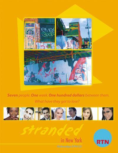
Figure 8.23. This design by Krista Olsen uses many different images but puts them in two cohesive groups so the layout doesn't feel too busy. There is a nice balance between the edginess of the main photo group and the lighter, more pleasant colors.
Figure 8.24. Michael Wrigley uses minimal color to give the layout drama, and presents a strong hierarchy of branding, imagery, and typography. The images give an air of suspense that persuades viewers to watch.
|

EAN: 2147483647
Pages: 103