Visual Style
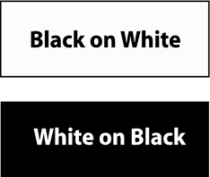
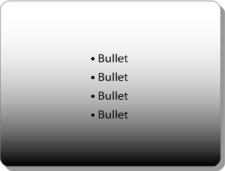
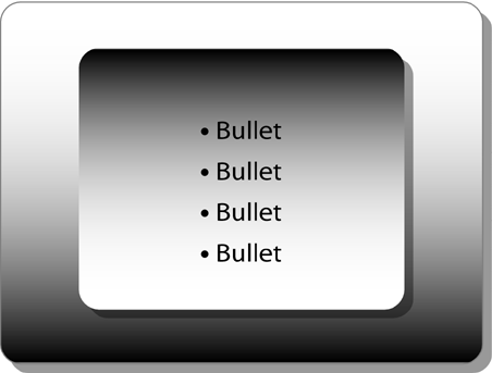
| Many business presentations are supported by a collection of slides that are only text no pictorial, relational, or numeric slides at all. Not only does this border on the Presentation-as-Document Syndrome, it looks bland and boring. Twenty all-text slides in a row can produce the MEGO effect. Furthermore, reading an all-text slide feels like hard work, even when the slide is designed according to the principles above. Figure 7.13 is an example. Figure 7.13. An all-text slide, multiplied by 20, equals MEGO. There's nothing "wrong" with this slide, but it's certainly not interesting or even visually appealing. It's possible to add texture to an all-text slide like this without adding or subtracting a single letter. The secret is to use the simple design tools that are included in Microsoft PowerPoint. Figure 7.14 shows an example. Figure 7.14. Same text as Figure 7.13, with texture. By embedding text in boxes, and giving the boxes lines and shadows, you create a much more attractive and interesting version of the slide. It also makes the information easier to read. Grouping related items visually reduces the interpretive work your audience must do to follow the flow of your ideas. Microsoft PowerPoint provides a wealth of design options for adding texture to your text slides with countless styles, colors, elements, and formats. (Please see Figure 1 in the color insert for a textured version of Figure 7.14.) You can also create emphasis by using a technique called reverse out , which sets off a headline from the rest of your text by reversing the background and font colors, as in Figure 7.15. Figure 7.15. The reverse out effect. You can also enhance the design of the background by adding stripes , borders, edges, and cornices. There are so many interesting design options that it's easy to get carried away. For example, one option is gradient shading, as shown in Figure 7.16. Figure 7.16. Gradient shading. This looks cool at first. But then you realize that it's difficult to read the last bullet. Not to worry; there's always another bell or whistle in the graphics toolbox. You can add a double gradient as in Figure 7.17. Figure 7.17. Double gradient shading. But now you realize that you can't read the first bullet!
The point here is the same as with font choices: Remember the Less Is More principle. Many presenters get carried away with the plethora of fancy graphic toys available to them. Choose one or two graphics effects that will enhance the clarity and attractiveness of your slide design, and use only these throughout your presentation. Select a limited color palette, two or three colors at most, to complement the colors in your company logo, and use them consistently. For example, if you use a gold border and a royal blue headline on your first slide, then every slide should contain a gold border and a royal blue headline. Finally, optimize all your text slides by following these simple guidelines: |


EAN: 2147483647
Pages: 94