| Now that the responsibilities and expected functionality of the OutlookBarTab have been defined, it's time to realize the design in code. Listing 7.1 provides the complete listing for the OutlookBarTab component. Listing 7.1 OutlookBarTab 1: using System; 2: using System.ComponentModel; 3: using System.Drawing; 4: using System.Windows.Forms; 5: 6: namespace SAMS.ToolKit.Controls 7: { 8: 9: [ 10: Description( "OutlookBarTab Component" ), 11: ToolboxItem( false ) 12: ] 13: public class OutlookBarTab : System.ComponentModel.Component { 14: 15: #region STATIC FIELDS 16: internal static int EDGE_PADDING = 4; 17: #endregion 18: 19: #region Protected Instance Members 20: protected string text; 21: protected StringAlignment textAlignment; 22: protected Color foreColor; 23: protected Icon tabIcon; 24: protected Control child; 25: 26: protected Rectangle tabRect; 27: protected Rectangle iconRect; 28: protected ButtonState buttonState; 29: #endregion 30: 31: 32: #region Internal Events 33: 34: [Description( "Event rasied when the Text property has been modified" )] 35: public event EventHandler TextChanged; 36: 37: [Description( "Event rasied when the TextAlignment property has been  modified" )] 38: public event EventHandler TextAlignmentChanged; 39: 40: [Description( "Event rasied when the ForeColor property has been modified" )] 41: public event EventHandler ForeColorChanged; 42: 43: [Description( "Event rasied when the Icon property has been modified" )] 44: public event EventHandler IconChanged; 45: 46: [Description( "Event rasied when the Child property has been modified" )] 47: public event EventHandler ChildChanged; 48: 49: #endregion 50: 51: 52: #region Properties 53: 54: [ 55: Description( "The text displayed on the control tab" ), 56: Category( "Appearance" ) 57: ] 58: public string Text { 59: get { return text; } 60: set { 61: if( !text.Equals( (string)value ) ) { 62: text = value; 63: OnTextChanged( new EventArgs( ) ); 64: } 65: } 66: } 67: 68: [ 69: Description( "Specifies the alignment of the text within the control tab" ), 70: Category( "Appearance" ) 71: ] 72: public StringAlignment Alignment { 73: get { return textAlignment; } 74: set { 75: if( textAlignment != value ) { 76: textAlignment = value; 77: OnTextAlignmentChanged( new EventArgs( ) ); 78: } 79: } 80: } 81: 82: [ 83: Description( "Specifies the color used to render the text on the tab control" ), 84: Category( "Appearance" ) 85: ] 86: public Color ForeColor { 87: get { return foreColor; } 88: set { 89: if( foreColor != value ) { 90: foreColor = value; 91: OnForeColorChanged( new EventArgs( ) ); 92: } 93: } 94: } 95: 96: [ 97: Description( "Specifies the Icon to drawn on the control tab" ), 98: Category( "Appearance" ), 99: DefaultValue( null ) 100: ] 101: public Icon Icon { 102: get { return tabIcon; } 103: set { 104: if( tabIcon != value ) { 105: tabIcon = value; 106: OnIconChanged( new EventArgs( ) ); 107: } 108: } 109: } 110: 111: [ 112: Description( "Child control hosted within the control tab" ), 113: Category( "Behavior" ) 114: ] 115: public Control Child { 116: get { return child; } 117: set { 118: if( child != value ) { 119: child = value; 120: OnChildChanged( new EventArgs( ) ); 121: } 122: } 123: } 124: 125: [ Browsable( false ) ] 126: internal ButtonState ButtonState { 127: get { return buttonState; } 128: } 129: 130: [ Browsable( false ) ] 131: internal Rectangle TabRect { 132: get { return tabRect; } 133: } 134: 135: #endregion 136: 137: public OutlookBarTab() 138: { 139: text = ""; 140: foreColor = System.Drawing.SystemColors.ControlText; 141: child = null; 142: tabIcon = null; 143: textAlignment = StringAlignment.Center; 144: } 145: 146: public virtual void Draw( Graphics g, 147: Rectangle destRect, 148: Font font, 149: ButtonState buttonState ) { 150: 151: tabRect = destRect; 152: this.buttonState = buttonState; 153: 154: DrawButton( g ); 155: if( tabIcon != null ) 156: DrawIcon( g ); 157: DrawText( g, font ); 158: } 159: 160: public bool HitTest( Point pt ) { 161: return tabRect.Contains( pt ); 162: } 163: 164: #region Protected Instance Methods 165: 166: 167: 168: protected virtual void DrawButton( Graphics g ) { 169: ControlPaint.DrawButton( g, tabRect, buttonState ); 170: } 171: 172: 173: protected virtual void DrawIcon( Graphics g ) { 174: int top = tabRect.Top + EDGE_PADDING; 175: int left = tabRect.Left + EDGE_PADDING; 176: int width = tabIcon.Width; 177: int height = tabIcon.Height; 178: 179: //Does the Icon need scaled? 180: if( (top+height) >= (tabRect.Height - (2*EDGE_PADDING))) { 181: float maxHeight = (tabRect.Height - (2*EDGE_PADDING)); 182: float scaleFactor = maxHeight / (float)height; 183: height = (int)((float)height*scaleFactor); 184: width = (int)((float)width*scaleFactor); 185: } 186: 187: iconRect = new Rectangle( left, top, width, height ); 188: if( buttonState == ButtonState.Pushed ) 189: iconRect.Offset(1,1); 190: 191: g.DrawIcon( tabIcon, iconRect ); 192: } 193: 194: protected virtual void DrawText( Graphics g, Font font ) { 195: Rectangle textRect = tabRect; 196: 197: textRect.X += EDGE_PADDING; 198: textRect.Width -= EDGE_PADDING; 199: textRect.Y += EDGE_PADDING; 200: textRect.Height -= EDGE_PADDING; 201: 202: //Adjust for possible icon 203: if( tabIcon != null ) { 204: textRect.X += iconRect.Width; 205: textRect.Width -= iconRect.Width; 206: } 207: 208: //Adjust for button state 209: if( buttonState == ButtonState.Pushed ) 210: textRect.Offset(1,1); 211: 212: //Render the Text 213: StringFormat fmt = new StringFormat( ); 214: fmt.Alignment = textAlignment; 215: fmt.LineAlignment = StringAlignment.Center; 216: fmt.Trimming = StringTrimming.EllipsisCharacter; 217: fmt.FormatFlags = StringFormatFlags.NoWrap | StringFormatFlags.LineLimit; 218: 219: Brush textBrush = new SolidBrush( foreColor ); 220: 221: g.DrawString( text, font, textBrush, textRect, fmt ); 222: 223: textBrush.Dispose( ); 224: } 225: 226: 227: protected virtual void OnTextChanged( EventArgs e ) { 228: if( TextChanged != null ) 229: TextChanged( this, e ); 230: } 231: protected virtual void OnTextAlignmentChanged( EventArgs e ) { 232: if( TextAlignmentChanged != null ) 233: TextAlignmentChanged( this, e ); 234: } 235: protected virtual void OnForeColorChanged( EventArgs e ) { 236: if( ForeColorChanged != null ) 237: ForeColorChanged( this, e ); 238: } 239: protected virtual void OnIconChanged( EventArgs e ) { 240: if( IconChanged != null ) 241: IconChanged( this, e ); 242: } 243: protected virtual void OnChildChanged( EventArgs e ) { 244: if( ChildChanged != null ) 245: ChildChanged( this, e ); 246: } 247: #endregion 248: } 249: } modified" )] 38: public event EventHandler TextAlignmentChanged; 39: 40: [Description( "Event rasied when the ForeColor property has been modified" )] 41: public event EventHandler ForeColorChanged; 42: 43: [Description( "Event rasied when the Icon property has been modified" )] 44: public event EventHandler IconChanged; 45: 46: [Description( "Event rasied when the Child property has been modified" )] 47: public event EventHandler ChildChanged; 48: 49: #endregion 50: 51: 52: #region Properties 53: 54: [ 55: Description( "The text displayed on the control tab" ), 56: Category( "Appearance" ) 57: ] 58: public string Text { 59: get { return text; } 60: set { 61: if( !text.Equals( (string)value ) ) { 62: text = value; 63: OnTextChanged( new EventArgs( ) ); 64: } 65: } 66: } 67: 68: [ 69: Description( "Specifies the alignment of the text within the control tab" ), 70: Category( "Appearance" ) 71: ] 72: public StringAlignment Alignment { 73: get { return textAlignment; } 74: set { 75: if( textAlignment != value ) { 76: textAlignment = value; 77: OnTextAlignmentChanged( new EventArgs( ) ); 78: } 79: } 80: } 81: 82: [ 83: Description( "Specifies the color used to render the text on the tab control" ), 84: Category( "Appearance" ) 85: ] 86: public Color ForeColor { 87: get { return foreColor; } 88: set { 89: if( foreColor != value ) { 90: foreColor = value; 91: OnForeColorChanged( new EventArgs( ) ); 92: } 93: } 94: } 95: 96: [ 97: Description( "Specifies the Icon to drawn on the control tab" ), 98: Category( "Appearance" ), 99: DefaultValue( null ) 100: ] 101: public Icon Icon { 102: get { return tabIcon; } 103: set { 104: if( tabIcon != value ) { 105: tabIcon = value; 106: OnIconChanged( new EventArgs( ) ); 107: } 108: } 109: } 110: 111: [ 112: Description( "Child control hosted within the control tab" ), 113: Category( "Behavior" ) 114: ] 115: public Control Child { 116: get { return child; } 117: set { 118: if( child != value ) { 119: child = value; 120: OnChildChanged( new EventArgs( ) ); 121: } 122: } 123: } 124: 125: [ Browsable( false ) ] 126: internal ButtonState ButtonState { 127: get { return buttonState; } 128: } 129: 130: [ Browsable( false ) ] 131: internal Rectangle TabRect { 132: get { return tabRect; } 133: } 134: 135: #endregion 136: 137: public OutlookBarTab() 138: { 139: text = ""; 140: foreColor = System.Drawing.SystemColors.ControlText; 141: child = null; 142: tabIcon = null; 143: textAlignment = StringAlignment.Center; 144: } 145: 146: public virtual void Draw( Graphics g, 147: Rectangle destRect, 148: Font font, 149: ButtonState buttonState ) { 150: 151: tabRect = destRect; 152: this.buttonState = buttonState; 153: 154: DrawButton( g ); 155: if( tabIcon != null ) 156: DrawIcon( g ); 157: DrawText( g, font ); 158: } 159: 160: public bool HitTest( Point pt ) { 161: return tabRect.Contains( pt ); 162: } 163: 164: #region Protected Instance Methods 165: 166: 167: 168: protected virtual void DrawButton( Graphics g ) { 169: ControlPaint.DrawButton( g, tabRect, buttonState ); 170: } 171: 172: 173: protected virtual void DrawIcon( Graphics g ) { 174: int top = tabRect.Top + EDGE_PADDING; 175: int left = tabRect.Left + EDGE_PADDING; 176: int width = tabIcon.Width; 177: int height = tabIcon.Height; 178: 179: //Does the Icon need scaled? 180: if( (top+height) >= (tabRect.Height - (2*EDGE_PADDING))) { 181: float maxHeight = (tabRect.Height - (2*EDGE_PADDING)); 182: float scaleFactor = maxHeight / (float)height; 183: height = (int)((float)height*scaleFactor); 184: width = (int)((float)width*scaleFactor); 185: } 186: 187: iconRect = new Rectangle( left, top, width, height ); 188: if( buttonState == ButtonState.Pushed ) 189: iconRect.Offset(1,1); 190: 191: g.DrawIcon( tabIcon, iconRect ); 192: } 193: 194: protected virtual void DrawText( Graphics g, Font font ) { 195: Rectangle textRect = tabRect; 196: 197: textRect.X += EDGE_PADDING; 198: textRect.Width -= EDGE_PADDING; 199: textRect.Y += EDGE_PADDING; 200: textRect.Height -= EDGE_PADDING; 201: 202: //Adjust for possible icon 203: if( tabIcon != null ) { 204: textRect.X += iconRect.Width; 205: textRect.Width -= iconRect.Width; 206: } 207: 208: //Adjust for button state 209: if( buttonState == ButtonState.Pushed ) 210: textRect.Offset(1,1); 211: 212: //Render the Text 213: StringFormat fmt = new StringFormat( ); 214: fmt.Alignment = textAlignment; 215: fmt.LineAlignment = StringAlignment.Center; 216: fmt.Trimming = StringTrimming.EllipsisCharacter; 217: fmt.FormatFlags = StringFormatFlags.NoWrap | StringFormatFlags.LineLimit; 218: 219: Brush textBrush = new SolidBrush( foreColor ); 220: 221: g.DrawString( text, font, textBrush, textRect, fmt ); 222: 223: textBrush.Dispose( ); 224: } 225: 226: 227: protected virtual void OnTextChanged( EventArgs e ) { 228: if( TextChanged != null ) 229: TextChanged( this, e ); 230: } 231: protected virtual void OnTextAlignmentChanged( EventArgs e ) { 232: if( TextAlignmentChanged != null ) 233: TextAlignmentChanged( this, e ); 234: } 235: protected virtual void OnForeColorChanged( EventArgs e ) { 236: if( ForeColorChanged != null ) 237: ForeColorChanged( this, e ); 238: } 239: protected virtual void OnIconChanged( EventArgs e ) { 240: if( IconChanged != null ) 241: IconChanged( this, e ); 242: } 243: protected virtual void OnChildChanged( EventArgs e ) { 244: if( ChildChanged != null ) 245: ChildChanged( this, e ); 246: } 247: #endregion 248: } 249: } The implementation of the OutlookBarTab follows the general layout of the topics discussed within this chapter. Each of the outlined properties, events, and public methods has been implemented. In addition, the Draw method delegates various drawing tasks to specific protected methods within the component. As expected, the drawing of the components represents most of the component's logic. The OutlookBarTab must determine how to draw itself based on the properties, size, and state of the tab. Drawing of the tab is broken down into three areas: DrawButton, DrawIcon, and DrawText. The DrawButton method uses the familiar ControlPaint class to render a basic button-style control. Next, the DrawIcon method draws a properly scaled version of the icon image associated with the tab component. Finally, the DrawText method is called to draw the text for the component, taking into consideration the icon and text length. It's important to note the use of the ToolboxItem attribute used on the OutlookBarTab class. The ToolboxItem attribute specifies whether the toolbox should create a toolbox item. In addition, it can be used to specify the type of toolbox item to create. In the case of the OutlookBarTab, the component should not be available on the toolbar. This will prevent the component from being available for use as a toolbox control. After all, the OutlookBarTab is really a subcomponent of the OutlookBar control. Testing the Component Without having the OutlookBar control implemented, testing the OutlookBarTab requires creating a custom test-bed application. One thing to keep in mind when building custom controls is that most of the time you are left to your own devices when it comes to testing the control. Although VS .NET provides a rich infrastructure for control development, many times your own creativity and necessity will spawn new tools for testing. As with many of the applications built so far for testing, the property grid will serve as a means to interact with the properties provided by the OutlookBarTab component. Figure 7.2 shows the test-bed application. Figure 7.2. The OutlookBarTab test-bed demo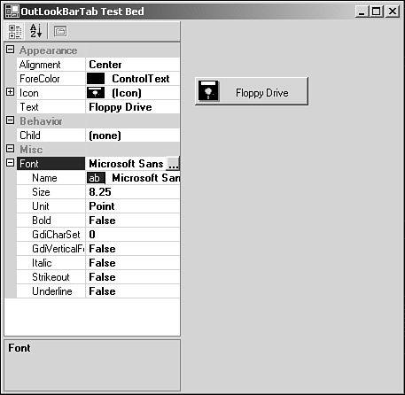
Before diving into the source for the test bed, you should have noticed the Font property being displayed within the property grid. The OutlookBarTab component has no Font property, yet a grid item appears. When the OutlookBar control is built, its own Font property will be used when rendering the child tabs, and as such this functionality should be tested as well. To provide the Font property, the OutlookBarTab will serve as a base class from which a derived class will provide a single property: Font. Listing 7.2 shows the source listing for the test-bed application. Listing 7.2 Testing the OutlookBarTab Component 1: using System; 2: using System.Drawing; 3: using System.Collections; 4: using System.ComponentModel; 5: using System.Windows.Forms; 6: using System.Data; 7: 8: namespace OutlookBarTabTest 9: { 10: 11: public class OutlookBarTabWithFont : SAMS.ToolKit.Controls.OutlookBarTab { 12: 13: private Font font; 14: 15: public Font Font { 16: get { return font; } 17: set { font = value; } 18: } 19: } 20: 21: 22: public class Form1 : System.Windows.Forms.Form { 23: private System.Windows.Forms.PropertyGrid propertyGrid1; 24: private System.ComponentModel.Container components = null; 25: 26: 27: private OutlookBarTabWithFont testTab; 28: 29: public Form1() { 30: // 31: // Required for Windows Form Designer support 32: // 33: InitializeComponent(); 34: 35: testTab = new OutlookBarTabWithFont( ); 36: testTab.Font = this.Font; 37: this.propertyGrid1.SelectedObject = testTab; 38: this.propertyGrid1.PropertyValueChanged += new PropertyValueChangedEventHandler( OnPropertyValueChanged ); 39: 40: } 41: 42: protected void OnPropertyValueChanged( object sender, PropertyValueChangedEventArgs e ) { 43: this.Invalidate( ); 44: } 45: 46: protected override void OnPaint( PaintEventArgs e ) { 47: base.OnPaint( e ); 48: 49: testTab.Draw( e.Graphics, new Rectangle(216,64,128,32 ), testTab.Font, ButtonState.Normal ); 50: } 51: 52: protected override void OnMouseDown( MouseEventArgs e ) { 53: if( e.Button == MouseButtons.Left && testTab.HitTest( new Point( e.X, e.Y ) ) ) 54: testTab.Draw( CreateGraphics( ), new Rectangle(216,64,128,32 ), testTab.Font, ButtonState.Pushed ); 55: } 56: 57: protected override void OnMouseUp( MouseEventArgs e ) { 58: testTab.Draw( CreateGraphics( ), new Rectangle(216,64,128,32 ), testTab.Font, ButtonState.Normal ); 59: } 60: 61: 62: 63: protected override void Dispose( bool disposing ) 64: { 65: if( disposing ) 66: { 67: if (components != null) 68: { 69: components.Dispose(); 70: } 71: } 72: base.Dispose( disposing ); 73: } 74: 75: #region Windows Form Designer generated code 76: /// <summary> 77: /// Required method for Designer support - do not modify 78: /// the contents of this method with the code editor. 79: /// </summary> 80: private void InitializeComponent() 81: { 82: this.propertyGrid1 = new System.Windows.Forms.PropertyGrid(); 83: this.SuspendLayout(); 84: // 85: // propertyGrid1 86: // 87: this.propertyGrid1.CommandsVisibleIfAvailable = true; 88: this.propertyGrid1.Dock = System.Windows.Forms.DockStyle.Left; 89: this.propertyGrid1.LargeButtons = false; 90: this.propertyGrid1.LineColor = System.Drawing.SystemColors.ScrollBar; 91: this.propertyGrid1.Name = "propertyGrid1"; 92: this.propertyGrid1.Size = new System.Drawing.Size(200, 273); 93: this.propertyGrid1.TabIndex = 0; 94: this.propertyGrid1.Text = "propertyGrid1"; 95: this.propertyGrid1.ViewBackColor = System.Drawing.SystemColors.Window; 96: this.propertyGrid1.ViewForeColor = System.Drawing.SystemColors.WindowText; 97: // 98: // Form1 99: // 100: this.AutoScaleBaseSize = new System.Drawing.Size(5, 13); 101: this.ClientSize = new System.Drawing.Size(360, 273); 102: this.Controls.AddRange(new System.Windows.Forms.Control[] { 103: this.propertyGrid1} ); 104: this.Name = "Form1"; 105: this.Text = "OutoolBarTab Test Bed"; 106: this.ResumeLayout(false); 107: 108: } 109: #endregion 110: 111: /// <summary> 112: /// The main entry point for the application. 113: /// </summary> 114: [STAThread] 115: static void Main() 116: { 117: Application.Run(new Form1()); 118: } 119: } 120: } By deriving the class OutlookBarTabWithFont from the OutlookBarTab component, a Font property can be added for the property grid support. At the same time, this technique does not disturb the OutlookBarTab component in any way that would alter its behavior. The test-bed application is a standard Windows Forms based application. To test the OutlookBarTab component, the form will act as the parent and handle managing the component. The major areas of the test bed revolve around mouse events and painting. When a mouse click occurs on the parent form, the x and y coordinates of the mouse click are passed to the OutlookBarTab for hit-testing. Again, hit-testing is used to determine whether a point is located within the soft-control. Depending on the result of the hit-testing for the OutlookBarTab, the appropriate parameters are passed to the Draw method of the component. Again, the Draw method handles all the drawing logic for the component. In addition to mouse events and drawing, the main form subscribes or listens to the events of the component. These events include TextChanged, ForeColorChanged, and so on. When a property of the component has changed, it is necessary for the parent form to provide a Graphics object that the OutlookBarTab can use to redraw itself to reflect the changed properties. All the necessary testing code is found between lines 42 and 59 of Listing 7.2. Using the PropertyGrid control gives a pseudo design-time feeling to the component being tested. The VS .NET IDE provides no support for testing soft-controls such as the OutlookBarTab, and a simple test application such as that developed in Listing 7.2 could easily be extended and reused to test and develop other soft-controls. |