Detailed Design
| Before diving into the code for the OutlookBarTab, its design must be fully specified. The design details include the following:
After the design criteria have been established, it's merely a matter of realizing the design in code. The first question, of course, is where to start. Base ClassDeciding on the base class for the OutlookBarTab requires determining what role the component plays, the needs of the component, and its interaction with its eventual container. Because the OutlookBarTab represents a graphical entity on the screen, it might seem necessary for it to derive from the Control base class. The Control base class would allow for the OutlookBarTab to receive Windows messages, such as keystrokes and mouse events. However, there is no requirement which states that only controls can draw on the screen. All that is required to draw on the screen is a device context, such as the Graphics object. In fact, the OutlookBarTab mostly serves to hold information about a particular tab within the OutlookBar control. The individual tabs are not full-blown controls, but rather a means for the user to choose which tab within the control to activate. These types of controls are known as soft-controls. Remember that soft-controls do not have an associated window handle or message loop and therefore do not require any real resources. This design allows for a light and efficient control design. In contrast, if the OutlookBarTab were to be derived from the Control base class, each individual tab would have an associated window handle and the extra weight of the Control base class. The upside to this is that each OutlookBarTab would be capable of processing Windows messages on its own. In processing the messages, the OutlookBarTab control would then need to notify its parent container, in this case the OutlookBar control, of relevant events such as activation via a mouse click. Exposing events from the control to which the OutlookBar control would subscribe would develop this interaction. Deciding on the base class for any control requires careful consideration of the intended use and the requirements of the control. The reason for creating the OutlookBarTab as a soft-control is to provide an example of soft-control creation and use. After all, the purpose of this book is to demonstrate various techniques for creating custom controls. InterfacesAs seen in Chapter 5, "Advanced Control Development," the .NET BCL, base class library, provides several interfaces geared toward control development. The various control base classes implement these interfaces to provide a default implementation. During the development of a custom control, it may be necessary to override the implementation of one or more interface methods or properties. In the next chapter, a custom control collection is constructed to maintain a collection of OutlookBarTabs. This custom collection is constructed by implementing the necessary collection interfaces: ICollection, IList, and IEnumerable. Properties and EventsDefining the OutlookBarTab properties is relatively easy. Consider what information the component needs to contain, and chances are most of that information will need to be available to users of the component. In addition to these properties, there needs to exist an event to notify observers of the component when a particular property has changed. The event name should coincide with the name of the property. For example, the Text property should have a corresponding event named OnTextChanged. This property/event pair holds true for all properties. Beginning with properties, the purpose of the OutlookBarTab is to hold a child control, such as a panel or list box. The OutlookBarTab also provides a text caption and an associated icon. In addition, the text color and text alignment of the tab can be changed during design-time and at runtime. The properties for the OutlookBarTab are listed in Table 7.1.
The properties listed in Table 7.1 are used to define the appearance of the OutlookBarTab. In addition, each property has a corresponding event that is used to notify the OutlookBar control that a property has been modified. The property/event pairing is suggested by the design guidelines provided by Microsoft for control development. Table 7.2 lists the matching events for the properties in Table 7.1.
Each of the events from Table 7.2 has a corresponding protected member method associated with it. The corresponding member methods have the method signature protected virtual OnEventName( object sender, EventArgs e ) where the EventName is replaced with the name of the corresponding event. Again, this is according to the development guidelines proposed by Microsoft. This is done so that any derived classes have the first opportunity to handle the various events. This is accomplished by overriding the protected event methods. Public MethodsTo keep the OutlookBarTab component simple, only two public methods are provided for the soft-control. Based on previous discussions of soft-controls, you have probably guessed that the two public methods relate to drawing and hit-testing. Table 7.3 lists the public methods for the OutlookBarTab component.
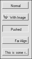
When you're building soft-controls, the methods listed in Table 7.3 are the usual starting point. Of the two methods, the Draw method is often subdivided into several smaller methods, with each method handling a different aspect of the drawing logic. User InterfaceEven though the OutlookBarTab is not a control, it will still be responsible for rendering its own UI within the OutlookBar control. The reason for this is to keep the drawing code contained within the OutlookBarTab. This frees the parent control from having to perform the drawing of the soft-control and helps segment the code. In addition, the OutlookBarTab component could then serve as a base class, and the derived class could in turn provide its own custom drawing logic. Rendering of the tab component includes a normal look with and without an image, and a pushed look, such as when a mouse has been clicked over the tab. In addition, the OutlookBarTab will trim its text with an ellipsis (…) set of characters when the text length exceeds the size of the tab. Figure 7.1 shows the various looks of the tab component. Figure 7.1. The OutlookBarTab look and feel.
In addition, the OutlookBarTab will keep track of its own bounding rectangle and provide hit-testing, determining whether a mouse click point is contained within its bounding region. The bounding rectangle is the physical size of the component and is used when determining whether a mouse click has occurred within the component. This is known as hit-testing. DesignerOne of the most critical aspects of a control from a developer's point of view is the design-time experience. When end users of an application see the runtime behavior, a developer requires that the control be rich in design-time functionality. The need to provide an easy-to-design control with custom editing features requires careful attention to be given to the designer for a control. Sometimes the default designer provides the necessary support, as is the case with the OutlookBarTab component. For a Component-derived class the ComponentDesigner class represents the default designer. For classes derived from the Control base class, the default designer is the ControlDesigner class. The basic support derived from the ComponentDesigner consists of placing an icon within the Icon Tray area of the VS .NET IDE and property browser support. In addition, basic code serialization services are provided. During the development of the OutlookBar control in Chapter 8, a custom designer will be required to provide features such as drag-and-drop at design-time for child controls. |
EAN: 2147483647
Pages: 74