Design-Time UI Clues
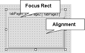
| Now that the dry, tedious topics have been covered, it's time to get back to the fun stuff. The goal of any control designer is to provide a proper view of how the control will appear during runtime. However, it is also necessary for the designer to provide a set of hints or visual clues that facilitate the design of the control. The designer itself provides these design-time hints or UI clues by overriding the OnPaintAdornments method. Figure 5.4 shows the various UI clues provided by the TabPage designer. Figure 5.4. The TabPage designer UI clues.
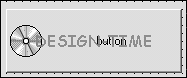
Each TabPage designer draws a focus rectangle and the control alignment grid only if the grid is turned on. These subtle UI clues provide important information to the developer when he is designing the control. The focus rectangle not only shows the active tab, but also defines the client area boundary for the current TabPage. In addition, the TabPage designer draws the control alignment grid to assist the developer in aligning child controls within the boundary of the TabPage. To see how simple it is to provide UI clues, note how the IconButtonDesigner class is extended to provide an annoying design-time adornment. The IconButton designer paints the term "DESIGN-TIME" across the top of the IconButton, as shown in Figure 5.5. Figure 5.5. Providing UI clues.
Implementing the OnPaintAdornments method is similar to implementing the OnPaint method of a control. The OnPaintAdornments is called after the OnPaint method of the control has been invoked. Also, the OnPaintAdornments method is invoked only during design-time because the designer is not present during runtime. This allows for the adornments to be painted on top of the control itself. Listing 5.1 shows the updated IconButtonDesigner class source. Listing 5.1 IconButtonDesigner 1: //////////////////////////////////////////////////////////////////////// 2: ///File :IconButtonDesigner.cs 3: ///Author :Richard L. Weeks 4: /// 5: /// Copyright (c) 2001 by Richard L. Weeks 6: /// This file is provided for instructional purposes only. 7: /// No warranties. 8: //////////////////////////////////////////////////////////////////////// 9: 10: using System; 11: using System.ComponentModel; 12: using System.ComponentModel.Design; 13: using System.Collections; 14: using System.Drawing; 15: using System.Windows.Forms; 16: using System.Windows.Forms.Design; 17: 18: 19: namespace SAMS.ToolKit.Design 20: { 21: /// <summary> 22: /// Simple Designer for IconButton 23: /// </summary> 24: public class IconButtonDesigner : System.Windows.Forms.Design.ControlDesigner { 25: 26: private enum VERBS { 27: Red, 28: Green, 29: Blue 30: } 31: 32: private DesignerVerb[] designerVerbs; 33: 34: public IconButtonDesigner() { 35: designerVerbs = new DesignerVerb[3]; 36: DesignerVerb[] verbs = new DesignerVerb[3]; 37: designerVerbs[(int)VERBS.Red] = new DesignerVerb( "Red", new The OnPaintAdornments method found on line 84 of Listing 5.1 simply creates an opaque brush and renders the text "DESIGN-TIME" across the top of the IconButtonControl. Obviously, this is not the best idea for a UI clue; however, it does illustrate the ease with which UI clues or adornments can be added to a control. |
 EventHandler( this.OnRedVerb ) ); 38: designerVerbs[(int)VERBS.Green] = new DesignerVerb( "Green", new
EAN: 2147483647
Pages: 74