29. Multi-Vari Studies Overview A Multi-Vari Study[51] is an overarching study that encompasses many other Lean Sigma tools. At the highest level a study comprises [51] The name "Multi-Vari" was given to this methodology by L. A. Seder in the paper titled, "Diagnosis with Diagrams," which appeared in Industrial Quality Control in January and March, 1950.
Data capture of Xs and the corresponding level of Ys at various times from the process (see "KPOVs and Data" in this chapter) Examination of the data using graphs to identify potential relationships between the Xs and the Ys Validation of the potential relationships using the appropriate statistical tools Statements of practical conclusion
Data for the Multi-Vari is captured in a passive way in that the process is allowed to run in its natural state rather than actively manipulating it as in a Designed Experiment (DOE). Logistics A Multi-Vari Study is a complex series of tools and thus planning is paramount. It is absolutely a Team activity and requires significant support from the Champion and Process Owner to ensure it proceeds to plan. A typical Multi-Vari Study can take up to four to six hours to plan and is executed over a period of one day to two months depending on availability of data and the pace of the process in question. Roadmap The overarching roadmap is as follows (however, each tool used within the roadmap can have its own series of sub-steps that are described separately): | | Step 1. | Develop a Data Collection Plan. A Multi-Vari Study is used to understand the relationship between the Xs and Y(s) in the equation Y = f(X1,X2,..., Xn). Data is captured as a series of snapshots in time for the value of all the Xs and the corresponding values of the Y(s) for some 3050 data points. Data is best captured in a directly analyzable form using a Data Sheet format as shown in Figure 7.29.1. To do this, develop a data collection plan as per "KPOVs and Data" in this chapter. The Xs should not be plucked out of thin air (a common Belt mistake); the Lean Sigma roadmap should have led the Team to this point with a reduced number of Xs from use of the SIPOC, VOC, KPOVs, Cause and Effect (C&E) Matrix, and the Failure Modes & Effects Analysis (FMEA).
Figure 7.29.1. An example of a Data Collection Sheet for Seal Defects.Shift | Operator | Cement Lot | Flame Temp | Line Speed | Seal Defects |
|---|
1 | 1 | 1 | 550 | 38 | 1 | 1 | 1 | 2 | 560 | 37 | 2 | 1 | 1 | 3 | 560 | 38 | 8 | 1 | 1 | 4 | 550 | 37 | 9 | 1 | 2 | 1 | 550 | 38 | 4 | 1 | 2 | 2 | 580 | 38 | 3 | 1 | 2 | 3 | 570 | 39 | 8 | 1 | 2 | 4 | 570 | 36 | 12 | 2 | 1 | 1 | 570 | 39 | 5 | 2 | 1 | 2 | 560 | 38 | 5 | 2 | 1 | 3 | 560 | 38 | 8 | 2 | 1 | 4 | 550 | 37 | 14 | 2 | 2 | 1 | 580 | 39 | 4 | 2 | 2 | 2 | 560 | 38 | 6 | 2 | 2 | 3 | 550 | 37 | 12 | 2 | 2 | 4 | 550 | 39 | 17 |
Observe the process over a short period of time as a "proof of concept" study for the data collection plan, measuring and recording values for the KPOVs (Ys), and simultaneously recording the values of the KPIVs (Xs). Have the Team carefully observe the process and take plenty of notes. Revise the data collection plan as required.
| Step 2. | Collect the data as per the Data Collection plan (see "KPOVs and Data" in this chapter). This is a Team activity. Data should be collected until the process has revealed a full range of variation.
| | | Step 3. | Analyze the data collected graphical to identify any possible relationships or patterns. This is typically a Belt activity, rather than tying up the whole Team's time. The Belt reports back to the Team with the full analysis completed. Graphical tools might include
Main Effects Plots Box Plots Multi-Vari Plot Time series Plots Scatter Plots Dot Plots Interaction Plots Histograms
The outputs of some of these for the example data shown in Figure 7.29.1 are shown in Figure 7.29.2.
Figure 7.29.2. A graphical analysis of a Seal Defect example. 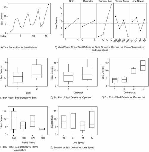
For each possible pattern or relationship identified, the Belt documents the finding similar to the Seal Defects example here:
Seal Defects average varies by Shift (Graphs B and C) Seal Defects average varies by Operator (Graphs B and D) Seal Defects average varies by Cement Lot (Graphs B and E) Seal Defects variation varies by Flame Temperature (Graph F) There is a cyclical pattern in Seal Defects versus Time (Graph A)
Note the word possible. Graphical evidence is not nearly enough to demonstrate conclusively that the preceding effects are real. Each pattern or relationship identified can be real, but each needs to be followed up with the appropriate statistical test.
Essentially the Belt is conducting an investigation of the data like a detective looking for clues, with the data and statistical test forming the evidence.
| | | Step 4. | For each and every one of the patterns and relationships identified in Step 3, a Hypothesis Test needs to be formulated in the form:
(Null hypothesis) Ho: Nothing is going on, there is no relationship, there is just background noise, any visible effects are just due to random chance (Alternate hypothesis) Ha: Something is going on, the effect is real, it is not background noise
For example, for the Seal Defects example, one of the Hypotheses might be
| | | Step 5. | At this point a statistical test is applied to the data to determine a "p-value" or probability value. The p-value represents the likelihood of seeing a pattern or effect this strong purely by random chance if in fact nothing were going on. If for example, the p-value is 0.07, then the chance of seeing a difference in Seal Defects this big if, in this case, Cement Lot really had no effect, is 7%. The standard cutoff value is 0.05. Below this value the conclusion is that the effect is unlikely enough to be considered real ("statistically significant" in Statspeak) and it is not a good idea to accept the Null Hypothesis. If it is above this value then the conclusion should be that an effect this size is completely possible by random chance and the Null hypothesis is probably right. The p-value gives a level of confidence in the claims being made.
The catchphrase frequently used is "If p is low then Ho must go," or in other words, if p is less than 0.05 the graph probably shows something real. Note the use of the words "probably,""could be," and "might be"the joy of statistics!
The correct test to use is determined almost completely by the type of X and Y data, whether they are Attribute or Continuous. Figure 7.29.3 shows a simple statistical tool-selector based on data type. For example, in the example the Y Seal Defects is Attribute data (a count) and the single X Cement Lot is also Attribute data (4 lots); thus, the appropriate statistical test is a Chi-Square Test. Running a Chi-Square Test on the data would yield a p-value, which would tell you whether the effect seen in the graphs is real (statistically significant).
Figure 7.29.3. Selecting the correct statistical tool based on data type. 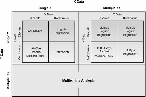
| Step 6. | Make practical conclusions. With the Team, review the analyses, determine the physical implication, and develop final conclusions. All conclusions should not be based on conjecture or intuition, should make sense from a practical standpoint, and must be supported by data.
| | | Step 7. | Report the results and recommendations. For clarity, it is best to show end results in graphical format supported by the statistical test. A full Multi-Vari Report would include
Process description Study objectives Input and output variables measured Sampling plan Process settings Graphical analysis results Statistical analysis results Practical conclusions Recommendations for further studies
|
|