Section 05. Box Plot
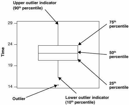
05. Box PlotOverviewThe Box Plot is a graphical representation of data, as shown in Figure 7.05.1. Figure 7.05.1. Composition of a Box Plot. The graph is composed of elements describing the distribution of the data.
Box Plots are dull when applied to a column of data in one lump. They become far more useful when the data is cut by an X. For example in Figure 7.05.2, the data is cut by the X Operator, and there are three boxes representing the Operators Bob, Jane, and Walt. Figure 7.05.2. A Box Plot applied to data cut by Operator.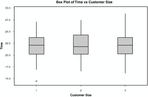 Interpreting the OutputBox Plots should not be used in isolation. Figure 7.05.2 seems to show a difference in the time each Operator takes to process an entity (the boxes aren't all aligned). The key word here is seems. A Box Plot can help identify if there might be differences between levels of an X, such as the Operator, but those differences might not be statistically significant. Any graphical tool such as this should be followed by the appropriate statistical tool to understand the likelihood of seeing the difference purely by random chance. In fact Box Plots are best used as part of a Multi-Vari Study where data is collected and analyzed systematically using multiple graphical and statistical tools. Factors, such as the shape of the data (normal or non-normal) and the number of data points, along with a host of others, play a role in understanding the data. |
EAN: 2147483647
Pages: 138
- ERP Systems Impact on Organizations
- The Second Wave ERP Market: An Australian Viewpoint
- The Effects of an Enterprise Resource Planning System (ERP) Implementation on Job Characteristics – A Study using the Hackman and Oldham Job Characteristics Model
- Data Mining for Business Process Reengineering
- Development of Interactive Web Sites to Enhance Police/Community Relations