Chapter 3. Creating Static Graphics Elements
 | CONTENTS |  |
In this chapter:
- Essential Building Blocks
- The <rect> Element
- A Simple Square
- The <line> Element
- The <circle> Element
- The <ellipse> Element
- Combining Ellipses
- The <polyline> Element
- The <polygon> Element
- The <path> Element
Essential Building Blocks
This chapter introduces the basic elements that SVG provides to allow you to fully define the parts of an SVG image. You do want to have full control over how your image looks, don't you? Then you need to understand how to control these basic SVG elements.
These basic graphic elements are not visually exciting they are, for want of a better term, just basic. However, you should understand and master them. Just as an artistic masterpiece, perhaps the Mona Lisa, is made up of hundreds and hundreds of basic brush strokes, sophisticated SVG images whether they are static or include animation or interaction are composed of several or dozens or even hundreds of SVG elements. If the image is deficient in some respect, you need to understand how to tweak it to produce just the effect you want.
The elements described in this chapter are essential building blocks of those exciting SVG images. The SVG elements you look at are the <rect> element, which represents a rectangle, and the <circle>, <ellipse>, <line>, <polyline>, <polygon>, and <path> elements.
Parts of this chapter may seem to you like a lesson in geometry. That isn't surprising because a computer screen is basically a grid of pixels. Or, if you prefer, the screen is like a sheet of graph paper with very small squares.
The simplest way to create SVG graphic shapes is to draw them in an SVG-enabled vector drawing package, such as Jasc WebDraw, Adobe Illustrator 9, or Corel Draw 10. Most vector drawing packages have preset primitives for rectangles, lines, and polygons, for example. However, if you use only vector drawing packages and don't understand the SVG underlying the image that is produced, you inevitably will be limited to some degree in the ways you can tweak the image or design an SVG image as a visual component for reuse.
In this chapter, I hand-craft much of the code to help you understand how the SVG elements work. In a production setting, you can choose which technique you prefer or combine the techniques to suit your knowledge and the characteristics of the image you are trying to create. However, read the following section to find out how to create your first SVG graphic using one of the available SVG-enabled vector drawing tools.
The <rect> Element
The SVG <rect> element, when rendered, causes a rectangle to be painted on the SVG canvas. When you drag out a rectangle using Jasc WebDraw or your favorite SVG-enabled vector drawing tool, you produce a simple SVG document that looks something like this:
Listing 3.1 (03WebDraw.svg)
<?xml version="1.0" standalone="no"?> <!DOCTYPE svg PUBLIC "-//W3C//DTD SVG 1.0//EN" "http://www.w3.org/TR/2001/PR-SVG-20010719/ DTD/svg10.dtd"> <svg width="500" height="500"> <rect x="192" y="93" width="142" height="78" rx="0" ry="0" style="stroke-miterlimit:4; stroke-linejoin:miter; stroke-width:3; stroke-opacity:1; stroke:rgb(0,204,255); fill-opacity:1;fill:rgb(204,204,204); opacity:1"/> </svg> <!-- Generated by Jasc WebDraw PR4(tm) on 04/03/01 10:20:08 -->
Take a closer look at the <rect> element produced by WebDraw, with the code reformatted to aid readability:
<rect x="192" y="93" width="142" height="78" rx="0" ry="0" style="stroke-miterlimit:4; stroke-linejoin:miter; stroke-width:3; stroke-opacity:1; stroke:rgb(0,204,255); fill-opacity:1; fill:rgb(204,204,204); opacity:1"/>
As you can see, WebDraw automatically creates several SVG attributes for even a simple rectangle.
The x and y attributes of the <rect> element describe the location of the upper-left corner of the rectangle. The x attribute has a value of 0 toward the left side of the screen and increases as you move toward the right side. The y coordinate has a value of zero at the top of the screen and increases as you move down. After you have also defined the values of the width and height attributes of the rectangle, you know the coordinates of all four corners of the rectangle relative to the <svg> element within which it is contained. If only one <svg> element is in the document, its upper-left corner is at (0,0).
In the rectangle I drew, the corners are square, as shown by
rx="0" ry="0"
which means that the radius of the corner is zero. To make the corners of a rectangle rounded, you simply give the rx or ry attributes positive integer values.
SVG allows you to simply create rounded corners for any rectangle. Those rounded corners need not be circular because SVG provides both an rx attribute to describe the x radius and an ry attribute to describe the y radius. Of course, when the values of the rx and ry attributes are equal, the corners are circular rather than elliptical.
The style attribute of the <rect> element has within it several Cascading Style Sheet, or CSS, properties.
Look first at the stroke property. It defines the color of the outline of the rectangle, which has a greenish blue stroke. The example shows one of three alternative syntaxes to describe the greenish blue color. The syntax used is stroke:rgb(0,204,255), although it could also have been expressed as stroke:#00CCFF. For certain colors, SVG provides named colors. So if you have a red stroke for a rectangle, you can express it in three ways: stroke:#FF0000, stroke:rgb(255,0,0), or stroke:red.
The stroke-width property defines the width of the stroke. The outline of a rectangle, and other SVG shapes, is assumed to have zero width. Therefore, when a stroke has a width of three (pixels), half is painted within the outline and half outside. When you are seeking precision placement, you need to be aware that thick strokes slightly increase the size of an SVG graphical element. Thus, the width onscreen of the rectangle is 145 pixels rather than the 142 stated in the width attribute (1.5 pixels overlap on one side and 1.5 overlap on the other, making a total increase of 3 pixels).
The stroke-opacity property has a value of 1, which means that it is fully opaque. The stroke-opacity property takes values from zero (totally transparent) to 1 (totally opaque). You may set any value you want between 0 and 1.
The stroke-linejoin property is defined as miter. The stroke-miterlimit attribute limits the width of the join of the sides to the top or bottom of the outline of the rectangle.
The fill property, like the stroke property described earlier in this chapter, can be expressed in two ways or, in the case of named colors, in three ways. The fill-opacity property of the rectangle has a value of one, meaning that it is fully opaque.
As with the stroke-opacity property, the fill-opacity property can take values from zero (fully transparent) to one (fully opaque).
The rx and ry attributes allow the corners of a rectangle to be rounded. Typically, the rx and ry attributes are equal, although there is no need for them to be. If, for example, the rx attribute is significantly greater than the ry attribute, as shown in the following listing, you can produce a lozenge shape, as you can see in Figure 03.01:
Figure 03.01. A rectangle that has rounded corners but unequal rx and ry attributes.
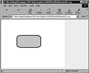
Listing 3.2 (RectRndCorners01.svg)
<?xml version="1.0" standalone="no"?> <!DOCTYPE svg PUBLIC "-//W3C//DTD SVG 1.0//EN" "http://www.w3.org/TR/2001/PR-SVG-20010719/ DTD/svg10.dtd"> <svg width="400" height="300"> <rect x="100" y="100" width="150" height="75" rx="30" ry="15" style="stroke:#000099;fill:#CCCCCC;stroke-width:4;"/> </svg>
A Simple Square
Now create a simple square in SVG, which you use in a number of examples later on. A square is simply a rectangle with its width equal to its height, so you can use the <rect> element here.
What I want you to create is a simple static logo that at this stage uses only SVG <rect> elements and the <svg> element you learned about in Chapter 2, "SVG Document Overview."
First, create in Listing 3.3 an image with a single rectangle.
Listing 3.3 (SingleRect.svg)
<?xml version="1.0" standalone="no"?> <!DOCTYPE svg PUBLIC "-//W3C//DTD SVG 1.0//EN" "http://www.w3.org/TR/2001/PR-SVG-20010719/ DTD/svg10.dtd"> <svg width="400" height="500"> <rect x="10" y="20" width="100" height="100" style="fill:none; stroke:#000099; stroke-width:4;"/> </svg>
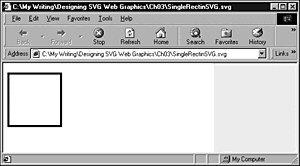
Because you later use the rectangle as part of a simple logo and you may want to reposition it on the page, enclose the <rect> element within a nested <svg> element. By repositioning the <svg> element, which you do by changing the values of its x and y attributes, you can reposition the whole logo and preserve the relative positions of its component parts.
Listing 3.4 (SingleRectinSVG.svg)
<?xml version="1.0" standalone="no"?> <!DOCTYPE svg PUBLIC "-//W3C//DTD SVG 1.0//EN" "http://www.w3.org/TR/2001/PR-SVG-20010719/ DTD/svg10.dtd"> <svg width="400" height="500"> <svg x="0" y="0" width="300" height="400"> <rect x="10" y="20" width="100" height="100" style="fill:none; stroke:#000099; stroke-width:4;"/> </svg> </svg>
Both Listing 3.3 and Listing 3.4 produce the same visual appearance onscreen and are represented in Figure 03.02.
Figure 03.02. A simple rectangle with transparent fill, contained in a nested <svg> element, to allow later repositioning.
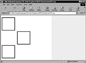
As part of the simple logo I have in mind to add another two <rect> elements, which are also nested within the <svg> element. When you add the two further <rect> elements one is directly below the first and the other is offset a little to the right.
Listing 3.5 (ThreeRectsinSVG.svg)
<?xml version="1.0" standalone="no"?> <!DOCTYPE svg PUBLIC "-//W3C//DTD SVG 1.0//EN" "http://www.w3.org/TR/2001/PR-SVG-20010719/ DTD/svg10.dtd"> <svg width="400" height="500"> <svg x="0" y="0" width="300" height="400"> <rect x="10" y="20" width="100" height="100" style="fill:none; stroke:#000099; stroke-width:4;"/> <rect x="130" y="130" width="100" height="100" style="fill:none; stroke:#000099; stroke-width:4;"/> <rect x="10" y="240" width="100" height="100" style="fill:none; stroke:#000099; stroke-width:4;"/> </svg> </svg>
Visually, this code is pretty simple. You still don't know yet about how to add text or other necessary parts of the logo. Onscreen, the code is shown in Figure 03.03.
Figure 03.03. Three identical rectangles with transparent fill, which you use in an animation in Chapter 8, "Animation: SVG and SMIL Animation."
Now you can go on to learn a little about the SVG <line> element so that you can add a couple of lines to the logo to provide a little more visual interest.
The <line> Element
The SVG <line> element defines a straight line. A line has starting coordinates and ending coordinates. In addition, a line can have stroke, stroke-width, and stroke-opacity properties.
Thus, you can completely define a line in SVG like this, which defines a line running diagonally from the upper-left corner of an SVG image toward the lower-right corner. I have also included a second line whose stroke-opacity property is 0.5 as shown in Figure 03.04. (The line is semitransparent, so you can see how that setting affects the rendering of the line.)
Figure 03.04. Two lines created using the SVG <line> element.
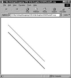
Listing 3.6 (Line01.svg)
<?xml version="1.0" standalone="no"?> <!DOCTYPE svg PUBLIC "-//W3C//DTD SVG 1.0//EN" "http://www.w3.org/TR/2001/PR-SVG-20010719/ DTD/svg10.dtd"> <svg> <line x1="50" y1="50" x2="300" y2="300" style="stroke:#FF0000; stroke-width:4; stroke-opacity:0.3;"/> <line x1="50" y1="100" x2="300" y2="350" style="stroke:#FF0000; stroke-width:4; stroke-opacity:1;"/> </svg>
That concept is basic, so now go on and create part of a logo that you use later; you simply use two <line> elements and a <rect> element. See the appearance shown in Figure 03.05.
Figure 03.05. A right-pointing arrow created using two <line> elements and a <rect> element with a white outline.
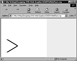
Listing 3.7 (WhiteRect.svg)
<?xml version="1.0" standalone="no"?> <!DOCTYPE svg PUBLIC "-//W3C//DTD SVG 1.0//EN" "http://www.w3.org/TR/2001/PR-SVG-20010719/ DTD/svg10.dtd"> <svg width="300" height="300"> <line x1="35" y1="135" x2="110" y2="180" style="stroke-width:5; stroke:#000099"/> <line x1="35" y1="225" x2="110" y2="180" style="stroke-width:5; stroke:#000099"/> <rect x="18" y="130" width="100" height="100" style="fill:none; stroke:white; stroke-width:16;"/> </svg>
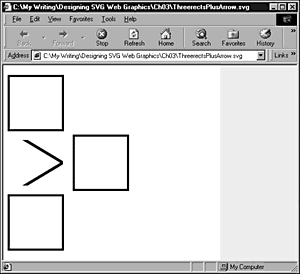
What this code does is to create a right-pointing arrowhead, whose edge shape is defined by the stroke of the <rect> element. Notice that the <rect> element occurs later in the document, so the white outline is painted on top of the two lines. If you put it together with the foundation of the three-rectangles logo, you have this code:
Listing 3.8 (ThreerectsPlusArrow.svg)
<?xml version="1.0" standalone="no"?> <!DOCTYPE svg PUBLIC "-//W3C//DTD SVG 1.0//EN" "http://www.w3.org/TR/2001/PR-SVG-20010719/ DTD/svg10.dtd"> <svg width="400" height="500"> <svg x="0" y="0" width="300" height="400"> <rect x="10" y="20" width="100" height="100" style="fill:none; stroke:#000099; stroke-width:4;"/> <rect x="130" y="130" width="100" height="100" style="fill:none; stroke:#000099; stroke-width:4;"/> <rect x="10" y="240" width="100" height="100" style="fill:none; stroke:#000099; stroke-width:4;"/> <line x1="35" y1="135" x2="110" y2="180" style="stroke-width:5; stroke:#000099"/> <line x1="35" y1="225" x2="110" y2="180" style="stroke-width:5; stroke:#000099"/> <rect x="18" y="130" width="100" height="100" style="fill:none; stroke:white; stroke-width:16;"/> </svg> </svg>
The code looks like Figure 03.06 onscreen. You add text and animation to the logo in later chapters.
Figure 03.06. A simple skeleton of a logo created using <rect> and <line> elements, which are developed further in later chapters.
Now go on to create a scale using several SVG <line> elements. These can be useful visual components and can be reused in graphics or, typically, as in Flash movies, be animated. This chapter looks at creating a static scale.
I create the scale as a series of <line> elements nested within a grouping <g> element, which is itself nested within a <defs> element. If you read through the following code, you should be able to follow the construction of the scale. The first <line> element is the long horizontal line; and then follows the series of the longer of the two sizes of vertical scale marks; and then come the shorter, vertical scale marks. Following the <defs> element is a <rect> element to create the background color for the scale and a <use> element that uses an xlink:href attribute to reference the group <g> with an ID of MyScale, which you created in the <defs> element.
Listing 3.9 (Scale01.svg)
<?xml version="1.0" standalone="no"?> <!DOCTYPE svg PUBLIC "-//W3C//DTD SVG 1.0//EN" "http://www.w3.org/TR/2001/PR-SVG-20010719/ DTD/svg10.dtd"> <svg width="800" height="100"> <defs> <g id="MyScale"> <line x1="50" y1="20" x2="750" y2="20" style="stroke:white; fill:white;"/> <line x1="50" y1="20" x2="50" y2="30" style="stroke:white; fill:white;"/> <line x1="150" y1="20" x2="150" y2="30" style="stroke:white; fill:white;"/> <line x1="250" y1="20" x2="250" y2="30" style="stroke:white; fill:white;"/> <line x1="350" y1="20" x2="350" y2="30" style="stroke:white; fill:white;"/> <line x1="450" y1="20" x2="450" y2="30" style="stroke:white; fill:white;"/> <line x1="550" y1="20" x2="550" y2="30" style="stroke:white; fill:white;"/> <line x1="650" y1="20" x2="650" y2="30" style="stroke:white; fill:white;"/> <line x1="750" y1="20" x2="750" y2="30" style="stroke:white; fill:white;"/> <line x1="300" y1="20" x2="300" y2="25" style="stroke:white; fill:white;"/> <line x1="400" y1="20" x2="400" y2="25" style="stroke:white; fill:white;"/> <line x1="500" y1="20" x2="500" y2="25" style="stroke:white; fill:white;"/> <line x1="600" y1="20" x2="600" y2="25" style="stroke:white; fill:white;"/> <line x1="700" y1="20" x2="700" y2="25" style="stroke:white; fill:white;"/> </g> </defs> <rect x="0" y="0" width="800" height="100" style="fill:#CCCC99; stroke:none;"/> <use y1="20" y2="20" xlink:href="#MyScale" /> </svg>
You may be asking why I went to the additional trouble of placing the <g> element in the definitions. Suppose that your client suggests to you that he wants the scale the other way up. Of course, you could make all the necessary individual changes to the x1, x2, y1, and y2 attributes, but, with the way I created this example, you don't need to. Simply alter one line of code, the <use> element, to read like this:
<use y1="20" y2="20" xlink:href="#MyScale" transform="rotate(180 400 50)"/>
You can then rotate your scale through 180 degrees around the coordinates (400,50), which turns the scale line upside down, as shown in Figure 03.07.
Figure 03.07. The scale rotated through 180 degrees by means of a transform on the <use> element.
If you want to preserve the same vertical position, you can rotate the scale around (400,20) by using this code:
<use y1="20" y2="20" xlink:href="#MyScale" transform="rotate(180 400 20)"/>
It's done!
You can also create Web page furniture using <rect> and <line> elements, as shown in this example:
Listing 3.10 (RectWithLines01.svg)
<?xml version="1.0" standalone="no"?> <!DOCTYPE svg PUBLIC "-//W3C//DTD SVG 1.0//EN" "http://www.w3.org/TR/2001/PR-SVG-20010719/ DTD/svg10.dtd"> <svg xmlns:xlink="http://www.w3.org/1999/xlink"> <defs> <line id="MyLine" x1="0" x2="300" y1="0" y2="0" style="fill:#000099; stroke:#000099; stroke-width:1;"/> </defs> <g> <rect x="0" y="0" width="300" height="68" style="fill:#DDDDFF; stroke:none"/> <line x1="0" x2="300" y1="2" y2="2" xlink:href="#MyLine"/> <line x1="0" x2="300" y1="4" y2="4" xlink:href="#MyLine" /> <line x1="0" x2="300" y1="6" y2="6" xlink:href="#MyLine"/> <use transform="translate(0,8)" xlink:href="#MyLine"/> <use transform="translate(0,12)" xlink:href="#MyLine"/> </g> </svg>
Because I planned to use a <line> element possibly multiple times, I created a definition of a <line> element with an ID attribute of value MyLine so that I could reuse that same <line> element multiple times in the image.
Notice that I also used three <line> elements at the top of the image, in a way that gives (at least in the Adobe SVG Viewer) very fine lines, which are useful in creating patterns for Web page furniture. These fine lines can be used creatively with lines of differing stroke widths. Figure 03.08 shows the code in Listing 3.10. Listing 3.11 adapts that code.
Figure 03.08. A rectangle with a pattern created using repeated lines.
Listing 3.11 (RectWithLines02.svg)
<?xml version="1.0" standalone="no"?> <!DOCTYPE svg PUBLIC "-//W3C//DTD SVG 1.0//EN" "http://www.w3.org/TR/2001/PR-SVG-20010719/ DTD/svg10.dtd"> <svg xmlns:xlink="http://www.w3.org/1999/xlink"> <defs> <line id="MyLine" x1="0" x2="300" y1="0" y2="0" style="fill:#000099; stroke:#000099; stroke-width:0.05;"/> </defs> <g> <rect x="0" y="0" width="300" height="68" style="fill:#DDDDFF; stroke:none"/> <line x1="0" x2="300" y1="2" y2="2" xlink:href="#MyLine"/> <line x1="0" x2="300" y1="4" y2="4" xlink:href="#MyLine" style="fill:red;"/> <line x1="0" x2="300" y1="6" y2="6" xlink:href="#MyLine"/> <use transform="translate(0,8)" xlink:href="#MyLine"/> <use transform="translate(0,12)" xlink:href="#MyLine"/> </g> </svg>
You can create similarly fine lines within the lines created by the <use> element if the line is defined as having a stroke-width of 0.05 in the original definition (within a <line> element that is nested in a <defs> element), as shown in the preceding code. Note that even when using the <use> element, you can specify a modified style property.
So far, you have been looking at static SVG shapes, which involve only straight lines. Let's move on and begin to look at the graphical shapes provided by SVG that represent curved shapes.
The <circle> Element
A circle, at least in geometry, is completely described by its radius and the coordinates of its center. In SVG too, those are the most important attributes of a <circle> element. In addition, of course, it has a style attribute with various CSS properties you can use.
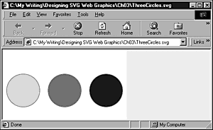
Listing 3.12 (ThreeCircles.svg)
<?xml version="1.0" standalone="no"?> <!DOCTYPE svg PUBLIC "-//W3C//DTD SVG 1.0//EN" "http://www.w3.org/TR/2001/PR-SVG-20010719/ DTD/svg10.dtd"> <svg width="300" height="200"> <circle cx="50" cy="100" r="40" style="fill:#000099; stroke:#FF0099; fill-opacity:0.1;"/> <circle cx="150" cy="100" r="40" style="fill:#000099; stroke:#FF0099; fill-opacity:0.5;"/> <circle cx="250" cy="100" r="40" style="fill:#000099; stroke:#FF0099; fill-opacity:1;"/> </svg>
In the preceding code, I have created three circles, which differ only in their cx coordinates and the value of the fill-opacity property. The position of each circle is determined by the cx and cy attributes, which define, respectively, the x and y coordinates of the center of the circle.
Each circle has the same fill color, a deep blue, but the value of the fill-opacity property varies from 0.1 in the left circle to 1 (fully opaque) in the right one. The opacity must be in the range 0 (fully transparent) to 1 (fully opaque). The effect of varying the opacity of the fill is shown in Figure 03.09.
Figure 03.09. Three circles with varying opacities of fill: 0.1, 0.5, and 1.
The <circle> element has many similarities to the <ellipse> element, which is discussed next.
The <ellipse> Element
An ellipse, geometrically speaking, is simply a circle where the radius in the x direction and the radius in the y direction differ. If the radii are the same, the curved graphic element is a circle. In SVG, you can represent a circle by using either a <circle> element or an <ellipse> element with the x and y radii being equal.
A simple ellipse shape would have SVG source code like this:
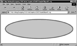
Listing 3.13 (SimpleEllipse01.svg)
<?xml version="1.0" standalone="no"?> <!DOCTYPE svg PUBLIC "-//W3C//DTD SVG 1.0//EN" "http://www.w3.org/TR/2001/PR-SVG-20010719/ DTD/svg10.dtd"> <svg width="250" height="150"> <ellipse cx="80" cy="70" rx="35" ry="10" style="stroke:red; fill:#CCCCCC"/> </svg>
The cx and cy attributes define the position of the center of the ellipse. However, an ellipse has two radii, not one, as the <circle> element had. The rx attribute defines the radius in the horizontal direction, and the ry attribute defines the radius in the vertical direction.
Onscreen, it is displayed as a small ellipse, as shown in Figure 03.10. Note that the edges of the ellipse, which have a red stroke against a white background, do show significant jaggies at parts of the circumference.
Figure 03.10. An <ellipse> element showing jaggies.
However, the jaggies behave quite differently from jaggies on a bitmap graphic, as you can see when you zoom in close on the ellipse, as shown in Figure 03.11.
Figure 03.11. The ellipse shown in Figure 03.10 is zoomed. Note that the jaggies are less obvious than in the original image.
Combining Ellipses
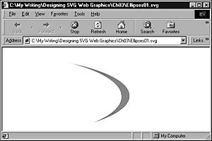
You likely know that by combining two ellipses that differ only slightly in size and shape, you can obtain a variety of interesting and attractive curved shapes. For example, with the following code:
Listing 3.14 (Ellipses02.svg)
<?xml version="1.0" standalone="no"?> <!DOCTYPE svg PUBLIC "-//W3C//DTD SVG 1.0//EN" "http://www.w3.org/TR/2001/PR-SVG-20010719/ DTD/svg10.dtd"> <svg> <ellipse cx="80" cy="170" rx="350" ry="100" style="stroke:none; fill:red"/> <ellipse cx="50" cy="172" rx="360" ry="110" style="stroke:none; fill:white"/> </svg>
you can produce the curve shown in Figure 03.12, which hints at dynamism and other positive attributes. You probably have seen many online logos created by combining ellipses in similar ways.
Figure 03.12. The curved shape produced by Listing 3.14 is zoomed.
The figure shows the curve zoomed in, but you can produce a similar appearance, as shown in the following code:
Similarly, by adjusting relative x and y axis radii, by means of changing the values of the rx and ry attributes, you can create pseudo-3D ellipses using simple vector shapes, as shown in the following code and seen in Figure 03.13:
Figure 03.13. A pseudo-3D shape created using two <ellipse> elements.
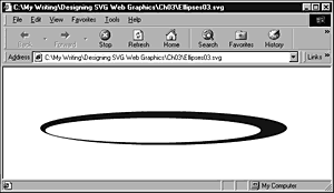
Listing 3.15 (Ellipses03.svg)
<?xml version="1.0" standalone="no"?> <!DOCTYPE svg PUBLIC "-//W3C//DTD SVG 1.0//EN" "http://www.w3.org/TR/2001/PR-SVG-20010719/ DTD/svg10.dtd"> <svg> <g> <ellipse cx="240" cy="170" rx="220" ry="30" style="stroke:none; fill:#000099"/> <ellipse cx="221" cy="174" rx="192" ry="22" style="stroke:none; fill:white"/> </g> </svg>
In later chapters, you use these types of ellipses shapes to create simple static or animated logos.
The <polyline> Element
A <polyline> element can create any shape that consists of only straight lines drawn sequentially. The following simple example draws three sides of the rectangle you created in an earlier example. If you omit any mention of the fill property, a black and fully opaque fill is inserted. In this example (illustrated in Figure 03.14), I have created an almost transparent fill of the same color as the stroke.
Figure 03.14. A <polyline> element that creates three sides of a square and has a fill that is 90 percent transparent.
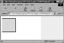
Listing 3.16 (Polyline01.svg)
<?xml version="1.0" standalone="no"?> <!DOCTYPE svg PUBLIC "-//W3C//DTD SVG 1.0//EN" "http://www.w3.org/TR/2001/PR-SVG-20010719/ DTD/svg10.dtd"> <svg width="300" height="200"> <polyline style="stroke:#000099; stroke-width:4; fill:#000099; fill-opacity:0.1" points="10,20 110,20 110,120 10,120"/> </svg>
The <polygon> Element
The <polygon> element is used for a shape with multiple (at least three) straight sides. Figure 03.15 and the following example show a hexagon with a red stroke and a gray fill.
Figure 03.15. A hexagon created using the <polygon> element.
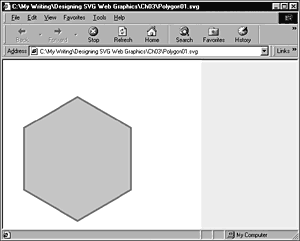
Listing 3.17 (Polygon01.svg)
<?xml version="1.0" standalone="no"?> <!DOCTYPE svg PUBLIC "-//W3C//DTD SVG 1.0//EN" "http://www.w3.org/TR/2001/PR-SVG-20010719/ DTD/svg10.dtd"> <svg width="400" height="500" > <polygon style="fill:#CCC; stroke:red; stroke-width:3" points="150,75 258,137.5 258,262.5 150,325 42,262.5 42,137.5" /> </svg>
If you were so inclined, you could create a rectangle or square using the <polygon> element, but the <rect> element is usually more convenient.
The <path> Element
The <path> element is probably the most important SVG shape, at least in the sense that it is the most versatile. Any 2-dimensional shape that you can draw, an SVG <path> element can describe. Except for the simplest shapes, however, you would be well advised to let a vector drawing package automatically create the code for you.
The following is an example of a <path> element:
<path d="M10,20 L110,20 110,120 10,120" style="fill:#000099; fill-opacity:0.1; stroke:#000099; stroke-width:4"/>
The d attribute of the <path> element describes several types of drawing action. The M10,20 means to move to coordinates (10,20) . The L110,20 means to draw a line from the preceding point to coordinates (110,20). The 110,120 means the same as L110, 120 would. When the action (in this case, drawing a line) is the same as the preceding action, the letter can be omitted. The final part of the value of the d attribute, 10, 120, means to draw a line to (10,120).
The d attribute can be complex, as summarized in Table 3.1.
As you can probably guess from the abbreviated definitions, you may be getting into some seriously serious geometry here. In the sections that follow, I introduce you to some of the syntax hinted at by the table, although I don't attempt to cover everything relating to the <path> element.
| Command | Name | Description |
|---|---|---|
| M (absolute) | moveto | Moves to described point without drawing |
| m (relative) | ||
| L (absolute) | lineto | Draws a line from the current point to the point |
| l (relative) | defined | |
| H (absolute) | horizontal | Draws a horizontal line from the current point to the |
| h (relative) | lineto | point defined |
| V (absolute) | vertical | Draws a vertical line from the current point to the |
| v (relative) | lineto | point defined |
| C (absolute) | curveto | Draws a cubic Bezier curve from the current point |
| c (relative) | ||
| S (absolute) | shorthand/ | Draws a cubic Bezier curve from the current point |
| s (relative) | smooth curveto | |
| Q (absolute) | quadratic Bezier | Draws a quadratic Bezier curve from the current point |
| q (relative) | curveto | |
| T (absolute) | shorthand/ | Draws a quadratic Bezier curve from the current |
| t (relative) | smooth quadratic | point |
| Bezier curveto | ||
| A (absolute) | elliptical arc | Draws an arc from the current point |
| a (relative) | ||
| Z or | closepath | Closes the path by drawing a line to the first point |
| z | of the path |
Creating open shapes using straight lines
You can create lines and shapes created by one or multiple lines by using the <path> element. For example, the shape you created earlier using the <polyline> element can also be created using the <path> element, as shown in the following listing. The visual appearance is identical to the one shown in Figure 03.14.
Listing 3.18 (Path01.svg)
<?xml version="1.0" standalone="no"?> <!DOCTYPE svg PUBLIC "-//W3C//DTD SVG 1.0//EN" "http://www.w3.org/TR/2001/PR-SVG-20010719/ DTD/svg10.dtd"> <svg width="300" height="200"> <path d="M10,20 L110,20 110,120 10,120" style="fill:#000099; fill-opacity:0.1; stroke:#000099; stroke-width:4"/> </svg>
You can see that the <path> element uses a much more cryptic syntax than, for example, the <line> element. In a moment, you examine that syntax in more detail. The reason for the cryptic syntax is that the <path> element can be used to create immensely complex shapes. Because each drawing action to create these types of shapes has to be incorporated in the path data, the path data attribute can become very long. By using a cryptic, abbreviated syntax, the size of the SVG file containing such shapes is minimized, and download times are therefore kept from being unneces-sarily long. A black, fully opaque fill is created for a <path> element unless a fill is specified. To create an outline without any fill, you must specify the fill property to have a value of none.
Look more closely at the syntax of the d attribute of the <path> element. The d attribute represents the path data. It may help you to visualise the values in the d attribute as a series of instructions for drawing on a sheet of graph paper. M10, 20 indicates a move to (10,20) with the pen raised from the paper so that that no visual representation of that movement occurs. L110, 20 means to draw a line from the current point (10,20) to the point defined after the L (110 along and 20 down, or (110,20). The next part of the path data is 110, 120. The absence of a leading letter doesn't mean that I have forgotten how to write L110, 120; the SVG specification assumes, however, if the preceding command was to draw a straight line, that you keep on drawing straight lines until another type of instruction is given. Similarly, the final part of the path data, 10, 120, means to draw a straight line to (10,120). The values of the stroke, stroke-width, and stroke-opacity properties (defaults to 1, fully opaque) define the visual appearance along the lines that are drawn.
Each part of the path data in the preceding example is described as a series of points with the absolute x and y coordinates. The <path> element has an alternative syntax that uses relative coordinates and for which the lowercase equivalent letter is used. For example, to draw a straight line using relative coordinates rather than absolute ones, you use the lowercase of L as the initial letter. The following example produces the same visual appearance as the preceding example, but uses relative movements to express the drawing of the line.
Listing 3.19 (Path02.svg)
<?xml version="1.0" standalone="no"?> <!DOCTYPE svg PUBLIC "-//W3C//DTD SVG 1.0//EN" "http://www.w3.org/TR/2001/PR-SVG-20010719/ DTD/svg10.dtd"> <svg width="300" height="200"> <path d="M10,20 l100,0 0,100 -100,0" style="fill:#000099; fill-opacity:0.1; stroke:#000099; stroke-width:4"/> </svg>
The preceding path data indicates, "Move to (10,20) absolute, draw a straight line to a point 100 pixels to the right, then draw a straight line to a point 100 pixels down, and, finally, draw a straight line to a point 100 pixels to the left."
Creating closed shapes using straight lines
Just as you can create open shapes using straight lines, so can you create closed shapes. The following code describes the creation of a triangle that has a red stroke and a gray fill. The <rect> element simply provides a border for the SVG image, as you can see in Figure 03.16.
Figure 03.16. A triangle created using the <path> element.
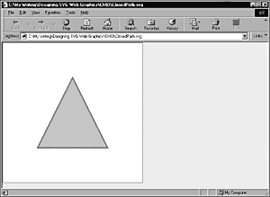
Listing 3.20 (ClosedPath.svg)
<?xml version="1.0" standalone="no"?> <!DOCTYPE svg PUBLIC "-//W3C//DTD SVG 1.0//EN" "http://www.w3.org/TR/2001/PR-SVG-20010719/ DTD/svg10.dtd"> <svg width="400" height="400" viewBox="0 0 400 400"> <desc>A simple path that draws a triangle</desc> <rect x="1" y="1" width="398" height="398" style="fill:none; stroke:red"/> <path d="M 200 100 L 300 300 L 100 300 z" style="fill:#CCCCCC; stroke:red; stroke-width:3"/> </svg>
Creating arcs
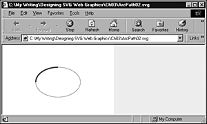
Take a look now at creating an elliptical arc. In the following example, I was trying to draw an arc from the extreme left side of an ellipse to its highest point.
Listing 3.21 (ArcPath02.svg)
<?xml version="1.0" standalone="no"?> <!DOCTYPE svg PUBLIC "-//W3C//DTD SVG 1.0//EN" "http://www.w3.org/TR/2001/PR-SVG-20010719/ DTD/svg10.dtd"> <svg width="300" height="200"> <ellipse cx="150" cy="100" rx="60" ry="40" style="fill:none; stroke:#999999; stroke-width:1;"/> <path style="fill:none; stroke:#990000; stroke-width:3;" d="M90,100 A60,40 0 0,1 150,60 " /> </svg>
Consider the content of the d attribute step by step. The M90, 100 is a move command similar to those you have read about earlier in this chapter. The point you move to is on the outline of the <ellipse> element. The A60, 40 means to draw an arc with x radius of 60 and y radius of 40. The final part of the syntax, 150, 60, defines where the final point of the arc is located at a point with coordinates (150,60), which is the highest point on the arc.
Those are the easy parts, but what does 0 0, 1 mean? The first 0 indicates any rotation, the x-axis-rotation, from the current coordinate system. Because I wanted to draw the arc along the outline of the ellipse, I didn't want to rotate anything. The 0, 1 refers, respectively, to the large-arc-flag and sweep-flag . If you have x-axis-rotation set at zero, you can produce the intended arc shape, as you can see in Figure 03.17.
Figure 03.17. An arc drawn along part of the circumference of an ellipse.
Creating a quadratic Bezier curve
My purpose here is not to describe the mathematics of quadratic Bezier curves. I want to show you a simple example and discuss the syntax within the data path d attribute. In the following example, I show you two quadratic Bezier curves.
Listing 3.22 (QuadraticBezier02.svg)
<?xml version="1.0" standalone="no"?> <!DOCTYPE svg PUBLIC "-//W3C//DTD SVG 1.0//EN" "http://www.w3.org/TR/2001/PR-SVG-20010719/ DTD/svg10.dtd"> <svg> <path d="M50,100 Q200,0 300,300" style="fill:none; stroke:red; stroke-width:5" /> <circle cx="300" cy="300" r="5" style="fill:red; stroke:red;"/> <path d="M50,100 Q200,0 200,200 T500,200" style="fill:none; stroke:blue; stroke-width:2" /> <circle cx="200" cy="200" r="5" style="fill:blue; stroke:blue;"/> </svg>
The starting point of the thicker curve is defined by the command M50, 100, so you know that the curve starts at (50,100). The syntax Q200, 0 defines the location of a control point, which influences the shape of the curve. The data 300, 300 defines where the curve finishes, as you can see by the presence of the small circle at the end of the thicker (red) curved line.
In the second, thinner (blue) curve, you find, as before, that the first part of the path data is M50, 100, which is a move command defining the starting point of the curve. The final part of the path data, T500, 200, defines the location of the other end of the curve. The Q200, 0 again defines the control point. The data 200, 200 defines the "end," if you like, of the first part of the curve (as shown by the small circle on the thinner line). This curve is shown in Figure 03.18.
Figure 03.18. A quadratic Bezier curve.
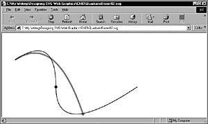
Mastery of the control of Bezier curves takes time. If you have experience in controlling the shape of Bezier curves in a vector drawing package, making progress with this process is likely to be easier.
Creating cubic Bezier curves
A cubic Bezier curve is similar to a quadratic Bezier, but has control points at both ends of the curve.
Listing 3.23 (CubicBezier01.svg)
<?xml version="1.0" standalone="no"?> <!DOCTYPE svg PUBLIC "-//W3C//DTD SVG 1.0//EN" "http://www.w3.org/TR/2001/PR-SVG-20010719/ DTD/svg10.dtd"> <svg> <path d="M50,100 C200,0 400,100 300,300" style="fill:none; stroke:red; stroke-width:5" /> <circle cx="300" cy="300" r="5" style="fill:red; stroke:red;"/> </svg>
Look at the content of the path data d attribute, which produces the appearance shown in Figure 03.19. The first part of the data defines the starting point of the curve at (50,100). The two pairs of data in C200, 0 400, 0 define the coordinates for the control points for the start of the curve, at (50,100), and the end of the curve, at (300,300), respectively. As I have done previously, I have included a small circle in the figure so that you can verify the end point of the curve.
Figure 03.19. A cubic Bezier curve.
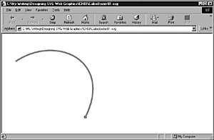
Notice that, as before, the fill property is set to a value of none. If the fill property is omitted, the curve has a solid, opaque black fill.
The examples of the quadratic and cubic Bezier curves show open curves. If you want to close any of the curves, you can add a z closepath command to the end of the values contained in the path data d attribute of the <path> element.
Having looked at the graphics shapes of SVG, you examine, in Chapter 4, "Using Text in SVG," the use of text in SVG .
| CONTENTS | |
EAN: 2147483647
Pages: 26