Flylib.com

Books Software


The Option Button Control

 <  Day Day Up  >  

The Option Button Control

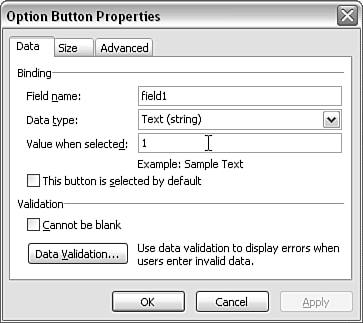
The option button control allows you to insert a set of one or more radio buttons that provide a mutually exclusive choice. In other words, you can choose one choice (not several, as you could from a set of check box controls). When you drag an option button control from the Controls task pane, you will be asked how many option controls you want to form the set. Choose the number appropriate to your situation.

For example, if you want to collect gender information, you would, of course, want two options. When you select two option buttons, they will be placed in the form area with a default name of field1 or the name of a chosen field in the data source. To specify the labels for each option, simply edit the labels for the option button on the form area.

If you want to change the properties of an option button control, you must right-click the option button itself, not its label. It's possible to change the data source field to which an option button control binds, but be careful to ensure that changes to each option button in the set are the same ” otherwise data inconsistencies are likely to arise.

The default value for the first of a set of option button controls is the number 1 (with a text data type). That may or may not be what you want. You can change the value in the Value When Selected text box in the Option Button Properties window (see Figure 4.26). If you want a value other than text, you can change the data type, if it is not already defined in a schema, by using the Data Type drop-down menu.

Figure 4.26. Changing the value of an option button control.

graphics/04fig26.gif

 <  Day Day Up  >  
 <  Day Day Up  >  

The Section Control

The section control can be a convenient way to group a number of form controls. For example, you might want all of the form controls in the section to be hidden initially and then made visible at the user 's command. In that case, the section control is equivalent to the optional section control, which is described in the next section.

Another option is to create a section control that's visible initially but that can be deleted by the user. You can set options to do this in the Section Properties window (see Figure 4.27). I consider this approach potentially problematic . If a user deletes a section in error, he might not realize that he can use the Undo option on the Edit menu to restore the deleted section, at least until he carries out some other action in filling in the form.

Figure 4.27. Setting a section control to be deleted at user option.

graphics/04fig27.gif

When users can delete a section control and the focus is on the expendable section, they see a blue box with a white down arrow at the top-left of the section. Clicking on the arrow brings up a menu that includes the option to delete the section (see Figure 4.28).

Figure 4.28. The option to delete a section control.

graphics/04fig28.gif

A section control can be used to apply the effects of conditional formatting to all form controls in the section. Conditional formatting is described in Chapter 6.

To learn more about conditional formatting, see "Conditional Formatting," p. 117 (Chapter 6).


 <  Day Day Up  >  
 <  Day Day Up  >  

The Optional Section Control

You're likely familiar with situations in which you either ignore or scribble "Not Applicable" across a form section that isn't relevant to you. On a paper form, there is no option to hide a section that's only applicable to some users. If a section collects essential data for some users, it must be visible on paper to all users. In InfoPath forms, the optional section control means that wasted space is greatly reduced. An optional section is initially displayed only as a placeholder; it is displayed in full only if it is relevant to the user .

In the Controls task pane, the optional section control is offered as a choice separate from the section control, which was described in the previous section. In fact, the optional section control is simply a section control with preselected options. The section is not displayed in the form by default, and the user can choose to insert the section.

The Show Instructional Text text box (see Figure 4.29) in the Section Properties window is important because the text you provide in it tells users whether they should insert the optional section. Particularly when using InfoPath with new users, it makes sense to also add a short explanatory paragraph to help familiarize them with the purpose of the optional section.

Figure 4.29. Specifying instructional text for an optional section control.

graphics/04fig29.gif

 <  Day Day Up  >