Web Par ts
A really cool feature of ASP.NET 2.0 that allows customizing Web applications for every user is Web Parts. With Web Parts portal-style Web applications can be created easily. http://www.msn.com (see Figure 19-10) is an example of a portal-style application that offers news, shopping information, stocks, entertainment, and so on. With a personalized Web portal the user can configure what Web parts should be available.
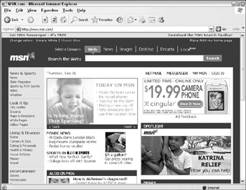
Figure 19-10
The Web Parts framework is made up of zones and parts. The parts that can be inside a zone depend on the type of the zone; for example, a LayoutEditorPart can be a part inside the EditorZone.
The major zone is the Web Parts zone. A Web page can have multiple Web Parts zones to define the layout of the page. Inside this zone multiple Web parts, user controls, or Web server controls can be contained.
The catalog zone allows the user or administrator to choose Web parts from a catalog to be displayed within the Web page. For this zone the parts PageCatalogPart, ImportCatalogPart, and DeclarativeCatalogPart can be used.
With the Editor zone the user or administrator can edit the behavior and appearance of individual Web parts. The items that allow changing the look and feel of Web parts are AppearanceEditorPart, BehaviorEditorPart, and LayoutEditorPart.
The connections zone is used to connect multiple Web parts together. This way communication between multiple Web parts can be done. For example, if the user selects a month in one Web part another Web part that is displayed within the same page can know about the month and change its own behavior accordingly.
Now let's look into the Web Parts framework and start creating Web applications using Web Parts.
Web Parts Manager
A control that is required with every Web Parts–enabled site is the WebPartManager. This control is responsible for managing Web parts. With the WebPartManager Web Parts controls can be created, deleted, or moved.
All that's needed with a WebPartManager is that it be represented on a Web page as shown with this ASPX code:
<asp:WebPartManager runat="server"></asp:WebPartManager> This control doesn't have a user interface at runtime, and it's not necessary to configure any properties. With its properties you just can configure some warning messages when Web Parts controls are closed and deleted. What's more interesting with the WebPartManager is the methods that can optionally be used to change the display mode, as will be shown later.
Web Parts Zone
To make use of the Web Parts framework at least one WebPartZone must exist. A WebPartZone contains Web Parts controls and defines the layout and appearance of the Web Parts controls within the zone. As previously mentioned, the WebPartZone can contain user controls, Web parts, and Web server controls.
Within the ASPX page, the WebPartZone includes a ZoneTemplate that contains controls for display. The example here contains the previously created user control ListEvents.
<asp:WebPartZone runat="server"> <ZoneTemplate> <uc1:ListEvents runat="server" /> </ZoneTemplate> </asp:WebPartZone>
With the WebPartZone it is possible to define layout, coloring, and menus. The following sample shows the WebPartZone with the predefined professional layout to set colors and styles to the frame and the Web Parts menus.
<asp:WebPartZone BorderColor="#CCCCCC" Font-Names="Verdana" Padding="6" runat="server"> <PartChromeStyle BackColor="#F7F6F3" BorderColor="#E2DED6" Font-Names="Verdana" ForeColor="White" /> <MenuLabelHoverStyle ForeColor="#E2DED6" /> <EmptyZoneTextStyle Font-Size="0.8em" /> <MenuLabelStyle ForeColor="White" /> <MenuVerbHoverStyle BackColor="#F7F6F3" BorderColor="#CCCCCC" BorderStyle="Solid" BorderWidth="1px" ForeColor="#333333" /> <HeaderStyle Font-Size="0.7em" ForeColor="#CCCCCC" HorizontalAlign="Center" /> <MenuVerbStyle BorderColor="#5D7B9D" BorderStyle="Solid" BorderWidth="1px" ForeColor="White" /> <PartStyle Font-Size="0.8em" ForeColor="#333333" /> <TitleBarVerbStyle Font-Size="0.6em" Font-Underline="False" ForeColor="White" /> <MenuPopupStyle BackColor="#5D7B9D" BorderColor="#CCCCCC" BorderWidth="1px" Font-Names="Verdana" Font-Size="0.6em" /> <PartTitleStyle BackColor="#5D7B9D" Font-Bold="True" Font-Size="0.8em" ForeColor="White" /> <ZoneTemplate> <uc1:ListEvents runat="server" /> </ZoneTemplate> </asp:WebPartZone>
In the next Try It Out, you create the Web page WebPartDemo.aspx with the initial steps required to use the Web Parts framework. You will add two user controls to two different zones.
Try It Out – Create a Web Application Using Web Parts
-
Open the previously created Web application.
-
Add a new page named WebPartsDemo.aspx.
-
Add a WebPartManager control to this page.
-
Add a table with two columns and two rows to organize the layout of the Web parts.
-
Within each column of the second row add a WebPartZone control. Later, controls will be added to the first row. Set the ID of the first Web Part zone to EventsZone and the ID of the second zone to WeatherZone.
-
Using the smart tag of the first WebPartZone control in design view, select the Professional Auto Format. For easy differentiation of the second WebPartZone, select the Colorful Auto Format.
-
Set the HeaderText property of the first WebPartZone to Events, and set the same property of the second zone to Weather.
-
Add the user control ListEvents.ascx, which was created earlier, to the left WebPartZone.
-
Create a new user control Weather.ascx to show weather information based on a country. At this time the user control just needs one label named LabelWeather. You can use a random algorithm as shown if sun, cloudy, or rain should be displayed. Add this user control to the right WebPartZone.
public partial class Weather : System.Web.UI.UserControl { protected void Page_Load(object sender, EventArgs e) { Random r = new Random(); int n = r.Next(1, 3); switch (n) { case 1: LabelWeather.Text = "Sun"; break; case 2: LabelWeather.Text = "Rain"; break; case 3: LabelWeather.Text = "Cloudy"; break; } } } -
Now you can start the Web page. You can see the user controls in Figure 19-11. Notice the frame around the user controls with the title Untitled and the small arrow (the Verb button) on the right side of the frame. This frame is known as the chrome. If you click the Verb button, you can see the menu entries Minimize and Close. Try to minimize the control and restore it again. However, don't click the Close menu entry, because as long as there's no catalog configured, it is not possible to reopen the closed controls.
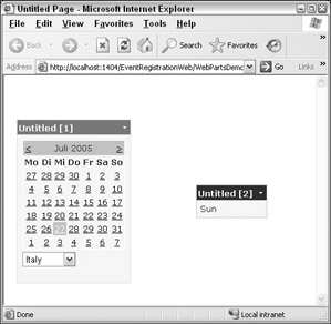
Figure 19-11 -
Next, you are going to make it impossible to close the controls. Open the Web page again in the designer and select a Web part. Open the CloseVerb property in the Property Editor. Set the Enabled option of this property to false. This setting makes it is impossible to select the Close menu item. To remove the menu entry, the Visible property can be set to false, too.
-
Open the Web page in the browser again. Notice that the Close menu entry cannot be selected.
Editor Zone
The Editor zone is used to change the appearance, behavior, and layout of the Web parts. For each of these activities different editor parts are available. The editor parts are active when a Web Parts control is set to Edit mode.
The Layout Editor part (see Figure 19-12) allows setting the chrome state, the zone where the Web part should be placed, and the order of a Web part inside a zone. The chrome state can be Normal or Minimized. When minimized chrome the Web part shows up only with a small icon so that it won't take up a lot of space within the Web page. The user can restore the Web part to a normal view by clicking this icon. The Zone combo box lists the names of all zones where the Web Parts controls can be placed.
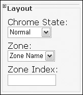
Figure 19-12
The Appearance Editor part allows setting the title, chrome type, and size. Figure 19-13 shows all the possible settings of the Appearance Editor part. The title is used to give a Web part a new header. The chrome type defines the visibility of the title and the border. The height and width of the Web Parts control can also be specified.
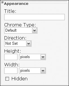
Figure 19-13
The Behavior Editor part (shown in Figure 19-14) allows setting title links and images, catalog links and images, and whether the Web Parts controls should be allowed to close, be edited, hide, and be minimized. The Export mode defines whether it is possible to export the Web Parts control information to the local disk of the user. Here, only the settings of the Web Parts control are exported to the local disk. This configuration can be used again to import the Web Parts control with any Website that offers the same Web Parts controls.
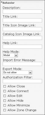
Figure 19-14
Try It Out – Add an Editor Zone
Adding an Editor zone makes it possible to change the appearance, behavior, and layout of the Web parts.
-
Open the previously created Web page WebPartDemo.aspx.
-
Add an EditorZone control to the first row of the table within the page.
-
Add an AppearanceEditorPart and a LayoutEditorPart to the Editor zone.
-
Add a DropDownList control to the top of the page. This control will be used to change from Browse mode to edit mode. Rename the DropDownList control to DropDownListDisplayModes.
-
Set the AutoPostBack property of the DropDownListDisplayModes control to true.
-
Add this code to the class WebPartsDemo in the file WebPartsDemo.aspx.cs. Here, all the display modes that are supported by the actual configuration of the WebPartManager are shown in the drop-down list.
protected void Page_Init(object sender, EventArgs e) { foreach (WebPartDisplayMode mode in WebPartManager1.SupportedDisplayModes) { if (mode.IsEnabled(WebPartManager1)) { DropDownListDisplayModes.Items.Add(new ListItem(mode.Name)); } } }
-
Add the method OnChangeDisplayMode to the SelectedIndexChanged event of the drop- down list DropDownListDisplayModes.
-
Add an implementation to the method OnChangeDisplayMode() to change the display mode of the WebPartManager to the mode that is selected in the drop-down list DropDownListDisplayModes:
protected void OnChangeDisplayMode(object sender, EventArgs e) { string selectedMode = DropDownListDisplayModes.SelectedValue; WebPartDisplayMode mode = WebPartManager1.SupportedDisplayModes[selectedMode]; if (mode != null) { WebPartManager1.DisplayMode = mode; } } -
Start the Web page in the browser. Because of the existence of an Editor zone there's an Edit selection in the drop-down list. Set the drop-down list to Edit the Page. Notice the Edit menu with the Web parts chrome when you click the Verb button.
-
Select the Edit menu. The Editor zone appears. Change the title and chrome type of the Web parts. Try to move the Web parts to other zones, and change the zone order.
-
Instead of using the Editor parts of the Editor zone to change the Web parts, you can also drag and drop a Web part from one zone to another — if the mode is set to Edit mode.
Catalog Zone
The Catalog zone is a real catalog — you can select Web parts from a catalog. Again, the Catalog zone is a zone similar to the other zones that manage Web parts. The Web parts that are managed by a Catalog zone are Catalog parts. ASP.NET 2.0 has three different kinds of catalogs: a page catalog, a declarative catalog, and an import catalog.
Figure 19-15 shows the PageCatalogPart. The page catalog lists all Web parts that are available within a Web page. All Web parts that have been closed by the user are listed within the PageCatalogPart. This way the user can reopen closed controls.
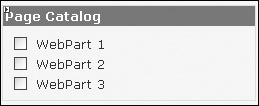
Figure 19-15
With the DeclarativeCatalogPart that is shown in Figure 19-16, the controls that should be available for selection must be explicitly defined within a <WebPartsTemplate> element. With the Visual Studio Designer, this can be done by clicking the smart tag of the control and clicking Edit Templates.

Figure 19-16
<asp:CatalogZone runat="server"> <ZoneTemplate> <asp:DeclarativeCatalogPart runat="server" > <WebPartsTemplate> <uc1:ListEvents runat="server" /> <asp:Calendar runat="server" /> </WebPartsTemplate> </asp:DeclarativeCatalogPart> </ZoneTemplate> </asp:CatalogZone>
The ImportCatalogPart can be used to import Web parts that have been stored on the client system. As you can see in Figure 19-17, ImportCatalogPart includes Browse and Upload buttons. With the Browse button a locally stored Web part can be selected, and uploaded to the user's personalized settings on the Web server.
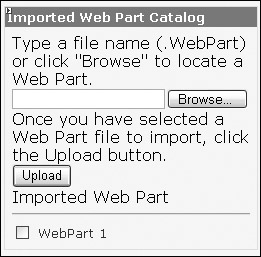
Figure 19-17
Adding a Catalog zone makes it possible to select Web parts that should be included with the Web page from a catalog. In the next Try It Out, you create a Catalog zone that includes multiple catalogs.
Try It Out – Add a Catalog Zone
-
Open the previously created Web page WebPartDemo.aspx.
-
Add a CatalogZone control to the second column of the first row of the table within the page.
-
Select a Professional Auto Format with the CatalogZone control.
-
Add a PageCatalogPart and a DeclarativeCatalogPart to the Catalog zone.
-
The DeclarativeCatalogPart requires some configuration. In the designer, click the smart tag of the DeclarativeCatalogPart control, and click Edit Templates. Now, you can add several controls (user controls or Web server controls) to the control. After you've completed adding the controls, click on End Template Editing.
-
Start the Web page in the browser. Close one or several Web Parts controls by clicking the Close menu. The Web Parts controls disappear. Of course you cannot close the controls of the zone you've set the Enabled property of CloseVerb to false.
-
Set the DropDownList to Show the Catalog. Because of the existence of the CatalogZone, the Catalog menu is added to the drop-down list. The Catalog zone opens.
-
Select Page Catalog from the catalog list. In the page catalog all Web parts that have been closed show up in a list. Select Web Parts from the list and add it to a zone.
-
Select Declarative Catalog from the catalog list. With the declarative catalog all Web parts that have been configured show up in the list. Select Web Parts from the list and add it to a zone.
-
Close the Catalog Zone.
Connections
Using the Connections zone, it is possible to send data from one Web Parts control to another Web Parts control on the same page. For example, if the user selects a city for weather information from the Weather Web part, the selected city can be sent to the News Web part that shows news from the same city.
The WebPartManager is responsible for initiating and managing the communication between the Web Parts. Communication between the Web parts requires a consumer and a provider to be differentiated. The provider offers some data; the consumer uses the data. Figure 19-18 shows the interaction of the WebPartManager with the consumer and the provider. First, the WebPartManager calls methods from the providers to get interfaces that can be accessed to receive the data. The providers are identified with the attribute [ConnectionProvider]. The WebPartManager then passes these interfaces to the consumers. Consumers are identified with the attribute [ConnectionConsumer]. Now, the consumer can invoke methods of the provider to receive data.
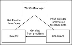
Figure 19-18
In the next Try It Out, you enable two Web parts to communicate, passing a selected country from the ListEvents Web part to another Web part.
Try It Out – Create a Connection between Web Parts
-
Open the previously created Website EventRegistrationWeb.
-
Open the special folder App_Code in the Solution Explorer. If the folder does not exist, create a new one by selecting the menu Website Add Folder App_Code Folder.
-
Create a new C# file ICountry.cs to define the ICountry interface:
public interface ICountry { string GetCountry(); }
-
Open the source code (ListEvents.ascx.cs) of the previously created user control ListEvents. With the class ListEvents implement the interface ICountry. The GetCountry() method is implemented to return the selected country to the caller.
public partial class ListEvents : System.Web.UI.UserControl, ICountry { public string GetCountry() { return DropDownListCountries.SelectedItem.Value; } //...
-
The provider also needs a method that is marked with the attribute [ConnectionProvider]. The method must return an interface. Implement the method GetCountryInterface() to return a reference to the ICountry interface.
The attribute [ConnectionProvider] defines a friendly name (Country) and an actual name (CountryProvider) for the provider.
[ConnectionProvider("Country", "CountryProvider")] public ICountry GetCountryInterface() { return this; }
-
Create a new user control named Country.ascx that acts as a consumer. This user control just needs a simple label to display the country.
-
Open the C# code of the user control Country to implement a consumer method that is marked with the attribute [ConnectionConsumer]. The method SetCountry() receives the ICountry interface that it uses to receive the data from the provider by calling the GetCountry() method. The returned string is assigned to the Text property of the label.
[ConnectionConsumer("Country", "CountryConsumer")] public void SetCountry(ICountry provider) { string country = provider.GetCountry(); if (!string.IsNullOrEmpty(country)) { LabelCountry.Text = country; } }
-
Open the Web page WebPartDemo.aspx. Add the new Country.ascx user control to a Web parts zone.
-
Select the WebPartManager and click the Ellipsis button with the StaticConnections property in the Property Editor. Add a new Connection with these settings:
Connection Properties
Value
ConsumerConnectionPointID
CountryConsumer
ConsumerID
Country1
ID
CountryConnection
ProviderConnectionPointID
CountryProvider
ProviderID
ListEvents1
Configuring the connections with the Property Editor adds the <StaticConnections> element to the WebPartManager control, as shown:
<asp:WebPartManager Runat="server"> <StaticConnections> <asp:Connection Provider ProviderConnectionPoint Consumer ConsumerConnectionPoint /> </StaticConnections> </asp:WebPartManager>
-
Now you can start the Web page. With the connection setup, if you select a country with the ListEvents control, the country shows up in the Country control.
-
Instead of using static connections, with the possibility to change the Web parts shown during runtime, it is also necessary to configure connections during runtime. This can be done with the ConnectionsZone control. Add the ConnectionsZone control to the Web page and remove the static connections from the WebPartManager.
-
Start the Web page again. Select Connect Web Parts in the drop-down list.
-
Setting the WebPartManager to ConnectDisplayMode (what happens when the drop-down list is changed) causes the Verb button to offer the new verb Connect. Click this Connect menu entry of the Country control and create a dynamic connection with the ListEvents control.
-
As before, select a country with the ListEvents control, so that the selected country shows up in the ListEvents control.
EAN: N/A
Pages: 278