METHODOLOGY
BenchmarkingThe Xerox Corporation, one of the pioneers in benchmarking, uses the following definition of benchmarking: "Benchmarking is the continuous process of measuring our products, services and practices against the toughest competitors recognized as industry leaders" (Gustafsson, 1992). The purpose of benchmarking is to compare the activities of one company to those of another, using quantitative or qualitative measures, in order to discover ways in which effectiveness could be increased. Benchmarking using quantitative data is often referred to as financial benchmarking, since this usually involves using financial measures. There are several methods of benchmarking. The type of benchmarking method applied depends upon the goals of the benchmarking process. Bendell et al. (1998) divide benchmarking methods into four groups: internal, competitor, functional, and generic benchmarking. This study is an example of financial competitor benchmarking. This implies that different companies that are competitors within the same industry are benchmarked against each other using various quantitative measures (i.e., financial ratios). The information used in the study is all taken from the companies' annual reports.
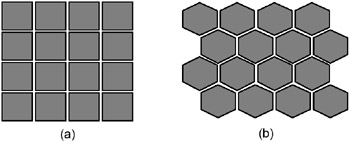
Self-Organizing MapsSelf-organizing maps (SOMs) are two-layer neural networks, consisting of an input layer and an output layer. SOMs are an example of neural networks that use the unsupervised learning method. This means that the network is presented with input data, but, as opposed to supervised learning, the network is not provided with desired outputs. The network is therefore allowed to freely organize itself according to similarities in the data, resulting in a map containing the input data. The SOM has turned out to be an excellent data-mining tool, suitable for exploratory data analysis problems, such as clustering, categorization, visualization, information compression, and hidden factor analysis. Before the SOM algorithm is initiated, the map is randomly initialized. First, an array of nodes is created. This array can have one or more dimensions, but the most commonly used is the two-dimensional array. The two most common forms of lattice are rectangular and hexagonal, which are also the types used in the SOM_PAK software that was used to create the maps used in this experiment. These are illustrated in Figure 1. The figure represents rectangular and hexagonal lattices, i.e., 16 nodes. In the rectangular lattice, a node has four immediate neighbors with which it interacts; in the hexagonal lattice, it has six. The hexagonal lattice type is commonly considered better for visualization than the rectangular lattice type. The lattice can also be irregular, but this is less commonly used (Kohonen, 1997).
Each node i has an associated parametric reference vector mi. The input data vectors, x, are mapped onto the array. Once this random initialization has been completed, the SOM algorithm is initiated. The SOM algorithm operates in two steps, which are initiated for each sample in the data set (Kangas, 1994):
These steps are repeated for the entire dataset, until a stopping criterion is reached, which can be either a predetermined amount of trials, or when the changes are small enough. In Step 1, the best matching node to the input vector is found. The best matching node is determined using some form of distance function, for example, the smallest Euclidian distance function, defined as ||x−mi||. The best match, mc, is found by using the formula in Equation 1 (Kohonen, 1997):
Once the best match, or winner, is found, Step 2 is initiated. This is the "learning step," in which the network surrounding node c is adjusted towards the input data vector. Nodes within a specified geometric distance, hci, will activate each other and learn something from the same input vector x. This will have a smoothing effect on the weight vectors in this neighborhood. The number of nodes affected depends upon the type of lattice and the neighborhood function. This learning process can be defined as (Kohonen, 1997):
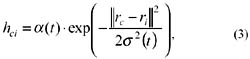
where t = 0,1,2, is an integer, the discrete-time coordinate. The function hci(t) is the neighborhood of the winning neuron c, and acts as the so-called neighborhood function, a smoothing kernel defined over the lattice points. The function hci(t) can be defined in two ways. It can be defined as a neighborhood set of arrays around node c, denoted Nc, whereby hci(t) = a(t) if i ∊ Nc, and hci(t) = 0 if i ∉ Nc. Here a(t) is defined as a learning rate factor (between 0 and 1). Nc can also be defined as a function of time, Nc(t). The function hci(t) can also be defined as a Gaussian function, denoted:
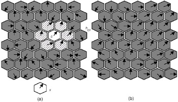
where α(t) is again a learning rate factor, and the parameter s(t) defines the width of the kernel, or radius of Nc(t). For small networks, the choice of process parameters is not very important, and the simpler neighborhood-set function for hci(t) is therefore preferable (Kohonen, 1997). The training process is illustrated in Figure 2. The figure shows a part of a hexagonal SOM. First, the weight vectors are mapped randomly onto a two-dimensional, hexagonal lattice. This is illustrated in Figure 2 (a) by the weight vectors, illustrated by arrows in the nodes, pointing in random directions. In Figure 2 (a), the closest match to the input data vector x has been found in node c (Step 1). The nodes within the neighborhood hci learn from node c (Step 2). The size of the neighborhood hci is determined by the parameter Nc(t), which is the neighborhood radius. The weight vectors within the neighborhood hci tune to, or learn from, the input data vector x. How much the vectors learn depends upon the learning rate factor α(t). In Figure 2 (b), the final, fully trained network is displayed. In a fully trained network, a number of groups should have emerged, with the weight vectors between the groups "flowing" smoothly into the different groups. If the neighborhood hci were to be too small, small groups of trained weight vectors would emerge, with largely untrained vectors in between, i.e., the arrows would not flow uniformly into each other. Figure 2 (b) is an example of a well-trained network.
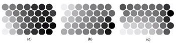
The result of the SOM algorithm should be a map that displays the clusters of data, using dark shades to illustrate large distances and light shades to illustrate small distances (unified distance matrix, or U-matrix method) (Kohonen, 1997;Ultsch, 1993). On a finished map, lightly shaded borders indicate similar values, and dark borders indicate large differences. By observing the shades of the borders, it is possible to isolate clusters of similar data. In order to identify the characteristics of the clusters on the U-matrix map, single vector-level maps, called feature planes, are also created. These maps display the distribution of individual columns of data in this case, the values of individual financial ratios. Three examples of feature planes are illustrated below in Figure 3 (a), (b), and (c). The feature planes display high values using lighter shades, and low values with dark shades. For example, in Figure 3 (a), companies located in the lower left corner of the map have the highest values in Operating Margin, while companies in the lower right corner have the lowest values. In Figure 3 (b), companies located in the upper left corner have the highest Return on Equity, while companies in the right corner again have the lowest values and so on.
The quality of a map can be judged by calculating the average quantization error, E. The average quantization error represents the average distance between the best matching units and the sample data vectors. The average quantization error can be calculated using the formula:
where N is the total number of samples, xi is the input data vector, and mc is the best matching weight vector. Often, the correct training of a SOM requires that the input data be standardized according to some method. Sarle (2001) suggests that the best alternative is one in which the data is centered on zero, instead of, for example, within the interval (0,1). This view is also advocated by Kohonen (1997). A common approach is to use the standard deviation when standardizing the data. Another option would be to use histogram equalization (Klimasauskas, 1991), used among others by Back et al. (1998, 2000). Although the optimal parameters are different in each case, there are a number of recommendations for parameters used in the training process. These are actually more like starting points, from which to work out the optimal parameters for the experiment in particular. These recommendations will be discussed below. The network topology refers to the shape of the lattice, i.e., rectangular or hexagonal. The topology should, in this case, be hexagonal, since hexagonal lattices are better for visualization purposes, as was previously mentioned. Network size, or the dimensions of the map, is important for visualization purposes. If the map is too small, differences between units are hard to identify. Movements from map to map are also difficult to illustrate. However, a small map is best for cluster-identification purposes. On the other hand, if the map is too large, the clusters do not appear, and the map seems "flat." Another thing to remember is that the map dimensions should be rectangular instead of square. This is because the reference vectors must be oriented along with the x-axis in order for the network to stabilize during the learning process (Kohonen, Hynninen, Kangas, & Laaksonen, 1996). A commonly used principle is that the x-axis should be roughly 1.3 times the length of the y-axis. The map is trained in two phases. The first phase is a rough training of the map, in which the network is allowed to learn a lot from each data vector. Therefore, learning rates and radiuses are high in the first phase, and there are less training steps (smaller training length). The second phase is a fine-tuning phase, in which the network learns less at a time, but data vectors are introduced to the network more times. Thus, learning rates and radiuses are lower than in the first phase, but the training length is much higher. The training length in each phase refers to how many training steps are used, i.e., how many times data vectors are introduced to the network. The statistical accuracy of the mapping depends upon the number of steps in the final learning phase. This phase, therefore, has to be relatively large. A good rule of thumb is that, in order to achieve good statistical accuracy, the amount of steps in the final phase must be at least 500 times the amount of nodes in the network (Kohonen, 1997). It is common practice for the initial training phase to have at least 10% of the amount of steps used in the final phase. The learning rate factor, or α(t), refers to how much a node learns from each data vector and should start out as fairly large in the first phase, but should be very low in the final phase. A commonly used starting point is 0.5 for the first phase, and 0.05 in the final phase. The selection of the network neighborhood size, Nc(t), is possibly the most important parameter. If the selected neighborhood size is too small, the network will not be ordered globally. This will result in various mosaic-like patterns, with unordered data in between. Therefore, the initial network radius should be rather large, preferably larger than half the network diameter (Kohonen, 1997). Generally, the final network radius should be about 10% of the radius used in the first part.
Financial RatiosThe performance of the companies included was rated according to seven different financial ratios. These were chosen based on an empirical study by Lehtinen (1996). Lehtinen rated different ratios according to two factors: their reliability in the international context, and the validity of the ratio. The reliability of a ratio implies how much the ratio is affected by international accounting differences, while validity measures how well the ratio measures the intended principle (Lehtinen, 1996). Since the comparison in this experiment is an international one, high reliability has been prioritized. Financial ratios can be divided into four classes: profitability ratios, liquidity ratios, solvency ratios, and efficiency ratios (Lehtinen, 1996). The emphasis in this experiment has been on profitability, since this can be considered the most commonly used measure of a company's success. The chosen ratios are displayed below:
Profitability
Liquidity
Solvency
EfficiencyProfitability naturally measures how well a company is able to generate profit on the invested capital. Operating Margin was chosen as the first ratio for three reasons. First, it is a very commonly used ratio, and second, it is very simple and quick to calculate. Finally, and most importantly, it is a rather reliable measure in an international context. This is because it uses total income instead of net income, thus ignoring posts like extraordinary income/expenses, depreciation in excess of plan, and taxation. There is, however, a problem with Operating Margin. Since Operating Margin is an income statement ratio, implying that figures are only taken from the income statement, the ratio does not take capital into account. This makes the ratio less valid (Lehtinen, 1996). In order to remedy this, Return on Equity (ROE) and Return on Total Assets (ROTA) were also included as profitability ratios. These ratios are called mixed ratios, since they take into account both the income statement and the balance sheet, thus providing us with ratios that take into account both profit and capital. This makes them very valid ratios for measuring profit. Of the two ratios, ROE is more sensitive to international accounting differences, thus making it slightly less reliable than Operating Margin or ROTA. This is because ROE uses net income, which is more heavily influenced by accounting differences than total income. Also, the denominator of ROE includes retained earnings, which contain differences retained from previous years. However, because of its very high validity, ROE was included in the experiment. ROTA, on the other hand, is both very valid and very reliable in an international context (Lehtinen, 1996). Liquidity ratios measure the ability of a company to meet its short-term financial obligations, i.e., how much liquid assets (cash, sales receivables, inventories, etc.) a company has. Quick Ratio, like Operating Margin, was chosen because it is commonly used, is easy to calculate, and is very reliable. Quick ratio, unlike Current Ratio, does not include the value of inventories, since these are in many ways not as liquid as receivables or cash. However, Quick Ratio is less valid than ratios that include figures from both the income statement and balance sheet. However, such ratios are very complicated to calculate and are not as reliable as Quick Ratio and Current Ratio (Lehtinen, 1996). Solvency ratios measure how indebted a company is, or how well a company is able to meet its long-term financial obligations. Equity to Capital is included because it is one of the most commonly used ratios in financial comparisons. However, it does suffer from much of the same problems as ROE and is not therefore as reliable as some other ratios. Therefore, Interest Coverage was included as a second solvency ratio, since it is much more reliable than Equity to Capital (Lehtinen, 1996). Efficiency, as the name indicates, measures how efficiently a company uses its resources. In this experiment, Receivables Turnover was chosen since it is both valid and reliable (Lehtinen, 1996).
| |||||||||||||||||||||||||||||||||
| | |||||||||||||||||||||||||||||||||

EAN: 2147483647
Pages: 194