| Before you start creating applications using components, you need to know where to find them, and how to control them. All components can be found in the Components panel (Window>Components). The Components Panel As you can see in Figure 16.1, Flash MX 2004 Professional comes with three distinct sets of components: Data components components for connecting and working with external data sources. FLV PlaybackPlayer 8 a fully function component for playing external Flash video files in the Flash player 8. FLV Playback Custom UI these are pieces that can be used to customize the user interface of an FLV Playback component. Media Player 6-7 these are components designed to help you work with external Flash video files in the Flash player 6 and 7. User Interface these are, as they state, user interface components for building forms or interactions in your Flash file.
Figure 16.1. The Components panel where all components that come with Flash as well as any you create can be found. 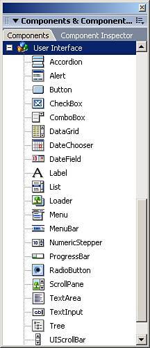
This chapter focuses mainly on the User Interface components, but the other components are covered in other chapters where applicable. Adding Components to the Stage Adding components to the stage is as simple as dragging them from the Components panel onto the stage. You can also double-click any one of them, and it will appear on the stage. NOTE If you need multiple copies of a single component, drag one instance onto the stage and either copy and paste it, or drag other instances from the library. Do not drag multiple instances of the same component onto the stage from the Components panel because it may increase file size unnecessarily.
After you have brought a component onto the stage, you can also attach more instances to the stage using the attachMovie() method. The attachMovie() Method The attachMovie method will use the component's linkage identifier to create a new instance of the component on the stage at runtime. The generic template for this method is as follows: movieClip.attachMovie(linkageID, newName, depth, initObj);
The movieClip in the preceding code represents which movie clip the component will reside in. This method has four parameters: linkageID The linkage identifier of the movie clip or component being attached. newName A string literal indicating the instance name of the new movie clip or component. depth A numerical value representing the depth of the new movie clip or component. initObj This optional parameter is an object containing properties, events, and methods with which to initialize the new movie clip or component.
All components, by default, have a linkage identifier that is the same as the component's name. To view it, drag an instance of any component (in this case a Button component) onto the stage, open the library and right-click (MacCtrl-Click) the component, and choose Linkage from the menu. You will see the Linkage Properties dialog box as shown in Figure 16.2. You cannot change the linkage identifier of any components. Figure 16.2. The Linkage Properties dialog box for a Button component. 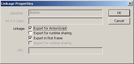
Follow these steps to attach a new Button component to the stage: 1. | Create a new Flash document.
| 2. | Drag an instance of the Button component to the center of the stage.
This step will also add the Button component to the library.
| 3. | Create a new layer called actions.
| 4. | In the first frame of the actions layer, open up the Actions panel and place this code in it:
//attach the Button this.attachMovie("Button", "myButton_butn", 1); //give it a label myButton_butn.label = "Click me";
|
The preceding code first attaches the new Button component and then gives it a label. If you test the movie, you will see that a second Button component has indeed been brought to the stage. If a label was not assigned to it at runtime, it would be blank, so keep that in mind. TIP New to Flash 8 is the ability to drag components directly to the Library from the Components panel. That means you can use the attachMovie() method without ever having placed a component onto the stage.
Now that you know how to add components to the stage, you should know how to control certain aspects of them. Setting Parameters Each component has a set of parameters that can be set to adjust the visual aspects of the component, how they operate, or what data they contain. You can set these parameters two different ways: by selecting the Parameters tab in the Properties Inspector, or by using the Component Inspector. The Properties Inspector The Properties Inspector will change when you select the Parameters tab for a component, as shown in Figure 16.3 for the Button component. Figure 16.3. The Properties Inspector showing the parameters for the Button component. 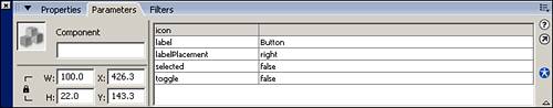
The following sections list all the parameters with descriptions for all the UI components: Accordion, Alert, Button, CheckBox, ComboBox, DataGrid, DateChooser, DateField, Label, List, Loader, Menu, MenuBar, NumericStepper, ProgressBar, RadioButton, ScrollPane, TextArea, TextInput, tree, UIScrollbar, and Window. Accordion Component childIcons An array of linkage identifiers representing symbols to be used as icons in the headers of the Accordion's panels. childLabels An array of text strings to use as headers for the Accordion's panels. childNames An array of text strings used as the instance names of the child symbols for the Accordion component. childSymbols An array of linkage identifiers representing the symbols to be used for the Accordion's children.
Alert Component The Alert component has no parameters and must be adjusted with ActionScript. Button Component icon A linkage identifier to the symbol to be used as an icon with the Button component. label A text string representing the text to appear in the Button component. labelPlacement A drop-down menu of choices representing where the text will be placed relative to the icon. selected A Boolean value representing the state of the Button; selected if true, unselected if false. toggle A Boolean value representing whether this Button component is a toggle button (true) or not (false).
CheckBox Component label A text string representing the text of the check box. labelPlacement A drop-down menu of choices representing the position of the label to the check box itself. selected A Boolean value representing the initial state of the check box; if this parameter is true, the box is selected; if it is false, the box is unselected.
ComboBox Component data An array of data to coincide with each item in the ComboBox. Note that this information will not be displayed in the component itself, but can be accessed via ActionScript. editable A Boolean value indicating whether a user can manually type in the ComboBox or not; editable if TRue, not editable if false. labels An array of text strings representing the label of each item in the ComboBox. rowCount A numerical value representing the maximum number of rows to be shown when the ComboBox is selected.
DataGrid Component editable A Boolean value indicating whether the information in the DataGrid can be edited by a user. multipleSelection A Boolean value indicating whether a user can select more than one row of information at a time. If this parameter is true, selecting multiple rows is allowed; if false, it is not allowed. rowHeight The height in pixels of the rows in a DataGrid.
DateChooser Component (Calendar Component) dayNames An array of strings representing the name of each day of the week; by default, the letter for each day is already there. disabledDays An array of numerical values (06) representing which days to disable, meaning they cannot be selected. firstDayOfWeek A numerical value (06) representing which day of the week should be considered the first; by default, the value is 0, Sunday. monthNames An array of text strings representing the names of each month to display (by default, the month names are already there). showToday A Boolean value indicating whether or not to automatically highlight the current date; highlight date if true, do not highlight date if false.
DateField Component dayNames An array of strings representing the name of each day of the week; by default, the names of days are already there. disabledDays An array of numerical values (06) representing which days to disable, meaning they cannot be selected. firstDayOfWeek A numerical value (06) representing which day of the week should be considered the first; by default, the value is 0, Sunday. monthNames An array of text strings representing the names of each month to display (by default, the month names are already there). showToday A Boolean value indicating whether or not to automatically highlight the current date; highlight date if TRue, do not highlight date if false.
Label Component autoSize A drop-down menu indicating how the text in the Label component will resize. It has these parameters: none The label will not resize at all. left The right and bottom sides of the label resize to fit. right The left and bottom sides of the label resize to fit. center The bottom side of the label resizes to fit.
html A Boolean value indicating whether the label supports HTML or not. text A text string that will appear in the label.
List Component data An array of data to coincide with each item in the List component. Note that this information will not be displayed in the component itself, but can be accessed via ActionScript. labels An array of text strings representing the label of each item in the List component. multipleSelection A Boolean value indicating whether a user can select more than one row of information at a time. If this parameter is true, selecting multiple rows is allowed; if false, it is not allowed. rowHeight The height in pixels of the rows in a List component.
Loader Component autoLoad A Boolean value indicating whether to automatically load the content or not. If this value is true, the content will load automatically. If it is false, the Loader component will wait until told through ActionScript to load the content. contentPath A text string representing the absolute or relative path to the content being loaded, either a SWF or JPG file. scaleContent A Boolean value indicating whether to scale the content to the size of the Loader component (true), or to scale the Loader component to the size of the content (false).
Menu Component MenuBar Component NumericStepper Component maximum A numerical value representing the maximum allowable value. minimum A numerical value representing the minimum allowable value. stepSize A numerical value representing the amount the value moves up or down. value A numerical value representing the initial value.
ProgressBar Component conversion A number to divide the %1 and %2 values of the label being displayed. It is used to display different types of measurements of file sizes such as bytes or kilobytes. direction A drop-down menu indicating which direction the loader should move toward, either right or left. label This is a text string of particular characters used to give feedback to the user as to how much of the content has loaded; here are the special characters to use with the ProgressBar component: %1 The number of bytes loaded %2 The total number of bytes loading %3 The percentage that has been loaded %% The percentage sign (%)
The default value of %3%% will show the percentage loaded with a percentage sign (%). labelPlacement A drop-down menu indicating where the label will appear in the ProgressBar component. mode A drop-down menu indicating which mode the ProgressBar will operate in. source A text string representing the source of the download where the loader can get the total file size of the content being loaded, and the current amount loaded (the Loader component for example).
RadioButton Component data A text string representing the value associated with the RadioButton. Note that this information will not be displayed in the component itself, but can be accessed via ActionScript. groupName A text string indicating which RadioButton group the individual RadioButton belongs to. label A text string indicating the label of the individual RadioButton. labelPlacement A drop-down menu representing the position of the label in the RadioButton component. selected A Boolean value representing the initial state of the radio button; selected (true), unselected (false).
NOTE Only one RadioButton in a given group can be selected at a time.
ScrollPane Component contentPath A text string representing the relative or absolute path to the content being loaded. hLineScrollSize A numerical value representing the number of units the horizontal scrollbar moves each time a scroll button is clicked. hPageScrollSize A numerical value representing the number of units the horizontal scrollbar moves each time a scroll track is clicked. hScrollPolicy This is a drop-down menu representing whether the horizontal scrollbars will be visible; it will show the bar (on), it will not show the bar (off), or it will decide if it is necessary (auto). scrollDrag A Boolean value indicating whether users can drag the content around (true) or not (false). vLineScrollSize A numerical value representing the number of units the vertical scrollbar moves each time a scroll button is clicked. vPageScrollSize A numerical value representing the number of units the vertical scrollbar moves each time a scroll track is clicked. vScrollPolicy This is a drop-down menu representing whether the vertical scrollbars will be visible; it will show the bar (on), it will not show the bar (off), or it will decide if it is necessary (auto).
TextArea Component editable A Boolean value representing whether the user can edit the TextArea component at runtime (TRue) or not (false). html A Boolean value indicating whether the TextArea component will display HTML text as HTML (TRue) or not (false). text A text string that will initially appear in the TextArea component. wordWrap A Boolean value indicating whether to wrap text to the next line when it reaches the border (true) or not (false). Note that you can still create new lines if this parameter is set to false, they will just have to be created manually.
TextInput Component editable A Boolean value representing whether the user can edit the TextInput component at runtime (TRue) or not (false). password A Boolean value indicating whether the text will be legible (false) or just a bunch of asterisks (true). text A text string that will initially appear in the TextInput component.
tree Component multipleSelection A Boolean value indicating whether a user can select more than one node of information at a time; selecting multiple nodes is allowed if true and is not allowed if false. rowHeight The height in pixels of the nodes in a tree component.
UIScrollBar Component _targetInstanceName The instance name of the text field that the scroll bar will be controlling. horizontal The orientation of the scroll bar to the text field. If true, the scroll bar will control horizontal scrolling of the text field, if false (the default), the scroll bar will control the vertical scrolling of the text field. Note, with this component, you can simply drag and drop it right on the text field you want it to work with, and the parameters will be filled automatically.
Window Component closeButton A Boolean value indicating whether the close button at the top right of the Window component will be visible (true) or not (false). contentPath A text string representing either a linkage identifier to a symbol in the library, or a relative or absolute path to external content. title A text string that will appear in the drag bar of the Window component.
Changing the Parameters of a Component Changing the parameters of a component is easy with the Properties Inspector. Follow these steps to set up the Button component: 1. | Create a new Flash document.
| 2. | Drag an instance of the Button component onto the stage.
| 3. | Select the Button component, and change the parameters to the following:
- icon leave blank
- label "My First Button"
- labelPlacement right
- selected false
- toggle TRue
|
Now test the movie, and you will see that you now have a toggle button. Buttons are pretty easy, but notice that some of the parameters for certain components were arrays, such as the labels parameter for the List component. Arrays in component parameters have their own special dialog box, as you will see in this next example where we will add some labels to the List box. 1. | Create a new Flash document.
| 2. | Drag an instance of the List component onto the stage.
| 3. | Select the List component, and go to the Properties Inspector. Select the labels parameter. Then you will see a small magnifying glass at the end of the field; select it or double click the field.
| 4. | The Values dialog box appears as in Figure 16.4. Click the Add Value button (the plus sign) three times, and you will see three items appear in the dialog box, all labeled "defaultValue".
Figure 16.4. The Values dialog box for array parameters in components. 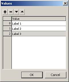
| 5. | Select each of these three items, and change the text to the following:
Flash
Dreamweaver
Fireworks
| 6. | Click OK, and you will see that the component on the stage shows the new values you just added.
|
Test the movie, and you will see that the three items are still there. Of course, the Properties Inspector is not the only place to control the parameters of a component; you can also change parameters in the Component Inspector panel. The Component Inspector Panel You can find the Component Inspector panel by going to Window>Component Inspector. As you can see in Figure 16.5, the Component Inspector has three tabs; Parameters, Bindings, and Schema. The Bindings tab is used to control data binding between components, and will be covered later in this chapter. The Schema tab controls all the properties of the component and is based on an XML document. In the Parameters tab, you can adjust component parameters as in the following example. Figure 16.5. The Component Inspector panel, which is used to control components. 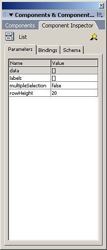
In this example, we are going to use a simple TextInput component and change a couple of its parameters using the Component Inspector panel. 1. | Create a new Flash document.
| 2. | Drag an instance of the TextInput component onto the stage.
| 3. | Select the TextInput component and open the Component Inspector. Then choose the Parameters tab.
Notice in Figure 16.6 that when you use the Component Inspector, you will see many more parameters than you do when using the Properties Inspector. This is because the Component Inspector allows access to more of the component's properties.
Figure 16.6. The Component Inspector provides direct access to more parameters than does the Properties Inspector. 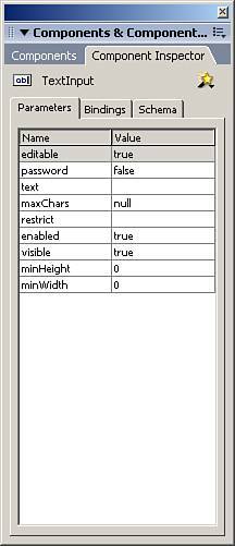
| 4. | Set the parameters of the TextInput component to the following:
- editable TRue
- password true
- text topSecret
|
The rest of the parameters we will leave to default values. As you change the password parameter, and then place text in, notice that the component on the stage again changes before the movie is even tested. Also, the parameters in the Properties Inspector change to match the Component Inspector panel. Test the movie, and you now have half of a login; all you need is a user name field. There is a third and final way you can change the parameters of a component, but these changes will not take effect until runtime. ActionScript Because component parameters are nothing more than direct links to component properties, we can control them from within ActionScript at runtime. Follow these steps to create a combo box and fill it with labels all from within ActionScript: 1. | Create a new Flash document.
| 2. | Drag an instance of the ComboBox component onto the stage.
| 3. | Give it an instance name of myCombo_cb so that we will be able to access it from ActionScript.
| 4. | Create a new layer called actions.
| 5. | In the first frame of the actions layer, open the Actions panel, and place this code in it:
//add some data to the ComboBox myCombo_cb.addItem("ASP"); myCombo_cb.addItem("PHP"); myCombo_cb.addItem("ASP.NET"); myCombo_cb.addItem("ColdFusion"); myCombo_cb.addItem("CGI"); myCombo_cb.addItem("Perl"); //change the width of the drop down myCombo_cb.dropdownWidth = 200;
|
The preceding code first adds some labels to the ComboBox, and finally changes the width of the ComboBox's drop-down menu to twice its size. Test the movie, and when you select the ComboBox, you will see that the drop-down is twice its default size. NOTE Even if you change a component's parameters manually, because ActionScript runs at runtime, ActionScript will override any manual settings.
Another great way ActionScript interacts with components is when you need to capture a component's event, such as if a user clicks a button. You need to know when that happens to run whatever code is associated with that button. Capturing Component Events Way back in Flash MX, component events were easy to control. There was a callback function associated with each instance of a component that would look on the timeline for any function with that name, and then run all the code associated with that function. Version 2.0 of components is slightly more complicated. In order to capture an event of a component, you must create a listener object. A listener object is a generic object whose sole purpose is to sit around and "listen" for a given event to occur. When this event does occur, it calls its associated callback method. But first, you have to add the event listener to the component using the addEventListener() method. The addEventListener() Method The addEventListener() method is used to add event listener objects to components. Each time it is used, it is basically subscribing the listener object to listen for a component's event. Here is the generic layout for the addEventListener() method: myComponent.addEventListener(event, listener);
One parameter of this method is the event parameter, which is a string literal name of the event being listened to. The other parameter is the listener, a reference to the event listener object. As you start to build applications with components, you will learn how important it is to be able to capture these events. For instance, if you wanted to get the label of an item in a List component whenever the user chooses one, you would use code that looks similar to this: The following code is in a frame on the same timeline where a List component with an instance name of myList_lb resides. //create the listener object var listListen:Object = new Object() //create the event callback for the event you're listening for listListen.change = function(){ trace(myList_lb.selectedItem.label); } //then add the event listener to the instance of the List component myList_lb.addEventListener("change", listListen);
All the preceding code does is create the generic object. Then it creates the callback function for the event it was listening to. Finally, it adds the event listener to the List component. It is possible to replace the preceding code by putting this code directly into the actions of the component itself: //the event on(change){ trace(this.selectedItem.label); }
Even though the preceding code would yield the exact same results, it is bad practice to put code directly in the object actions of components, or any other object for that matter, because it makes it difficult to find code hidden in objects when you need to find it. So throughout the rest of this chapter, we will be using event listeners on the timeline. You can also use the handleEvent() method, which will allow an event listener to handle multiple events, but you have to pass it the event, and then use conditionals to tell which event was called. The following is an example of using the handleEvent() to handle multiple events: //create the listener object var listListen:Object = new Object() //create the event callback for the event your listening for listListen.handleEvent = function(eventName){ if(eventName.type == "change"){ trace(myList_lb.selectedItem.label); }else if(eventName.type == "scroll"){ trace("scrolling"); } } //then add the event listener to the instance of the List component myList_lb.addEventListener("change", listListen); myList_lb.addEventListener("scroll", listListen);
As you can see from the preceding code, it is possible to have a single event listener listen to multiple events, but the code is quite messy, and not flexible. Now that you understand the concepts of capturing events in components, work through the following example to see how to capture the "click" event for a button: 1. | Create a new Flash document.
| 2. | Drag an instance of the Button component onto the stage.
| 3. | Give the button an instance name of myButton_butn and change the label to "Now".
| 4. | Create a new layer called actions and place this code in the first frame of it:
//create the event listener object var clickListen:Object = new Object(); //create the event callback for the click event clickListen.click = function(){ trace(getTimer()); } //now add the event listener to the Button instance myButton_butn.addEventListener("click", clickListen);
|
The preceding code creates the event listener object, and then creates its event callback method. Every time this event callback is called, it will send the number of milliseconds that have occurred since the beginning of runtime. Finally, we add the event listener to the Button component. Test this movie out, and every time you click the button, a number will be sent to the Output panel representing the number of milliseconds that have occurred since you tested the file. There is one more hidden way to capture events from components, and that is to set their own hidden event callbacks. Hidden Event Callbacks Components have events, but most look more like properties than events, and there doesn't seem to be any event callbacks for generic movie clips and buttons. However, they are there. Even though the component event callbacks are hidden, they are easy to guess as they use the word "Handler" in the callback for the event. For example, the Button event click has the event callback of clickHandler. Here is an example that will show it working, and the order in which it fires. 1. | Create a new Flash document.
| 2. | Drag an instance of the Button component onto the stage.
| 3. | Give the button an instance name of myButton_butn.
| 4. | Create a new layer called actions and place this code in the first frame of it:
//the event listener var clickListen:Object = new Object(); //the event clickListen.click = function(){ trace("This is the listener"); } //add the event listener to the Button component myButton_butn.addEventListener("click", clickListen); //the callback myButton_butn.clickHandler = function(){ trace("This is the event callback"); } //output: This is the event callback // This is the listener
|
Now test this movie, and you will see that when you click the button, the hidden callback event will fire first. That is important if you are using listeners in conjunction with the callback. And as you can see, the hidden event callbacks are just a matter of adding the word "Handler" to the event when you set it. Now you know how to put data into a component, and how to capture events from components. The next step is getting data from components. Getting Data from Components Even though we have done some useful examples so far, we haven't really gathered information from components yet, which is a major point to using components to quickly build applications. You can access most data by means of either a method, or more likely a property of a component. And in list type components, you can access properties of the selected item. In the next example, we will use a NumericStepper component to control the _alpha property of a movie clip. 1. | Create a new Flash document.
| 2. | Drag an instance of the NumericStepper component onto the top left of the stage; give it an instance name of myStepper and set its parameters to the following:
- maximum 100
- minimum 0
- stepSize 1
- value 100
| 3. | Now draw a rectangle in the center of the stage.
| 4. | Highlight the entire rectangle including the stroke and choose Modify, Convert to Symbol.
| 5. | Give it a symbol name of recMC and make sure the behavior is set to Movie Clip.
| 6. | Give the instance of the rectangle still on the stage an instance name of rec_mc.
| 7. | Create a new layer called actions.
| 8. | In the first frame of the actions layer, open the Actions panel and place this code in:
//create the listener object var stepListen:Object = new Object(); //add the event callback to the listener stepListen.change = function(){ //set the rectangles alpha rec_mc._alpha = myStepper.value; } //add the listener to the component myStepper.addEventListener("change", stepListen);
|
The preceding code is nothing new. It creates the event listener. Then it creates the event callback method for the change event of the NumericStepper. In that event, every time the user adjusts the NumericStepper component, the _alpha property of the rectangle changes to the value of the NumericStepper. Finally, we add the event listener. When you test this movie, you will see the transparency of the rectangle change as you change the value in the NumericStepper component. Now that you have seen how to use components, you need to know how to make them look good. | 