6.1. Creating Charts You can talk numbers until you're blue in the face, but when you really want to get your audience's attentionand get your point across in the shortest time possibleyou need a chart. Sometimes referred to as a graph , a chart is nothing more than a visual representation of a bunch of numbers. The ubiquitous pie chart (Figure 6-1) breaks up a circular area into easy-to-understand, color -coded wedges, each of which represents a numerical quantity. PowerPoint 2007 lets you add punch to your presentations with the same bar charts, line charts, scatter graphs, and so on that PowerPoint 2003 offered . Only now they're better looking, since Microsoft Excel has replaced PowerPoint 2003's Microsoft Graph program. DESIGN TIME
Go Easy on the Extras | | This chapter shows you the quickest, most powerful ways to customize your visuals, and the Appendix shows you how to get help with the more arcane customization options PowerPoint offers. But before you roll up your sleeves and customize every single tiny detail of your charts, diagrams, and tables, consider that the goal of every presentation is the same: to communicate something to an audience. In most cases, your audience couldn't care less if you beveled your table column headings to point up instead of down, or chose pink over salmon for your diagram's background. Your audience is after meaning . So always keep these question in mind: Why are you showing them this particular chart or diagram? Why have you chosen to highlight the second row of the table and not the third? If you've presented solid data in the clearest, most dramatic way possible and you have a little time left over, by all means add that bevel effect. Otherwise, save yourself some work (and your audience some eye-rolling) and leave it out. |
Note: You don't need to have Excel installed on your computer to create charts. If PowerPoint 2007 finds Excel on your PC, it uses Excel. Otherwise, it falls back on the built-in graphics program, Microsoft Graph. See the box in Section 6.1.3 for the full scoop.
Creating a chart in PowerPoint is a straightforward process. You tell the program which type of chart you want to create (pie chart, bar chart, and so on), you type a few rows of data into an Excel (or Graph) spreadsheet, and then you apply a predesigned Chart Style and Chart Layout. Bingoinstant chart. And if you've never seen a chart built with an Office 2007 program, you'll be amazed how good it looks. 6.1.1. Choosing a Chart Type PowerPoint's charts look great, but they're not all suited to every type of information. Do you know which one to choose? The chart type you pick affects how PowerPoint interprets your information, which affects your audience's conclusions. So choose a chart type based on what you're trying to communicate, not on what PowerPoint lets you do.  | Figure 6-1. Charting is an art unto itself, as all liars and statisticians are well aware. PowerPoint doesn't care whether the numbers you chart are accurate or whether your chart makes your conclusions dangerously misleadingit leaves those judgments up to you. | |
Charting is both art and science, and it's far too complex to tackle in a book about PowerPoint. Consider the following descriptions in deciding which type of chart to create: -
Bar chart . One of the most popular types of charts, the bar chart depicts numberslike dollars, products sold, or the number of times something happenedusing big, thick, hard-to- miss rectangles. Bar charts show numbers in the context of time. They can show how many field goals each high school's football team scored over the last five seasons. Bar charts can be stacked , which means PowerPoint stacks all of the data from all of the categories into one bar per event; or they can be clustered , which means that each data category gets its own bar for each event. -
Column chart . A column chart's the same as a bar chart, but lying on its side (with x-and y-axis labels flipped to match). Fancy types of column charts include cylinder, cone , and pyramid . -
Line chart . Line charts show noncumulative data horizontally, over time, so you can track performance. Consider a line chart if, for example, you're trying to show the progression of your company's quarter-by-quarter performance over the past fiscal year, compared with your two closest competitors ' performances over that same period of time. Similar to bar charts, line charts track numbers in relation to time. But unlike bar charts, which clump the data for specific events (like field-goal totals for those five football seasons), line charts show a continuous intersection of activity. Thus, if it's events you're interested in comparing, then use a bar chart; when it's a continuous progression of up-and-down movement, use a line chart. -
Pie chart . Because pie charts show percentage values as slices of a circle, this type of chart makes sense only if you have a single column of numbers that add up to 100. For example, you can use a pie chart if you're trying to show how much of every dollar raised for your charity goes to overhead, to individual programs, and so on. -
Scatter chart . Use a scatter chart when you're working with data that neither occurs at regular intervals nor belongs to a series. Sometimes referred to as XY charts or scatter graphs , scatter charts show information as points distributed around an x-y axisthink darts thrown at a dartboard. The dots give a quick visual showing the relationship between the data represented by the x and y axes. You might use a scatter chart to plot the relationship between the prices of ovens and how long the ovens last. Scatter charts are popular with scientists. -
Area, bubble, doughnut, stock, surface, and radar charts . Theoretically, you can graph any data you want any way you want, and in this spirit PowerPoint offers the doughnut, stock, radar, and other specialty graphs. For example, a radar graph is useful for comparing the aggregate values of a bunch of data series. Say you want to compare the vitamin levels of three different brands of orange juice. Creating a radar chart lets your audience see at a glance which brand of juice contains the most Vitamin C, Vitamin D, Vitamin A and which is the most nutritious overall.
Tip: Remember, though, the more complicated a graph is, the harder it is for your audience to understand iteven if you're there in person to explain it. And complexity totally defeats the purpose of a graph. Most of the time you should stick with the bar, column, line, and pie charts.
Figures 6-2 and 6-3 show you the different configuration your numbers and headings need to work with the different kinds of charts PowerPoint lets you create. 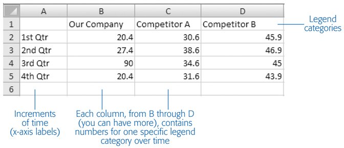 | Figure 6-2. The mocked-up data PowerPoint starts you off with would be a lot more useful if the program gave you a clue of how to interpret each cell . Here's how your data needs to appear for the Bar, Column, and Line charts (the ones that, along with Pie charts, you're most likely to use). | |
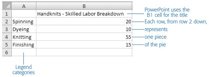 | Figure 6-3. Because pie charts can deal with only one category of numbers (in chart-speak, one data series), you need to arrange your figures as shown here for PowerPoint to graph your pie chart correctly. Also double-check your data range as described in the box in Section 6.1.3.1, since PowerPoint doesn't always extrapolate correctly. | |
6.1.2. Creating a Chart To create a chart, first tell PowerPoint what type of chart you want, and then feed it some data. The steps that follow explain how.
Note: Creating a chart is pretty simple, as you'll see in the following steps. But if you're new to Excel or spreadsheets in general, it's useful to walk through the process visually. A screencast at www.missingmanuals.com shows you how to create a chart in PowerPoint, complete with accompanying narration that explains each step.
-
Go to Insert  Illustrations Chart (Figure 6-4) . Illustrations Chart (Figure 6-4) . 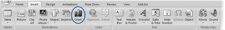 | Figure 6-4. If you've applied a Title and Content or Two Content layout to the slide you're adding your chart to, you'll see two versions of the Chart icon: one on the Insert ribbon (as shown here) and one in the center of your slide. Clicking the Chart icon in either location displays the Create Chart dialog box shown in Figure 6-5. | | The Insert Chart dialog box (Figure 6-5) appears. -
Choose the kind of chart you want to add to your slide, and then click OK . To find one you like, zip to the left side of the Insert Chart dialog box (Figure 6-5) and click a category (such as Bar, Area, or Doughnut), which whisks you straight to the section you're interested in. Or, if you prefer, you can use the scroll bar to browse leisurely through all the chart options.
Note: You can also double-click a chart type to add it to your slide.
Once you click OK, PowerPoint shrinks to half size and scoots over to make room for Excel, which appears on the right side of your screen complete with placeholder data displayed in an Excel spreadsheet titled "Chart in Microsoft Office PowerPoint." In PowerPoint, the Chart Tools Design, Chart Tools Layout, and Chart Tools Format tabs appear (Figure 6-6).  | Figure 6-5. The Insert Chart dialog box offers dozens of different types of charts. PowerPoint doesn't support live previews for charts the way it does for just about everything else, but it does display short descriptions as you mouse over each chart icon. | | -
Replace the mocked-up data you see in Excel with the real data you want to chart . To do so, you can: -
Click in each cell and type your own numbers and headings. -
If you've already got a spreadsheet containing the numbers you want to chart, you can copy the cells from that spreadsheet and paste them into the spreadsheet PowerPoint gives you. (For quick tips on pasting from Excel, see the box in Section 6.2.)  | Figure 6-6. Excel starts you off with a column or two of mocked-up dataone piece of information per spreadsheet cellso that you can get a feel for what your chart will look like. To expand the tiny chart preview PowerPoint displays on your slide, in PowerPoint either click Zoom a few times or drag the Zoom slider. | |
As you add, change, and delete data in the Excel spreadsheet, Excel's data range outline automatically changes to encompass your new data columns and headings, and your PowerPoint chart updates automatically to reflect your changes. -
When you're finished adding data, check to make sure the data range bounding box surrounds your entire data range, including your column and row headings . If it doesn't, drag the lower right corner of the data range bounding box so it covers all your cells (but no additional blank rows or columns). -
Click anywhere on your PowerPoint slide . PowerPoint whisks you back to slide-editing mode and updates your chart with the data you just gave it. FREQUENTLY ASKED QUESTION
Creating Charts Without Excel | | PowerPoint uses Excel to do all its charting now. But I don't have Excel, just PowerPoint. Does that mean I can't do charts? Microsoft Office comes with both programs, so lots of people who use Office have both PowerPoint and Excel installed on their computers. But not everyone who installs Office chooses to install both programsand some folks choose to buy just PowerPoint, not the entire Office suite. If you do have both PowerPoint and Excel installed on your computer, creating a chart in PowerPoint automatically kicks Excel into gear, as shown in this chapter. But if you don't have Excel installed, you can still create charts. Here's why: when PowerPoint can't find Excel, it automatically launches Microsoft Graph, the same charting and drawing program that came with PowerPoint 2003. Microsoft Graph doesn't offer the same bells and whistles that Excel doeswhich is why Microsoft replaced it with Excel in PowerPoint 2007but you can use it to do the same basic things. For example, you can click in Microsoft Graph data cells to type in your own numbers and column headings, just the way you can in Excel. This book focuses on creating charts in PowerPoint (and not Excel), so all of the instructions work the same for you as they do for someone who has Excel installedeven if what you see on your screen looks slightly different from the figures in this book. But if you run into a snag, then click the Microsoft Graph spreadsheet and choose Help Microsoft Graph Help. |
Tip: If your spreadsheet accidentally disappears (perhaps you clicked the X in the upper-right corner by mistake), you can get it back again by selecting your chart and then choosing Chart Tools Design Data Edit Data.
6.1.3. Customizing Charts with Prebuilt Layouts and Styles PowerPoint 2007 gives you the option of choosing both a canned Chart Layout and a canned Chart Style scheme. You simply pick one of PowerPoint's professionally designed Chart Layout schemes, some of which show the legend on the side of the chart, some at the bottom, and so on. Then you pick one Chart Style scheme, which sets the colors, data point markers, and a background for your chart. GEM IN THE ROUGH
Trying Data On for Size | | PowerPoint lets you pinpoint the perfect chart by "trying out" different sets of data. This is useful if you want to experiment to find out which of several sets of data translates to the most dramatic chart. Here's how it works: -
Create a chart as described in Section 6.1.2. -
Choose Chart Tools Design Data Select Data to display your spreadsheet (if it isint visible already) and to display the Select Data Source dialog box. -
In your spreadsheet, create another complete set of data; then click the new data range and drag to outline your newly created columns and rows. Notice that PowerPoint automatically adjusts the Select Data Source dialog box to reflect your changes. -
In the Select Data Source dialog box, click OK to tell PowerPoint to update your chart using your new data. -
Repeat steps 3 and 4 for as many sets of data as you have. After you've decided to stick with one, don't bother deleting the others from your spreadsheet. Leave them there in case you change your mind. |
6.1.3.1. Applying prebuilt Chart Layouts Since you're going to be working on your chart's appearance, give yourself a nice big view. If PowerPoint isn't maximized on your computer screen, click the Maximize button in the upper-right corner of the window to maximize it. Then follow these steps: -
On your slide, click your chart to select it . PowerPoint displays the Chart Tools contextual tab. -
Go to Chart Tools Design tab . You see tools for formatting your chart's looks (Figure 6-7). 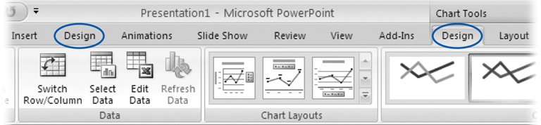 | Figure 6-7. Confusingly, when you select a chart, two Design tabs appear: the regular Design tab, and the Chart Tools Design contextual tab, which appears above the ribbon. PowerPoint also highlights the contextual tab to make it stand out a bit. The Chart Tools Design tab is specifically for working with your chart. | | -
Click the Chart Layout gallery to expand it (Figure 6-8). Then click to choose the layout you want to apply to your chart . PowerPoint redisplays your chart based on the layout you chose. 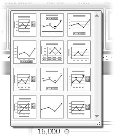 | Figure 6-8. The Chart Layout gallery varies depending on the type of chart you choose. Layouts define where chart elements such as titles, legends, and data and axis labels appear. This gallery shows the layouts that PowerPoint can apply to Line charts. | |
6.1.3.2. Applying prebuilt Chart Styles The Chart Style schemes that come with PowerPoint give you a quick way to choose the color of your chart's data elements, as well as your chart's background. Because all of the colors in the Chart Style schemes are professionally designed to coordinate with each other, your chart looks good no matter which one you chooseand no matter how many data elements you're charting. To apply a Chart Style: -
On your slide, click your chart to select it. Then go to Chart Tools Design tab . Tools for formatting your chart's appearance show up on the ribbon. -
Click to expand the Chart Styles gallery (Figure 6-9). From the Chart Styles gallery, click to choose the style you want to apply to your chart . PowerPoint redisplays your chart based on the style you chose. 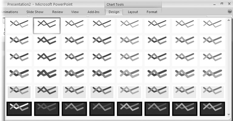 | Figure 6-9. The Chart Styles gallery gives you a super-easy way to apply an attractive color scheme (including background colors and gradients) to your charthere, a line chart. You can tweak the colors if you like, of course (see Section 3.2.4). | |
6.1.3.3. Customizing chart titles If you customize nothing else about your chart, you need to customize your title. That's because even though every chart needs a title, PowerPoint doesn't automatically assign one. You'll want to decide where to display your title, too. POWER USERS' CLINIC
Excel: The Least You Need to Know | | If you really want to get down and dirty with Excel, you need a good reference on the subject. (One to try is Excel 2007: The Missing Manual , by Matthew MacDonald.) But when all you want to do is to put together a decent-looking chart in PowerPoint and then get on with your life, you'll do all right if you know how to: Copy and paste cell data from an existing spreadsheet . You've already got a spreadsheet containing the data you want to chart, and you don't want to retype it into the spreadsheet PowerPoint provides. Copy and paste the data. Here's how: -
In the Excel spreadsheet PowerPoint opened (the one titled "Chart in Microsoft Office PowerPoint"), choose Office button Open and open a new spreadsheet (the spreadsheet containing the data you want to chart). -
Copy (or press Ctrl+C) to copy it. -
Paste or press Ctrl+V to paste the data. Delete the contents of cells . To clear out the contents of cells you don't want to chart (and don't want to see), drag to select the cells; then right-click the selection and choose Clear Contents from the shortcut menu Widen columns . If you type text into two side-by-side cells, you may not be able to read all the text in the first cell. To widen the first cell's column, click the edge of the column header and drag to widen the entire column. Insert and delete rows and columns . To insert a row or column, right-click the cell after which you want to add a row or column and then choose Insert from the shortcut menu. When the Insert dialog box opens, turn on the radio box next to "Entire row" (to insert a row) or "Entire column" (to insert a column). To add data to your chart, you may have to delete a row or column. Right-click the row or column heading (the actual letter or number of the row or column, as opposed to a cell in the row or column) and then choose Delete from the shortcut menu. |
 |