Tables
You can use tables for far more than simply presenting data in tabular form. They are one of the most powerful page layout tools available in HTML. The tags used to make tables are also rich in features, supporting everything from colored borders and backgrounds to the vertical and horizontal alignment of table contents.
Table Basics
Tables are marked by the tags <TABLE> and </TABLE>. Inside these tags, you use table row tags, <TR> and </TR>, to define rows of data. Within each row, cells are defined by table data tags <TD> and </TD>. Code Listing 3-1 presents a page containing a basic table. You can see the table produced by this code in Figure 3-1.
Setting the BORDER attribute to 1 creates a 1-pixel-wide border around each cell as well as around the whole table. If you increase this value, the thickness of the table border increases, although the line around each cell remains 1 pixel wide. (The following section discusses several other attributes that format the space between cells.)
NOTE
Because HTML ignores extra white space, we were able to use indents in Code Listing 3-1 to visually separate the different levels of the table. The <TD> tags are indented further than the <TR> tags, which are indented further than the <TABLE> tags. It isn't necessary to use indents, but we highly recommend this technique for its usefulness as a debugging tool, especially in more complex tables.
Code Listing 3-1.
<HTML> <HEAD> <TITLE>Listing 3-1</TITLE> </HEAD> <BODY> <TABLE BORDER="1"> <TR> <TD>R1, D1</TD> <TD>Row 1, Data 2</TD> </TR> <TR> <TD>Row 2, Data 1</TD> <TD>This is Row 2, Data Column 2</TD> </TR> </TABLE> </BODY> </HTML> |
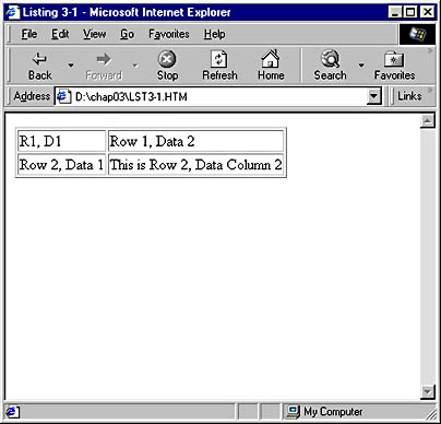
Figure 3-1. A basic table.
More Table Attributes
Table tags have many attributes in addition to BORDER. Code Listing 3-2 below sets up two tables that illustrate some of the most common attributes, as shown in Figure 3-2.
We set the BORDER attribute to 5 for the first table and 10 for the second; notice the difference in thickness of the outside border around each table in Figure 3-2. The CELLPADDING attribute controls the amount of space between a cell's contents and the cell's boundary, whereas CELLSPACING controls the spacing between cells. The first table in Figure 3-2 shows a lot of space between cells (CELLSPACING is set to 15) but only a little space separating text from the edges of the cell in which it resides (CELLPADDING is set to 2). The second table contains only a small amount of space between cells but a lot around the cell contents.
You can also change the background of an entire table, including the cells, by changing the setting of the BGCOLOR attribute, which controls the background color. By default, the background is transparent. If you set different background colors for a table and for a cell within that table, the cell's color takes precedence.
In the first table in Code Listing 3-2 and Figure 3-2, we set the background color of the table to yellow, but we set the BGCOLOR attribute of the first cell in the second row to white. As a result, the only part of the table that is white is the interior of that one cell.
Code Listing 3-2.
<HTML> <HEAD> <TITLE>Listing 3-2</TITLE> </HEAD> <BODY> <TABLE BORDER="5" CELLPADDING="2" CELLSPACING="15" BGCOLOR="yellow"> <TR> <TD>R1,D1</TD> <TD>Row 1, Data 2</TD> </TR> <TR> <TD BGCOLOR="white">Row 2, Data 1</TD> <TD BACKGROUND="back.gif">This is Row 2, Data Column 2</TD> </TR> </TABLE> <HR> <TABLE BORDER="10" CELLPADDING="15" CELLSPACING="2" BACKGROUND="back.gif"> <TR> <TD>R1,D1</TD> <TD>Row 1, Data 2</TD> </TR> <TR> <TD BGCOLOR="white">Row 2, Data 1</TD> <TD>This is Row 2, Data Column 2</TD> </TR> </TABLE> </BODY> </HTML> |
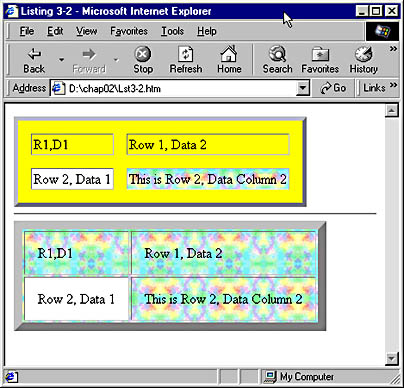
Figure 3-2. Two tables that illustrate basic table formatting.
The BACKGROUND attribute allows you to display an image behind a cell or an entire table; simply set this attribute to the path of the desired graphic. The last cell in the first table demonstrates a cell-only background, while the second table shows a full-table background image.
These are only the most common formatting attributes; many more are supported. The BORDERCOLOR, BORDERCOLORLIGHT, and BORDERCOLORDARK attributes let you fine-tune the appearance of borders. Attributes named FRAME and RULES control which sides of the outer and inner borders display. You can also create table headers and footers using tags such as <THEAD> and <TFOOT>, and you can organize the information within tables using the <TBODY> tag. The <CAPTION> tag can be used to label a table. (The SBN Workshop Web site and the CD that accompanies this book both fully describe all of these additional tags and attributes. On the CD go to Workshop (References); DHTML, HTML & CSS; HTML References, and then Elements. To get to the online version, visit the MSDN Online Resource page at msdn.microsoft.com/resources/schurmandhtml.htm , or open the file named MSDN_OL.htm on the companion CD, and choose HTML Tags and Attributes.) Some versions of Netscape Navigator (including versions 3 and 4) will have problems with several of the listed attributes, including BGCOLOR and BACKGROUND. These problems are most evident with version 3.
Cells of Variable Size
Not all cells in a table need to be the same size. For instance, some rows might require only two cells, while others need four. Some cells might need to be two or more rows tall. To accommodate this variability, HTML provides the COLSPAN and ROWSPAN attributes. Code Listing 3-3 and Figure 3-3 offer an example of how you can use the COLSPAN attribute.
Code Listing 3-3.
<HTML> <HEAD> <TITLE>Listing 3-3</TITLE> </HEAD> <BODY> <TABLE BORDER="1"> <TR> <TD COLSPAN="2" ALIGN="center">Row 1, Data 1</TD> </TR> <TR> <TD>Row 2, Data 1</TD> <TD>Row 2, Data 2</TD> </TR> </TABLE> </BODY> </HTML> |
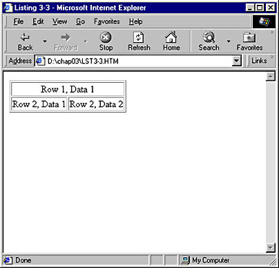
Figure 3-3. A table illustrating the use of the COLSPAN attribute.
The COLSPAN attribute specifies the width of a cell in columns. A cell normally fills one column. Setting COLSPAN to 2 causes a cell to span two columns; setting it to 4 creates a cell width of four columns. In Figure 3-3, you can see that setting COLSPAN to 2 causes the specified cell to be as wide as two of the cells in the adjacent row. Also notice that the ALIGN attribute has been set to center the contents of the cell. (Cell contents by default align to the left.) This technique of setting up a wide, center-aligned cell often comes in handy when you want to create a heading for a table.
Next let's take a look at a more advanced example of a table that uses both the COLSPAN and ROWSPAN attributes. Code Listing 3-4 contains the sample code; you can see the result that Microsoft Internet Explorer displays in Figure 3-4.
This example demonstrates two new techniques: the use of ROWSPAN and empty spacer cells. By setting the ROWSPAN attribute, you can create cells that are several rows tall, which is useful when you need to group types of data—in this case, apples and oranges. You can also use ROWSPAN and COLSPAN together to create cells that are both extra wide and tall, though we do not demonstrate this in the sample. Empty cells in the second row are denoted simply by a <TD> and </TD> tag pair, with nothing between the opening and closing tags. The Store 1 and Store 2 cells would have appeared at the far left of the row if we had not included these empty spacer cells.
Code Listing 3-4.
<HTML> <HEAD> <TITLE>Listing 3-4</TITLE> </HEAD> <BODY> <TABLE BORDER="1"> <TR> <TD COLSPAN="4" ALIGN="center"><B>Fruit Sales</B></TD> </TR> <TR> <TD></TD> <TD></TD> <TD>Store 1</TD> <TD>Store 2</TD> </TR> <TR> <TD ROWSPAN="2">Apples</TD> <TD>Day1</TD><TD>40</TD><TD>25</TD> </TR> <TR> <TD>Day2</TD><TD>30</TD><TD>30</TD> </TR> <TR> <TD ROWSPAN="2">Oranges</TD> <TD>Day1</TD><TD>40</TD><TD>25</TD> </TR> <TR> <TD>Day2</TD><TD>30</TD><TD>30</TD> </TR> </TABLE> </BODY> </HTML> |
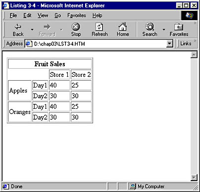
Figure 3-4. A table that illustrates the use of both the COLSPAN and ROWSPAN attributes.
Embedded Tables
An embedded table is exactly what you might expect: one table contained within, or embedded in, another. This technique provides a wide range of flexibility, allowing you to assign different background and border treatments to various parts of the table, and is often easier to use than ROWSPAN and COLSPAN. Code Listing 3-5 demonstrates the embedding of two smaller tables within a larger table. See Figure 3-5 to view how the listing is displayed.
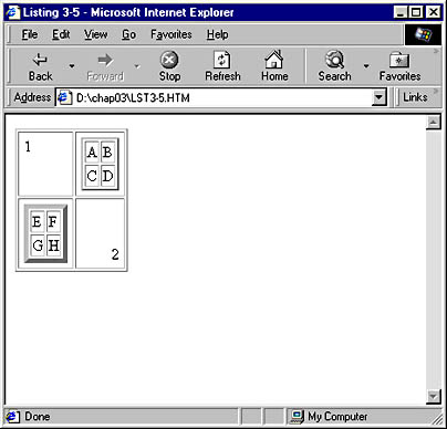
Figure 3-5. An example of embedded tables.
NOTE
Web browsers generally do not pay attention to where lines of code end in your HTML file. Because of this, we were able to combine several table data blocks (delimited by the <TD> and </TD> tags) into one line in Code Listing 3-4, saving space on the screen without sacrificing readability. You can see this in the row containing the Day1, 40, and 25 table data elements.
As you can see in Figure 3-5, the larger (outer) table in this example consists of two columns and two rows (four cells). The first and fourth cells in this table contain only simple numerical data (the numbers 1 and 2). The second and third cells, however, each contain a four-cell embedded table.
The code for the first cell also introduces a new attribute, VALIGN, which controls the vertical alignment of the contents of the cell. In this instance, we set VALIGN so that the cell contents appear at the top of the cell. In the fourth cell, we used both VALIGN and ALIGN to position the contents in the lower right corner of the cell. Also notice that we used the BORDER attribute to vary the width of the border around each table.
Code Listing 3-5.
<HTML> <HEAD> <TITLE>Listing 3-5</TITLE> </HEAD> <BODY> <TABLE BORDER="1" CELLPADDING="5"> <TR> <TD VALIGN="top">1</TD> <TD> <TABLE BORDER="2"> <TR><TD>A</TD><TD>B</TD></TR> <TR><TD>C</TD><TD>D</TD></TR> </TABLE> </TD> </TR> <TR> <TD> <TABLE BORDER="5"> <TR><TD>E</TD><TD>F</TD></TR> <TR><TD>G</TD><TD>H</TD></TR> </TABLE> </TD> <TD VALIGN="bottom" ALIGN="right">2</TD> </TR> </TABLE> </BODY> </HTML> |
NOTE
When you create embedded tables, the BORDER attribute can help with debugging. Regardless of whether your final product will contain borders, including them while you work allows you to see clearly where one table begins and another ends. This is important when you are creating complex tables that use COLSPAN and ROWSPAN, but especially so when you are creating multiple levels of embedding.
Tables as Layout Tools
Tables are perhaps the most important layout tool in conventional HTML. When you set the WIDTH and HEIGHT attributes for a table in combination with setting ALIGN and VALIGN attributes for cells, you can position items almost anywhere on a Web page. The code shown in Code Listing 3-6, for example, demonstrates how you can use a table to establish various regions on a page and specify that the regions contain different types of content. This example will dynamically resize as you resize your browser. Figure 3-6 shows how Internet Explorer displays the results.
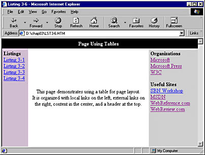
Figure 3-6. An example of using a table for page layout.
Code Listing 3-6.
<HTML> <HEAD> <TITLE>Listing 3-6</TITLE> </HEAD> <BODY TOPMARGIN="0" LEFTMARGIN="0"> <TABLE WIDTH="100%" HEIGHT="100%" CELLSPACING="0" CELLPADDING="5" BORDER="0"> <TR> <TD COLSPAN="3" ALIGN="CENTER" BGCOLOR="black" HEIGHT="25"> <FONT COLOR="white"><B>Page Using Tables</B></FONT> </TD> </TR> <TR> <TD BGCOLOR="thistle" WIDTH="70" VALIGN="top"> <IMG SRC="trans.gif" WIDTH="70" HEIGHT="0" BORDER="0"><BR> <B>Listings</B><BR> <A HREF="lst3-1.htm">Listing 3-1</A><BR> <A HREF="lst3-2.htm">Listing 3-2</A><BR> <A HREF="lst3-3.htm">Listing 3-3</A><BR> <A HREF="lst3-4.htm">Listing 3-4</A><BR> </TD> <TD ALIGN="center"> <IMG SRC="trans.gif" WIDTH="150" HEIGHT="0" BORDER="0"><BR> This page demonstrates using a table for page layout.<BR> It is organized with local links on the left, external links on the right, content in the center, and a header at the top. </TD> <TD VALIGN="top" WIDTH="25%" BGCOLOR="lightgrey"> <IMG SRC="trans.gif" WIDTH="120" HEIGHT="1" BORDER="0"><BR> <B>Organizations</B><BR> <A HREF="http://www.microsoft.com">Microsoft</A><BR> <A HREF="http://mspress.microsoft.com">Microsoft Press</A><BR> <A HREF="http://www.w3.org">W3C</A><BR> <BR> <B>Useful Sites</B><BR> <A HREF="http://microsoft.com/Workshop">SBN Workshop</A><BR> <A HREF="http://msdn.microsoft.com/">MSDN</A><BR> <A HREF="http://www.webreference.com">WebReference.com</A><BR> <A HREF="http://www.webreview.com">WebReview.com</A><BR> </TD> </TR> </TABLE> </BODY> </HTML> |
The table's WIDTH and HEIGHT attributes can be set either to pixel values or to a percentage of the screen size. In Code Listing 3-6, we set both attributes to 100 percent, which means that the table will take up all the allowable space in the window. Normally, a small margin exists around the contents of an HTML page, but we removed this margin by setting the <BODY> tag's TOPMARGIN and LEFTMARGIN attributes to 0. (Unfortunately, Netscape Navigator does not completely honor these attributes and will still display a small amount of white space at the perimeter of the page.) To ensure that there are no gaps between cells, we set the CELLSPACING attribute to 0. By making the table fill the entire window, we can treat the page like a grid and place items anywhere on the page. CELLSPACING has been set to 5 to prevent the text in the table from running right up against the edges of the cells.
NOTE
Generally, we feel it is much better to use a percentage WIDTH setting for a layout table than a pixel WIDTH setting. When a specific pixel width is set for a table, users who have screen resolutions different from that of the Web page author often end up with odd Web page displays. For example, if you create a table 640 pixels wide, intending it to take up the entire width of a low resolution screen, a user with a screen resolution of 1280 by 1024 will see the table taking up only half of the monitor's width. Through careful application of percentage WIDTH settings and the use of the transparent image technique discussed later in this section, a table that takes full advantage of screens at any resolution can be created.
The sample table has two rows and three columns. The first row consists of a single cell with COLSPAN set to 3, which extends the cell across the screen. This cell is used for the header.
The next row contains three cells. The first cell is set to a width of 70, which makes the cell 70 pixels wide. One potential problem is that some early browsers might not respect the WIDTH attribute of a <TD> tag and, as a result, create a cell that is too narrow. Such browsers, however, will not create a cell narrower than the widest item in the cell. Because of this, a common workaround is to place within the cell an invisible element of the desired minimum width. This can be accomplished with a transparent GIF file, sized according to the desired width of the cell. The sample file uses trans.gif, a one-pixel tall, one-pixel wide graphic that is only .043 kilobytes in file size. By using this image in the bottom left table cell and setting its corresponding <IMG> tag's WIDTH and HEIGHT attributes, we have restricted the minimum width of the cell in a way that should work in all browsers. This cell also uses a VALIGN of top to set the contents to the top of the cell.
The next cell uses the ALIGN attribute to center the contents of the cell. Cell contents are left-aligned and vertically centered by default. Therefore, in this case it is not necessary to explicitly set the VALIGN attribute. Because this cell has no set WIDTH, it will assume the width remaining after the first and last cells have reserved their spaces.
The last cell specifies a width of 25%. As a result, and in contrast to the first cell in this row, this last cell will change in width if the browser is resized. Using an image of a set width guarantees that the cell will never be narrower than a particular desired value. This prevents problems if a user resizes the browser window to be very small.
When you use tables for page layout, remember that setting the BORDER attribute can be a big help when you need to troubleshoot. For instance, if we were trying to create the same effect as in Code Listing 3-6, we would find that the code in Code Listing 3-7 contains a mistake. On the screen display, shown in Figure 3-7, the borders help you see the error. The table clearly contains too much space between cells—and when you check the code, you find that CELLSPACING has been set to 10 instead of 0, causing the extra space.
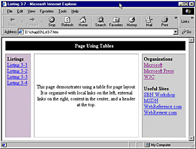
Figure 3-7. Using the BORDER attribute to troubleshoot tables.
NOTE
In the first column, we used an image sized to the minimum desired cell width in order to prevent the cell from getting smaller and causing the text in the cell to wrap undesirably. Instead of setting a minimum width, we could have prevented the text in the cell from wrapping in other ways. For example, we could have used the NOWRAP attribute on the <TD> tag for this cell. NOWRAP will prevent any text wrapping in a cell that is not explicitly set by the author. We also could have used a nonbreaking space character entity rather than a normal space after the word listing (listing 3-1 instead of listing 3-1). This entity treats the word listing and the following number as one word, instead of two. You can learn more about character entities in Chapter 4.