| You can change a button component's dimensions, change its label text, add an icon to customize the button, set the button's visibility, and set the button to act as a toggle. To modify button-component dimensions 1. | Continuing with the file you used in the preceding task, on the Stage, select the instance of MyBtnComponent.
| 2. | In the Parameters tab of the Property inspector, in the W and H fields, enter new values for width and height (Figure 12.22).
Figure 12.22. To change the dimensions of a button component instance, access the Parameters tab of the Property inspector and enter new width and height values in the W and H fields. 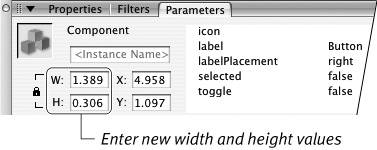
By default, the W and H fields are locked, so Flash preserves the component's aspect ratio (the ratio of width to height) when you enter new values. For this task, click the lock icon to deactivate the locked-aspect-ratio mode. Then enter the same value in both the W and H fields to create a square button.
| 3. | Press Enter to confirm the new value(s).
The button's dimensions change according to the value(s) you enter (Figure 12.23). The bounding box of the button defines the active area of the button. As you change the dimensions, Flash automatically changes the hit area for the button component to match.
Figure 12.23. You can change the rectangular Button component to a square by entering the same value for width and height (here it's 100 pixels). You must first deactivate the component's locked-aspect-ratio mode. In the Parameters tab of the Property inspector, click the lock icon to put the width and height fields in the unlocked mode. 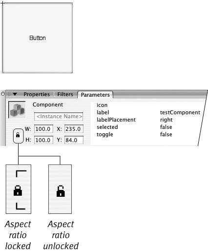
|
 Tips Tips
There are other ways to resize the button component. You can select the component instance and resize it using the Transform panel or the free-transform tool. Alternately, you can enter new width and height values in the Info panel. You can also rotate or skew a button component with the free-transform tool or Info panel. You should know, however, that Flash creates the button's label text using device fonts, which can't be rotated or skewed. If you rotate or skew a button component, its label text disappears. You can position your button precisely by entering values in the x- and y-coordinate fields of the Info panel or the Properties or Parameters tab of the Property inspector. Don't be confused by the minHeight and minWidth parameters in the Component inspector. Flash uses these parameters behind the scenes to resize the component as needed at runtime. More advanced Flash users who create their own applications can access these parameters via ActionScript to set up behind-the-scenes resizing rules.
The Mystery of Components The Button is just one element in Flash's set of user interface components. These components contain built-in coding that makes them easy to use. Macromedia designed them to work together to give an application or Web site a consistent look and feel. Components are sophisticated, scripted movie-clip symbols whose scripts have been compiled to save time during publishing. Unlike regular symbols, compiled symbols (also called .swc files) aren't directly editable within the authoring environment. Each component has its own editable parameters, however. Flash assists you in modifying these parameters through the Component inspector panel. More experienced Flash developers can change the look of components by editing the underlying theme, style, and skin files on which components are based. Advanced scripters can change the look of components during playback via ActionScript. These modification techniques are beyond the scope of this book. Although many of the advantages of components belong to advanced Flash authors who can use ActionScript to make components communicate with one another and to change them on the fly at runtime, even someone unfamiliar with scripting can use simple components to add interactivity to a project. All the components that come with Flash appear in the Components panel. One of the beauties of components is that advanced scripters can create their own components and share them with other Flash authors. One source for new components is the Macromedia Exchange portion of the Macromedia Web site. As third-party components become available, you can add them to your Components panel for easy access. |
To modify button-component labels 1. | Continuing with the file you used in the preceding task, on the Stage, select the instance of MyBtnComponent.
| 2. | Access the Component inspector.
In Flash Professional, the panel has three sections: Parameters, Bindings, and Schema. In Flash Basic, only the Parameters section appears.
| 3. | If Parameters isn't active, click the Parameters button (Mac) or tab (Windows) to view the component's parameters.
The panel displays a two-column table (Figure 12.24). The first column contains the parameter names; the second column contains the value for each parameter.
Figure 12.24. The Component inspector (Flash Professional shown here) displays all the parameters of the button component that you can modify during authoring. 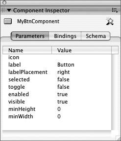
| 4. | To modify the text that appears on your button instance, in the row for label, click the value Button.
Flash activates the text field and selects the name; enter a new name, such as testComponent (Figure 12.25).
Figure 12.25. In the Component inspector (Flash Basic shown here) click the value field in the label row to activate text entry. Type your new label text. Press Enter to confirm the new label. 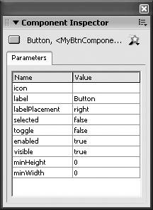
| 5. | Press Enter, or click outside the active text field.
With Flash's default settings, the new label text appears within the button-component instance (Figure 12.26). If you don't see the new text, choose Control > Enable Live Preview. Be forewarned, if your text is wider than the button instance, Flash will truncate the text to make it fit within the visible button area.
Figure 12.26. With Live Preview Enabled active, Flash previews your new label text in the button instance on the Stage. 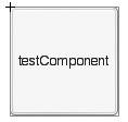
|
Tip
To set the button to act as a toggle 1. | Select an instance of a button component on the Stage.
| 2. | In the Component inspector or in the Parameters tab of the Property inspector, set the toggle value to true (Figure 12.27). Click anywhere in the row labeled Toggle, to activate the value pop-up menu. Click the value field to open the menu and select true. The button now acts as a toggle, so repeated clicks turn the button on and off (Figure 12.28).
Figure 12.27. When you select the Toggle value in the Parameters section of the Component inspector (top) or in the Parameters tab of the Property inspector (bottom), you can access a menu for choosing a value of true or false. 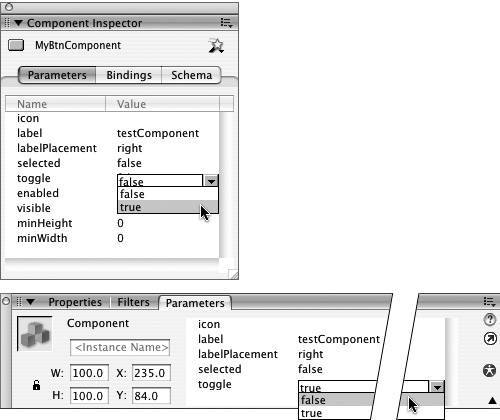
Figure 12.28. When the button component instance has a toggle value of true, it acts as a toggle button. Here the button component instances are viewed on the Stage with live preview enabled. The button on the left is selected, and the one on the right is deselected. When printed in grayscale, the difference is subtle. The border is slightly darker in the deselected button. In color, the border of the selected button is neon-green, and the deselected border is gray. 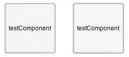
|
Tips The Parameters tab of the Property inspector and Parameters section of the Component inspector also contain a field for the button component's selected value (the choices are true and false). Use the selected value to set a toggle button's initial state (true sets the button to be selected initially; false sets the button to be deselected initially). To open the value pop-up menu quickly, double-click the value in the toggle row.
|