Chapter 12: Visualizations with Charts and Maps
|
Just because you're creating reports doesn't mean that you need to present your data in a dull, plain-vanilla format. Images such as graphs, charts, and maps will aid your report users in better understanding the relevant information of your reports. The truth is that for the majority of people, data is best understood if presented graphically.
In this chapter, we explore enhancing your reports through a variety of graphical means. Crystal Reports provides a number of different chart and graph templates (included newly added Gantt, Gauge, and Numeric Axis charts), as well as an impressive graphical mapping function (useful for identifying trends).
Understanding the Chart Expert
Crystal Reports contains 11 different chart types. Chart types define the kind of chart in which the data will display. Chart types include bar charts, line charts, and pie charts. To access these and other chart types, you utilize the Chart Expert. The Chart Expert is where you select a chart type and define how the data will be used to make up the chart.
To access the Chart Expert, go to the menu bar. Select Insert, Chart Expert. The Chart Expert dialog box displays, as shown in Figure 12-1.
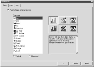
Figure 12-1: The Chart Expert
You'll notice three tabs at the top of the Chart Expert. These tabs perform the following functionality:
-
Type: This tab allows you to choose the type of chart you wish to create.
When you select one of these charts, you'll notice a set of chart options display to the right of the Chart type list box (these options display as thumbnails). These different options allow you to further specify the format of the chart. There's a description of each of these options below the thumbnails.
Table 12-1 summarizes the different chart types and layouts available within Crystal Reports.
Table 12-1: The chart types of Crystal Reports Chart Icon
Chart Type
Description

Bar
Displays data using a series of vertical bars. This chart is also known as a column chart.

Line
Displays data as a series of points connected by a line.

Area
Displays data as an area filled with a color or a pattern.

Pie
Displays data as a pie separated into slices that are filled with a color or a pattern.

Doughnut
Displays data as sections of a circle (or doughnut). These sections are filled with a color or a pattern.

3D Riser
Displays data in a series of three-dimensional objects. These objects display side by side.

3D Surface
Displays data in a topographic view.

XY Scatter
Displays a collection of plotted points, which represent data in a pool of information. These charts are useful for determining trends.

Radar
Displays group data at the perimeter of the radar and then places numeric values that make up the group from the center of the radar to the perimeter.

Bubble
Displays data as a series of bubbles, where the size of the bubble is proportional to the amount of data. This chart is an extension of the XY Scatter chart type.

Stock
Displays the high and low values of data.

Numeric Axis
Displays a bar, line, or area chart that uses a number field (or date/time field) as its "on change of" field.

Gauge
Displays a dial that shows a small number of data values.

Gantt
Displays horizontal bars used to provide a graphical illustration of a schedule.
-
Data: This tab allows you to choose the chart layout — in other words, where the data that makes up the chart comes from.
-
Text: This tab allows you to define any text that should display within the chart, such as a chart title, subtitle, or titles on the group or data itself.
Before jumping into the creation of a chart, take some time to look through the functionality of these different tabs.
Working with the Type Tab
The Chart Expert Type tab allows users to select the type of graphical chart to create from your data. Considering the different chart types and their options, there are over 40 different charts that you may utilize within your report. Table 12-1 lists the basic chart types that Crystal Reports provides.
To get a feel for the Chart Expert, let's create a new report example. Create a new report using the Customer and Orders tables. Allow the Smart Linking feature to link these tables or refer to the ER Model diagram in Appendix A.
Once you're at the Report Design area, perform the following:
-
Create a group using the Region field (available within the Customer table).
-
Add the following fields to the Details section:
-
Customer Name (from the Customer table)
Place this field at the 1" mark.
-
Order Date (from the Orders table)
Place this field at the 3.5" mark.
-
Order Amount (from the Orders table)
Place this field at the 5.5" mark.
-
-
Create a subtotal for the Order Amount, adding the subtotal after each region.
You can create this Summary field by right-clicking on the Order Date field. From the options menu, select Insert, Summary. Here you can define this summary field. Check out Chapter 9 for more information.
-
Change the Order Date format from date/time to just a date format.
From the Format Editor, select the Date and Time tab, and change the date format to mm/dd/yyyy. Check out Chapter 11 if you need a refresher on how to perform these steps.
-
In the Field Explorer pane, right-click on the Parameter Fields node.
An options menu displays. From this menu, select New. The Create Parameter Field dialog box displays.
-
In the Create Parameter Field dialog box, enter the following information:
-
In the Name field, type Order Date.
-
In the Prompting text field, type Please Enter Order Date:.
-
In the Value type drop-down list, select Date.
-
Select the Range value(s) option.
-
-
Press the OK button in the Create Parameter Field dialog box.
-
From the menu bar, select Report, Select Expert.
The Choose Fields dialog box displays.
-
From the Report Fields node (in the Choose Fields dialog box) select Orders.Order Date. Press OK.
The Select Expert displays.
-
In the Comparison operator drop-down field, select Is Equal To.
-
In the Comparison value drop-down field, select ?Order Date.
If you don't see this value within your drop-down fields, you can always type {?Order Date} in the parameter field.
Once you've done these steps, press the OK button in the Select Expert. Then, preview your report. An Enter Parameter Values dialog box displays. In the date range fields, type in 12/1/2001 to 12/31/2001, as shown in Figure 12-2.
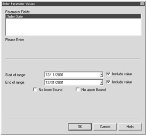
Figure 12-2: Dynamically selecting a date range for your report records
Once you've done this, press the OK button. You're asked if you'd like to use saved data or refresh your data. Refresh your data. You're returned to the Report Design area.
If you'd like, create a title for this report: Customer Sales by Region. This type of report is something utilized frequently by marketing departments. Figure 12-3 displays what your report should look like.
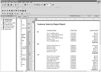
Figure 12-3: The start of Customer Sales by Region report
Once you've created this report, let's enhance it by adding a chart. In this chart, let's highlight the order amounts of the regions. Perform the following steps, using the report you just created in this chapter:
-
Access the Chart Expert by selecting Insert, Chart from the menu bar.
The Chart Expert displays.
-
Select the Type tab, which allows you to choose the type of chart you wish to use.
For this report, select the Bar chart type.
-
Select the following bar chart option: Side by side bar chart with 3D visual effect.
Figure 12-4 displays the bar chart option you should select for this example.
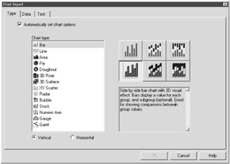
Figure 12-4: Selecting the side by side bar chart with 3D visual effect
Once you've selected this chart option, select the Data tab.
| Note | Within the Type tab of the Chart Expert, notice that the Automatically set chart options check box is checked by default. Checking this check box allows Crystal Reports to use its default chart formatting options and hides the Options and Axes tabs. If you wish to view and change the default chart options of Crystal Reports, uncheck this check box so you'll then have access to these two additional tabs. |
Working with the Data Tab
The Chart Expert Data tab allows you to select the specific data that makes up the chart. This tab also allows you to define how you wish to place the chart on the report.
Depending on the different chart type options that you've selected, the appearance of this tab may change. However, the Data tab is usually made up of the following three sections:
-
Placement: Allows you to select the location of the chart on the report and how the chart will recur throughout the report.
-
Layout: Defines the different data selection options that the chart allows — for example, Advanced (which provides optimal control of charting options), Group (which is the default layout and allows two drop-down boxes to specify the creation of your chart when you access the Data section), Cross-Tab (which only appears when your report is a Cross-Tab report), and OLAP (which only appears when your report utilizes an OLAP data source).
-
Data: Allows you to define the information that makes up the chart.
Continuing with your chart creation, select the following in the Data tab:
-
Within the Placement section, make sure the following is selected in the Place chart drop-down field: Once per report.
-
Also in the Placement section, select the Header option button.
-
In the Data section, make sure the following is selected in the On change of drop-down field: Customer.Region.
-
Also in the Data section, make sure the following is selected in the Show drop-down field: Sum of Orders.Order Amount.
Figure 12-5 displays what your Data tab should look like.
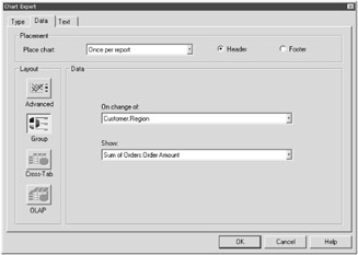
Figure 12-5: The Data tab
Once you've selected this information, select the Text tab at the top of the screen. The Text tab displays.
Working with the Text Tab
The Chart Expert Text tab allows you to define and format the titles that you wish to display within your chart. If you leave any of the text fields blank in this tab, that particular title will not display within your chart.
Before exploring this tab, notice that all check boxes are selected by default. Also, all the text fields next to these check boxes are dimmed. This means that Crystal Reports is automatically adding titles, based on the data within the chart. To change any of these titles, uncheck the check box. The text field then becomes active, allowing you to add or edit text.
To get a feel for this tab, continue with the chart that you've been creating within this chapter.
-
Uncheck the check box next to the Title text field.
This text field now becomes active, allowing you to modify it as you wish.
-
Change the Title text field to: Sum of Order Amount by Region.
-
Uncheck the check box next to the Group title text field.
-
Delete all text from the Group title text field.
Your screen should look like Figure 12-6.
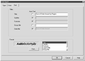
Figure 12-6: Modifying your chart within the Chart Expert Text tab -
To change the format of this title, go to the Format section of the Text tab.
Select Title from the list box (if it is not selected already).
-
Press the Font... button.
The Font dialog box displays, as shown in Figure 12-7.
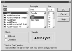
Figure 12-7: The Font dialog boxIf you're familiar with Microsoft Word or Excel, you've probably seen this Font dialog box before. The Font dialog box provides the functionality to determine a different text style for your chart text.
-
In the Font dialog box, change the following:
-
Change Font style to Bold Italic.
-
Change Size to 14.
-
-
Press the OK button in the Font dialog box.
You're returned to the Chart Expert.
-
Press the OK button in the Chart Expert.
You're returned to the Report Design area. Preview your report. Your screen should look like Figure 12-8.
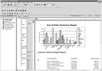
Figure 12-8: A report that utilizes a chart
| Tip | Keep in mind that the chart displayed in the Design tab is not your completed chart; it's just a graphical representation. You'll need to preview your report to actually see the correct orientation of your chart. |
Editing Your Created Chart
If for some reason you're not happy with the appearance of your chart, simply right-click on the chart. An options menu displays. From there, select the Chart Expert option. The Chart Expert dialog box displays, containing the information from your defined chart. From here, you can fine-tune your chart as needed.
Drilling Down on Chart Data
One of the nice features of charts created in Crystal Reports is that they contain drill-down functionality. In other words, you can double-click on a particular segment of your chart (basically, any area where the cursor turns into a magnifying glass), and a drill-down tab is created. This drill-down tab contains the detail that makes up that segment within your chart.
As an example, try double-clicking the "Lombardia" bar of your chart. A drill-down tab is created for Lombardia, as shown in Figure 12-9. In this new tab, you can view the information that makes up the total of the Lombardia bar within your chart.
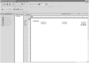
Figure 12-9: The drill-down tab of a chart
|
EAN: 2147483647
Pages: 177