Table Rendering Swing controls delegate the job of painting themselves to look-and-feel specific UI classes. The JTable UI classes in turn use helper classes called renderers to draw the contents of the table cells and the column headers, if there are any. Because most of the drawing functionality is implemented by renderers and not directly by the table's UI classes, it is much easier for a developer to customize the way in which the table's content is presented. Rendering Basics Drawing a table is a multi-step process carried out by the tables UI class when some or all of the table needs to be repainted. Here's how it works: -
The table is filled with its background color. -
The grid lines, if any, are drawn in the appropriate color (as set using the JTable setGridColor method). A table may have no grid lines, horizontal lines, vertical lines, or both. By default, these lines are solid and one pixel wide. -
The table cells are drawn, one by one. If the whole table is being redrawn, this operation works from top to bottom in rows and from left to right across each row. Often, only a portion of the table is visible or only a part of the table needs to be redrawn, in which case only the cells in the affected area will be re-rendered. Because of this, you should not make any assumptions about the order in which cells will be drawn when implementing a custom renderer. The Swing package includes renderers that can be used to draw cells that contain various types of data. Without any extension, the table can display data of the following types: Numbers. That is, objects derived from java.lang.Number, which includes all the Java numeric types like integer, Float, and Double. Numbers are displayed right-justified in their table cells. Booleans. A Boolean is represented by a check box, which is selected if the cell contains the value true and deselected if it contains false. Dates. A date is rendered using a DateFormat object (from the java.text package) in a format suitable for the system's default locale. Icons. If a cell contains an object that is derived from ImageIcon, the icon will be displayed, centered, in the cell. Although this allows you an easy way to incorporate a bare image in a table, you will often want to add some text to the icon. To do this, you'll need to implement your own renderer, an example of which will be shown later in this section. Any object that doesn't fall into any of the categories above is displayed, left-aligned, in the form of a text string obtained by calling the objects tostring method. While this might produce acceptable results in some cases, many objects need a custom renderer to display them properly. The most obvious (and common) case in which this is not true is a cell containing a string, for which the default behavior is perfectly acceptable. As well as the type of the object being displayed, there are two other criteria that partly determine how a particular cell should look, namely whether the cell is selected and whether it has the focus. These criteria are taken into consideration by all the default renderers and cause the background and foreground colors of the cell to be changed. In addition, the single cell that has the current focus (that is, the one that the user last clicked) is usually shown with a border. Core Note Starting with Swing 1.1.1 and Java 2 version 1.2.2, it is possible to supply an HTML string as the text for a Jlabel. The default renderers for JTable are based on JLabel and, as a result, it is possible to store HTML in the TableModel and have it displayed in the table. Alternatively, you can write a custom renderer that takes the content of a cell from the TableModel, wraps it in HTML, and then uses it to set the text of the JLabel that does the actual rendering. There is, however, extra overhead involved in using the HTML support. Whether this overhead is acceptable depends on the performance requirements of your application. In general, implementing a custom renderer is probably more efficient than using HTML to achieve the same effect, but requires more development effort.
There are two ways to control the choice of renderer for a given cell in a JTable: Override the table's getCellRenderer method to choose a specific renderer for an individual cell. This requires you to subclass JTable, which is not always desirable. Use the default mechanism, which chooses the renderer based on the cell's column or the class of the object in that column. As mentioned earlier, there are default renderers installed in the table that will render many types of objects properly without the need to explicitly configure custom renderers or to specify special action for individual columns. As you'll see later in this chapter, it is possible using this mechanism to select a specific renderer for each cell in the table without overriding getCellRenderer and hence without needing to subclass JTable. In this chapter, we'll use the column-based mechanism because it does no require subclassing JTable. Core Note You may be wondering why I consider subclassing JTable to select a cell-specific renderer a big issue. In many cases, there is no problem with doing this and, if you need to have different renderers for each cell, you should certainly consider subclassing JTable and overriding getCellRenderer to do so. Sometimes, though, it is better not to subclass JTable. This can be the case if you are using an integrated development environment (IDE) with a graphical user interface (GUI) builder that allows you to drag components and drop them onto a form and generates the Java code to create the corresponding layout for you. In this case, the IDE will generate code to instantiate JTable objects. Unless you want to edit the IDE's code, which will make it harder for you to change the layout in the GUI builder at a later date, you can't arrange for thisn code to use a JTABLE subclass with an overloaded getCellRenderer method. Instead, you have to get a reference to the table and use that to set up the correct renderers using the techniques you'll see here. In general, for the application developer, it is usually better, wherever possible, to tailor components by setting properties rather than by subclassing them.
Selecting the Renderer for a Column If you don't override the getCellRenderer method, the table selects a cell's renderer based on the column that the cell resides in. When choosing a renderer for a column, the table first looks at the TableColumn object that represents that column in the table's TableColumnModel. This object contains a renderer attribute that selects a particular renderer for that column, which can be set and retrieved using the following TableColumn methods: public void setCellRenderer(TableCellRenderer renderer); public TableCellRenderer getCellRenderer(); TableCellRenderer is an interface that must be implemented by every renderer; you'll see how this interface is defined in "Implementing a Custom Renderer". Although you can use this mechanism to select a specific renderer for a particular column, most simple tables are created with a default TableColumnModel that is built automatically from the table's data model. The columns in this TableColumnModel do not have specific renderers configured. When a column does not have a particular renderer selected, the table user interface (UI) class chooses a renderer based on the class of the objects that the column holds. To make this possible, the TableModel interface includes a method called getColumnClass that returns a Class object that is supposed to indicate the type of data that resides in that column. It is used to select a renderer from the default set configured when the table is created. Because these renderers are chosen using the column data's class, they are referred to as class-based renderers to distinguish them from the column-based renderers configured in a TableColumn object. In this chapter, you'll see examples of both class-based and column-based renderers. Core Note When it comes to the implementation, there is no inherent difference at all between class-based and column-based renderers indeed, a particular renderer could be used as both a class-based renderer. In any particular table, the term used describe a specific renderer depends only on how that renderer was chosen. Usually, however, a column-based renderer is a more refined version of a class-based one. For example, you might want to use the default number renderer for all numbers apart from those in the rightmost column of a table, which may, for some reason, need to show numbers in a larger font or in a different color. You can't make this distinction based on the class of the object in the column, because all the numeric columns will be of some type derived from Number, such as Integer, and so will all default to the same renderer. Instead, you need to override the default choice for the column that needs special treatment by assigning a column-based renderer that can do the special formatting for you.
The default class-based renderers were listed earlier in this chapter. If you need to, you can add a new class-based renderer to a table using the JTable setDefaultRenderer method: public void setDefaultRenderer(Class columnClass, TableCellRenderer renderer); The columnClass argument determines the class of the objects that this renderer can draw. Similarly, you can find out which renderer will be used to display an object of a given class by using the getDefaultRenderer method: public TableCellRenderer getDefaultRenderer( Class columnClass); Because the default renderers installed by JTable include a generic renderer for java.lang.Object, this method will always return a renderer no matter what argument it is given. Note that the names of these methods refer not to class-based renderers but to default renderers. The terms class-based renderer and default renderer are, in fact, used interchangeably and mean the same thing. The process of determining which class-based renderer to use is a recursive one. First, the set of default renderers is searched for one whose assigned class matches exactly the one given as the argument to the getDefaultRenderer method. If there isn't a renderer for this class, getDefaultRenderer invokes itself, passing the superclass of the class it was given as its argument. Ultimately, if no renderer is registered for any of the superclasses of the class it was originally passed, it will find and return the renderer for java.lang.object. As an example, suppose a table contains two columns, one of which has objects of type java.math.BigDecimal and the other of type java.lang.string. Suppose also that no custom class-based or column-based renderers have been installed in this table, so that only the default class-based renderers will be used. When the first column is being drawn, a renderer for Java.math.BigDecimal is needed. Because there isn't one, the next step is to look for a renderer associated with the superclass of BigDecimal, which is java.lang.Number. This search succeeds, finding the default renderer for Number objects installed by the table. Similarly, drawing the cells for a column containing strings first entails a search for a renderer for java.lang.String; again, this fails, but the search for the superclass, java.lang.Object, will find the last-ditch Object renderer. A Simple Rendering Example the Currency Table Let's see how the default renderers operate by looking at a simple example. The table in Figure 6-1 shows (fictional) exchange rates (against the US dollar) for a selection of currencies on two successive days. The columns in this table show the currency name, the exchange rate on the first and second days, and the amount by which the exchange rate changed between the two days. You can run this example using the command Figure 6-1. The basic currency table with no custom renderers.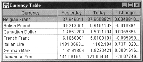 java AdvancedSwing.Chapter6.CurrencyTable The table model that was used to create this example is shown in Listing 6-1. This model will be used throughout this section and will remain unchanged as the table's appearance is enhanced by using custom renderers. Listing 6-1 The Currency Table Model package AdvancedSwing.Chapter6; import javax.swing.*; import javax.swing.table.AbstractTableModel; // Data for table examples public class CurrencyTableModel extends AbstractTableModel { protected String[] columnNames = {"Currency", "Yesterday", "Today", "Change" }; // Constructor: calculate currency change to // create the last column public CurrencyTableModel() { for (int i = 0; i < data.length; i++) { data[i][DIFF_COLUMN] = new Double( ((Double)data[i][OLD_RATE_COLUMN]). doubleValue() - ((Double)data[i][NEW_RATE_COLUMN]). doubleValue()); } } // Implementation of TableModel interface public int getRowCount() { return data.length; } public int getColumnCount() { return COLUMN_COUNT; } public Object getValueAt(int row, int column) { return data[row][column]; } public Class getColumnClass(int column) { return (data[0][column]).getClass(); } public String getColumnName(int column) { return columnNames[column]; } protected static final int OLD_RATE_COLUMN = 1; protected static final int NEW_RATE_COLUMN = 2; protected static final int DIFF_COLUMN = 3; protected static final int COLUMN_COUNT = 4; protected static final Class thisClass = CurrencyTableModel.class; protected Object[][] data = new Object[][] { { new DataWithIcon("Belgian Franc", new ImageIcon(thisClass.getResource( "images/belgium.gif"))), new Double(37.6460110), new Double(37.6508921) , null }, { new DataWithIcon("British Pound", new ImageIcon(thisClass.getResource( "images/gb.gif"))), new Double(0.6213051), new Double(0.6104102), null }, { new DataWithIcon("Canadian Dollar", new ImageIcon(thisClass.getResource( "images/Canada.gif"))), new Double(1.4651209), new Double(1.5011104), null }, { new DataWithIconf"French Franc", new ImageIcon( thisClass.getResource("images/franee.gif"))), new Double(6.1060001), new Double(6.0100101) , null }, { new DataWithIcon("Italian Lire", new ImageIcon(thisClass.getResource( "images/Italy.gif"))), new Double(1181.3668977), new Double(1182.104), null }, { new DataWithIcon("German Mark", new ImageIcon(thisClass.getResource( "images/germany.gif"))), new Double(1.8191804), new Double(1.8223421), null }, { new DataWithIcon("Japanese Yen", new ImageIcon(thisClass.getResource( "images/japan.gif"))), new Double(141.0815412), new Double(121.0040432), null } }; } This is a straightforward implementation of the TableModel interface, in which the data is held in a two-dimensional array of Objects and the column names are held in a separate string array. As usual, the getColumnName method provides the name associated with each column and the getValueAt method the data for each individual cell. The interesting pieces of this particular example are the getColumnClass method and the data array. The get-ColumnClass method is supposed to return the Java Class object representing the type of data held in a given column; this information is used to select a default renderer if the corresponding column does not have a specific renderer assigned to it. Here, the getColumnClass method extracts the data entry for the top row of the column and calls getclass on it to determine its data type. This is a useful technique that you can use to avoid hard-coding specific classes for each column in your table models. Core Alert While this is a useful shorthand when you know that all the entries in a column will be of exactly the same type, there are cases where you need to be careful. Suppose, for example, that a column contains a mixture of objects all derived from java.lang.Number. If the first row contains an object of type java.math.BigDecimal, using this technique would result in getColumnClass returning java.math.BigDecimalas the column calss for this column. Now suppose the second row contains an object of type java.lang.Integer. Ahough this type is derived from Number, it is not derived from BigDecimal. If you have installed custom class-based renderers for BigDecimal and Integer, they will override the default Number renderer and you will find that the BigDecimal renderer is called for all the rows in this column, while the Integer renderer is never invoked. This is probably not what you intended. In fact, there is no simple way to get the correct renderer invoked for each cell (because the selection is based only on the column and so only one renderer can be chosen for each column) and the best you could do would be to create a merged renderer that could deal with either of these types and return java.lang.Number as the column class. You would also need to assign your merged renderer as the default for objects of type Number. Later in this chapter, you'll see how to create renderers that behave differently for individual cells within a column.
The table data is held in the data array, in row order. Each row has data for a single currency and contains four entries: DataWithIcon object Double representing the exchange rate for the currency on the first day Double holding the exchange rate on the second day Double representing the change in exchange rate over the two days The DataWithIcon class holds a text string and an Icon. In this example, only the text string, which represents the currency name, will be used; the icon will be used later to demonstrate a custom renderer. The exchange rates are coded directly into the table data (in a real-world program, of course, all this data would be retrieved from some external source, such as a database) and the data model's constructor runs through the data to fill in the fourth column, which contains the difference between the two rates, when the table model is created. This task could have been deferred to the getValueAt method, which would have been implemented to return the difference between columns 2 and 1 when asked for the value of column 3. Because the data in this particular table model is constant, it is slightly more efficient to calculate the difference once, but this would not be possible if the table data were dynamically updated from an external source. When the table is drawn, the table UI class checks each column for a column-based renderer. In this example, the source code for which is shown in Listing 6-2, the table's column model is created automatically so there are no column-based renderers installed. Instead, default renderers will be used for all of the data in the table. Listing 6-2 The Currency Table Example package AdvancedSwing.Chapter6; import javax.swing.*; import javax.swing.table.*; import java.awt.*; import java.awt.event.*; public class CurrencyTable { public static void main(String[] args) { JFrame f = new JFrame("Currency Table"); JTable tbl = new JTable(new CurrencyTableModel()); TableColumnModel tcm = tbl.getColumnModel(); tcm.getColumn(0).setPreferredWidth(150); tcm.getColumn(0).setMinWidth(150); tbl.setAutoResizeMode(JTable.AUTO_RESIZE_OFF); tbl.setPreferredScrollableViewportSize( tbl.getPreferredSize()); JScrollPane sp = new JScrollPane(tbl) f.getContentPane().add(sp, "Center"); f.pack(); f.addWindowListener(new WindowAdapter() { public void windowClosing(WindowEvent evt) { System.exit(0); } }); f.setVisible(true); } } Let's look first at what happens to the last three columns. All these contain Doubles, so getColumnClass returns java.lang.Double in all three cases. There is no renderer installed for Double, but there is a default renderer for its superclass, Number, which will be used for these three columns. As noted earlier and as can be seen in Figure 6-1, this renderer displays numbers right-justified within the space allocated to each cell. The first class is slightly more interesting. The type returned by getColumnClass for this column is DataWithIcon. Because this is a custom type (the implementation of which is shown in Listing 6-4), there is certainly no default renderer installed for it. However, DataWithIcon is derived from java.lang.Object, so the Object renderer will be used to draw the cells in the first column. As you already know, the Object renderer displays the text returned by the toString method of the data that it is rendering. For this to display the currency name, DataWithIcon implements toString in such a way as to directly return the name of the currency, which was one of the two objects used to initialize each instance of it in the data array. You'll notice from the code in Listing 6-2 that the first column is explicitly sized to ensure that there is enough room to show all of the currency name. There is no simple way to know exactly how wide a table column should be to safely accommodate all the data that it will display and, in most cases, it is best to set the size based on trial and error. Of course, this only works if you can be sure that you know in advance the maximum length of the data in the column and the font that will be used to display it. In the next section, you'll see how to calculate an appropriate size for a column based on the actual data that it holds. Implementing a Custom Renderer As the example you have just seen demonstrates, the default renderers give you an easy way to build tables that you can get by with, but you can create much more usable tables if you implement your own renderers. In this section, you'll see how to extend the default renderers to improve the appearance of the currency table a little; after that, we'll show you how to create some more interesting effects by implementing your own renderers from scratch. How the Default Renderers Work All table renderers (custom or otherwise) implement the TableCellRenderer interface. This interface has only one method, which is defined as follows: public Component getTableCellRendererComponent(JTable table, Object value, boolean isSelected, boolean hasFocus, int row, int column); The arguments passed to this method are almost self-explanatory: | table | The JTable being rendered | | value | The data value from the cell being drawn | | isSelected | true if this cell is currently selected | | hasFocus | true if this cell has the input focus | | row | The row number of the cell being drawn | | column | The column number of the cell being drawn | The getTableCellRendererComponent method returns a Component that is used to draw the content of the cell whose row and column numbers and data value were passed as arguments. Although a Component of any kind can be returned, the return value is usually a JComponent and, most often, is a class derived from JLabel (although you will see examples later that return other components). When the table UI class is drawing the table, it calls the getTableCellRendererComponent method of the renderer appropriate for the column in which a particular cell resides; this method can take whatever steps it needs to return a suitably-configured component, which is then used to draw the cell. Typically, the component might be customized by having suitable foreground and background colors set, along with an appropriate font and, if the component is a JLabel, the text to be displayed in the cell will be associated with it using the JLabel setText method. The table UI class is not actually concerned with the exact customization performed; when the component is returned, it adjusts its size to suit that of the cell in which its content is to be displayed and then renders it by simply calling its paint method. Note that the column argument to getTableCellRendererComponent is expressed in terms of the table's column model, not in terms of the column numbers of the TableModel. Therefore, if the user reorders the table columns, this number will change. All the default renderers installed by JTable when it is created (apart from the renderer for Booleans) are derived from a prototypical TableCellRenderer implementation called DefaultTableCellRenderer, which is derived from JLabel. Here are the public methods of the DefaultTableCellRenderer class: public class DefaultTableCellRenderer extends JLabel implements TableCellRenderer, Serializable { public DefaultTableCellRenderer(); public void setForeground(Color c); public void setBackground(Color c); public Component getTableCellRendererComponent(JTable table, Object value, boolean isSelected, boolean hasFocus, int row, int column); } Because this class is derived from JLabel, it has the ability to paint its own background, draw text in any given color, and with a user-defined font, display an icon and align the text and/or the icon as required. However, because the default renderers are actually installed by the table, you don't get the chance to directly configure them. In the example shown in Listing 6-2, the renderer used for the first column was a DefaultTableCellRenderer configured to show left-aligned text, while the renderer in the other three displays its text right-aligned. The default renderers do not have specific foreground and background colors or fonts assigned to them. The DefaultTableCellRenderer obtains its background and foreground colors and its font from the table that it is drawing on, using the table argument to the getTableCellRendererComponent method to access them. However, you can override these attributes by using the setForeground, setBackground, and setFont methods (the latter of which is inherited from JLabel). Although you would normally do this when creating your own renderer, you can, if you want, apply color or font changes to the default renderers by using the getDefaultRenderer method to obtain references to them. Here's an example: TableCellRenderer renderer = table.getDefaultRenderer(java.lang.Object.class); if (renderer instanceof DefaultTableCellRenderer) { ((DefaultTableCellRenderer)renderer).setFont( new Font("Dialog", Font.BOLD, 14)); } When this code has been executed, any cells rendered in this specific table by the default renderer for objects will use a 14-point, bold font. Notice that it is necessary to check first that the renderer is a DefaultTableCellRenderer, because the setFont method is not part of the TableCellRenderer interface. DefaultTableCellRenderer takes special action when the cell that it is drawing is selected or has the input focus. When the cell is selected, the default colors (or any specifically installed ones) are ignored and the cell is rendered with foreground and background colors configured in the table using the JTable setSelectionForeground and setSelectionBackground methods. When the cell has the input focus, a border is installed to make it stand out. You can see this border surrounding the cell in the first column of the first row in Figure 6-1. The specific border used is obtained from the Swing look-and-feel UIManager class like this: Border border = UIManager.getBorder( "Table.focusCellHighlightBorder"); If the cell has the focus and the underlying data in the model is editable, the usual colors are replaced by a pair of look-and-feel specific colors that can also be obtained from the UIManager class as follows: Color foreground = UIManager.getColor("Table.focusCellForeground"); Color background = UIManager.getColor("Table.focusCellBackground"); Creating a Renderer That Displays Decimal Numbers Now that you have seen how the DefaultTableCellRenderer works, it is a relatively simple matter to enhance it to create a custom renderer. If you look back to Figure 6-1, you'll notice that the figures shown in the rightmost three columns of the table are a little haphazard you probably wouldn't describe this as a neatly arranged or readable layout. These columns are drawn by the default renderer for objects derived from Number, which converts the number's value to text using the tostring method of the class that it is actually displaying (in this case java.lang.Double) and then arranges for the text to be drawn by using the setText method, which DefaultTableCellRenderer inherits from JLabel. The problem with this approach, as far as this example is concerned, is that the toString method of Double shows as many decimal places as are necessary to represent the number that the Double contains (at least until the total number of digits in the number is no more than 16). This means that the decimal points in the rows of the table don't line up very well, resulting in an untidy appearance. In practice, you would probably prefer to show exchange rates with a fixed number of decimal places visible; if you could create a renderer that did this, your table would look much neater, because the decimal points would be much closer together and you would not be displaying digits that the user doesn't need to see. Core Note Even if you use a renderer that shows a fixed number of decimal places, the decimal points still won't necessarily line up unless you use a constant-width font. Even with a proportional font, however the table looks much better with this approach.
To create a custom renderer that displays a fixed number of decimal places, there are actually two problems to solve: -
How to create a string that represents the value of a Number with a specified number of decimal places. -
How to arrange for the renderer to draw that string when presented with a Number from the table model. The first problem can be solved using the Java.text.NumberFormat class, which allows you to format numbers in various different ways. Among the constraints that you can apply when formatting numbers using this class are the maximum and minimum number of decimal places to be shown and the maximum and minimum number of digits used to represent the complete number. Using this class, you can arrange for exactly three decimal digits to be shown as follows: Number number = new Double((double)123.45678}; NumberFormat formatter = NumberFormat.getlnstance(); formatter.setMaximumFractionDigits(3); formatter.setMinimumFractionDigits(3); String formattedNumber = formatter.format(number.doubleValue()); With this code, the formatted result in the variable formattedNumber would be 123.456. If the variable number had been initialized to the value 123.4, then the result would have been padded to the right with zeroes, giving 123.400. Core Note If you are not familiar with the java.text package in general or the NumberFormat class particular, you'll find a good description of them in Core Java 2, Volume 2: Advanced Features (Prentice Hall).
Once you've got a string that represents the number as you want it to, the next problem is to arrange for the renderer to display it. Because we are creating a custom renderer, we have a choice between creating a completely new class that implements the TableCellRenderer interface or simply subclassing DefaultTableCellRenderer. Usually, it is simpler to take the latter course. By doing so, you get the benefits of the special action that DefaultTableCellRenderer takes for selected and focused cells and the ability to configure different background and foreground colors. This renderer is sufficiently simple that it can be implemented as a subclass of DefaultTableCellRenderer and that is the approach that we'll adopt. Later, you'll see examples in which it isn't convenient to subclass DefaultTableCellRenderer. The code for this particular renderer is shown in Listing 6-3. Listing 6-3 A Renderer for Decimal Numbers package AdvancedSwing.Chapter6; import java.text.*; import javax.swing.*; import javax.swing.table.*; // A holder for data and an associated icon public class FractionCellRenderer extends DefaultTableCellRenderer { public FractionCellRenderer(int integer, int fraction, int align) { this.integer = integer; // maximum integer digits this.fraction = fraction; //exact number of fraction // digits this.align = align; // alignment (LEFT, // CENTER, RIGHT) } protected void setValue(Object value) { if (value != null && value instanceof Number) { formatter.setMaximumIntegerDigits(integer); formatter.setMaximumFractionDigits(fraction); formatter.setMinimumFractionDigits(fraction); setText(formatter.format( ((Number)value).doubleValue())); } else { super.setValue(value); } setHorizontalAlignment(align); } protected int integer; protected int fraction; protected int align; protected static NumberFormat formatter = NumberFormat.getInstance(); } You can see this renderer in action using the command java AdvancedSwing.Chapter6.FractionCurrencyTable The result you get will look like Figure 6-2. Figure 6-2. A custom renderer for decimal numbers. The code for the FractionCurrencyTable class is almost identical to that shown in Listing 6-2, except that the FractionCellRenderer was added as a class-based renderer for objects derived from java.lang.Number: JTable tbl = new JTable(new CurrencyTableModel()); tbl.setDefaultRenderer(java.lang.Number.class, new FractionCellRenderer(10, 3, SwingConstants.RIGHT)); Because there is only one class-based renderer for each class, our new renderer will displace the default one for numbers installed by the table and will be used to render all cells containing objects derived from java.lang.Number, which, in this example, means all of the rightmost three columns. Now let's look at Listing 6-3 and see exactly how this renderer works. If you've been following the discussion up to this point, you will probably be surprised at what you see. Given that the core of a renderer is its getTableCellRendererComponent method, you might be wondering why our renderer doesn't override this method to set the text of the label to the string created by formatting the number obtained from the table. Other than the constructor, which just stores a few parameters, this renderer only has a set-Value method, which doesn't seem to get invoked anywhere and wasn't listed among the public methods of DefaultTableCellRenderer earlier in this chapter. So what's happening here? To understand how this renderer works, you need to look a little more closely at the getTableCellRendererComponent method of DefaultTableCellRenderer. Because our renderer extends DefaultTableCellRenderer, this is the method that will be invoked to configure a component for each cell. When this method is called, it does the following: -
If the cell is selected, it sets the foreground and background colors using those configured in the table. -
If the cell is not selected, it sets the foreground and background colors from those configured using setForeground and setBackground. If either (or both) of these methods has not been called, the table foreground and/or background color is used instead. -
If the cell has the focus, a border to highlight the focus is installed. Otherwise, an empty border is used. -
The label font is set to the font used by the table. -
The label is configured by invoking the setvalue method, passing the value obtained from the table. It is the last of these steps that is the important one for renderers derived from DefaultTableCellRenderer. As you can see from Listing 6-3, setValue is a protected method that takes the Object value from the table cell as its only argument. The default implementation just applies the tostring method to this object and uses the result as the text of the label, like this: setText((value == null) ? "" : value.toString()); The advantage of the setValue method is that you don't need to replace all of the getTableCellRendererComponent method and rewrite the code that implements the first four steps in the previous list when you want to create a custom renderer instead, you override setvalue and just replace as much of the tailoring of the attributes of the label as you need to. Our renderer behaves differently from the default one by applying special formatting for objects derived from Number. As you can see from Listing 6-3, the overridden setValue method verifies that the object it is passed is a subclass of Number and, if it is, uses the technique you saw earlier to create a string representation with the appropriate number of decimal places, uses setText to arrange for the JLabel from which the renderer is derived to draw it. The number of decimal places, and the maximum number of digits to the left of the decimal point, are supplied as arguments to the constructor and are supplied direcdy to the NumberFormat class. The required text alignment (swingConstants.LEFT, CENTER, or RIGHT) is also a parameter to the constructor and is applied directly to the component using the setHorizontalAlignment method. You can see from the example code shown earlier that the table shown in Figure 6-2 was drawn by a default renderer constrained to show three decimal places, with the text right -aligned, and Figure 6-2 confirms that each of the currency values has exactly three decimal places, with zero-padding on the right where necessary. There is one final point to be made about Listing 6-3. Notice that if the object to be rendered is not a Number, the superclass setvalue method is invoked. This is absolutely necessary, of course, because our new code will only work if it is passed a Number. However, it is possible that this renderer will be configured in a column or on a table that returns other types (perhaps only in some rows of the table) and in that case we want to at least display something. Invoking the superclass setvalue method causes a string representation of the object to be drawn. A Renderer for Text and Icons A common requirement in tables is the ability to draw icons to supplement or replace text. The table directly supports the rendering of icons in table cells when the cell contains an ImageIcon object that is, if you arrange for get-ColumnClass to return ImageIcon.class for a particular column, the ImageIcons held in that column of the table will be drawn, centered, into their cells. However, this functionality does not provide for mixing text and icons in the same cell. The first column of the currency table holds the name of each currency. It would make the table look much nicer if the national flag of the appropriate country could be displayed alongside the currency name. One way to achieve this is just to add an extra column to the model and store an ImageIcon of the country's flag in it. Because the table has a default renderer for icons, this is all you would need to change the table column for the flag would be generated automatically and the flag would be drawn by the ImageIcon renderer. While this would be simple, it would give an inferior result, because the flag and the currency name would be in separate columns. To arrange for them to appear in the same column requires another new renderer. Before looking at how this renderer is implemented, let's think a little about the basic requirement. What we want to do is display some text and an icon together in a cell. This is a very basic task that a JLabel is able to perform without needing any extra code. Given that DefaultTableCellRenderer is derived from JLabel, it is clearly a good choice to derive the new renderer from DefaultTableCellRenderer and use the setValue method to configure the label with both the text and the icon. Recall that setvalue gets only the object value stored in the table model for the cell being rendered so, to make our approach possible, this object must contain both the text and the icon together. This, of course, is why the CurrencyTableModel shown in Listing 6-1 used the class DataWithIcon to populate the first column of the table instead of a simple string holding the currency name. Listing 6-4 shows the definition of the DataWithIcon class. Listing 6-4 The DataWithIcon Class package AdvancedSwing.Chapter6; import javax.swing.*; // A holder for data and an associated icon public class DataWithIcon { public DataWithIcon(Object data, Icon icon) { this.data = data; this.icon = icon; } public Icon getIcon() { return icon; } public Object getData() { return data; } public String toString() { return data.tostring(); } protected Icon icon; protected Object data; } As you can see, this is a pure container class that just stores the opaque data and the Icon that are passed to its constructor and allows them to be retrieved later. Also, and very importantly, it implements a toString method that delegates directly to the toString method of whatever the data object happens to be. This toString method has been used by the default renderer for the Object class to arrange for the currency name to appear in the tables that you have seen in the earlier examples in this chapter. With the appropriate data in place and the decision to subclass DefaultTableCellRenderer made, the actual implementation, shown in Listing 6-5, is very straightforward. Apart from the fact that this renderer deals with an icon as well as text, it is pretty much identical to the last renderer you saw. The setValue method receives an object to render. If the object reference is not null and refers to a DataWithIcon instance, the text and icon are extracted from it and configured into the JLabel superclass of the renderer using the usual setText and setIcon methods. The label then takes care of displaying them both when the table UI class actually paints the cell. Of course, the implementation shown here is a pretty basic one. For one thing, it hard-codes the relative alignment of the text and the icon, both horizontally and vertically. A more complete implementation would allow these to be supplied as arguments to the constructor, much as the text alignment was made a parameter of the constructor of the Fraction-CellRenderer shown in Listing 6-3. Listing 6-5 A Renderer for Text and Icons package AdvancedSwing.Chapter6; import javax.swing.*; import javax.swing.table.*; public class TextWithIconCellRenderer extends DefaultTableCellRenderer { protected void setValue(Object value) { if (value instanceof DataWithIcon) { if (value != null) { DataWithIcon d = (DataWithIcon)value; Object dataValue = d.getData(); setText(dataValue == null ? "" : dataValue.toString()); setIcon(d.getIcon()); setHorizontalTextPosition(SwingConstants.RIGHT); setVerticalTextPosition(SwingConstants.CENTER); setHorizontalAlignment(SwingConstants.LEFT); setVerticalAlignment(SwingConstants.CENTER); } else { setText(""); setIcon(null); } } else { super.setValue(value); } } } To demonstrate this renderer, it needs to be connected to the first column of the currency table. You could choose to install this renderer as a class-based renderer for class DataWithIcon; in this case, to show the use of a column-based renderer, an instance of TextWithIconCellRenderer is installed as the renderer for column 0 of the table, thus overriding the default renderer that has been used for that column in the previous examples in this chapter: TableColumnModel tcm = tbl.getColumnModel(); tcm.getColumn(0).setPreferredWidth(150); tcm.getColumn(0).setMinWidth(150); TextWithIconCellRenderer renderer = new TextWithIconCellRenderer(); tcm.getColumn(0).setCellRenderer(renderer); You can see the effect that this renderer has on the table using the following command: java AdvancedSwing.Chapter6.IconCurrencyTable This produces the result shown in Figure 6-3. Figure 6-3. Rendering text and an icon in the same table column. Calculating the Width of a Table Column As you can see from Figure 6-3, the first column of the table now contains both the currency name and a national flag. It so happens that this column was manually sized to ensure that there is room for both the text and the icon to be visible at the same time. In fact, it is always necessary to explicitly set a column's width if you want to be sure that the content of each cell in that column is completely visible. However, it is possible to calculate the appropriate width for a table column, as the code in Listing 6-6 shows. Listing 6-6 Calculating Table Column Widths package AdvancedSwing.Chapter6; import javax.swing.*; import javax.swing.table.*; import java.awt.*; public class TableUtilities { // Calculate the required width of a table column public static int calculateColumnWidth(JTable table, int columnIndex) { int width =0; // The return value int rowCount = table.getRowCount(); for (int i = 0; i < rowCount ; i++) { TableCellRenderer renderer = table.getCellRenderer(i, columnIndex); Component comp = renderer.getTableCellRendererComponent( table, table.getValueAt(i, columnIndex), false, false, i, columnIndex); int thisWidth = comp.getPreferredSize().width; if (thisWidth > width) { width = thisWidth; } } return width; } // Set the widths of every column in a table public static void setColumnWidths(JTable table, Insets insets, boolean setMinimum, boolean setMaximum) { int columnCount = table.getColumnCount(); TableColumnModel tcm = table.getColumnModel(); int spare = (insets == null ? 0 : insets.left + insets.right); for (int i = 0; i < columnCount; i + +) { int width = calculateColumnWidth(table, i); width += spare; TableColumn column = tcm.getColumn(i); column.setPreferredwidth(width); if (setMinimum == true) { column.setMinWidth(width); } if (setMaximum == true) { column.setMaxWidth(width); } } } } The TableUtilities class provides two static methods that allow you to determine the appropriate widths for table columns. The calculateColumnwidth method works out how wide a single column needs to be to fit the data that it will contain, while setcolumnwidths is a convenience method that calculates the appropriate width for all the columns in a given table and configures their TableColumn objects appropriately. Let's look first at how calculateColumnWidth works. The width of a column depends both on the data that it will contain and on the renderer used to draw it. To find out how much space a column needs, you need to process every cell in the column and work out how wide its representation will be when drawn on the screen with the renderer that will be used for that column. That's exactly what calculateColumnWidth does. Because each cell in a table can theoretically have its own renderer, for each row in the column concerned the JTable getCellRenderer method is invoked to get the appropriate renderer for that row. Of course, unless the table has been subclassed and this method has been overridden, the same renderer will actually be returned for each row in the column, but this code cannot make that assumption. After locating the renderer, the rest of the loop walks down the column from the first row to the last, extracting the data value from each cell and invoking the renderer's getTableCellRendererComponent method to obtain a Component configured to draw the cell's data. Because this is an ordinary AWT component, you can find out how big it needs to be by calling its getPreferredSize method and, from the result, extract the width. To comfortably display all its data, the column would need to be no narrower than the largest width required by any of the components returned by the renderer. This width is the value returned by calculate ColumnWidth. The second method uses calculateColumnWidth to configure the column widths for a complete table, by processing each column in turn. There are three attributes in the TableColumn object that influence the size of a column the preferred width, the minimum width, and the maximum width. The preferred width of the column is always set to the calculated width plus some optional extra space specified by an Insets object. Only the left and right members of this object are actually used to determine the additional space to be added on top of the room needed for the data. You can also supply a pair of booleans that determine whether the maximum and/or minimum widths should also be set to the same value. Setting the minimum width stops the user from making the cell any smaller, while setting the maximum stops the column from being made wider than the initial size. You can see how these methods work by running a modified version of the IconCurrencyTable in which the columns are automatically sized using setcolumnwidths. The code that configures this table looks like this: TableColumnModel tcm = tb1.getColumnModel(); TextWithlconCellRenderer renderer = new TextWithIconCellRenderer(); tcm.getColumn(O).setCellRenderer(renderer); // Automatically configure the column widths TableUtilities.setcolumnwidths(tbl, new Insets(0, 4, 0, 4), true, false); // Diagnostics: display the chosen column widths for (int i = 0; i < tcm.getColumnCount() ; i++) { System.out.println("Column " + i + ": width is " + tcm.getColumn(i).getPreferredWidth()); } The first column is no longer explicitly sized as it has been in all the earlier examples. Instead, the initial and minimum widths of all the columns are set so that there is enough room for all the data, plus a spare 8 pixels so that the table doesn't look too cluttered. You can run this example using the following command: java AdvancedSwing.Chapter6.CalculatedColumnTable So that you can see the process in operation, the preferred width of each column, as set by the setColumnWidths method, is shown in the window from which you run this program. Here is a typical set of results: Column 0: width is 138 Column 1: width is 67 Column 2: width is 67 Column 3: width is 54 You'll probably notice that the table is smaller than the one in the last example. The first column is 12 pixels narrower than the 150 pixels that were hard-coded into the earlier examples and the last three columns are also smaller than the default column size of 75 pixels that has applied up to now. While this approach works and can help to create an optimally sized table, it does have a drawback. To work out the exact sizes needed for a column, every cell in the column must be processed by its renderer. Even though this is cheaper than actually drawing all the cells, it can still represent a considerable overhead that is incurred when the table is created. Whether this over-head is acceptable depends on how much data the table contains obviously, the more rows the table has, the more delay there will be before the table appears. Also, the column width that calculateColumnWidth returns is good only for the table data that it is presented with. If the data in the table can change after the table has been created, you'll have to recalculate the size again. Whether any of this is worthwhile, therefore, depends on how your application works. In many cases, the best approach is to set the column widths manually by trial and error, or perhaps by using setColumnWidths during development to determine the appropriate widths and then hard-coding them. Customizing Cells and Rows JTable directly supports column and class-based rendering, examples of which you have just seen. Sometimes, however, you'll want to create tables in which rendering decisions are based not on which column a cell is in or on the type of data that it contains, but on other criteria. In this section, you'll see how to create renderers that operate differently for different rows within a table, or produce effects that depend on which individual cell is being drawn. A Row-Based Renderer: The Striped Table The next renderer you're going to see is one that will draw alternate rows of a table in different colors, producing a striping effect that can make it easier for the eye to follow related information in the table, particularly if the table is wide or if it needs to be scrolled to bring everything into view. You can see how this renderer looks when applied to the currency table in Figure 6-4. Figure 6-4. Using a renderer to create a striped table.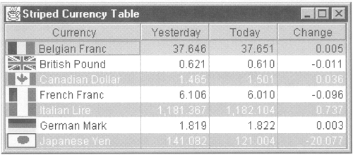 This particular renderer is configured with two pairs of foreground and background colors that are used to create the striping effect. In Figure 6-4, the rows are alternately white on light gray and black on white. How would you go about creating such a renderer? You know that the table draws each table cell separately by obtaining a suitably configured table from a renderer's getTableCellRendererComponent method and drawing it into the screen space allocated to the cell. To create a striped effect, you need to set the foreground and background differently for different rows in the table, keeping the same colors for all the cells within any given row. Because the getTable-CellRendererComponent method gets the row number as one of its arguments, it is simple enough to use one set of colors whenever the renderer is called for a cell in an even-numbered row and the other set to draw cells in odd-numbered rows and, in principle, that's all that this renderer does. However, that's not the only problem you need to solve. Here's the real issue: Renderers are selected on a per-column basis, but, in this case, you need to take the same action in every column. What this means is that you must install your renderer in every column of the table. Having done this, you can be sure that your renderer will be used to draw each cell in the table. However, this leads to a different problem. The first column contains text and an icon, so it must be drawn by a renderer that knows how to format a cell with an icon next to some text and also pick the appropriate foreground and background colors to give the striped effect. The other three columns were originally drawn by a renderer that deals with Numbers and displays a specific number of decimal places. Because the striping renderer has to draw the cells in these columns as well, it would seem that it must also have the same functionality as the FractionCellRenderer. This problem quickly gets out of hand each time you wanted to use a different renderer in a table that has striped rows, you would need to add the functionality of that renderer to the one that does the striping. Of course, this isn't really practical and it is, to say the least, an expensive price to pay just to get a striped table. The alternative instead of adding the drawing functionality of every other renderer into the striping renderer, adding the row-based coloring effect into all the other renderers is, of course, a problem of the same order of magnitude. There is, however, a simple solution to this problem by cascading one renderer in front of another, you can arrange to properly format each cell and also get the striped effect. In principle, what will happen is that the striped renderer will be installed on every column of the table. When it is called to get a component to draw a particular cell, it will invoke the getTableCellRendererComponent of the renderer that would been used for that cell and then change the foreground and background color of the component that the original renderer returns. The adjusted component will then be returned from the striping renderer. The result is that the effects produced by both renderers are applied to the cell. Our earlier renderers have been implemented by extending the DefaultTableCellRenderer class. When you do that, the renderer returns a new component from its getTableCellRendererComponent method. Core Note In fact, what DefaultTableCellRenderer's getTableCellRendererComponent method returns is this. This works because DefaultTableCellRenderer is derived from Jlabel, which is, of course, a Component.
When you are cascading renderers, you want the first renderer to create a new component, while all the subsequent ones just modify its attributes. It follows then that, because our striping renderer won't be returning a new component from its getTableCellRendererComponent method, it shouldn't be derived from DefaultTableCellRenderer. Instead, it will provide its own implementation of the TableCellRenderer interface. The problem with creating a renderer that uses another renderer is how to know which other renderer it should use. In the currency table, the striped renderer in the first column would need to invoke the TextWithIconCellRenderer, while in the last three columns it should use the FractionCellRenderer. How can it work out which renderer to call? The table UI class does this by first looking at the TableColumn object for the column that it is drawing. If this has a column renderer configured, it uses that; otherwise it uses the class-based renderer for the type of object in that column. To make the striping renderer work, it has to be installed as a column renderer for every column in the table that needs the stripe effect. If this column already needed a column-based renderer, it won't be possible for the striped renderer to consult the TableColumn object to find out which one that was, because all it will find there is an instance of itself! To solve this problem, this renderer supplies two convenience methods that allow you to install it on a specific column or on every column in a table. As it installs itself in a column, it will look to see whether that column already has a renderer configured for it and, if it does, it will store a reference to that renderer and use it when it's time to render a cell from that column. The details are in Listing 6-7. Listing 6-7 A Striped Table Renderer package AdvancedSwing.Chapter6; import javax.swing.*; import javax.swing.table.*; import java.awt.*; public class StripedTableCellRenderer implements TableCellRenderer { public StripedTableCellRenderer( TableCellRenderer targetRenderer, Color evenBack, Color evenFore, Color oddBack, Color oddFore) { this.targetRenderer = targetRenderer; this.evenBack = evenBack; this.evenFore = evenFore; this.oddBack = oddBack; this.oddFore = oddFore; } // Implementation of TableCellRenderer interface public Component getTableCellRendererComponent( JTable table, Object value, boolean isSelected, boolean hasFocus, int row, int column) { TableCellRenderer renderer = targetRenderer; if (renderer == null) { // Get default renderer from the table renderer = table.getDefaultRenderer( table.getColumnClass(column)); } // Let the real renderer create the component Component comp = renderer.getTableCellRendererComponent( table, value, isSelected, hasFocus, row, column); // Now apply the stripe effect if (isSelected == false && hasFocus == false) { if ((row & 1) ==0) { comp.setBackground(evenBack != null ? evenBack : table.getBackground()); comp.setForeground(evenFore != null ? evenFore : table.getForeground()); } else { comp.setBackground(oddBack != null ? oddBack : table.getBackground()); comp.setForeground(oddFore != null ? oddFore : table.getForeground()); } } return comp; } // Convenience method to apply this renderer to single column public static void installInColumn(JTable table, int columnIndex, Color evenBack, Color evenFore, Color oddBack, Color oddFore) { TableColumn tc = table.getColumnModel().getColumn(columnIndex); // Get the cell renderer for this column, if any TableCellRenderer targetRenderer = tc.getCellRenderer(); // Create a new StripedTableCellRenderer and install it tc.setCellRenderer(new StripedTableCellRenderer( targetRenderer, evenBack, evenFore, oddBack, oddFore)); } // Convenience method to apply this renderer to an // entire table public static void installInTable(JTable table, Color evenBack, Color evenFore, Color oddBack, Color oddFore) { StripedTableCellRenderer sharedInstance = null; int columns = table.getColumnCount(); for (int i = 0 ; i < columns; i++) { TableColumn tc = table.getColumnModel() .getColumn (i); TableCellRenderer targetRenderer = tc.getCellRenderer(); if (targetRenderer != null) { // This column has a specific renderer tc.setCellRenderer(new StripedTableCellRenderer( targetRenderer, evenBack, evenFore, oddBack, oddFore)); } else { // This column uses a class renderer - use a // shared renderer if (sharedInstance == null) { sharedInstance = new StripedTableCellRenderer( null, evenBack, evenFore, oddBack, oddFore); } tc.setCellRenderer(sharedInstance); } } } protected TableCellRenderer targetRenderer; protected Color evenBack; protected Color evenFore; protected Color oddBack; protected Color oddFore; } The constructor is simple enough; it takes the two foreground and background color pairs that will be used alternately on even- and odd-numbered rows and a target renderer, which it stores for later use. The target renderer is the one that should be used to obtain the component that can draw the cell and to which this renderer will apply its own foreground and background colors; it should be the original column-based renderer for the column into which the striped renderer is being installed, or null if there was no column renderer for that column. You can see how the target renderer is used in the getTableCellRendererComponent method. Because the striped renderer is going to be installed in a TableColumn object, this method will be invoked directly by the table UI class to draw every cell in the corresponding column. Its first job is to get the cell drawing component from the original renderer for the cell. If there was a column-based renderer, the targetRenderer member variable will be non-null and its getTableCellRendererCom-ponent method is called. On the other hand, if this column didn't have its own renderer, the appropriate default renderer, obtained from the JTable getDefaultRenderer method, is used instead. Either way, a component correctly configured to draw the table cell (without the stripes) is obtained. Now, all that needs to be done is to set the foreground and background colors to get the striped effect. In principle, this just involves using the setForeground and setBackground methods on the rendering component to set either the even or odd color pairs. Having customized the rendering component that it gets from the target renderer, the striped renderer's getTableCellRendererComponent method returns that component to its caller, so that it will be used, in its modified form, to render the cell currently being drawn. There are, however, some niceties to be observed here. First, if the cell is selected or has the focus, we don't want to change the colors at all, because to do so would lose the highlighting effect that the user would be familiar with. Because the isSelected and hasFocus arguments of the getTableCellRendererComponent method indicate these states, it is a simple matter to skip the color setting for either of these cases. The second thing to be careful of is a feature offered by this renderer that allows you to default the colors for a given row to the foreground and/or background colors of the table. This allows you to, for example, arrange for even rows to have black text on a light gray background, while leaving the odd-numbered rows unchanged. This behavior is configured by passing the appropriate arguments to the constructor as null. For example, the following line: StripedTableCellRenderer renderer = new StripedTableCellRenderer ( null, Color.lightGray, Color.black, null, null); creates a renderer that applies a light gray background and a black background to the even-numbered rows and uses the table's own colors in the odd-numbered rows. If you look at the getTableCellRendererComponent method, you'll notice that it always sets both the foreground and background colors, even if one or both of them has been supplied as null. You might think that you wouldn't have to set an explicit color if you just wanted the table's own foreground or background to be used, but you would be wrong. To see why this is, suppose you have a table with two columns, both of which contain strings and both of which are rendered using the default renderer for Objects. Now, if you install the striping renderer on this table, when rendering any given cell it will first invoke the Object renderer to get the component for that cell, and then set the appropriate attributes. Suppose also that the striped renderer has been configured to produce a light gray background on even-numbered rows and to leave odd-numbered rows in the table's background color. When the striping renderer is drawing the second column of the top row, it will call the setBackground method of the component returned by the Object renderer and set the background to light gray. The next cell to be drawn will be the first column of the second row, which should be drawn in the background color of the table. Here again, the striped renderer's getTableCellRendererComponent method will call the getTableCellRendererComponent method of the Object renderer. This is, of course, the same Object renderer that was used in the last column of the first row, so it will return the same component again. This component will, of course, have a light gray background. If the striped renderer did not explicitly set the background color to that of the table, this cell would also be drawn with a light gray background and, in fact, all the cells in the table would also be drawn in light gray! The moral of this story is to always set all the attributes that your renderer controls, even if the renderer supports some kind of default color setting as the striped renderer does. When you are cascading renderers like this, you can't really make any assumptions about how many different components will be returned from the renderers that you are calling, so you can't know what state the component that you are given will be in. The rest of the StripedTableCellRenderer consists of two convenience methods that allow you to install it in a single column of a table, or on an entire table. Both of these methods are given the even and odd foreground colors for both the odd and even rows and a reference to the JTable itself. The installInColumn method is also given the index of the column in which to install itself. This method is very simple. Using the column index, it gets the TableColumn object for that column and extracts that column's renderer, if it has one, and then creates a new StripedTableCellRenderer and installs it in the column. If the column originally had a column renderer, it will be passed as the first argument to the StripedTableCellRenderer constructor and stored for later use. If there was no column renderer configured, the getCellRenderer call on the TableColumn object will return null and this value will be passed to the StripedTableCellRenderer constructor as the target renderer. In this case, when a cell is being rendered, the striped renderer's getTableCellRendererComponent method will see that the target renderer is null and will invoke the default renderer for the objects in that column to get the component to which the stripe will be applied, which is the desired effect. You can use the installInColumn method to get striped effects for one or more individual columns. If you want to stripe an entire table (which is more likely), you can instead use the installInTable method, which has the same arguments, except that it doesn't need a column index. This method is basically just a loop that does the same job as installInColumn over each column in the table. There is, however, a minor optimization that is possible for columns that do not have a column renderer installed. If you use installInColumn, it creates a new StripedTableCellRenderer for each column. However, if there is no column renderer for a column, the first argument to the StripedTableCellRenderer constructor will be null. If you have several columns like this, they will all create different instances of the same renderer. To avoid this, the installInTable method creates only one such renderer on the first occasion that a column with no column renderer is encountered and then installs that single renderer in all such columns. In the case of the currency table, there is a column renderer in the first column, while the last three columns use default renderers. The first column, therefore, will have its own dedicated StripedTableCellRenderer. However, thanks to the optimization performed by installInTable, the last three columns will share the same StripedTableCellRenderer object. This would be true even if they used different default renderers to draw their contents, because the correct default renderer is determined dynamically as each cell is drawn. When using a cascading renderer like StripedTableCellRenderer, you must first set up the table as you want it, with the usual renderers configured for every column that needs one, then install the striping renderer. This order is essential so that the StripedTableCellRenderer installInColumn or installInTable methods can work out which renderers they need to have called when the table is being drawn. It is, however, very simple to add striping to a table that doesn't already have it, as you can see from Listing 6-8, which shows how striping is added to the currency table only the line high-lighted in bold has been added to stripe the table. You can try this example using the command java AdvancedSwing.Chapter6.StripedCurrencyTable and the result you get will look like that shown in Figure 6-4. Listing 6-8 Adding Striping to an Existing Table package AdvancedSwing.Chapter6; import javax.swing.*; import javax.swing.table.*; import java.awt.*; import java.awt.event.*; public class StripedCurrencyTable { public static void main(String[] args) { JFrame f = new JFrame("Striped Currency Table"); JTable tbl = new JTable(new CurrencyTableModel()); tbl.setDefaultRenderer(java.lang.Number.class, new FractionCellRenderer(10, 3, SwingConstants.RIGHT)); TableColumnModel tcm = tb1.getColumnModel(); tcm.getColumn(0).setPreferredWidth(150); tcm.getColumn(0).setMinWidth(150); TextWithIconCellRenderer renderer = new TextWithIconCellRenderer(); tcm.getColumn(0).setCellRenderer(renderer); tbl.setShowHorizontalLines(false); // Add the stripe renderer. StripedTableCellRenderer.installlnTable(tbl, Color.lightGray, Color.white, null, null); tbl.setAutoResizeMode(JTable.AUTO_RESIZE_OFF); tbl.setPreferredScrollableViewportSize( tbl.getPreferredSize()); JScrollPane sp = new JScrollPane(tb1); f.getContentPane().add(sp, "Center"); f.pack(); f.addWindowListener(new WindowAdapter() { public void windowClosing(WindowEvent evt) { System.exit(0); } }); f.setVisible(true); } } Cell-Based Rendering Now that you've seen how to simulate row-based rendering, it is simple to take one more step and produce a renderer that does different things for each individual cell. The same principle is used here as with row-based rendering: You create a renderer that can be installed in a column (or in all columns of the table if you want a table-wide effect) and that cascades to other renderers to handle the mundane details of routine formatting, and then adds the appropriate variation for individual cells. Let's create a simple example of a cell-based renderer that can be used in the currency table. The last column of this table shows the change in exchange rates between two successive days. For many users of the table, this will be the most important column for them to see, so we might want to make it stand out by changing its background color. Better still, how about making the cells that contain negative currency change values easier to see by changing both their foreground and background colors? To do this, the renderer has to examine the content of each cell and choose between two sets of foreground and background colors. This is very much like the striped renderer, except that the choice of attributes to be used depends not so much on where the cell is in that table, but instead on the data in the cell. As with the StripedTableCellRenderer, this one will directly implement the TableCellRenderer interface and will delegate to other renderers to do most of the work. To do its job, it must be configured with the original column-based renderer for any column it will be installed in (or null if the column uses a class-based renderer), the foreground and background colors to use for ordinary cells, and those that need to be highlighted. All this information will be stored for use when the renderer's getTableCellRendererComponent method is called. However, this particular renderer needs one more piece of information to do its job. We said that this renderer would highlight cells that contain negative values (representing currencies that are gaining value against the US dollar) by changing their foreground and background colors. One way to do this is to directly check the value of the number in a cell when that cell is being rendered. If we did this, however, we would end up with a renderer that worked, but would not be very reusable. Instead, it is better to factor out the decision-making process so that the same renderer could be used to highlight table content based on other criteria. Having done this, it would then be simple, for example, to create a renderer that highlights only values that had moved by more than 10 percent of the original value without having to rewrite all the rendering code. To make this possible, we invent a new interface called Comparator, defined as follows: public interface Comparator { public abstract boolean shouldHighlight (JTable tbl, Object value, int row, int column); } The shouldHighlight method has access to the table, the value of the cell currently being rendered, and the row and column indices of that cell. Its job is simply to return true if the cell should be drawn with highlighted colors and false if it should not. Listing 6-9 shows how the renderer is implemented. Listing 6-9 A Cell Renderer That Does Value-Based Highlighting package AdvancedSwing.Chapter6; import java.awt.*; import javax.swing.*; import javax.swing.table.*; // A holder for data and an associated icon public class HighlightRenderer implements TableCellRenderer { public HighlightRenderer(Comparator cmp, TableCellRenderer targetRenderer, Color backColor, Color foreColor, Color highlightBack, Color highlightFore) { this.cmp = cmp; this.targetRenderer = targetRenderer; this.backColor = backColor; this.foreColor = foreColor; this.highlightBack = highlightBack; this.highlightFore = highlightFore; } public Component getTableCellRendererComponent(JTable tb1, Object value, boolean isSelected, boolean hasFocus, int row, int column) { TableCellRenderer renderer = targetRenderer; if (renderer == null) { renderer = tbl.getDefaultRenderer( tbl.getColumnClass(column)); } Component comp = renderer.getTableCellRendererComponent(tbl, value, isSelected, hasFocus, row, column); if (isSelected == false && hasFocus == false && value != null) { if (cmp.shouldHighlight(tbl, value, row, column)) { comp.setForeground(highlightFore); comp.setBackground(highlightBack); } else { comp.setForeground(foreColor); comp.setBackground(backColor); } } return comp; } protected Comparator cmp; protected TableCellRenderer targetRenderer; protected Color backColor; protected Color foreColor; protected Color highlightBack; protected Color highlightFore; } The constructor is simple it just stores its parameters for later use. As with the striped renderer, the targetRenderer parameter should be the column renderer for the column into which this renderer is being installed if there is one, or null if there is not. The cmp argument is the Comparator that will be used to decide whether the content of a particular cell should be highlighted. The getTableCellRendererComponent method first obtains the component that will render the cell from the target renderer or the appropriate default renderer, and then invokes the Comparator's should Highlight method, the return value from which determines which set of foreground and background colors will be used. Notice that, as always, the colors are not changed if the cell is selected or has the focus. Installing this renderer in a table is very simple. Here's how to add it to the currency table example: // Add the highlight renderer to the last column. // The following comparator makes it highlight // cells with negative numeric values. Comparator cmp = new Comparator() { public boolean shouldHighlight(JTable tbl, Object value, int row, int column) { if (value instanceof Number) { double columnValue = ((Number)value).doubleValue(); return columnValue < (double)0.0; } return false; } }; tcm.getColumn(3).setCellRenderer(new HighlightRenderer(cmp, null, Color.pink. Color.black, Color.pink.darker(), Color.white)); The last line of this example creates an instance of the renderer that will display cells with black foreground on a pink background if they should not be highlighted and white on dark pink if they should be. The decision as to whether to highlight any given cell is made by the anonymous inner class shown at the beginning of the extract. This inner class implements the Comparator interface. Its shouldHighlight method checks to see that the value passed to it is a Number and, if it is, returns true if it has a negative value. If the value is zero or positive, or if the cell does not contain a Number, it will not be highlighted. You can try this example using the command java AdvancedSwing.Chapter6.HighlightCurrencyTable and the result will look like Figure 6-5. Figure 6-5. Highlighting individual cells based on their content.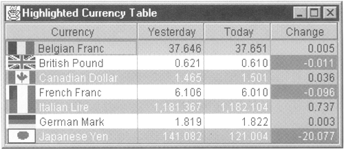 While this example looks only at the value of the cell it is rendering, it is just as easy to create an example that takes other criteria into account. For example, you could, as hinted earlier, implement a renderer that showed currencies that change by more than 10 percent of their original value by using a different Comparator: // Add the highlight renderer to the last column. Comparator cmp = new Comparator() { public boolean shouldHighlight (JTable tbl, Object value, int row, int column) { if (value instanceof Number) { Object oldValueObj = tbl.getModel().getValueAt(row, 1); if (oldValueObj instanceof Number) { double oldValue = ((Number)oldValueObj).doubleValue(); double columnValue = ((Number)value).doubleValue(); return Math.abs(columnValue) > Math.abs(oldValue/(double)10.0); } } return false; } }; If you try this modified Comparator using the command java AdvancedSwing.Chapter6.HighlightCurrencyTable2 you'll see a table that looks like Figure 6-6. Figure 6-6. Highlighting a cell containing a significant value change.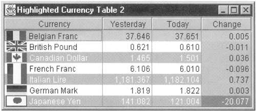 Header Rendering Although a table and its header are actually distinct components, they share the same TableColumnModel so that the column headers appear over the correct columns and to ensure that a column and its header have the same width. While the width of a table header cell is determined by the width of the corresponding column in the table, table header cells have their own renderers that are independent of those used to render the cells in the body of the table. Consequently, as you'll see in this section, you can directly control the way the header of a table looks in just the same way as you can manage the rendering of table cells. A Multi-Line Column Header Renderer Header renderers are simpler to deal with than the ones used in the body of the table, because every header cell has one and only one renderer, configured in the columns TableColumn object. When a TableColumn object is constructed, a default renderer is installed. This renderer is an instance of DefaultTableCellRenderer that draws the column name in the center of the column with a raised border around the outside. It defines its own get-TableCellRendererComponent method that sets the cell's background and foreground colors and its font using the colors and font configured for the table header. Usually, when you create a JTable and connect it to its data model, the appropriate TableColumnModel is constructed automatically, so unless you take specific action, your tables will be drawn with the default table header renderer. However, you can, if you wish, use the TableColumn setHeaderRenderer method to install a custom renderer of your own for any or all the columns in your table. All the tables that you have seen so far in this book have had one line of text over each column. For many tables, this is just not enough. Taking the currency table as an example, the three rightmost columns are labeled Yesterday, Today, and Change. What you would probably prefer to do, if you were able, would be to write Yesterday's Rate, Today's Rate, and Rate Change and, of course, you could easily do this by changing the data model so that the.getColumnName method returned these strings for the last three columns of data. The problem, of course, is that these long headings would make the columns too wide for the actual data that they contain, which would detract from the overall effect of the table. It would be nice to be able to supply more verbose column names without making the columns too wide by expanding the column header vertically in other words, by creating a column header renderer that is able to accommodate multiple lines of text instead of just one. In this section, you'll see how to create such a renderer. As you know, a renderer simply returns a component that knows how to draw whatever should appear in its cell. In the case of the header, the renderer is usually a DefaultTableCellRenderer that draws one line of centered text by using the features built into the JLabel component from which DefaultTableCellRenderer is derived. The most direct way to create a renderer that displays more than one line of text would be to use the HTML-based multi-line display capability of JLabel, which requires you to wrap the text in the appropriate HTML tags. While this is not difficult to do, it has a couple of disadvantages: Using HTML means using the HTML support supplied by the Swing text components. While this will work, it is a relatively heavyweight solution. Strictly speaking, HTML doesn't give you full control over how the text is rendered. Furthermore, if you want to mix text with other elements such as graphics or if you want to nest Swing components inside the column header, the HTML method does not make it simple to do so. Instead, we'll show you an alternative implementation that uses several JLabels, each of which will draw one line of text. To get the multi-line effect, we'll stack these JLabels one above the other in a container that will be the component returned from our renderer's getTableCellRendererComponent method. The usual Swing painting mechanics will then take care of drawing all the labels (and hence the text) for us to produce the desired effect. You can easily generalize this to get more complex column headers by replacing some or all the JLabels with another component if necessary. Before looking at the implementation, let's consider how the text for the column headers will be specified. The existing column renderer gets the text from the column's TableColumn object by invoking the getHeaderValue method, which returns an Object. If you use the default table columns created automatically for you by the table, the value that this method returns for a given column actually comes from the return value of the getColumnName method of TableModel. Thus, for example, in the case of the currency table, getColumnName for column 1 would return the string Yesterday. When the table's column model is created, this string will be stored as the header value for the table column mapping this column in the data model which, because the default column model maps the table model one for one, will be column 1 in the table column model. When the header for column 1 is rendered, it will therefore use the string Yesterday. When it comes to multi-line headers, what is the best way to supply the header text? One approach (and probably the one that springs immediately to mind) is to change nothing just store a longer column header in the table data model and let the renderer decide how to split the text over multiple lines given the space available to it. This is certainly simpler for the application programmer, but it gives the writer of the renderer more of a headache. The programmer of the renderer would prefer the application programmer split the text into multiple strings, one for each line. These strings could then be applied directly to JLabels without any messy tokenizing and font handling to work out how best to distribute the text over multiple lines. Splitting the text at compilation time is a small task to impose on the application programmer, which saves much complex renderer programming. It also has two other benefits. First, along with the saving in programming complexity comes a performance improvement. Working out how to split the text is a costly business that requires splitting the text string into individual words and calculating how much space each would take in whichever font is being used to render the header cell, and then adding the lengths of the words to be placed on each line until the line is full. This process must be repeated for each column header cell. Requiring the application programmer to do this manually during application development avoids this performance penalty entirely. Second, by handing responsibility to the application programmer, we can actually make another functionality improvement. The getHeaderValue method returns an Object. In Java, an array is a perfectly good Object, so one way to achieve the desired effect is to store an array of Strings in the table column header, for example: String[] multiLineText = { "Yesterday's", "Rate" }; TableColumn col = tbl.getColumnModel().getColumn(1); col.setHeaderValue(multiLineText); This certainly works, but we can do better. Because getHeaderValue and setHeaderValue can handle arrays, there is no reason to be restricted to strings you can, theoretically, supply an array of objects of any type, or of any combination of types. The only constraint is that the renderer must be able to do something useful with the array of objects when it is time to draw the column header to which the data is attached. One obvious way to make use of this is to create multi-line headers that mix text and icons on separate lines. For example: ImageIcon icon = new ImageIcon(...); // URL not shown Object[] multiLineHeader = {icon, "Yesterday's", "Rate" }; TableColumn col = tbl.getColumnModel().getColumn(1); col.setHeaderValue(multiLineHeader); You'll notice that both of these examples directly store the values to be used for the heading in the TableColumn object. This is unavoidable, because the TableModel getColumnName method can only return a String, so the column titles can't be stored in the data model when the multi-line renderer is in use. This is not really a problem the column name returned by getColumnName is really intended to be used as a symbolic reference to the column for use within an application program; that it doubles as the content of the header cell is only due to the fact that this is the default behavior of the table. The implementation of the renderer is shown in Listing 6-10. Listing 6-10 A Multi-Line Header Renderer package AdvancedSwing.Chapter6; import javax.swing.*; import javax.swing.border.*; import javax.swing.table.*; import java.awt.*; public class MultiLineHeaderRenderer extends JPanel implements TableCellRenderer { public MultiLineHeaderRenderer(int horizontalAlignment, int verticalAlignment) { this.horizontalAlignment = horizontalAlignment; this.verticalAlignment = verticalAlignment; switch (horizontalAlignment) { case SwingConstants.LEFT: alignmentX = (float)0.0; break; case SwingConstants.CENTER: alignmentX = (float)0.5; break; case SwingConstants.RIGHT: alignmentX = (float)1.0; break; default: throw new IllegalArgumentException( "Illegal horizontal alignment value"); } setBorder(headerBorder); setLayout(new BoxLayout(this, BoxLayout.Y_AXIS)); setOpaque(true); background = null; } public void setForeground(Color foreground) { this.foreground = foreground; super.setForeground(foreground); } public void setBackground(Color background) { this.background = background; super.setBackground(background); } public void setFont(Font font) { this.font = font; } // Implementation of TableCellRenderer interface public Component getTableCellRendererComponent( JTable table, Object value, boolean isSelected, boolean hasFocus, int row, int column) { removeAll(); invalidate(); if (value == null) { // Do nothing if no value return this; } // Set the foreground and background colors // from the table header if they are not set if (table != null) { JTableHeader header = table.getTableHeader(); if (header != null) { if (foreground == null) { super.setForeground(header.getForeground()); } if (background == null) { super.setBackground(header.getBackground()); } } } if (verticalAlignment != SwingConstants.TOP) { add(Box.createVerticalGlue()); } Object[] values; int length; if (value instanceof Object[]) { // Input is an array - use it values = (Object[])value; } else { // Not an array - turn it into one values = new Object[1]; values[0] = value; } length = values.length; // Configure each row of the header using // a separate JLabel. If a given row is // a JComponent, add it directly.. for (int i = 0 ; i < length ; i++) { Object thisRow = values[i]; if (thisRow instanceof JComponent) { add((JComponent)thisRow); } else { JLabel 1 = new JLabel(); setValue(1, thisRow, i); add(1); } } if (verticalAlignment != SwingConstants.BOTTOM) { add(Box.createVerticalGlue()); } return this; } // Configures a label for one line of the header. // This can be overridden by derived classes protected void setValue(JLabel 1, Object value, int lineNumber) { if (value != null && value instanceof Icon) { l.setIcon((Icon)value); } else { l.setText(value == null ? "" : value.toString()); } l.setHorizontalAlignment(horizontalAlignment); l.setAlignmentX(alignmentX); l.setOpaque(false); l.setForeground(foreground); l.setFont(font); } protected int verticalAlignment; protected int horizontalAlignment; protected float alignmentX; // These attributes may be explicitly set // They are defaulted to the colors and attributes // of the table header protected Color foreground; protected Color background; // These attributes have fixed defaults protected Border headerBorder = UIManager.getBorder( "TableHeader.cellBorder"); protected Font font = UIManager.getFont( "TableHeader.font"); } The constructor allows you to specify both the horizontal and vertical alignment of the text within the header, given as values from the set provided by the SwingConstants class. The horizontal alignment determines whether the text in each line is centered (SwingConstants.CENTER) or left- or right-aligned (SwingConstants.LEFT or SwingConstants.RIGHT); the same constraint is applied to each line. The vertical alignment is more interesting. If all the column headers have the same number of lines, there would be no need to describe how to align them. Suppose, however, that one or more of the headers has fewer lines. Should these lines be placed at the top of the header cell leaving blank space beneath, or at the bottom? The vertical alignment allows you to control this, using the values SwingConstants.TOP to place the first line at the top of the cell or SwingConstants.BOTTOM to place the last line at the bottom of the cell. There is a third possibility, SwingConstants.CENTER, which distributes the spare space evenly between the top and bottom of the cell. This might not always be desirable, however, because the text in these cells will probably not align well with that in the other cells. The renderer is derived from JPanel, which is a simple container that can paint its own background. The labels that hold each line of the column header will be stacked vertically within the panel. The simplest way to create this arrangement is to replace the JPanel's default FlowLayout manager with a BoxLayout, specifying a vertical arrangement. BoxLayout determines the horizontal alignment of components within its container by looking at their x-alignment attributes, which are controlled using the JComponentsetAlignmentX method. This attribute specifies where a given component's alignment point resides. If the component has an x-alignment of 0.0, the alignment point is on its left edge; a component with an alignment of 1.0 has its alignment point at its right edge. Values in between place the alignment point somewhere between the two edges so that, for example, an alignment value of 0.5 specifies that the alignment point is in the middle. With a vertical arrangement, BoxLayout arranges its components so that their alignment points are directly above each other. To create the horizontal alignment requested in the constructor, the alignment values must be translated to the values 0.0 for left alignment, 0.5 for center alignment, and 1.0 for right alignment. The appropriate value is stored for use when the components of the header are added to the JPanel. Finally, a default border is configured. This border is the same as that which has been used for the column headers that you have already seen so far. In fact, the actual border depends on the selected look-and-feel. You can, of course, use a different border or completely remove the border by using the setBorder method, which MultiLineHeaderRenderer inherits from JComponent. Here is how you might create a column header with the text left- and top-aligned and with no border: MultiLineHeaderRenderer renderer = new MultiLineHeaderRenderer( SwingConstants.LEFT, SwingConstants.TOP); renderer.setBorder(BorderFactory.createEmptyBorder()); The BorderFactory createEmptyBorder method returns a border that occupies no space. You can also customize other attributes of the JPanel. For example, you can use setBackground to change the background color and setFont to control the font used to render each line of the header. The real work of this renderer is done in the getTableCellRendererComponent method. This method is going to return the JPanel from which the renderer is derived as the component that will draw the cell, but before doing that, it must add the necessary JLabels and configure them properly. Because the same renderer will be called several times each time the table headers are rendered (once for each visible column), the first job is to remove the components that were added last time using the removeAll method. Then, the new components are added one by one, using the value parameter provided as the second argument. In the case of a table header renderer, this parameter is the value returned from getHeaderValue for the column being drawn. As we said earlier, to make proper use of the renderer, this value should be initialized to contain an array of Objects, each of which will form one line of the header; it is also possible to supply a single Object, in which case a single-line header will be created, with the horizontal and vertical alignments as specified to the constructor. Usually, the array items will either be Strings or icons. In both cases, a JLabel is created and customized using the setvalue method, the default implementation of which simply installs the text or icon in the label and ini- tializes the label's foreground and background colors, its font, and its x-alignment. The configured JLabel is then added to the renderer JPanel. As with earlier renderers, you can change some or all this behavior by implementing a subclass and overriding the setValue method. If any of the values in the array is not a String or an Icon, its tostring method is used to create a String, which is then used as the label text. There is one exception to this rule that makes this renderer potentially very powerful. By placing a JComponent in the value array, you can arrange for an arbitrary component to appear in the column header. This allows you, for example, to include a header line that contains both text and an icon. When the renderer finds a JComponent, it adds it directly to the JPanel instead of creating a JLabel. However, it does not customize any of the component's attributes, because you can do this directly if necessary. If you want the component to have the same background color as the column header, you should use its setopaque method to make it transparent, or explicitly set its background color. You should also set its x-alignment value to match that used for the other components added by the renderer. Figure 6-7 shows the currency table with multi-line headers. You can try this example for yourself using the command: Figure 6-7. Table columns with multiple heading lines.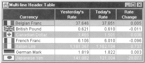 java AdvancedSwing.Chapter6.MultiLineHeaderTable Here is the code that was added to install the column headers: // Add the custom header renderer MultiLineHeaderRenderer headerRenderer = new MultiLineHeaderRenderer(SwingConstants.CENTER, SwingConstants.BOTTOM); headerRenderer.setBackground(Color.blue); headerRenderer.setForeground(Color.white); headerRenderer.setFont(new Font("Dialog", Font.BOLD, 12)); int columns = tableHeaders.length; for (int i = 0 ; i < columns ; i++) { tcm.getColumn(i).setHeaderRenderer(headerRenderer); tcm.getColumn(i).setHeaderValue(tableHeaders[i]); } As you can see, the column headers have white text on a blue background and the font is changed to a 12-point, bold dialog font. The header values are held in a static array, defined as follows: public static Object[][] tableHeaders = new Object[][] { new String[] { "Currency" }, new String[] { "Yesterday's", "Rate" }, new String[] { "Today's", "Rate" }, new String[] { "Rate", "Change" } }; Each entry in this array is itself an array that specifies the header for one column of the table, while each item in the array for a given column provides the data for one line of the column header. In this case, the values are all Strings. Notice that the first column has only one associated line of text, whereas the others have two. Because this table uses header renderers configured with the vertical alignment set to SwingConstants.BOTTOM, the text for this column will appear on the lowest line of the header, as you can see in Figure 6-7. How is this achieved? If we took the simple approach of simply adding each line of text as a JLabel, the first column would have one JLabel and the last two columns would have two. BoxLayout would then place the single JLabel for the first column at the top of the header cell, not at the bottom. To persuade BoxLayout to push the labels to the bottom, as is necessary when the vertical alignment requested is SwingConstants.BOTTOM, vertical glue is added before the first label, like this: if (verticalAlignment != SwingConstants.TOP) { add(Box.createVerticalGlue()); } Glue is a JComponent that expands to fill the space available to it. When the vertical alignment is SwingConstants.BOTTOM, glue is added at the top only, so that all the spare vertical space appears at the top. When the vertical alignment is SwingConstants.TOP, the spare space should be allocated at the bottom, so that is where the glue is placed and, finally, in the case of SwingConstants.CENTER, the glue is placed at both the top and the bottom to allocate spare room evenly between these two regions. You may be wondering how the size of the areas allocated to the column headers is actually determined. The width of each header is determined by the width of the corresponding column in the table; this should, of course, be obvious otherwise, the column header would not line up properly with the columns. The header height is determined by the table UI class, which invokes the header renderer of each column to get the component that will draw the cell and then asks for its preferred size. The height of the header is then set to the maximum requested height of all the column header components. A Multi-Line Cell Renderer Now that you've seen how to create a multi-line renderer for the table header, it's a relatively simple matter to turn the same renderer into one that works in the body of the table instead, although there are a few tricky points to be careful of. The main difference between creating a renderer for the table body and one for the header is that the header renderer does not have to take account of color handling for selected cells or the cell that has the focus. In addition, you'll also see that you need to be careful about color handling if you want your renderer to work with other ones such as the striping renderer shown earlier in this chapter. The implementation of this renderer is shown in Listing 6-11. Listing 6-11 A Multi-Line Table Cell Renderer package AdvancedSwing.Chapter6; import javax.swing.*; import javax.swing.table.*; import javax.swing.border.*; import java.awt.*; public class MultiLineCellRenderer extends JPanel implements TableCellRenderer { public MultiLineCellRenderer(int horizontalAlignment, int verticalAlignment) { this.horizontalAlignment = horizontalAlignment; this.verticalAlignment = verticalAlignment; switch (horizontalAlignment) { case SwingConstants.LEFT: alignmentX = (float)0.0; break; case SwingConstants.CENTER: alignmentX = (float)0.5; break; case SwingConstants.RIGHT: alignmentX = (float)1.0; break; default: throw new IllegalArgumentException("Illegal horizontal alignment value"); } setLayout(new BoxLayout(this, BoxLayout.Y_AXIS)); setOpaque(true); setBorder(border); background = null; foreground = null; } public void setForeground(Color foreground) { super.setForeground(foreground); Component[] comps = this.getComponents(); int ncomp = comps.length; for (int i = 0 ; i < ncomp; i++) { Component comp = comps[i]; if (comp instanceof JLabel) { comp.setForeground(foreground); } } } public void setBackground(Color background) { this.background = background; super.setBackground(background); } public void setFont(Font font) { this.font = font; } // Implementation of TableCellRenderer interface public Component getTableCellRendererComponent(JTable table, Object value, boolean isSelected, boolean hasFocus, int row, int column) { removeAll(); invalidate(); if (value == null || table == null) { // Do nothing if no value return this; } Color cellForeground; Color cellBackground; // Set the foreground and background colors // from the table if they are not set cellForeground = (foreground == null ? table.getForeground() : foreground); cellBackground = (background == null ? table.getBackground() : background); // Handle selection and focus colors if (isSelected == true) { cellForeground = table.getSelectionForeground(); cellBackground = table.getSelectionBackground(); } if (hasFocus == true) { setBorder(UIManager.getBorder( "Table.focusCellHighlightBorder")); if (table.isCellEditable(row, column)) { cellForeground = UIManager.getColor( "Table.focusCellForeground"); cellBackground = UIManager.getColor( "Table.focusCellBackground"); } } else { setBorder(border); } super.setForeground(cellForeground); super.setBackground(cellBackground); // Default the font from the table if (font == null) { font = table.getFont(); } if (verticalAlignment != SwingConstants.TOP) { add(Box.createVerticalGlue()); } Object[] values; int length; if (value instanceof Object[]) { // Input is an array - use it values = (Object[])value; } else { // Not an array - turn it into one values = new Object[1]; values[0] = value; } length = values.length; // Configure each row of the cell using // a separate JLabel. If a given row is // a JComponent, add it directly.. for (int i = 0 ; i < length ; i++) { Object thisRow = values[i]; if (thisRow instanceof JComponent) { add((JComponent)thisRow); } else { JLabel 1 = new JLabel(); setValue(1, thisRow, i, cellForeground); add(1); } } if (verticalAlignment != SwingConstants.BOTTOM) { add(Box.createVerticalGlue()); } return this; } // Configures a label for one line of the cell. // This can be overridden by derived classes protected void setValue(JLabel 1, Object value, int lineNumber, Color cellForeground) { if (value != null && value instanceof Icon) { l.setIcon((Icon)value); } else { l.setText(value == null ? "" : value.toString()); } l.setHorizontalAlignment(horizontalAlignment); l.setAlignmentX(alignmentX); l.setOpaque(false); l.setForeground(cellForeground); l.setFont(font); } protected int vertical-Alignment; protected int horizontal-Alignment; protected float alignmentX; // These attributes may be explicitly set // They are defaulted to the colors and attributes // of the table protected Color foreground; protected Color background; protected Font font; protected static Border border = new EmptyBorder( 1, 2 , 1, 2); } As you can see, the constructor is virtually identical to that of the header renderer. The only significant difference is that the cell renderer installs a small empty border instead of the look-and-feel specific border that the table header uses. This border will be used in all the cells drawn by this renderer, except when a cell has the focus, when a line border will be substituted. The setForeground method also has a more complex implementation here. The mechanics of this method are simple to understand because the component that this renderer uses to draw each cell is a JPanel that will hold one or more child components, changing the cell's foreground color and making it effective for every line of the cell's content means setting the foreground color for each of the components that the JPanel contains. This is why the setForeground method is implemented as a loop that processes all the JPanel's components. As you'll see shortly, this complication is only necessary for a cell renderer and was avoided for the simpler header renderer. Most of the changes appear in the getTableCellRendererComponent method. In principle, the same mechanism is being used here several JLabels (or explicitly supplied components) are placed onto a single JPanel to create the multi-line effect and you'll notice that the last part of this method is the same for both renderer implementations. There are two major changes in the cell renderer: The reason for all of this complication is that table cells have three possible states, whereas header cells only have one state. Each separate state has different colors associated with it. Here are the three states that a table cell can be in: -
It can be neither selected nor have the input focus. -
It can be selected. -
It can have the input focus. The first case is the most usual and the easiest to deal with. Here, the background and foreground colors may be either explicitly set using the setForeground and setBackground methods, or inherited from the table. You'll see that the getTableCellRendererComponent method uses two local variables (cellForeground and cellBackground) to hold the appropriate colors for the cell and that these are initialized to those that would be expected in this state. If, however, the cell is selected, these variables are changed to the selected foreground and background colors configured in the table. The most complex case is the last one, in which the cell has the input focus. In this case, nothing special is done unless the cell is editable, because the focus doesn't mean anything for a non-editable cell. If the cell is editable, two different colors, obtained from the selected look-and-feel, are substituted. In addition (whether or not the cell is editable), a different border is used, as noted earlier. When the correct cell colors have been determined, the foreground and background attributes of the JPanel are set using the selected colors. Core Note You may wonder why the foreground color of the JPanel is set, because JPanel doesn't use this attribute. Usually, this is a redundant step. However, it is possible, as you know, to supply a custom component instead of text or an icon as part of the content to be rendered in the cell and such a component could be written to take its own foreground color from that of its container, which would be our JPanel. Setting the JPanel's foreground ensures that such a component would acquire the correct foreground attribute. The same argument also works for the background color.
When it comes to adding the components that make up the multi-line cell, each of them needs to use the same foreground color. This is why the setValue method for this renderer requires a foreground argument because of the possibility of the cell being selected or having the focus, the appropriate foreground color is not necessarily the color configured using setForeground or inherited from the table; the only way for this method to know the correct color is to pass it as an argument from getTableCellRendererComponent. The header renderer did not have this complication because it has only one possible foreground color. Note that there is no need to take special action for the background, because the JLabels that are added to the JPanel are made transparent, so automatically acquire the correct background color. Before explaining the reason for the more complicated setForeground method, let's see what a table with multi-line cells looks like. You can see a table that includes this renderer using the following command: java AdvancedSwing.Chapter6.MultiLineTable The result will look like Figure 6-8. Figure 6-8. A table with multi-line cells. This table shows the seven Apollo lunar landing flights (including the ill-fated Apollo 13, which did not land), along with the names of the crew members. You'll see that each crews names are listed vertically, one per line, in single cell. This effect is, of course, obtained using the multi-line cell renderer. It is less obvious that the same renderer is also used in the first column, which contains only the flight name. The renderer for both these columns is configured with the vertical alignment set to SwingConstants.CENTER. In the case of the second column, this has no real effect because the three lines of text fill the cell. However, because there is only one line in the first column, the glue components that are added above and below the single JLabel force the flight name to appear in the middle of the cell. In fact, the same renderer instance is shared between both columns of this table. For reference, the code that creates this table (apart from the data model) is shown in Listing 6-12. Listing 6-12 Installing the Multi-Line Cell Renderer package AdvancedSwing.Chapter6; import javax.swing.*; import javax.swing.table.*; import java.awt.*; import java.awt.event.*; public class MultiLineTable { public static void main(String[] args) { JFrame f = new JFrame("Multi-line Cell Table"); JTable tb1 = new JTable(new MultiLineTableModel()); // Create the custom cell renderer MultiLineCellRenderer multiLineRenderer = new MultiLineCellRenderer( SwingConstants.LEFT, SwingConstants.CENTER); TableColumnModel tcm = tbl.getColumnModel(); tcm.getColumn(0).setPreferredWidth(75); tcm.getColumn(0).setMinWidth(75); tcm.getColumn(1).setPreferredWidth(150); tcm.getColumn(1).setMinWidth(150); // Install the multi-line renderer tcm.getColumn(0).setCellRenderer(multiLineRenderer); tcm.getColumn(1).setCellRenderer(multiLineRenderer); // Set the table row height tbl.setRowHeight(56); // Add the stripe renderer. StripedTableCellRenderer.installlnTable(tbl, Color.lightGray, Color.white, null, null); tbl.setAutoResizeMode (JTable.AUTO_RESIZE_OFF); tbl.setPreferredScrollableViewportSize( tbl.getPreferredSize()); JScrollPane sp = new JScrollPane(tbl); f.getContentPane().add(sp, "Center"); f.pack(); f.addWindowListener(new WindowAdapter() { public void windowClosing(WindowEvent evt) { System.exit(0); } }); f.setVisible(true); } } Notice that a single MultiLineCellRenderer is created and shared between the two columns. This is appropriate in this case, and saves resources. If, however, you wanted the flight names in the left column to appear against the top of each cell instead of in the center, you would create separate renderers for the two columns with different alignment attributes. The most important point to note about this code is the following line: tbl.setRowHeight(56); This shows a very important difference between table cells and header cells. Whereas the size of the component returned by the header renderer determined the height of the cells in the table header, this is not true for the table. The height of every row in this table is the same and is explicitly set using the setRowHeight method. By default, table rows are 16 pixels high. In this case, a 56-pixel row happens to allow enough space for three lines of text in the default font used by this table. In a production application, you would probably compute the required height by extracting the tables selected font using the get- Font method (inherited by JTable from Component) and then using the font's metrics to deduce the space required to draw however many lines of text will appear in the table. If your multi-line cells contain icons or custom components, the calculation method will, of course, be different. The important thing to realize is that, if you don't set the appropriate height, the content of the cell will be confined to the fixed space allocated to each table row, with the result that the lower part of each cell will be clipped if it is too large to fit in the row. Core Note The restriction that all rows in a table have the same height will be removed in Java 2, version 1.3.
What about the complications in the setForeground method? You'll see from this example that the multi-line renderer is used in conjunction with the striped renderer that was developed earlier in this chapter. As you know, the striped renderer operates by first calling the getTableCellRendererComponent of each cell's actual renderer, and then changing the returned component's foreground and background colors to get the striping effect. In this case, the getTableCellRendererComponent method of MultiLineCellRenderer will first be called and will return a JPanel with its foreground and background colors set according to whether the cell being drawn has the focus or is selected, or neither. Assuming that the cell is neither selected nor focused, the striped renderer will change the foreground and background colors to white on gray or black on white (in the case of this table) by calling the MultiLineCellRenderer setForeground and setBackground methods. To effect the required foreground color change, the foreground colors of all the JLabels mounted in the JPanel must be changed, as noted earlier. This is not required, of course, for the multi-line header renderer because it will never be used in conjunction with another renderer that will change the foreground color after the getTableCellRendererComponent method has set it. Finally, you may be wondering how the data for this table is represented in the table model. The data model is implemented in a class called MultiLineTableModel, derived from AbstractTableModel. The methods of this class are almost identical to those of the currency data model shown in Listing 6-1. The only interesting part of this model is the getValueAt method and the way in which the data is stored. Here is the implementation of the getValueAt method: public Object getValueAt(int row, int column) { return data[row] [column]; } This method simply returns whatever is in the data array, indexed by row and column. Because a multi-line renderer is being used, you know that the values in the model must be an array of Objects, each of which will occupy one line of the rendered cell. Bearing this in mind, the initialization of the data array should come as no surprise; here's part of the statement that creates the data: protected Object[][] data = new Object[][] { { "Apollo 11", new String[] { "Neil Armstrong", "Buzz Aldrin", "Michael Collins" } }, { "Apollo 12", new String[] { "Pete Conrad", "Alan Bean", "Richard Gordon" } }, // More data not shown }; Each row in this two-dimensional array contains the data for a single row of the table. The data for the first column of the first row is, therefore, the single String Apollo 11. Although the MultiLineCellRenderer usually expects to receive an array of objects, as you saw earlier when the implementation of the MultiLineHeaderRenderer was discussed, it is prepared to accept a single Object and treat it as an array with one entry. This simplifies the initialization of the data model. The second column of the first row is, however, an array, consisting of three Strings. When drawing this cell, the renderer's getTableCellRendererComponent method will be passed this array as the table model value for the cell and will place each string on its own line. The part of the data model that is not shown previously follows the same pattern. You can find the source for the entire data model in the file MultiLineTable.java included with this book's sample code. Renderers and Tooltips By default, a JTable displays only a single tooltip that you can set using its setToolTipText method, which it inherits from JComponent. However, by using a custom renderer, you can arrange for different cells to have their own tooltips. This can often be a useful feature. To see how to implement it, let's consider again our hard-working currency table example. The first time you saw this table in Figure 6-1, it showed all the currency figures with as many decimal places as it could. However, this produced an untidy table, so we added a renderer that showed a smaller, fixed number of decimal places, sacrificing precision for presentation. Now, suppose you want the user to be able to see, on demand, the exact value of a particular currency's exchange rate, as originally displayed in Figure 6-1. One way to do this is to provide a button outside the table that would change to a renderer that showed more or less digits. But there is a more convenient way why not show the exact value in a tooltip? If you do this, a more accurate version of an exchange rate will appear automatically when the user allows the mouse to hover for a short time over a cell containing an exchange rate. You can see an example of this in Figure 6-9 and you can try out the program that was used to generate this screen shot using the command Figure 6-9. Using a cell-specific tooltip. java AdvancedSwing.Chapter6.ToolTipTable In Figure 6-9, the mouse was placed over the top row of the Today's Rate column; after a short delay, a tooltip containing a more precise exchange rate of the Belgian Franc appeared. If you compare this with Figure 6-1, you'll see that the tooltip does indeed contain the correct exchange rate to six decimal places, which is the arbitrary higher limit placed on the number of decimal places shown in tooltips for this table. You can, of course, set the number of digits you want to display when you create the renderer. To create this effect, the FractionCellRenderer that was installed as the class-based renderer for java.lang.Number in the earlier examples in this chapter has been replaced by a new renderer called ToolTipFractionCellRenderer, the implementation of which is shown in Listing 6-13. Listing 6-13 A Renderer That Creates a Tooltip package AdvancedSwing.Chapter6; import java.text.*; import java.awt.*; import javax.swing.*; import javax.swing.table.*; // A holder for data and an associated icon public class ToolTipFractionCellRenderer extends FractionCellRenderer { public ToolTipFractionCellRenderer( int integer, int fraction, int maxFraction, int align) { super(integer, fraction, align); this.maxFraction = maxFraction; // Number of tooltip // fraction digits } public Component getTableCellRendererComponent( JTable table, Object value, boolean isSelected, boolean hasFocus, int row, int column) { Component comp = super.getTableCellRendererComponent( table, value, isSelected, hasFocus, row, column); if (value != null && value instanceof Number) { formatter.setMaximumIntegerDigits(integer); formatter.setMaximumFractionDigits(maxFraction); formatter.setMinimumFractionDigits(maxFraction); ((JComponent)comp).setToolTipText( formatter.format( ((Number)value).doubleValue())); } return comp; } protected int maxFraction; } As you can see, this renderer is created by extending FractionCellRenderer. This is logical because, apart from its ability to generate a tooltip, it has the same functionality as FractionCellRenderer. By subclassing an existing renderer in this way, you get to reuse all its code and minimize the new work to be done. The constructor of the new renderer accepts the same parameters as that of the old one and simply passes them through to the superclass constructor. In addition, it requires an extra parameter, maxFraction, which specifies the maximum number of decimal places that should be shown in the tooltip. In this example, of course, this will be larger than the number actually shown in the table cells. This value is stored for later use. As with all renderers, the interesting part is the getTableCellRendererComponent method. This method simply invokes the existing method of its superclass, which means that it returns a JLabel with the same text as FractionCellRenderer and so the cell will be drawn in the same way by both renderers. As well as that, however, ToolTipFractionCellRenderer also sets the tooltip of the JComponent returned from the original renderer. This is the crucial step that enables the correct tooltip to be displayed for this cell, because the table invokes the renderer when it needs to draw the content of a cell and when it needs a tooltip for a cell. When the table is asked for a tooltip, it first attempts to get one from the renderer of the cell under the mouse, if any, by calling its getTableCellRendererComponent method and, when this method completes, it invokes the getToolTipText method on the JComponent that is returned and uses the value that it gets, if it is not null, as the tooltip for the cell. Core Note This mechanism only works, of course, if the getTableCellRendererComponentmethod returns a JComponent,as it does in all the examples in this chapter. You could, if you wished, write a renderer that returned an object derived from Component,not JComponent,in which case it would not be able to supply a tooltip for its individual cells and the global tooltip set for the table using the JTable setToolTipTextmethod, if any, would be used instead. This also happens if the cell's renderer returns a JComponentbut does not set a tooltip by calling setToolTipText,as was the case with the earlier examples in this chapter.
In this example, the tooltip is the value from the table cell, which is passed into the getTableCellRendererComponent method in the usual way. Formatting the value for the tooltip, which must be a String, is simply a matter of using the NumberFormat object created by the FractionCellRenderer superclass, adjusting the precision to supply the required number of decimal digits. The string returned from the NumberFormat format method is stored as the rendering JComponent's tooltip using the setToolTipText method, allowing the table UI class to extract it later. This is a relatively simple example that shows how to supply cell-specific tooltips for a table; the same mechanism, of course, also works for trees. Core Note In early releases of Swing, when the table needed a tooltip, it invoked the renderer's getTableCellRendererComponentwith the value argument set to null.This had the advantage that it was not necessary to incur the overhead of generating a tooltip when the renderer was being used to draw the cell. It did, however, have the disadvantage that if, as in this case, you needed to access the cell's associated value from the TableModel,you had to get it for yourself using code like this: value = table.getValueAt(row, column); The new API is simpler for the renderer, but results in extra overhead when the table is being drawn.
|