3.2. Understanding Data Maps Imagine this: if you had a table of data that contained population count and area in square miles per state, and a map of the United States with states color-coded with corresponding population densities, on which one would it be easier to spot the state with the highest population density? Visualizing statistical data on maps makes grasping the key statistics more intuitive, especially if they are based on location. MapPoint 2004 supports data visualization on maps through its data APIs. You can display data maps using either native MapPoint demographic data or an external data source such as a text file, Excel spreadsheet, or even a SQL Server database. In MapPoint 2004, a data map is represented with a DataMap class. A DataMap object can only be created using a DataSet object by calling the DisplayDataMap method. The resulting map displays data on the current active map of the MapPoint ActiveX Control or the ApplicationClass object and returns a DataMap instance. The DataMap object exposes a set of read-only properties that define the data map's behavior. The only property for which you can set a value is the LegendTitle property, used in the legend pane. Before we get into coding details of data maps, there are a couple of details that you need to know: what data map styles (also known as data map types) are, and how to use the DataSet.DisplayDataMap method. 3.2.1. Understanding Data Map Styles MapPoint 2004 supports three broad categories of data map styles: Location data map Single item data map Multiple items data map
Each category is appropriate for a different set of uses. 3.2.1.1. Location data map This data map style should be used when you want to display only locations and have no data associated with them. For example, if you want to display your company's retail store locations in the United States, use a location data map. In this data map style, there are two display options to represent locations on maps:
Pushpin maps Use standard MapPoint 2004 pushpins or custom pushpins to represent each location. For example, locations such as a coffee shop, your office, and your home will be shown using one pushpin type.
Multiple symbol maps Use different symbols to represent each location. For example, locations such as a coffee shop, your office, and your home are marked with different pushpins for easy identification.
3.2.1.2. Single-item data map This data map style should be used when you have a single data item associated with each location that you want displayed on a map (or when you have multiple data items but want to display only one on the map). For example, to display the annual sales for each retail store in the United States, use a single-item data map. In a single item data map, each location has an associated data item. In this category, you have four display options:
Shaded area maps In this map style, shown in Figure 3-2, varying map shades and colors represent the data associated with each location. This map style is useful for displaying data for larger areas, such as states, countries, and Zip Codes. In this map style, a lighter shade represents a lower value, and a darker shade represents a higher value. For example, if you use the shaded area map style to represent annual sales amounts per state for retail stores, all states that have a lighter shade represent poorly-performing stores, and all states that have a darker shade represent the stores that are performing well in sales. Figure 3-2. Shaded area map (Color Plate 1) 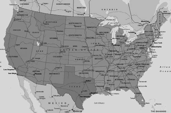
Shaded circle maps In this map style, similar to the shaded area map style, varying map shades represent the data associated with each location. Since each location is represented as a circle, this map style is suited only for point locations such as cities or addresses. In this map style, shown in Figure 3-3, all circles are the same size, and the shade of the circle represents the data value; lighter shades mean lower values, while darker shades mean higher values. This map style is suitable if you want to display annual sales per store. Figure 3-3. Shaded circle map 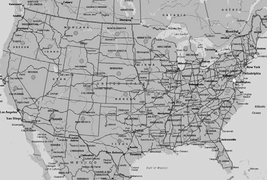
Sized circle maps In this map style, shown in Figure 3-4, varying circle size represents the data associated with each location. This map style is useful when displaying data for medium to large locations, such as a city, county, state, or Zip Code. In this map style, the circle's size represents the data associated with that location. For example, if you use the sized circle map style to represent annual sales amounts per state for your retail stores, states with smaller circles represent poorly-performing stores, and states with bigger circles represent the stores that are performing well in sales.
Multiple symbol maps In this map style, shown in Figure 3-5, multiple symbols represent locations, and different colors represent ranges of value associated with each location. For example, you could use the multiple symbol map style to display annual sales of your retail stores by using green to represent top sales range (say, >$10 million), orange to represent medium sales range (say, from $5 million to $10million), and red to represent poor sales range (say, from $1 million to $5 million).
Figure 3-4. Sized circle map 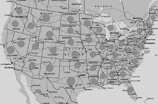
In all these map styles, there is only one dimension being analyzed based on location (for example, retail store sales). But what map styles would you use to display both your sales and your competitor's sales based on location? This situation is when you need multiple item data maps . 3.2.1.3. Multiple item data map In multiple item data maps, you display two or more items based on location. For example, you could display your sales and your competitor's sales per state to understand how you are performing against your competitor, or you could display your sales and average spending per state to verify whether you are targeting the right market segments. So, in a multiple item data map, there are two or more pieces of information associated with each location. Again, in this category, there are different map styles that come to our rescue to represent multiple values for each location:
Pie chart map The pie chart map style, shown in Figure 3-6, is good for displaying multiple data items for each location. The maximum number of data items that can be displayed for each location is 16. Each data item's value is represented by the size of the pie for each location. Use this map style to display sales by product line for your retail stores. Figure 3-5. Multiple symbol map (Color Plate 2)  Figure 3-6. Pie chart map (Color Plate 3) 
Sized pie chart map The sized pie chart map style, shown in Figure 3-7, is similar to the pie chart map style except that the size of the pie chart represents the overall value of the data items associated with that location. For example, to see how your sales are doing against your competitor's sales per state as a pie chart, and also to get a sense of overall sales (yours and your competitor's combined) for each state, use this map style. In this figure, a bigger pie chart represents higher overall sales, while a smaller pie chart represents poorer overall sales. Figure 3-7. Sized pie chart map (Color Plate 4) 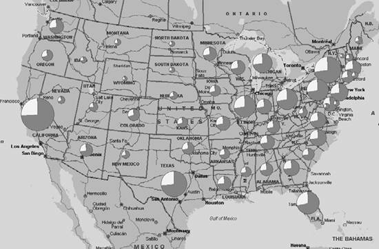
Column chart map In this map style, shown in Figure 3-8, each data item associated with a location is represented by a column. The size of the column represents the value, so the taller the column, the higher the value. You can also assign different colors to each column. For example, to display your sales against your competitor's sales, use a column chart map style. The maximum number of data items that can be associated with a location is 16.
Series column chart map This map style, shown in Figure 3-9, is identical to column chart map style but all columns are of the same color. This map style is more suitable for representing a series of data. For example, presenting your store sales per month per state is more suited for series column chart map style . This map style also supports associating up to 16 data items per location.
Figure 3-8. Column chart map (Color Plate 5) 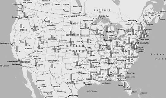
Figure 3-9. Series column chart map 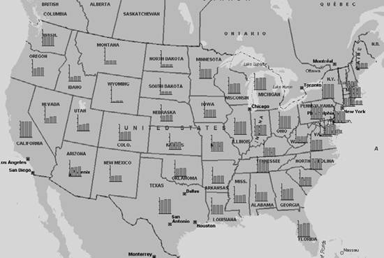
Now that we know what data map styles are and what they are well-suited for, let's look at the DataSet.DisplayDataMap method used to display a data map. 3.2.2. Understanding the DataSet.DisplayDataMap Method The DisplayDataMap method is called on a valid DataSet object to display a map using the data in the dataset. This method provides a lot of flexibility and control to choose from a wide variety of parameters for data maps, but this flexibility comes with a penaltycomplexity. It is not an exaggeration to say that the DataSet object's DisplayDataMap method is one of the most complex methods available with the MapPoint 2004 APIs because of both the complex inner workings of the method and the sheer number of arguments that it accepts. See the following code snippet of the DisplayDataMap method: //Invoke DisplayDatamap method MapPoint.DataMap datamap = dataset.DisplayDataMap(MapPoint.GeoDataMapType.geoDataMapTypeCategoricalColumn, datafields, MapPoint.GeoShowDataBy.geoShowByRegion1, MapPoint.GeoCombineDataBy.geoCombineByNone, MapPoint.GeoDataRangeType.geoRangeTypeDefault, MapPoint.GeoDataRangeOrder.geoRangeOrderDefault, 6, 5, arrayOfCustomValues, arrayOfcustomNames, missing, arrayOfcustomLabels, missing );
The DisplayDataMap method takes 13 arguments to display a data map; look at the original definition of the DisplayDataMap method signature to understand what each parameter represents in the previous method call: DataSet.DisplayDataMap([DataMapType], [DataField], [ShowDataBy], [CombineDataBy], [DataRangeType], [DataRangeOrder], [ColorScheme], [DataRangeCount], [ArrayOfCustomValues], [ArrayOfCustomNames], [DivideByField], [ArrayOfDataFieldLabels], [ArrayOfPushpinSymbols])
Table 3-3 shows how each parameter is used during this method call. Table 3-3. DataSet.DisplayDataMap method parametersParameter Name | Description |
|---|
DataMapType | The type of data map to display. Default is geoDataMapTypeDefault. | DataField | A Field object or an array of Field objects of the data set to be mapped. String fields are invalid for unsized pie chart, sized pie chart, column chart, and series column chart maps. Default is the first valid field in the data set. | ShowDataBy | The geographical entity by which the data is to be shown on the map. See GeoShowDataBy values for a list of values and descriptions. Default is geoShowByDefault. | CombineDataBy | Used only if data aggregration is required. Data aggregation is required when the geographical entity designated by GeoShowDataBy is larger than the set of data to be mapped. Is ignored (geoCombineByNone) if not needed or if the DataSet object has a HowCreated property of geoDataSetDemographic. Default is geoCombineByDefault. | DataRangeType | Determines the appearance of data on the map by range type. Default is geoRangeTypeDefault. | DataRangeOrder | Determines the order in which data is displayed. Ignored for unsized pie chart, column chart, and series column chart maps. Default is geoRangeOrderDefault. | ColorScheme | An integer that determines the color scheme used for mapped data. See the ColorScheme property topic for color schemes and integer values associated with different data map types. Default is geoColorSchemeDefault (-1). | DataRangeCount | An integer between one and eight that indicates the number of data ranges. Ignored for continuous data ranges and unsized pie chart, column chart, and series column chart maps. | ArrayOfCustomValues | An array of the custom value for each data range. If used, this parameter sets the IsCustomized property of a DataRanges collection, which will be cleared if the user changes the range type. Ignored for unsized pie chart maps. | ArrayOfCustomNames | An array that contains labels for the map legend. Ignored for unsized pie chart maps. | DivideByField | The field or column to which the DataFields property of the DataMap object is compared. If this parameter is not provided, then the current DivideByField is used. | ArrayOfDataFieldLabels | An array that contains color labels for the legend. | ArrayOfPushpinSymbols | An array that establishes the pushpin symbols used with multiple symbol maps. |
If you are worried about how to remember all this, thankfully, it is possible to categorize these arguments into one argument and two major categories, as follows: dataset.DisplayDataMap(Data map style, [Data Specification], [Range Specification]);
Let's discuss this method in detail by starting off with a hypothetical scenario: say your requirement is to display your average annual sales for each product line compared to your competitor's. A hypothetical display data map command (like in SQL) would look like this: Display a pie chart data map per state for our annual sales (per product line) compared to our competitor's annual sales per product line.
Also, let's assume that you have data in a table with the schema shown in Table 3-4. Table 3-4. Hypothetical business data for data mapsCounty | Our annual sales | Competitor's annual sales | Total product lines lold | ............. |
|---|
Pierce | 34,561,775 | 11,701,483 | 20 | .............. | King | 22,456,333 | 16,995,443 | 18 | .............. | .............. | .............. | .............. | .............. | .............. |
Note that your data is categorized based on county and not on state, but the requirement is to display a data map based on states. Next, let's look at the DisplayDataMap method to display the data map specified in this hypothetical command. 3.2.2.1. Defining data map style This is the first step in displaying a data map. Choose the map style for the data map using the DataMapType argument. This argument is GeoDataMapType enumeration, and you can choose among the nine available map styles. Setting it to geoDataMapTypeDefault allows MapPoint 2004 to decide what map is best suited for the input data and other factors. In our example, we wanted a pie chart map, so set this to geoDataMapTypeUnsizedPie enumeration value. The portion of the hypothetical display data map command completed so far: Display a pie chart data map...
Next, let's look at the data specification arguments category, which you use to actually specify which data will be be displayed on the map and how to manipulate or process it on the fly before displaying it. 3.2.2.2. Specifying Data Detail In this category, the following arguments are used to specify the data and how to process the data before displaying it on a data map. Let's look each of these arguments in detail:
DataField Indicates field name or names to be displayed as a data map. The field values can be numeric or non-numeric, but they should be linked to a location dimension. This argument is of object type, so you can pass either a string or an array of strings depending on the requirement. In our example, we want to display your company's sales and your competitor's annual sales, so that would be two named columns, Our Annual Sales and Competitor Annual Sales from Table 3-1. The portion of the hypothetical display data map command completed so far: Display a pie chart data map per state for our annual sales compared to our competitor's annual sales...
ShowDataBy Specifies which location dimension you are applying to your data to display a data map. In other words, indicates whether you want to display your data map based on a city, state, country, and so on. This argument is of type GeoShowDataBy, which is an enumeration, and geoShowByDefault is the default value. In our example, we want to display data map of average annual sales per state, so you need to pass the GeoShowDataBy.geoShowByRegion1.  | For a full list of values available with the GeoShowDataBy enumeration and their meanings, see MapPoint 2004 help: mk:@MSITStore:C:\Program%20Files\Microsoft%20MapPoint\MapPoint.chm::/BIZOMVGeoShowDataBy.htm. |
|
The portion of the hypothetical display data map command completed so far: Display a pie chart data map per state for our annual sales compared to our competitor's annual sales...
However, there is an issue with this command. The sales data we have is at the county level, but we want to display data at state level. How can we do it? Now we need theCombineDataBy argument.
CombineDataBy An optional argument needed only when data aggregation is used. Aggregation is required when you want to show data at a larger location dimension than the one in the data table. This argument is of GeoCombineDataBy type, which is an enumeration. Since you don't have state level sales data readily available, you have to aggregate (add) the county data to produce a data map at the state level; so, in our example, you have to pass the value geoCombineAdd. Other combine options include average, count, default, and none. The portion of the hypothetical display data map command completed so far: Display a pie chart data map per state for our annual sales compared to our competitor's annual sales...
DivideByField Indicates whether there is any divide-by operation to be performed on the data (DataField argument) being displayed. This argument takes a column name from the table. When you pass a valid column for this field, the data used to display on the map will be: Data displayed on the map = DataField(s)/DivideByField
So, in our example, since we want to display annual sales per product line, we need to divide the annual sales number by the product line count. So, we need to pass the Total Product Lines Sold field for this argument. The hypothetical display data map command is now complete: Display a pie chart data map per statefor our annual sales per product line compared to our competitor's annual sales per product line.
We have now finished the display data map task as we specified it at the beginning. Now it's time to address the range specification. 3.2.2.3. Specifying data range The range specification argument group consists of the arguments that specify the data ranges and related color scheme to be used with the data map. What is a data range in the data map context? Data range is where you define the limits (lowest and highest) for your data to be displayed on the data map. Some ranges will be narrow, while others will be widethis depends purely on the input data. Usually MapPoint 2004 does a good job of deciding which range types and orders to use depending on the input data. For most applications, leaving the default values would suffice. Still, let's look at each argument in detail. The range specification argument group consists of the following arguments:
DataRangeType This argument indicates which kind of data range you prefer to use to display a data map. This argument is of type GeoDataRangeType enumeration, which has values to indicate different data range types such as continuous, logarithmic, discrete, equal data, and so on. When in doubt, just use geoRangeTypeDefault, and MapPoint will choose the suitable range for your data. If you are planning to use a specific range type for your data maps, there are some compatibility issues that you need to be aware of (for example, a logarithmic data range type cannot be used with unsized pie chart data maps). For a full list of range types and compatibilities, refer to the DisplayDataMap method in the help documentation.
DataRangeOrder This argument indicates whether the data map should display range from low to high or high to low. This argument is of type GeoDataRangeOrder enumeration. The default value is geoRangeOrderDefault, and MapPoint decides which order to use based on the input data.
DataRangeCount This argument indicates preferred data range count for the data map. The allowed range is from one to eight. This argument is of type integer. This argument is ignored for maps with a continuous data range (since the range here is continuous, rather than a specific ranges in steps) and for unsized pie chart, column chart, and series column chart map styles.
ColorScheme This argument indicates the color scheme to use for your data map. There are 16 different types of color schemes (0-15) available in MapPoint. You have to pass the integer value that represents the suitable color scheme for your data map. You can also pass -1 to let MapPoint pick the appropriate color scheme for you.
| For more details on how the color scheme values map to actual colors, refer to the "ColorScheme Property" topic (http://msdn.microsoft.com/library/en-us/mappoint2004/BIZOMPColorScheme.asp) in the online help documentation on MSDN. |
|
So far, we have discussed the arguments you need to understand to work with data maps. If you are not anticipating using custom data range specifications, you can safely skip the following section on specifying custom ranges without losing any continuity or context. 3.2.2.4. Specifying custom ranges The following sets of arguments are used only to specify a custom data range. Why do you need a custom data range? Say, for example, that you have sales data ranging from $10 to $10,000. If you want to consider a specific range of sales amount in your data map, say from $500 to $5,000, ignoring all other data, you need to use a custom data range specification that sets the range limits as $500 and $5,000. Remember, though, that there is a direct relationship between the DataRangeCount argument and the custom data range values, which is shown in Table 3-5. Table 3-5. DataRangeCount and custom data range relationshipData range type | DataRangeCount | Custom data range values | Notes |
|---|
Continuous / Continuous Logarithmic | Ignored | 3 | Set only first and third custom range values. | Unique Values | 1 to 8 | 1 to 8 | If your data has more than 8 unique values, only first 8 will be displayed. | Discrete Equal Values/ Discrete Logarithmic/ Equal Data Points | 1 to 8 | Data Range Count + 1 | |
Similar to the previous range count, range type, and custom range value relationships, there is one more relationship between map style and custom range values. For column chart and series column chart maps, the number of custom values is always set to five, and you need to set only the first and fifth custom range values. With this introduction, let's take a look at the custom range specification arguments in detail:
ArrayOfCustomValues Indicates the custom range values used for displaying the data map. Use this argument to pass the custom data ranges.
ArrayOfCustomNames Lists the names of the custom data range values. The rules applicable to the custom data range values and data range count are also applicable to the custom data range names, which are displayed in the legend pane.
ArrayOfDataFieldLabels Contains the labels for the colors in the legend pane. This argument size must match the number of colors displayed on the map, which is equal to the number of data fields, except for the series column chart map style, in which case the column charts are always displayed in one uniform color, so only one label is required.
ArrayOfPushpinSymbols Used only with the multiple symbol map style. For other styles, the size of this array is equal to that of the data range count. The valid values are 0-255.
We have now finished a grand tour of the DisplayDataMap method argument list. If your head is spinning by now, don't worryI will discuss all of these concepts with some examples later in this chapter. For now, there is one last important issue that you need to understand in order to use this method in .NET: dealing with optional values . | One of the easiest ways to figure out how data maps work is to experiment with the Data Mapping Wizard of the MapPoint application. |
|
3.2.2.5. Dealing with optional values The DisplayDataMap method (along with many other methods in the MapPoint 2004's API) has optional arguments that can be safely omitted by passing nothing in COM/VB era. It's not that simple when you call this method from .NET. Whether it's C#, VB.NET, or any other .NET language, there is no notion of optional values that can be skipped in a method call. However, the .NET framework provides a type, System.Reflection.Missing.Value, which represents a COM optional value. So, when you are working with a method that has optional values, and you do not have any specific value to pass, you need to send the missing value instance: //Define missing argument for optional argument object missing = System.Reflection.Missing.Value; .... //Now display datamap MapPoint.DataMap datamap = dataset.DisplayDataMap( GeoDataMapType.geoDataMapTypeCategoricalColumn, datafields, GeoShowDataBy.geoShowByRegion1, GeoCombineDataBy.geoCombineByNone, GeoDataRangeType.geoRangeTypeDefault, GeoDataRangeOrder.geoRangeOrderDefault, 6, 3, missing, missing, missing, missing, missing);
Now that you have a good understanding of data map styles and the DisplayDataMap method, it's time write some code to display data maps. As a first step, let's look at how to use the native demographic data that ships with MapPoint 2004 to display data maps. Next, we'll look at some techniques to display external data (for your business) and to integrate the demographic data and your data. |