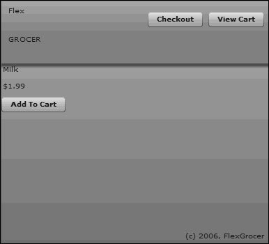
| The e-commerce application of FlexGrocer is where customers come to shop for groceries. This application has a top region with the store logo as well as links always available to the application. Below that is a series of clickable icons that users can use to browse the various categories of groceries (dairy, meat, fruit, and so on). Below the icons will be an area for displaying products. 1. | Open the EComm.mxml file that you created in the previous lesson.
If you didn't complete the previous lesson, you can open EComm.mxml from Lesson03/start and save it in your FlexGrocer directory.
| 2. | Switch FlexBuilder 2 to Design mode.
FlexBuilder 2 has Buttons on top to switch between Design mode and Source mode.
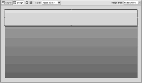
| 3. | In the Components view, open the Layout folder. Drag an ApplicationControlBar container to the top of the Application. Set Dock: to TRue, set the width of the ApplicationControlBar container to be 100%, set the height to be 90, and remove any entries for x and y.
Tip  | A blue bar will appear, indicating where you can drop the component. |
Once placed, you should see a light gray bar stretching across the top of the page.
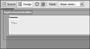
 | | | 4. | From the Components view, drag a Canvas container into the ApplicationControlBar container. In the Flex Properties view, set the canvas width to 100%.
Adding a Canvas container inside the ApplicationControlBar container enables you to specify the exact positioning of the elements within it. By setting the canvas width to 100%, you are telling the canvas to be as wide as the container it is in, which is the ApplicationControlBar container.
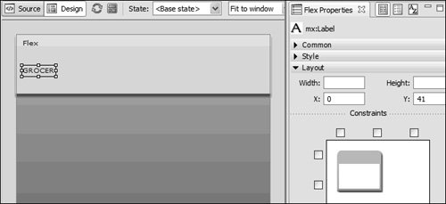
 | | | 5. | In the Components view, open the Controls folder and drag a Label control into the Canvas container in the ApplicationControlBar container. In the Flex Properties view, set the text property for the label to be Flex and set the x and y coordinates to 0.
Tip | Clicking the Show Surrounding Containers button (between the Refresh button and State combo box above the Design area) can help ensure that you place the Label control in the proper container. |
This will hold the company name: Flex GROCER.
The company name, Flex GROCER, will be split into two labels. In the next lesson, you will learn that a Label control can hold only a single line of text, and the FlexGrocer logo has the company name split across two lines.
| 6. | From the open Controls folder, drag another Label control into the Canvas; place this one just below the first label. In the Flex Properties view, set the text property for the label to be GROCER, set the x coordinate to 0, and set the y coordinate to 41.
Later in the book, you will apply styles to set the company logo colors and size. For now, you are just placing the text in the appropriate position.
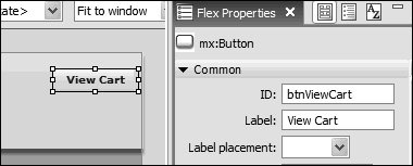
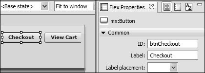
 | 7. | With the Controls folder still open, drag a Button control into the Canvas container so it is positioned near the right edge of the container. In the Flex Properties view, give the Button control an ID of btnViewCart and a label of View Cart.
Don't worry about the exact placement. Later in this lesson, you will learn how to use a constraint-based layout to position the button so its right edge is always 10 pixels from the right edge of the application.
| | | 8. | Drag a second Button control into the Canvas container, just to the left of the first Button control. In the Flex Properties view, give the Button control an ID of btnCheckout and a label of Checkout.
The users will use this button to indicate that they are done shopping and want to complete the purchase of the selected products. Again, the exact placement will happen later in this lesson, when you learn about constraint-based layout.
| 9. | Drag a Label control from the Controls folder and place it near the bottom-right edge of the screen. Double-click the label and set the text property to be (c) 2006, FlexGrocer.
Much like the buttons you just added, you needn't worry about the exact placement because it will be handled later with constraints.
| 10. | Drag an HBox layout container from the Containers folder and place it in the large area below the ApplicationControlBar container. As you drop it, the Insert HBox dialog box will appear. Set the height and width to be 100% and click OK. In the Flex Properties view, set the x and y coordinates to 0, and set the ID of the HBox container to be bodyBox.
This HBox container will hold the product details and shopping cart for the application. Remember that an HBox container displays its children horizontally, so you can have products shown on the left and the shopping cart on the right.
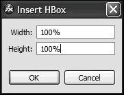
| | | 11. | Drag a VBox layout container from the Layout folder of the Components view and drop it inside the HBox container (you can use the Outline view or the Show Surrounding Containers to verify that you have it in the right container). In the Insert VBox dialog box, assign a height and width of 100% and click OK. In the Flex Properties view, give the VBox container an ID of products.
This VBox container will hold the details for a product.
 | 12. | Drag a Label control into the new VBox container. Set the ID of the Label control to be prodName and the text to be Milk. Drag a second Label control below the first one. Give the second one an ID of price and set $1.99 as the text.
Because they are children of the VBox container, the product name will appear vertically above the price of the product.
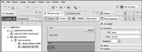 Tip | If you open Outline view, you can see the hierarchy of your application. The root is the <mx:Application> tag, which contains an ApplicationControlBar container and an HBox container as children. You can also see the various children of the ApplicationControlBar container. This is a useful view if you want to make a change to a component. It can be difficult to select just the ApplicationControlBar container in Design mode in the Editor. You can easily select it by clicking it in Outline view. |
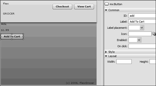
| | | 13. | Add a Button control below the two labels, with an ID of add and the Label Add To Cart.
For each product, you will be showing a name of the product and its price. The button gives the user the ability to add that product to their shopping cart. Because those three controls are in a VBox container, they appear one above the other. The functionality for the Button will be added in a later lesson.
 | 14. | Save the file and click Run.
As this runs, you can clearly see the difference between elements in the ApplicationControlBar container and those in the body.
|
|