Recipe 9.3. Building a Two-Column Layout with Fixed-Width Columns
ProblemYou want to create a two-column layout with fixed-width columns. SolutionFirst, mark up the content with div elements by using the id attributes that contain appropriate values representing their placement on the page (see Figure 9-7): <div > [...] </div> <div > [...] </div> <div > [...] </div> <div > [...] </div> Figure 9-7. The default rendering of the page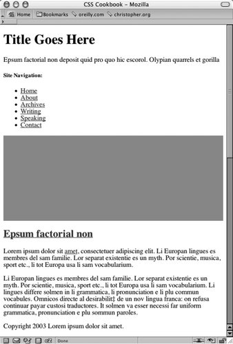 Using the float property, set the width of the left column to a length unit rather than to percentages. Also, set the width of the entire document to a length unit (see Figure 9-8): body { margin: 0; padding: 0; font-family: Georgia, Times, "Times New Roman", serif; color: black; width: 600px; border-right: 1px solid black; } #header { background-color: #666; border-bottom: 1px solid #333; } #columnLeft { float: left; width: 160px; margin-left: 10px; padding-top: 1em; } #columnRight { padding-top: 1em; margin: 0 2em 0 200px; } #footer { clear: both; background-color: #ccc; padding-bottom: 1em; border-top: 1px solid #333; padding-left: 200px; } Figure 9-8. The two-column layout enabled by CSS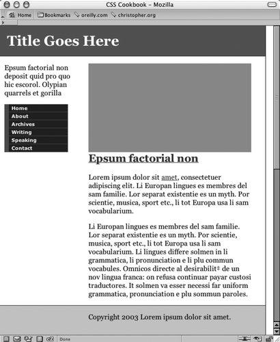 DiscussionBy default, block-level elements stretch to the width of their containers. If the browser window is small, the block-level elements shrinkin other words, text inside the content wraps into narrow columns. However, when you use length units rather than percentages, the width of the columns becomes fixed. Even as a browser window shrinks or expands, the column widths remain fixed. To keep the width of the left column fixed while enabling the main column to stretch, simply remove the width property assigned to the body element. If you want to have the columns reversed as like the ones in Figure 9-9, reorder the content with the following markup: <div > [...] </div> <div > [...] </div> <div > [...] </div> <div > [...] </div>
Then use the following updated CSS rules: #columnLeft { width: 340px; margin-left: 10px; margin-top: 1em; } #columnRight { float: right; width: 200px; } #footer { clear: both; background-color: #ccc; padding-bottom: 1em; border-top: 1px solid #333; padding-left: 10px; } Figure 9-9. The columns are reversed See AlsoRecipe 9.2 on creating a two-column layout with flexible-width columns. |
EAN: 2147483647
Pages: 235