Recipe 9.2. Building a Two-Column Layout
ProblemYou want to create a two-column layout with columns that resize to the width of the browser, as in Figure 9-2. Figure 9-2. Two-column layout achieved through CSS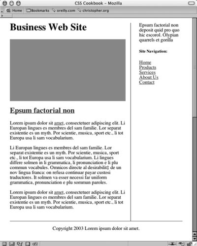 SolutionFirst, mark up the content with div elements by using the id attributes that contain appropriate values (see Figure 9-3). Figure 9-3. The default rendering of the page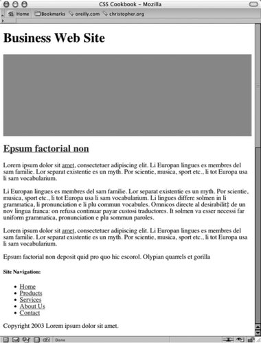 For demonstration purposes, the values of the id attributes are used to show where the content is displayed when CSS is used. Semantic values would be preferred, like mainContent or sidebar, instead of using values that represent their placement on the page: <div > [...] </div> <div > [...] </div> <div > [...] </div> Then, in CSS, use the float property to move the contents of the left column to the left, and set a width that is two-thirds the web document's width: #columnLeft { float: left; width: 67%; background: #fff; margin-top: 0; margin-right: 1.67em; border-right: 1px solid black; padding-top: 0; padding-right: 1em; padding-bottom: 20px; }The right column wraps around the contents of the left column. On the right column, set the top of the margin and padding to 0, allowing the column and the first element in it to become level with the left column: #columnRight { padding-left: 2em; margin-top: 0; padding-top: 0; } h1 { margin-top: 0; padding-top: 0; }To display the footer at the bottom of the web document, set the clear property to both: #footer { clear: both; padding-bottom: 1em; border-top: 1px solid #333; text-align: center; }DiscussionThe float property is similar to the align attribute that is used in HTML to allow text and other elements to flow around an image: <img src="/books/3/27/1/html/2/this.jpg" width="250" height="150" hspace="7" vspace="7" alt="example" align="right" /> Once the image has been set to align to either the right or left, the content around the image flows to the opposite side of the image's alignment. For example, an image aligned to the right forces content to flow around the image on the left side (see Figure 9-4). With CSS, floats provide a similar function, except they offer more exacting control over the presentation by using borders, margins, padding, and other properties. Figure 9-4. Text wrapping around an image set to right alignment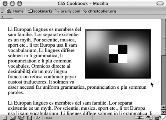 To make sure the content that comprises the footer is placed at the bottom of the columns, set the clear property to a value of both. When you set the value to both, the browser understands that the content of the footer isn't flowing around the floated left column and positions it below (or past) any floated elements. The only caveat to this technique for creating a two-column layout is that the content in the left column needs to be longer than the content in the right column. Because the content in the left column appears first in the document, the content in the right column wraps around the left column. Too much content in the column that doesn't float results in the anomaly that you see in Figure 9-5. Figure 9-5. Unwanted wrapping of text under the left column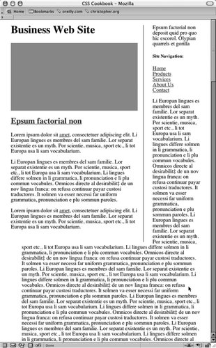 A method for fixing this problem is to set off the left margin or padding on the right column element so that the column width is at least maintained after the content flows below the float: #mainColumn { width: 400px; /* Enough padding to compensate for the left column */ padding-left: 200px; } #navigation { float: left; width: 175px; }If you want to have the columns reversed (see Figure 9-6), switch the order of the columns by using the following markup: <div > [...] </div> <div > [...] </div> <div > [...] </div> Figure 9-6. The columns are reversed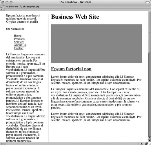 Then apply the following CSS to the columns: #columnRight { float: right; width: 67%; padding-bottom: 20px; padding-top: 0; } #columnLeft { width: 29%; padding-right: 1em; border-right: 1px solid black; padding-top: 0; }
See AlsoRecipe 9.3 for a two-column layout with fixed widths; Jeffrey Zeldman's "From Table Hacks to CSS Layout: A Web Designer's Journal" for a background on this Solution at http://www.alistapart.com/articles/journey/. |
EAN: 2147483647
Pages: 235
- Structures, Processes and Relational Mechanisms for IT Governance
- Linking the IT Balanced Scorecard to the Business Objectives at a Major Canadian Financial Group
- Measuring ROI in E-Commerce Applications: Analysis to Action
- Technical Issues Related to IT Governance Tactics: Product Metrics, Measurements and Process Control
- Managing IT Functions
- Command Reference
- Configuring L2TPv3 Static Tunnels
- Case Study 2: Implementing Multi-VRF CE, VRF Selection Using Source IP Address, VRF Selection Using Policy-Based Routing, NAT and HSRP Support in MPLS VPN, and Multicast VPN Support over Multi-VRF CE
- Case Study 7: Implementing Hub and Spoke Topologies with OSPF
- Case Study 10: BGP Site of Origin