|
CSS Cookbook Authors: Schmitt C. Published year: 2006 Pages: 133-134/235 |
Recipe 7.14. Highlighting Form FieldsProblemYou want to highlight the form field that a visitor is currently using. SolutionUse the :focus pseudo-class selector. With a preexisting form, create a new CSS rule that changes the background color when an input element is being used (see Figure 7-22). Figure 7-22. Background color of input field changes as text is entered
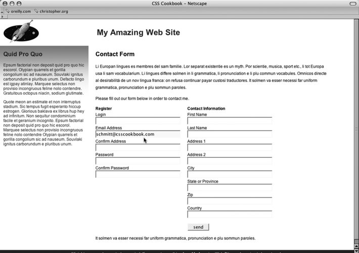
This rule makes changes the background color of the field:
input:focus {
background-color: yellow;
}
DiscussionThe browsers that support :focus are Netscape Navigator 6+, Firefox, Safari, and Opera 7. Browsers that don't support the declaration block will simply ignore it, making it degrade gracefully. See AlsoRecipe 7.4, concerning styling for textarea elements; Table D-9 in Appendix D. |
Recipe 7.15. Integrating Form Feedback with a FormProblemYou want to show users which parts of a form are required. SolutionFirst, place an icon and text warning next to form labels of fields that are required (see Figure 7-23). Apply a class attribute with a value of required to the label and form elements that are required in order to successfully process a form. <form id="msgform" name="msgform" method="post" action="/process.php"> <fieldset> <legend>Contact Information</legend> <label for="fmtitle" accesskey="i">T<span class="akey">i</span>tle</label> <select name="fmtitle" id="fmtitle"> <option value="ms">Ms.</option> <option value="mrs">Mrs.</option> <option value="miss">Miss</option> <option value="mr">Mr.</option> </select> <label for="fmname" accesskey="n"><span class="akey">N</span>ame</label> <input type="text" name="fmname" id="fmname" /> <label for="fmemail" accesskey="e" class="required" > <span class="akey">E</span>mail <img src="alert.gif" /> Required </label> <input type="text" name="fmemail" id="fmemail" class="required" /> </fieldset> <fieldset> <legend>Your Message</legend> <label for="fmstate" accesskey="y">Subject</label> <input type="text" name="fmcountry" id="fmcountry" /> <label for="fmmsg" class="required"><span class="akey">M</span>essage <img src="alert.gif" /> Required </label> <textarea name="fmmsg" accesskey="m" id="fmmsg" rows="5" cols="14" class="required" ></textarea> </fieldset> <input type="submit" name="submit" value="send" class="submit" /> </form> Figure 7-23. Required icon and warning text
Apply rules to change the text and border color of the forms (see Figure 7-24):
label {
margin-top: .33em;
display: block;
}
input {
display: block;
width: 250px;
}
textarea {
width: 250px;
height: 75px;
}
label.required {
color: #c00;
font-weight: bold;
}
textarea.required, input.required {
border: 1px solid red;
background-color: #eee;
}
Figure 7-24. Modified required form fields
DiscussionModifying form and label elements with color and bold text lets users readily know what the problem areas of their form are. Adding the word "required" and a warning icon also help to clue users to problems with their form submission. In case a user 's browser doesn't support CSS, the text and image will then be the only clues for users as to what needs to be corrected in order for the form to be submitted correctly. See AlsoA tutorial on integrating form feedback with PHP at http://www.maketemplate.com/feedback/. |
|
CSS Cookbook Authors: Schmitt C. Published year: 2006 Pages: 133-134/235 |