Advanced Functionality of the Chart Component
Now that we've covered all the basics of charting, let's explore a few of the more advanced features of the Chart component, especially those not found in traditional Excel charting. You will see many of these features put to use in the solutions presented in Part II of this book. When we get to those solutions, if you need to refresh your memory on the basics of any particular feature, simply refer back to this section for a more general explanation.
Multiple Charts in "Chart Space"
As noted earlier, the Chart control can display more than one chart at a time in what is known as a chart space. The top-level programming interface for the Chart control is actually called ChartSpace, and when you insert a new Chart control into a container, the default name given the control is usually ChartSpace1.
Showing multiple charts at once in a control is useful for displaying related plots that you want to compare in one glance. This design, often called small multiples, can be a powerful analysis tool. For example, if you need to show sales data across time, salespeople, and geography simultaneously, you might create one chart for each country, each displaying the salespeople as series and the time as categories. Figure 3-18 shows what the resulting charts might look like.
The Chart control can show up to 16 charts in the same chart space, but all the charts must share the same set of categories. If two charts have a different set of categories, the set of categories used for both charts will be the union of the categories from each chart. This is because small-multiple designs rely on the consistency of the categories, series, and axis scalings among the various charts so that you notice large differences and trends easily.
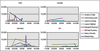
Figure 3-18. Multiple charts in one chart space.
That said, the Chart control will not automatically normalize the value axis scales among all the various charts for you, but you can do this quite easily with a little bit of code from the MultipleCharts.htm file in the Chap03 folder on the companion CD:
'------------------------------------------------------------------------ ' NormalizeCharts() ' ' Purpose: Makes all value axes of charts in a chart space the same ' so that you can accurately compare values ' In: cspace = reference to the ChartSpace object ' nAxis = index of the value axis in the WCAxes collection ' Sub NormalizeCharts(cspace, nAxis) ' Local variables Dim cht ' Temporary chart object reference Dim ax ' Temporary axis object reference Dim nMax ' Maximum value across the axes nMax = 0 ' Loop through all the charts once to determine the overall maximum For Each cht In cspace.Charts Set ax = cht.Axes(nAxis) If ax.Scaling.Maximum > nMax Then nMax = ax.Scaling.Maximum End If Next 'cht ' Loop again to set the maximum For Each cht In cspace.Charts Set ax = cht.Axes(nAxis) ax.Scaling.Maximum = nMax Next 'cht End Sub 'NormalizeCharts() |
The code here performs two loops over all the Chart objects in the chart space. The first determines the maximum value across all the value axes, and the second sets the Scaling.Maximum property to the maximum value so that all charts have the same maximum on their value axis. Note that this kind of method is necessary only when your chart has a value axis—so it does not apply to multiple Pie, multiple Stacked Pie, or multiple Doughnut charts.
You can also control the layout of multiple charts within the chart space by adjusting the ChartLayout and ChartWrapCount properties of the top-level ChartSpace object. You can set the ChartLayout property to make the charts lay out horizontally or vertically. ChartWrapCount controls how many charts appear in each row or in each column before wrapping to the next. You can also adjust the HeightRatio and WidthRatio properties of each WCChart object to allow more or less room for specific charts.
Server-Side Use
Each of the Office Web Components can be used as a nonvisible, in-memory object in addition to a COM control hosted on a form. But when it comes to running on a web server, the Chart component is probably the most desirable of the Office Web Components. When the OWC team first started releasing beta builds internally at Microsoft, we immediately began to receive e-mail from other groups in the company that wanted to know how to use the Chart control on the server to generate charts of live data (in most cases, to report bug statistics). Many businesses have a set of metrics they use to measure a production or operational process; it's a manager's dream to simply open his or her web browser and see a chart with up-to-the-minute data. Since the Chart control can be used on the server and can emit a GIF image of itself, many developers find utilizing the Chart control on the server a compelling way to generate charts of live data that can be used across the Internet or in enterprises where the client desktop is heterogeneous.
You will find this type of solution implemented in Chapter 6, where we will examine it in much greater detail. For now, I will familiarize you with what the Chart control can do when running on the server and show you the basics of saving the Chart control's contents as a GIF image.
You can employ all the normal features of the Chart control when using it on the server. Also, all the code we discussed earlier that is used to load the chart with different data is applicable in that environment. Typically, you load the Chart control from an ADO Recordset object obtained from either a server-side object or another script on the server. You can refer to all the elements of the chart as if they were on the screen, and when you are finished creating the chart, you can use the ChartSpace object's ExportPicture method to write the GIF image to a file. The Chart control supports exporting to only the GIF image format in this release, but you can specify any width and height you want in pixels.
The last point I want to make about server-side usage is that you should check the license agreement that comes with your copy of Office 2000 and ask a Microsoft Application Developer Customer Unit (ADCU) representative for more information on distributing a solution that uses the Office Web Components on a web server. At the time of this writing, the Office marketing group was putting together a special server-side usage license for the Office Web Components. Although the details had not been finalized, this fee was intended to cover an unlimited number of clients so that you could use these components on an Internet site.
Split Axes
Another commonly requested charting feature is the ability to split a value axis at a certain point so that you can portray small and large numbers on the same value axis and still show the local variation. Figure 3-19 depicts a common Split-Axis chart.
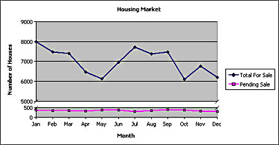
Figure 3-19. A Split-Axis chart.
Charts can have one split per value axis, and you can specify the exact values where the value axis's split starts and ends. You can do this in the Property Toolbox at design time by selecting the value axis and using the Split Axis section of the Property Toolbox to set the start and end split values. You can also do this with code at runtime by setting the HasSplit property of the axis's Scaling object to True and then setting the SplitMinimum and SplitMaximum properties.
Adjusting an Axis's Scaling
The Chart control by default will choose an automatic minimum and maximum for a value axis that will make all the data points visible and leave a little bit of margin around the plot area. However, sometimes you will want to override these defaults and manually adjust an axis's scaling attributes to get precisely the minimum and maximum you want.
Every WCAxis object has a Scaling property that returns a WCScaling object. The WCScaling object has properties called Minimum and Maximum for setting an explicit minimum and an explicit maximum or for reading the current values. You can also set the HasAutoMinimum and HasAutoMaximum properties to True to force the axis to return to automatic scaling behavior.
The WCScaling object also lets you tell the axis to use a logarithmic scale instead of a linear one. Set the Type property of WCScaling to the chScaleTypeLogarithmic constant to make the scale logarithmic, or restore it to the chScaleTypeLinear constant to make it linear again. You can also adjust the LogBase property to set the base of the logarithmic scale.
Another interesting setting you can adjust is the Orientation property, which makes a scale display backwards, from minimum to maximum, rather than vice versa. This might or might not be useful for a value axis, but it is the easiest way to make a category axis show the categories in reverse order.
Probably the most interesting use of the Scaling object is to simulate zooming and panning on an axis. If your chart is densely packed with data points, it is useful to allow an analyst to zoom into a specific section of the axis and then pan across the axis to see various sections. You can do this by simply manipulating the Minimum and Maximum properties of the Scaling object, which has the effect of zooming and panning in the chart because the chart shows less numerical distance in the same visual distance on the screen.
Homemade Chart Tips
The Chart component does not yet have the chart tips feature that you have no doubt seen in Excel. Chart tips are the larger ScreenTips that show up when you hover the mouse over a data point or chart element. Chart tips show the data point's value, category, series, and other useful information. The bad news is that these chart tips are not a native feature of the Chart control; the good news is that you can add them yourself by catching a few events raised by the Chart control. In Part II of the book, I will explain how you can create these homemade chart tips. For now, I will just give you the basics of how they work.
The Chart control raises the MouseMove event whenever the mouse is moved over the control. During this event, you can ask for the mouse's current X and Y coordinates with respect to the control's top-left pixel. These X and Y coordinates not only help you position other elements where the mouse is, but you can also feed them to the ChartSpace object's RangeFromPoint method to get the chart object that is currently under the mouse. For example, if your mouse is positioned over a data point, this method will return a WCPoint object, with which you can determine the parent series, the category, and the exact value of the point using the GetValue method. You can also adjust the formatting for that specific data point using the WCPoint object, which means you can, for instance, change the border color to highlight the value or change the interior color to a slightly darker or lighter shade of the current fill color. If the mouse is positioned over a chart element such as the legend, you will get a WCLegend object back from this method. Use the TypeName method in VBScript and VBA to determine what kind of object you get back from the RangeFromPoint method. You can also use the ChartSpace object's SelectionType property to determine the type of object returned from the Selection property.
For an example of using the Chart component's events and reacting to the mouse, see the file ReactingToMouse.htm in the Chap03 folder on the companion CD.
Why Is It Called RangeFromPoint?When I first started looking into the nooks and crannies of the Chart component's programming model, I asked Jason Cahill, the Chart component's program manager, why this method was called RangeFromPoint when it clearly had nothing to do with ranges and instead returned chart objects. "Shouldn't this be called ObjectFromPoint?" I asked.
Jason explained that when Microsoft's accessibility group first decided to build screen readers for the blind, they wanted a method in Excel that would return the current range underneath the mouse so that they could read the values in the cells over the computer's audio system. (In case you were wondering, the accessibility group makes computers accessible to people with disabilities. Screen readers use audio to "read" onscreen text aloud for blind users.) Excel correctly named the method RangeFromPoint since it returned a range from an (X,Y) point. However, the accessibility group coded that method name into their application, and now anyone who wants accessibility to the screen reader must implement the RangeFromPoint method even though his or her application might not have anything to do with spreadsheet ranges.
EAN: 2147483647
Pages: 111