SUMMARIZING DATA
The purpose of collecting data is not to categorize everything into neat figures but to provide a basis for action. The data themselves can be in any form, that is, measurement data (continuous data, length, weight, time, and so on) or attribute data (countable data, number of defects, number of defectives, percentage of defectives, and so on).
In addition, there are also data on relative merits, data on sequences, and data on grade points, which are somewhat more complicated but useful to those with the experience to draw appropriate conclusions from them.
After the data are collected, they are analyzed , and information is extracted through the use of statistical methods such as histograms, Pareto diagrams, check sheets, cause and effect diagrams, scatter diagrams, box plots, dot plots, stem and leaf displays, descriptive statistics, control charts , and many other tools and methods.
Therefore, data should be collected and organized in such a way as to simplify later analysis. For example, the nature of the data must always be identified. Time may elapse between the collection and the analysis of the data. Moreover, the data may be used at other times for different purposes. It is necessary to record not only the purpose of the measurement and its characteristics but also the date, the instrument used, the person doing it, the method, and everything else pertaining to the collection process.
Some of the key characteristics in the process of summarizing the data to find causal factors are to:
-
Clarify the purpose of collecting the data. Only when the purpose is clear can the proper disposition can be made.
-
Collect data efficiently . Unless the data are collected within the budget constraints and in such a way that they indeed reflect the process, product, or system, the analysis will fail.
-
Take action according to the data. The decision must be made on the basis of the data, otherwise they will not be collected in a positive manner. Make a habit of discussing a problem on the basis of the data and respecting the facts that they show.
-
Determine the shape of the distribution.
-
Determine the relationship with specifications.
-
Be concerned with changing the histogram. A case can be made when a distribution is of a bimodal nature.
-
Prepare a cause and effect diagram with as many people as possible. Their input will make it an educational experience. Everyone taking part in making this diagram will gain new knowledge. Even people who do not yet know a great deal about their jobs can learn a lot from making a cause and effect diagram or merely studying a complete one. It generates, as well as facilitates, discussion.
-
Seek causes actively.
-
Use a Pareto diagram as the first step in seeking improvements. In making these improvements, the following are important:
-
Everyone concerned must cooperate.
-
It must have a strong impact.
-
A concrete goal must be selected.
-
Recognize that if all workers try to make improvements individually with no definite basis for their efforts, a lot of energy will produce little result. The Pareto diagram is very useful in drawing the cooperation of all concerned.
-
-
In using a scatter diagram, be aware of stratification. Conflicting results in correlation may be indicated.
-
Look for the peaks and troughs as well as for the range in which correlation exists when using scatter diagrams.
-
Know that control charting, even though it is replacing many acceptable sampling plan systems, is still a graphical aid for the detection of quality variation in output from a given process. It is a summarizing as well as an evaluative method to improve the process on an ongoing basis by which corrective action, when necessary, may take place. (A strong reminder here: The term control is used in the title of control chart, but, in fact, we all must recognize and always remember that the control chart does not control anything.)
FREQUENCY DISTRIBUTIONS
The construction of a numerical distribution consists essentially of three steps:
-
Choosing the classes into which the data are to be grouped
-
Sorting or tallying the data into the appropriate classes
-
Counting the number of items in each class
Because the last two of these steps are procedural, we will discuss the problem of choosing suitable classifications.
The two things necessary for consideration in the first step are to determine the number of classes into which the data are to be grouped and the range of values each class is to cover, that is, from where to where each class is to go. The following are some guidelines:
-
We seldom use fewer than 6 or more than 15 classes; the exact number used in a given situation depends on the nature, magnitude, and range of the data.
-
We always choose classes such that all of the data can be accommodated.
-
We always make sure that each item belongs to only one class; in other words, we avoid overlapping classes. Successive classes that have one or more values in common are not allowed.
-
Whenever possible, we make the class interval of equal length; in other words, we have the intervals cover equal ranges of values. It also is generally desirable to make these ranges multiples of 5, 10, 100, and so on, to facilitate the reading and use of the resulting table.
WHAT HISTOGRAMS ARE
A histogram is a type of graph that shows the distribution of whatever you are measuring. In our modern world, in which we design products to be produced to given measurement, a histogram portrays how the actual measurement of different units of that product vary around this desired value. The frequency of occurrence of any given measurement is represented by the height of vertical columns on the graph. Now let us consider a detailed example showing the procedure for a histogram.
We have selected the following defect data points:
| 29 | 67 | 34 | 39 | 23 | 66 | 24 | 37 | 45 | 58 |
| 51 | 37 | 45 | 26 | 41 | 55 | 27 | 96 | 22 | 43 |
| 73 | 48 | 63 | 37 | 19 | 31 | 37 | 68 | 22 | 35 |
| 31 | 58 | 35 | 82 | 28 | 35 | 44 | 40 | 41 | 34 |
| 15 | 31 | 34 | 56 | 45 | 27 | 54 | 46 | 62 | 29 |
| 51 | 31 | 56 | 43 | 39 | 35 | 23 | 28 | 45 | 48 |
| 47 | 41 | 34 | 47 | 30 | 54 | 49 | 34 | 53 | 61 |
| 82 | 45 | 26 | 35 | 67 | 73 | 30 | 16 | 52 | 35 |
| 46 | 40 | 41 | 56 | 37 | 51 | 33 | 92 | 70 | 63 |
| 72 | 35 | 62 | 28 | 38 | 61 | 33 | 49 | 59 | 36 |
Because the smallest of the values is 15 and the largest is 96, it seems reasonable to choose the nine classes going from 10 to 19, 20 to 29, and so on, up to from 90 to 99. Performing the actual tally and counting the number of items in each class, we obtain the frequency distribution shown in Table 3.1.
| Class Frequency | Tally | Frequency | Cumulative Frequency |
|---|---|---|---|
| 10 “19 | \\\ | 3 | 3 |
| 20 “29 | \\\\\ \\\\\ \\\\ | 14 | 17 |
| 30 “39 | \\\\\ \\\\\ \\\\\ \\\\\ \\\\\ \\\\ | 29 | 46 |
| 40 “49 | \\\\\ \\\\\ \\\\\ \\\\\ \\ | 22 | 68 |
| 50 “59 | \\\\\ \\\\\ \\\\ | 14 | 82 |
| 60 “69 | \\\\\ \\\\\ | 10 | 92 |
| 70 “79 | \\\\ | 4 | 96 |
| 80 “89 | \\ | 2 | 98 |
| 90 “99 | \\ | 2 | 100 |
| Total | 100 | 100 | 100 |
The numbers shown in the righthand column of Table 3.1 are called class frequencies, whereas the smallest and largest values that can go into any given class are referred to as class limits. Thus, the limits of the nine classes are 10, 20, 30, and so on. More specifically , 10, 20, 30, and so on until 90 are referred to as the lower class limits, whereas 19, 29, 39,...99 are referred to as the upper class limits of the respective classes.
Numerical distributions also have class marks, class intervals, and class boundaries. A class mark is simply the midpoint of the class and is calculated by adding the lower and upper class limits and dividing the sum by two. In this example, the class mark for each class frequency is 14.5, 24.5, 34.5, and so on until 94.5. A class interval is simply the length of a class, or the range of values it can contain, and when we are dealing with equal class intervals, their length is given by the difference between any two successive class marks. Thus, the class interval for our data is 10, or as it is customary to say, "it has a class interval of 10." It is important to know here that the class intervals of this distribution are not given by the respective differences between the upper and lower class limits, which would be 9 instead of 10.
At this point, it is very important for the reader that each of the data values falls into a specific cell . In other words, the first class actually contains all values between 9.5 and 19.5; the second contains all values falling between 19.5 and 29.5; and so on. These values are called class boundaries, and sometimes they are called the "real" class limits. Again the reader should note that the difference between the two boundaries of a class equals its class interval; in fact, for distributions having classes of unequal length, the difference between the two boundaries of a class serves to define its interval.
For our discussion, it is also important to remember that class boundaries must always be " impossible " values; that is, values that cannot occur among the data we want to group . To make sure of this, we have only to observe the extent to which the data are rounded.
For a typical histogram, see Figure 3.1.
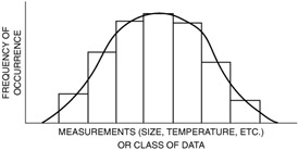
Figure 3.1: A typical histogram.
The shape or contour formed by the tops of the columns has a special meaning. This shape can be associated with statistical distribution that in turn can be analyzed with mathematical tools. These various shapes are often given definitions, such as normal, bimodal, or skewed, and a special significance can sometimes be attached to the causes of these shapes. A normal distribution causes the distribution to have a bell shape and is referred to as a bell curve.
WHY HISTOGRAMS ARE USED
Histograms are used because they help to summarize data and tell a story that would be lengthy and less effective in narrative form. Also, they are standardized in format and thus lend themselves to a high degree of communication between users.
On the basis of a long history of experience in analyzing observations made about happenings in nature, activities of people, and machine operations, it has been found that repetitive operations yield slightly different results. Sometimes these differences are significant and sometimes not; a histogram aids in determining the significance. The shape of the diagram gives the user some clues as to the statistical distribution represented and thereby a clue as to what might be causing the distribution. For example, if a machine is worn out and will not hold close tolerances, measurement of parts coming off that machine will produce a histogram that is wide and flat like that in Figure 3.2.
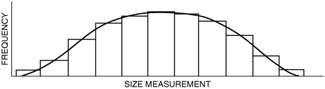
Figure 3.2: A histogram representing a machine that is worn out.
HISTOGRAM CONSTRUCTION
As mentioned earlier, the number of classes is important because it will determine the usefulness of the completed histogram. The extreme case of having too few classes results in all the data being in one class. Nothing is gained by such a histogram. The opposite extreme is to have so many classes that no more than one or two observations are grouped in any one class. Here again, the resulting histogram is of no value because it has not summarized the data sufficiently.
To guide you in deciding the proper class size , the following table is provided:
| Number of Observations ( N ) | Appropriate Number of Classes ( K ) |
|---|---|
| 31 “50 | 5 “7 |
| 51 “100 | 6 “10 |
| 101 “250 | 7 “12 |
| more than 250 | 10 “20 |
As an alternative to this table, one may use the square root method. That is, if we have X observations, we need ![]() classes. Both methods are acceptable; choose to use the one with which you are more comfortable.
classes. Both methods are acceptable; choose to use the one with which you are more comfortable.
How do you arrive at a specific number of classes from the range of classes suggested by the above table? The procedure for selecting a specific number of classes is one that results in a class size that will be convenient to use. Consider this example: the number of observations is 100. Assume that among these observations, the largest is 3.68 (xl) and the smallest is 3.30 (xs). From this, the range, R, is calculated:
R = xl - xs = 3.68 - 3.30 = 0.38
Refer to the table and select 10 as the number of classes because it corresponds to 100 observations. (Note that using the table allows a subjectivity factor in selection. In this case, the appropriate K level is 7 “12. So the choice of 10 is somewhat arbitrary. On the other hand, the square root of 100 is 10, which is very precise. If the number is a decimal figure, then it should be rounded off to the closest number.)
On the basis of the classes, we then proceed to calculate the class size.
Class size = R/K = 0.38/10 = .038
At this point, consider the calculated class size; then, in your judgment, determine whether it is a convenient number to work with. In this case, experience leads to the selection of 0.04 as the most convenient size.
A histogram can now be constructed with 10 classes, with each class 0.04 units wide. Boundaries are at 3.30, 3.34, 3.38, ... 3.68. Observations are not to lie exactly on a boundary, so making a slight refinement is necessary in establishing the boundaries of the bar.
Length is given by the difference between any two successive class marks. Thus, in our example, the class interval is 10, because the difference between the class marks (of, say, 24.5 “14.5) is 10. Note that the class interval in this example is not given by the respective difference between the upper and the lower class limits, which would equal 9 instead of 10 (range, 96 - 15 = 81; class size = 81/9 = 9).
It is very important to note that the choice of the class limits depends on the extent to which the numbers we want to group are rounded off. Again, referring to our example, we observe that the first class actually contains all values between 9.5 and 19.5, the second class contains all values between 19.5 and 29.5, the third class contains all values falling between 29.5 and 39.5, and so on. As we said earlier, these are sometimes called the "real" class limits.
Sometimes, in analyzing experiments, it is preferable to present data in what is called a cumulative frequency distribution, or simply a cumulative distribution, which shows directly how many of the items are less than or greater than various values. Successively adding the frequencies will produce the cumulative frequency.
EAN: 2147483647
Pages: 181