GETTING PRINTING RESULTS
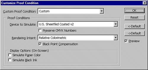
| The best guarantee of a good final product is a quality source image. If your color was good coming in, it's more likely to look good for output. So if your subject has an odd green skin tone, your print will probably have the green skin, too. If you are printing on an inkjet printer, realize that despite an inkjet's CMYK color space, it actually prints from RGB images. A great many programs that don't even support CMYK images print just fine to inkjet printers. Regarding commercial printing, the most important piece of advice I can give you is to simply talk with your commercial printer. Just as a racecar driver trusts his mechanic to prepare a multimillion-dollar vehicle, so should you trust your printer to run his or her machinery at maximum efficiency. Communication is the key. Instead of wondering what you can do past calibrating your monitor and choosing the correct color management settings, you might request a proof from your printer. Some test prints are prohibitively expensive, but depending on the facility, your printer may have a specialized color laser printer calibrated with the press for accurate proofing. If you are not satisfied with the color proof, communication is still the key. You should express your concerns and find out what modifications should be made. Many jobs have non-critical color requirements. That means that if the skin tones look correct and nothing looks out of the ordinary, the slight color variance will likely go unnoticed. With logos and other specific company brand colors, you have critical color needs. Make sure you are using the right CMYK or spot colors. Never just eyeball your color in these situations. Sample the important color from existing art or get the CMYK or spot color numbers from the marketing department. When you match the numbers, you know that even if it doesn't look quite right onscreen, at least your prints will be correct. You will find that different printers may print the same graphic just a little differently. These variations come from color mixing differences and machine calibration differences. Using a spot color such as one from the Pantone Matching System helps guarantee accurate color matching because print vendors mix Pantone colors to exact specifications. Viewing and Correcting ColorsBecause the range of color in CMYK is limited and because not all of Photoshop's filters are available in that color mode, design and creation are often done in RGB mode, and the artwork is later converted to CMYK for print. The difference in gamut, however, allows you to design in RGB with colors that can't be printed in CMYK. Photoshop warns you if you select an RGB color that cannot be reproduced with CMYK inks. Photoshop enables you to soft proof your work. This means viewing your image onscreen while Photoshop attempts to simulate different outputs onscreen. By choosing View, Proof Colors, you can check how your project is expected to print. The View, Proof Setup, Custom command enables you to select a color profile for the printer. You then use the View, Proof Colors command to toggle the preview on and off. The Custom option opens the Customize Proof Condition dialog, shown in Figure 5.26. Figure 5.26. Changes made in the Customize Proof Condition dialog do not change the selections in the Color Settings dialog.
Soft proofing is not usually considered an acceptable substitute for hard (printed) proofs. Soft proofing is feasible only when the monitor has been properly calibrated and an appropriate profile for the specific printer is available. The Simulate Paper Color check box, when enabled, compensates for the medium defined in the profile (if any). The Simulate Black Ink option simulates onscreen the dynamic range of the selected profile. Selecting the appropriate color profile is critical if the Proof Setup command is to give you an accurate representation of the image. Your printer may be able to supply you with a profile for the particular press and inks that will be used on your project. The Preserve Color Numbers option shows you what your artwork would look like if it were thrown on the press "as is." This setting simulates printing the color values without compensating for the profile space. Normally, you should leave this option unchecked. The Intent pop-up menu gives you the same four options that you can find in the Advanced section of the Color Settings dialog:
|
EAN: 2147483647
Pages: 426