Control Bars
|
|
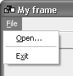
| A control bar provides a convenient way to contain and arrange multiple controls. There are currently three kinds of control bars: wxMenuBar, wxToolBar, and wxStatusBar. wxMenuBar can only belong to a wxFrame. wxToolBar and wxStatusBar are most commonly used with wxFrame, but they can also be children of other windows. wxMenuBarA menu bar contains a series of menus accessible from the top of a frame under the title bar. You can replace a frame's current menu bar by calling SetMenuBar. To create a menu bar, use the default constructor and append wxMenu objects. For example: wxMenuBar* menuBar = new wxMenuBar; wxMenu* fileMenu = new wxMenu; fileMenu->Append(wxID_OPEN, wxT("&Open..."), wxT("Opens a file")); fileMenu->AppendSeparator(); fileMenu->Append(wxID_EXIT, wxT("E&xit"), wxT("Quits the program")); menuBar->Append(fileMenu); frame->SetMenuBar(menuBar, wxT("&File")); This code creates a one-menu menu bar, as shown in Figure 4-34. Figure 4-34. A wxMenuBar
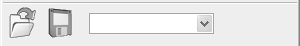
You can append submenus to a wxMenu, and you can create check and radio menu items (refer to the "Menus" section earlier in this chapter). As in the previous example, an ampersand in a label indicates that the following character should be used as a mnemonic (pressing that key when the menu is shown executes the associated command). If you provide a help string, it will be shown in the frame's status bar (if any) by virtue of the default EVT_MENU_HIGHLIGHT handler. wxMenuBar StyleswxMenuBar takes the wxMB_DOCKABLE style, used under GTK+ to allow the menu bar to be detached from the frame. wxMenuBar EventsMenu bars use the events already covered in the description of wxMenu. wxMenuBar Member FunctionsThese are the major wxMenuBar functions. Append adds a menu to the end of the menu bar, which will then own the menu and will destroy it when the menu bar is destroyed (usually by the owning frame). Pass the menu and a label. Insert inserts a menu at the given position. Enable enables or disables the given menu item, given its identifier. Use IsEnabled to check its enabled status. Check checks or unchecks a check or radio menu item. Use IsChecked to test its checked status. EnableTop enables or disables a whole menu, by zero-based position. FindMenu returns the index of a menu whose label matches the given string, with or without mnemonic characters. It returns wxNOT_FOUND if there was no match. FindMenuItem returns the index of a menu item given a menu name and a menu item. FindItem returns the wxMenuItem object given a menu item identifier, and if it is a submenu, its wxMenu pointer will be returned in the second argument. GetHelpString and SetHelpString are accessors for the help string for a given menu item. GetLabel and SetLabel are accessors for a menu item's label. GetLabelTop and SetLabelTop are accessors for a menu's label in the menu bar, given the zero-based menu position. GetMenu returns a pointer to the wxMenu at the given zero-based position. GetMenuCount returns the number of menus in the menu bar. Refresh redraws the menu bar. Remove removes a menu and returns the wxMenu object, which the application is then responsible for deleting. Replace replaces a menu at the given position with another one. The old menu is returned, and the application is responsible for deleting it. wxToolBarA toolbar contains a number of buttons and controls. It can be horizontal or vertical, and the buttons can be push, check, or radio buttons. The buttons can show labels as well as bitmaps. If you use wxFrame::CreateToolBar to create the toolbar, or wxFrame::SetToolBar to associate it with a frame, the frame will manage the toolbar, and it will not be counted as part of the client area. If you use it in any other way, then your code will have to manage the toolbar size and position using sizers or some other method. Here's an example of creating a toolbar and associating it with a frame: #include "wx/toolbar.h" #include "open.xpm" #include "save.xpm" wxToolBar* toolBar = new wxToolBar(frame, wxID_ANY, wxDefaultPosition, wxDefaultSize, wxTB_HORIZONTAL|wxNO_BORDER); wxBitmap bmpOpen(open_xpm); wxBitmap bmpSave(save_xpm); toolBar->AddTool(wxID_OPEN, bmpOpen, wxT("Open")); toolBar->AddTool(wxID_SAVE, bmpSave, wxT("Save")); toolBar->AddSeparator(); wxComboBox* comboBox = new wxComboBox(toolBar, ID_COMBOBOX); toolBar->AddControl(comboBox); toolBar->Realize(); frame->SetToolBar(toolBar); Under Windows, this will create a toolbar, as shown in Figure 4-35. Figure 4-35. A wxToolBar
Note the call to Realize, which must be performed after all buttons and controls have been added to the toolbar; otherwise, nothing will appear in the toolbar. Check out the wxWidgets sample in samples/toolbar for a demonstration of changing orientation, showing labels on buttons, changing the button size, and other aspects of wxToolBar. Tool Bitmap Colors Under WindowsUnder Windows, wxWidgets will attempt to map colors in the tool bitmaps that are close to "standard" colors to equivalents used by the current theme. In particular, light gray is used to indicate transparency within the bitmap. Table 4-48 lists these colors. In fact, colors in the bitmap only have to be close to the indicated color (each RGB element can be within 10 units of the standard value) for the substitution to take place.
This is fine for 16-color tool bitmaps, but if you use more colors, the mapping can be undesirable because it leads to a grainy effect. In this case, add the following line to your code before the creation of the toolbar to switch off the mapping: wxSystemOptions::SetOption(wxT("msw.remap"), 0); You will need to include wx/sysopt.h in your source file. wxToolBar StylesTable 4-49 lists the specific window styles for wxToolBar.
wxToolBar EventsToolbar event macros are listed in Table 4-50. The toolbar class emits menu commands in the same way that a frame's menu bar does, so you can use one EVT_MENU or EVT_TOOL macro for both a menu item and a toolbar button. The event handler functions take a wxCommandEvent argument. For most of the event macros, the identifier of the tool is passed, but for EVT_TOOL_ENTER, the toolbar window identifier is passed, and the tool identifier is retrieved from the wxCommandEvent. This is because the identifier may be -1 when the mouse moves off a tool, and -1 is not allowed as an identifier in the event system.
wxToolBar Member FunctionsThese are the major wxToolBar functions. AddTool adds a tool: specify the identifier, an optional label, a bitmap, a help string, and the kind of tool (wxITEM_NORMAL, wxITEM_CHECK, or wxITEM_RADIO). Use InsertTool to insert the tool at a particular position. You can also use AddCheckTool and AddRadioTool to avoid specifying wxITEM_CHECK or wxITEM_RADIO. AddSeparator adds a separator, which is a line or a space depending on implementation. Use InsertSeparator to insert a separator in a given position. For example, the following line adds a checkable tool with a caption ("Save"), a bitmap, and a help string ("Toggle button 1"): toolBar->AddTool(wxID_SAVE, wxT("Save"), bitmap, wxT("Toggle button 1"), wxITEM_CHECK); AddControl adds a control, such as a combo box. InsertControl inserts a control at a given position. DeleteTool deletes a tool specified by identifier. DeleteToolByPos deletes a tool by position. RemoveTool removes a tool from the toolbar but doesn't delete the wxToolBarTool object, which is returned from the function. Use EnableTool to enable or disable a tool, but rather than doing this explicitly, you may want to use UI update events (see Chapter 9). GetToolEnabled returns the enabled status. Use FindById and FindControl to find a tool or control by identifier. If you need to add bitmaps with a size other than the default 16x15, call SetToolBitmapSize. GetToolBitmapSize returns the current bitmap size. GetToolSize returns the size including decorations around the tool. GetMargins and SetMargins are accessors for the left/right and top/bottom margins. GetToolClientData and SetToolClientData can be used to return or associate an arbitrary wxObject for a tool, given the tool identifier. GetToolLongHelp and SetToolLongHelp are accessors for the long help string associated with a tool. This is a line of help that could be shown in a status bar, for example. GetToolShortHelp and SetToolShortHelp are accessors for the short help string (tooltip) associated with a tool. GetToolPacking and SetToolPacking are accessors for the tool spacing in the vertical direction if the toolbar is horizontal, and for spacing in the horizontal direction if the toolbar is vertical. GetToolPosition returns the position in the toolbar given a tool identifier. GetToolSeparation and SetToolSeparation are accessors for the tool separator size. GetToolState and SetToolState are accessors for a check or radio tool on/off state. Realize must always be called after tools have been added. ToggleTool toggles the given radio or check tool on or off. wxStatusBarA status bar is a narrow window that can be placed along the bottom of a frame to give small amounts of status information. It can contain one or more fields, which can have fixed or variable width. If you use wxFrame::CreateStatusBar to create the status bar, or wxFrame::SetStatusBar to associate it with a frame, the frame will manage the status bar, and it will not be counted as part of the client area. If you use it in any other way, then your code will have to manage the status bar size and position using sizers or some other method. Here's an example of creating a status bar with three fields, two that are 60 pixels wide and a third that expands to fill the rest of the status bar. #include "wx/statusbr.h" wxStatusBar* statusBar = new wxStatusBar(frame, wxID_ANY, wxST_SIZEGRIP); frame->SetStatusBar(statusBar); int widths[] = { 60, 60, -1 }; statusBar->SetFieldWidths(WXSIZEOF(widths), widths); statusBar->SetStatusText(wxT("Ready"), 0); The resulting status bar is shown in Figure 4-36. Figure 4-36. A wxStatusBar
If you want, you can create small controls inside status bar fields. You will have to manage their size and position yourselffor example, from within the size event handler of a class derived from wxStatusBar. wxStatusBar StylesTable 4-51 shows the specific window style for wxStatusBar. You can also determine the appearance of the individual field borders using SetStatusStyles.
wxStatusBar EventsThere are no special events for wxStatusBar. wxStatusBar Member FunctionsThese are the major wxStatusBar functions. GetFieldRect returns the size and position of a field's internal bounding rectangle. GetFieldsCount returns the number of fields in the status bar. Use SetFieldsCount to set the number of fields. GetStatusText gets the status text for a field, and SetStatusText sets the text for a field. PushStatusText saves the current field text in a stack and sets the field text to the string passed as an argument. PopStatusText sets the field text to the top of the stack and pops the stack of saved strings. SetMinHeight sets the minimal possible height for the status bar. SetStatusWidths takes the number of fields and an array of integers that represent each field's width, or a negative number to specify a proportion of the status bar to fill. For example, to create one field of fixed width 100 in the right part of the status bar and two more fields that get 66% and 33% of the remaining space respectively, you should specify an array containing -2, -1, and 100. The negative numbers are used to distinguish absolute pixel values from proportions. SetStatusStyles takes the number of fields and an array of integer styles that determine the appearance of the fields. Use wxSB_NORMAL for a sunken field with a 3D border, wxSB_FLAT for a flat field with no border, and wxSB_RAISED for a field with a raised 3D border. |
|
|
EAN: 2147483647
Pages: 262
- Chapter I e-Search: A Conceptual Framework of Online Consumer Behavior
- Chapter VII Objective and Perceived Complexity and Their Impacts on Internet Communication
- Chapter XII Web Design and E-Commerce
- Chapter XIII Shopping Agent Web Sites: A Comparative Shopping Environment
- Chapter XIV Product Catalog and Shopping Cart Effective Design