Collecting User Input with CheckBoxLists and RadioButtonLists
| In Hour 11 we saw how to use the CheckBox and RadioButton controls to collect user input. When using these individual controls, we had to manually add one CheckBox or one RadioButton control for each check box or radio button needed. Rather than using a series of single CheckBox or RadioButton controls, we can use, instead, the CheckBoxList or RadioButtonList.
The CheckBoxList and RadioButtonList's items can be specified statically via the ListItem Collection Editor dialog box, which you can reach by clicking the Edit Items link in the control's smart tag. The process for adding items to a CheckBoxList or RadioButtonList using the ListItem Collection Editor dialog box is identical to adding items this way for a DropDownList. These steps were covered in detail in Hour 11. The CheckBoxList and RadioButtonList can also be bound to a data source control as we saw in the "Binding Data to a List Web Control" section earlier in this hour. What we didn't look at earlier, though, was how to determine what item or items, in the case of a CheckBoxList, were selected by the user. There are a couple ways to accomplish this:
Let's examine both of these techniques. First, let's create a new ASP.NET page named CheckAndRadio.aspx that has on it a SqlDataSource control, a CheckBoxList, and a RadioButtonList. Configure the SqlDataSource to return all columns and all records of the Books table. Bind this SqlDataSource to both the CheckBoxList and RadioButtonList, having the list controls display the Title column with their values set to the BookID column. Finally, add a Button Web control and a Label Web control. Create a Click event handler for the Button Web control. Then clear out the Text property of the Label control and assign it an ID property value of results. Take a moment to view the page through a browser. You should see a series of check boxes listing each of the five books in the table, followed by a series of radio buttons listing the same books. Enumerating the List Web Control's List ItemsAs discussed earlier in this hour, all three list Web controls have an Items property that is a collection of list items. This collection can be programmatically enumerated using the following code: 'Enumerate the list of items in the CheckBoxList For Each li As ListItem In listWebControlID.Items ' Work with the list item, li Next Within the For Each loop, you can access the properties of the current list item (li), with the germane ones being
If we wanted to display a list of the selected items in the results Label Web control, we could use the following code: results.Text = String.Empty 'Enumerate the list of items in the CheckBoxList For Each li As ListItem In CheckBoxList1.Items If li.Selected Then results.Text &= li.Text & " was selected!<br />" End If Next This code starts by clearing out the Text property of the Label control and then enumerates the list items of the CheckBoxList CheckBoxList1. If an item is selectedthat is, if li.Selected is truethen the Label's Text property has appended a string indicating that the particular list item was selected. (The <br /> in the string is an HTML tag that adds a breaking line; it's used to help improve the readability of the output in the page.) Figure 17.10 shows this ASP.NET page. Note that for each selected check box a corresponding message is displayed in the Label. (This approach works equally well for RadioButtonLists.) Figure 17.10. The Label's output is dictated by what check boxes were selected.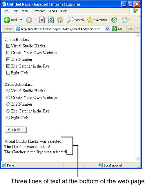 Using SelectedItem and SelectedValueIn Hour 11 we saw how to programmatically determine the selected item or value of the DropDownList using the SelectedItem and SelectedValue properties. The SelectedItem property returns the ListItem instance of the selected item; SelectedValue returns the value of the selected item. Both the RadioButtonList and CheckBoxList have these two properties as well; however, more care must be taken when using these properties with either of these two controls. When you're using a RadioButtonList or CheckBoxList, understand that the user may not choose any item. With either of these controls, the user can simply avoid selecting a check box or radio button. (This concern doesn't exist with the DropDownList control.) Before using these properties, then, you must first ensure that a value was selected. The simplest way to ensure that a value has been selected is to test to see whether the SelectedItem property is equivalent to Nothing; if it is, then that means an item was not selected. We can use the following code to proceed within the conditional only if an item has been selected. That is, we test to see whether SelectedItem is not Nothing and, if so, we can then work with the SelectedItem or SelectedValue properties (see Figure 17.11):
Figure 17.11. The selected radio button's text is displayed in the results Label.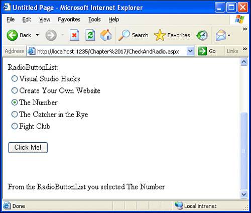
Another concern with SelectedItem and SelectedValue is that they return a single ListItem instance or value. How does this work with the CheckBoxList, which might have multiple selected items? SelectedItem and SelectedValue return the first selected item from the list. Therefore, we typically use SelectedItem or SelectedValue only with DropDownLists or RadioButtonLists. For determining the selected items in a CheckBoxList, stick with enumerating the CheckBoxList's Items collection, as we saw in the previous section. Customizing the Appearance of the RadioButtonList and CheckBoxList ControlsLike the other ASP.NET Web controls we've examined throughout this book, the RadioButtonList and CheckBoxList controls have Font, ForeColor, BackColor, and other common properties we've seen before. As with other Web controls, these properties can be found in the Appearance section within the Properties window. In addition to these properties, the RadioButtonList and CheckBoxList also have some additional properties worth noting in the Layout section of the Properties window. By default, both the RadioButtonList and CheckBoxList are rendered as one-column HTML <table> elements, with each item of the control displayed as a row in the <table>. Listing 17.1 shows the HTML rendered by a CheckBoxList that's bound to the contents of the Books table with its Layout settings left as the default values. Listing 17.1. The HTML Produced by a CheckBoxList with the Default Layout Settings
As you can see, the CheckBoxList renders as a one-column HTML <table> element, with one table row for each check box. The result in the end user's browser is a vertical column of check boxes, as we saw in Figure 17.3. Although the default Layout properties will likely suffice for CheckBoxLists or RadioButtonLists with a small number of items, displaying dozens of check boxes or radio buttons in this vertical, single-column manner could easily chew up a lot of screen real estate. Rather than confining the items to a single column, we might want to have the check boxes or radio buttons span multiple columns. The Layout properties allow you to customize the layout direction along with other facets dictating how these two Web controls are rendered; the germane properties are listed in Table 17.1.
The RepeatLayout property determines the HTML elements used when rendering the controls' radio buttons or check boxes. The default value is Table, indicating that an HTML <table> should be used, as was shown in Listing 17.1. If you set this property to Flow, <span> elements are used in place of the <table>. Listing 17.2 shows the HTML produced by a CheckBoxList whose RepeatLayout property is set to Flow. Listing 17.2. The HTML Produced by a Flow CheckBoxList
In place of the <table> element, a <span> element is used. Furthermore, after each check box there's a <br /> element, which adds a breaking line in the user's browser. The HTML in Listing 17.2 will render in a browser almost exactly like the <table> markup in Listing 17.1.
Laying Out Items HorizontallyBy default the CheckBoxList and RadioButtonList controls display their items vertically, using one column. For lengthy CheckBoxLists or RadioButtonLists, you may want to have the items laid out using multiple columns. To accomplish this, use the RepeatColumns, which specifies how many columns to display and can be assigned any non-negative integer value. The RepeatDirection property indicates the direction the items are laid out, and can be either Horizontal or Vertical (the default). Figure 17.12 shows a CheckBoxList and RadioButtonList with three columns. The figure also illustrates the effects of the RepeatDirection property: The CheckBoxList has its RepeatDirection property set to Vertical, whereas the RadioButtonList's is set to Horizontal. The results here are ordered by BookID, so Visual Studio Hacks is the first book, then Create Your Own Website, followed by The Number, and so on. As you can see, with the CheckBoxList, the first two books are in the first column, the second two in the second column, and so on. In essence, the output is grouped by row. With the RadioButtonList's Horizontal RepeatDirection value, the output is grouped by column, with the first three books in the first column and last two books in the second column. Figure 17.12. A RadioButtonList and CheckBoxList, with RepeatColumns set to 3.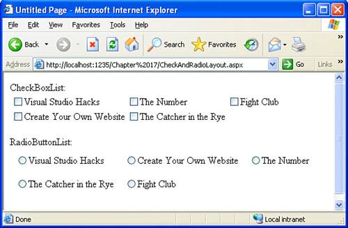 Also notice that there is more padding within each cell in the RadioButtonList than in the CheckBoxList. The reason is that I've set the CellPadding property of the RadioButtonList to 8. |
 .SelectedItem.Text End If
EAN: 2147483647
Pages: 233