A Quick Review of the DataGrid Column Controls
| As we saw in Chapter 1, there are two ways to specify the columns that should appear in the DataGrid:
Although the first method is clearly a much easier and quicker way to display data in a DataGrid, the second method allows for much more flexibility, because you can specify the ordering of the columns and formatting information like horizontal alignment, font settings, and colors (as we saw in Chapter 3, "Customizing the HTML Output"). Recall that when explicitly specifying the columns that should be displayed in the DataGrid Web control, we used the BoundColumn control to indicate that the column should display the value of a particular field in the DataSource. There are other types of columns that can be added to the DataGrid, though. For example, the ButtonColumn, which we'll be examining shortly, displays a button in each row. The five built-in DataGrid column types can be seen in Table 4.1.
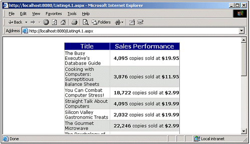
In Chapter 3 we examined the use of the TemplateColumn column control. In this chapter we will look at ButtonColumn and HyperLinkColumn controls in detail. We will not be discussing the EditCommandColumn control until Chapter 9, "Editing the DataGrid Web Control." If none of the built-in column controls meet the functionality you need, you can always write your own DataGrid column control. We'll examine how to do this in Chapter 12, "Creating Custom Column Controls for the DataGrid." Before we delve into using the ButtonColumn control, let's take a quick moment to review the syntax for explicitly specifying columns in a DataGrid Web control. Listing 4.1 contains the DataGrid declaration section from Listing 3.4. Note that to explicitly specify the DataGrid's column layout, you need to do two things: first, ensure that the AutoGenerateColumns property is set to False (if you forget to do this, all the DataSource's fields will be displayed along with the columns you explicitly indicate to be displayed); second, using the Columns tag, explicitly specify those columns that should appear in the DataGrid. When specifying the columns to be displayed, you can choose from any of the column types listed in Table 4.1. Listing 4.1 shows a BoundColumn being used to display the title database field (lines 12 and 13), and a TemplateColumn used to display the ytd_sales and price fields (lines 19 and 21, respectively). Listing 4.1 A DataGrid's Column Layout Can Be Specified Explicitly 1: <asp:datagrid runat="server" 2: AutoGenerateColumns="False" 3: Font-Name="Verdana" Width="50%" 4: HorizontalAlign="Center" ItemStyle-Font-Size="9"> 5: 6: <HeaderStyle BackColor="Navy" ForeColor="White" 7: HorizontalAlign="Center" Font-Bold="True" /> 8: 9: <AlternatingItemStyle BackColor="#dddddd" /> 10: 11: <Columns> 12: <asp:BoundColumn DataField="title" HeaderText="Title" 13: ItemStyle-Width="70%" /> 14: 15: <asp:TemplateColumn HeaderText="Sales Performance" 16: ItemStyle-HorizontalAlign="Right" 17: ItemStyle-Wrap="False"> 18: <ItemTemplate> 19: <b><%# DataBinder.Eval(Container.DataItem, "ytd_sales", "{0:#,###} ") %></b> 20: copies sold at 21: <b><%# DataBinder.Eval(Container.DataItem, "price", "{0:c}") %></b> 22: </ItemTemplate> 23: </asp:TemplateColumn> 24: </Columns> 25: </asp:datagrid> Along with specifying the DataGrid columns that should appear, the code in Listing 4.1 also includes a number of stylistic settings, such as the AlternatingItemStyle setting (line 9), as well as various DataGrid display properties (lines 3 and 4). For more information on these display properties, refer back to Chapter 3. Figure 4.1 shows a screenshot of Listing 4.1 when viewed through a browser. Figure 4.1. The columns displayed in the DataGrid are those that have been explicitly specified. |
EAN: 2147483647
Pages: 111