Adding Error Bars and Trendlines
|
| < Day Day Up > |
|
Two additional visual cues, error bars and trendlines, can help your readers understand your data more quickly. Error bars show the error margin built into each data marker, and trendlines use an analysis of existing data to predict future behavior.
Inserting Error Bars
You can create error bars for the data series in your 2-D area, bar, column, and line charts, as well as bubble and XY (scatter) charts. To add error bars to your chart, follow these steps:
-
Double-click your chart to select it.
-
Use the Chart Objects list to select the data series to which you want to add error bars.
-
Right-click the selected series, and then choose Format Data Series from the shortcut menu.
-
Click the Y Error Bars tab, and then select the Display option you want. You can choose one of the following, as Figure 14-14 shows:
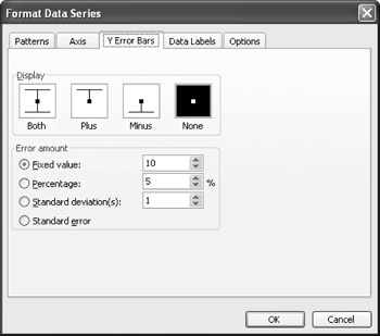
Figure 14-14: Use the Format Data Series dialog box to add error bars that show a margin for error in which the result could be a bit higher or lower than what's shown in your chart.-
Both-Displays an error amount above and below the displayed value
-
Plus-Displays an error amount above the displayed value
-
Minus-Shows an error amount below the displayed value
-
None-No error bars are displayed
-
-
In the Error Amount section, choose the amount of the difference between actual and plus or minus that you want to show.
-
Click OK to add the error bars and return to the chart.
Plotting Trendlines
Trendlines are helpful when you want to use your chart as a basis for either looking ahead to future possibilities or seeing trends in the past. You can add trendlines to area, bar, bubble, column, line, stock, or XY (scatter) charts. When you've created one of these chart types, adding a trendline is simple. Here are the steps:
-
Double-click the chart to select it.
-
Choose Chart, Add Trendline. The Add Trendline dialog box appears, as shown in Figure 14-15.
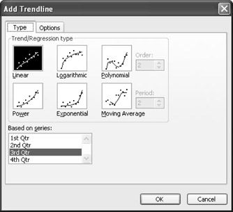
Figure 14-15: In the Add Trendline dialog box, select the formula you want Graph to use to plot your projections. -
In the Trend/Regression Type section, choose the type of trendline you want to create. Each of these types is based on a formula that calculates and projects data patterns based on the information in your datasheet.
-
In the Based On Series section, select the data series you want to use to create the trendline.
-
Click the Options tab. Here you'll enter a name for the trendline (if necessary), choose the length of the periods forward and backward you want to project, and choose whether you display equations or values on the chart. Make your choices, and then click OK. You're returned to Graph, and the trendline has been added, as shown in Figure 14-16.
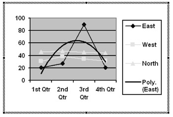
Figure 14-16: A trendline in your chart can show a general direction for your data and help readers understand at a glance what the significant changes in your data might be.
|
| < Day Day Up > |
|
EAN: 2147483647
Pages: 373