Stick to Industry Standards
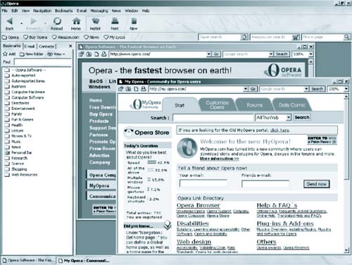
| At the time of this writing, Microsoft's Internet Explorer (MSIE) is the dominant Web browser, used by somewhere between 80% and 90% (estimates vary) of all computers hooked to the Internet. Many site owners have looked at this statistic, and have decided to make sites that fully work only with MSIE. But it is dangerous to tie your Web site's future to any one browser or operating system, even if it comes from a company as seemingly unstoppable as Microsoft. Not many years ago, Netscape was the dominant, apparently unstoppable Web browser company, and Netscape browsers had few things they could do that were not part of the Internet coding and HTML display standards laid down by the World Wide Web Consortium (W3C.org). Since the vast majority of Internet users back then 1995 or 1996 used Netscape, many Web designers incorporated Netscape-specific features into their pages. And then, when MSIE started to get popular, they had to redo all their work. History repeats itself. Now AOL seems to be moving from MSIE toward a custom Internet browser it designed itself, based on the same programming that has gone into recent Netscape and Mozilla browsers. (AOL owns Netscape, so this is a totally logical business move.) AOL, by most estimates, controls about 30% of all Internet traffic. This means every site that is fully compatible only with MSIE (and that includes most sites made with Microsoft's FrontPage software) must be redesigned or face potentially severe traffic losses. Netscape is now on the upswing, and the relatively obscure but technically excellent Opera Browser (www.opera.com) from Norway is being built into more Web-enabled cellular phones and other non-PC Web access devices every year, and is slowly but steadily gaining market share on PC desktops, especially in Europe. (See Figure 8-1.) Figure 8-1. Opera Browser offers many features that MSIE lacks, including the ability to stop popup ads and keep animated banners from blinking.
The only true defense against shifts in browser technology is to make sure (a) your site follows display standards laid down by the World Wide Web Consortium (aka W3C), the international group that determines technical specifications for the World Wide Web and (b) that it does not favor one browser over another. Some Web designers will tell you this can't be done, and others will try to talk you into making many different versions of your site, and setting up your servers so they automatically detect which browser each user is running and display the correct version for that browser. A skilled Web designer can make an attractive site that works with almost any browser. It may not have as many baubles and bangles as one designed to look its best with one particular browser and operating system combination, but you are not putting up a Web site to prove that you (or your site designer) know how to use all kinds of cool technologies. You are making it to attract a targeted group of readers or potential customers, and this means your aim is to present information as clearly and simply as you can for many different browser systems.
|
EAN: 2147483647
Pages: 88