Chapter 45: The Power Curve
Overview
-
As my company produces more of a product, it learns how to make the product more efficiently. Can I model the relationship between units produced and the time needed to produce a unit?
A power curve is calculated with the equation y =axb. In the equation, a and b are constants. Using a trend curve, we can determine the values of a and b that make the power curve best fit a scatter plot diagram. In most situations, a is greater than 0. When this is the case, the slope of the power curve depends on the value of b, as follows:
-
For b>1, y increases as x increases, and the slope of the power curve increases as x increases.
-
For 0<b<1, y increases as x increases, and the slope of the power curve decreases as x increases.
-
For b=1, the power curve is a straight line.
-
For b<0, y decreases as x increases, and the power curve flattens out as x increases.
Here are examples of different relationships that can be modeled by the power curve. These examples are contained in the file Powerexamples.xlsx.
If we are trying to predict total production cost as a function of units produced, we might find a relationship similar to that shown in Figure 45-1 on the next page.
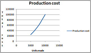
Figure 45-1: Predicting cost as a function of the number of units produced
Notice that b equals 2. As I mentioned previously, with this value of b, the cost of production increases with the number of units produced. The slope becomes steeper, which indicates that each additional unit costs more to produce. This relationship might occur because increased production requires more overtime labor, which costs more than regular labor.
If we are trying to predict sales as a function of advertising expenditures, we might find a curve similar to that shown in Figure 45-2.
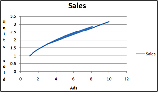
Figure 45-2: Plotting sales as a function of advertising
Here, b equals 0.5, which is between 0 and 1. When b has a value in this range, sales increase with increased advertising but at a decreasing rate. Thus, the power curve allows us to model the idea of diminishing return-that each additional dollar spent on advertising will provide less benefit.
If we are trying to predict the time needed to produce the last unit of a product based on the number of units produced to date, we often find a scatter plot similar to that shown in Figure 45-3.
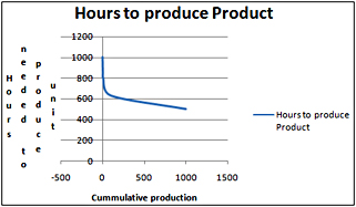
Figure 45-3: Plotting the time needed to produce a unit based on cumulative production
Here we find that b equals –0.1. Because b is less than 0, the time needed to produce each unit decreases, but the rate of decrease-that is, the rate of “learning”-slows down. This relationship means that during the early stages of a product’s life cycle, huge savings in labor time occur. As we make more of a product, however, savings in labor time occur at a slower rate. The relationship between cumulative units produced and time needed to produce the last unit is called the learning or experience curve.
A power curve has the following properties:
-
Property 1 If x increases by 1 percent, y increases by approximately b percent.
-
Property 2 Whenever x doubles, y increases by the same percentage.
Suppose that demand for a product as a function of price can be modeled as 1000(Price)–2. Property 1 then implies that a 1 percent increase in price will lower demand (regardless of price) by 2 percent. In this case, the exponent b (without the negative sign) is called the elasticity. We will discuss elasticity further in Chapter 70, “Estimating a Demand Curve.” With this background, let’s take a look at how to fit a power curve to data.
-
As my company produces more of a product, it learns how to make the product more efficiently. Can I model the relationship between units produced and the time needed to produce a unit?
-
The file Fax.xlsx contains data about the number of fax machines produced and the unit cost (in 1982 dollars) of producing the “last” fax machine made during each year. In 1983, for example, 70,000 fax machines were produced, and the cost of producing the last fax machine was $3,416. The data is shown in Figure 45-4.
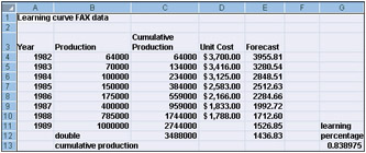
Figure 45-4: Data used to plot the learning curve for producing fax machines -
Because a learning curve tries to predict either cost or the time needed to produce a unit from data about cumulative production, I’ve calculated in column C the cumulative number of fax machines produced by the end of each year. In cell C4, I refer to cell B4 to show the number of fax machines produced in 1982. By copying from C5 to C6:C10 the formula C4+B5, I compute cumulative fax machine production for the end of each year.
-
We can now create a scatter plot that shows cumulative units produced on the x-axis and unit cost on the y-axis. After creating the chart, click one of the data points (the data points will be displayed in blue), then right-click and click Add Trendline. In the Format Trendline dialog box, select the Power option, and check the Display Equation On Chart and the Display R-Squared Value On Chart boxes. With these settings, we obtain the chart shown in Figure 45-5. The curve drawn represents the power curve that best fits the data.
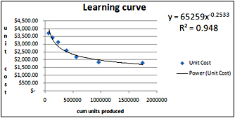
Figure 45-5: Learning curve for producing fax machines -
Our power curve predicts the cost of producing a fax machine as follows:
Cost of producing fax machine=65,259(cumulative units produced)-
-
Notice that most data points are near the fitted power curve and that the R2 value is nearly 1, indicating that the power curve fits the data well.
-
By copying from cell E4 to E5:E10 the formula 65259*C4^–0.2533, we compute the predicted cost for the last fax machine produced during each year. (The carat symbol [^], which is located over the 6 key, is used to raise a number to a power.)
-
If we estimated that 1,000,000 fax machines were produced in 1989, after computing the total 1989 production (2,744,000) in cell C11 we can copy our forecast equation to cell E11 to predict that the last fax machine produced in 1989 cost $1,526.85.
-
Remember that Property 2 of the power curve states that whenever x doubles, y increases by the same percentage. By entering twice cumulative 1988 production in cell C12 and copying our forecast formula in E10 to cell E12, we find that doubling cumulative units produced reduces our predicted cost to 83.8 percent of its previous value (1,456.83/1,712.60). For this reason, the current learning curve is known as an 84 percent learning curve. Each time we double units produced, the labor required to make a fax machine drops by 16.2 percent.
-
If a curve gets steeper, the exponential curve might fit the data as well as the power curve does. A natural question is, which curve fits the data better? In most cases, this question can be answered simply by eyeballing the curves and choosing the one that looks like it’s a better fit.
-
The learning curve was discovered in 1936 at Wright-Patterson Air Force Base in Dayton, Ohio, when it was found that whenever the cumulative number of airplanes produced doubled, the time required to make each airplane dropped by around 15 percent.
-
Wikipedia gives the following learning curve estimates for various industries:
-
Aerospace: 85 percent
-
Shipbuilding: 80–85 percent
-
Complex machine tools for new models: 75–85 percent
-
Repetitive electronics manufacturing: 90–95 percent
-
Repetitive machining or punch-press operations: 90–95 percent
-
Repetitive electrical operations: 75–85 percent
-
Repetitive welding operations: 90 percent
-
Raw materials: 93–96 percent
-
Purchased parts: 85–88 percent
-
EAN: 2147483647
Pages: 200