Lesson 2: Data Analysis Tools
In this lesson, you will learn about client tools that you can use to analyze data that is stored in your data warehouse. These include the OLAP Manager, Microsoft Excel 2000, Microsoft English Query, and third-party products.
After this lesson, you will be able to:
- Use the OLAP Manager Cube Browser and Excel 2000 to analyze data from a cube
Estimated lesson time: 60 minutes
OLAP Manager
OLAP Manager is included with SQL Server OLAP Services. It is the management utility for OLAP Services and includes the Cube Browser, which is a tool to help you analyze the data in the warehouse.
Manage the OLAP Server
OLAP Manager is a Microsoft Management Console (MMC) application that is included with OLAP Services. OLAP Manager provides a way to access OLAP Servers and the metadata repositories that define multidimensional database structures. You use OLAP Manager to
- Specify databases and data sources
- Build and process cubes
- Specify storage options and optimize query performance
- Manage server security
- Browse cube data
Just as you use SQL Server Enterprise Manager to administer SQL Server, OLAP Manager helps manage OLAP Services. Both tools provide a way to create objects and administer your environment. They provide end-user tools for managing a service.
Both tools are based on an object library. You can write your administrative applications using languages that support COM automation, such as Microsoft Visual Basic or Microsoft Visual C++. Decision Support Objects (DSO) expose the object model for OLAP Services. Your applications can use DSO to control the server, create and maintain OLAP objects, and establish data source connections. OLAP Manager uses DSO in the same way that SQL Server Enterprise Manager uses SQL-DMO.
Browsing Cube Data
You can use the Cube Browser, part of OLAP Manager, to view and analyze the data of a cube. The cube must be processed before you can view its data in the Cube Browser. If the cube has not been processed, you can view sample data in the Cube Editor.
The Cube Browser organizes the cube data in a data grid. The default view for the data grid shows the data in table format with one dimension across the column headings and another dimension down the left column. (Measures are treated as a single dimension for this purpose.) The remaining dimensions of the cube are displayed in the Slicer pane at the top of the window.
Figure 10.1 shows the Sales cube in the Northwind_DSS database.
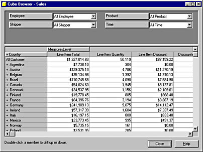
Figure 10.1 The Sales cube in the Cube Browser
In the grid, you can double-click any dimension that has a plus sign (+) before the name of the dimension to drill down into that dimension. Add dimensions to the grid by dragging and dropping the dimensions from the Slicer pane to the grid. Remove dimensions from the grid by dragging and dropping the dimensions from the grid to the Slicer pane. To limit the data displayed in the grid to specific dimension member values, select the desired member values in the drop-down boxes in the Slicer pane.
The following figures show how you can drill down into the dimensions of the cube. Figure 10.2 shows the Sales cube after drilling down into a country (USA) to display regions in the country.
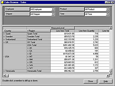
Figure 10.2 Drilling down to regions in the Sales cube
Figure 10.3 shows the Sales cube after adding the Product dimension to the grid and limiting the measures to show only the Discounted Line Total.
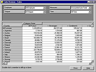
Figure 10.3 The Product dimension displayed for the Sales cube
Figure 10.4 shows the Sales cube after drilling down into the Beverages product category.
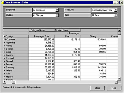
Figure 10.4 Drilling down to products in the Sales cube
Learn about Data Warehouse Concepts
The OLAP Manager contains a Help system and tutorial that help you to learn data warehousing concepts as well as how to store and manage multidimensional data. It also includes a step-by-step tutorial on building and deploying an OLAP cube.
Excel 2000
With Excel 2000 for Microsoft Windows, Microsoft provides an excellent client analysis tool for financial and numerical calculations. Excel uses the PivotTable Service to make it possible for users to work with cubes in three ways:
- Connect to a data cube in OLAP Services. You have full access to all of the data in the cube.
- Connect to a data cube in OLAP Services, and slice sections from the data cube and store them locally. This means that users can later analyze the data in Excel, even when the users are disconnected from the OLAP Server.
- Connect to any OLE DB or ODBC data source and generate a local data cube. This makes it possible to analyze data that is not stored in a multidimensional format on the server in the same way as data that is stored in a data warehouse.
Analyzing Data
You can analyze the data contained in local and server cubes using the features of Excel 2000. The cube data appears in a spreadsheet format, and you can analyze it as you would any spreadsheet information. The advanced PivotTable features in Excel make it possible to generate detailed or high-level reports and drill through your data. Excel PivotTables enable you to drag and drop dimensions in a similar way to the Cube Browser.
Visually Representing the Data
You can also take advantage of the charting and graphing features of Excel to view the information in a visual format. Charts and graphs often make it easier to identify trends or exceptions. You choose the type of chart that best presents the data, such as a scatter, line, or bar chart. Excel PivotCharts are similar to PivotTables in that they allow you to drag and drop dimensions, but they display data values in a chart rather than a spreadsheet grid. Figure 10.5 shows a PivotChart that you will create later in this chapter.
All of the reports and charts that you generate in Excel can be saved in HTML format so that they can be published on an intranet or Internet Web server.

Figure 10.5 The axes in a PivotChart

Exercise 1: Connecting to the OLAP Server
In this exercise, you will connect to the previously created Sales data cube using the PivotTable and PivotChart wizard in Excel. When you start the PivotTable and PivotChart wizard, it prompts you for a connection to a data source. You need to create a data source for the Sales cube because you do not yet have one. After you have created the new data source, you will connect to it in the wizard.
From the Start menu, click Programs, and then click Microsoft Excel.
Excel opens with a default worksheet entitled Book1.
- On the toolbar, click the Save button. Save the file to C:\SQLDW\Exercise\Ch10\Pivot.xls.
- On the Data menu, click the PivotTable and PivotChart Report menu option.
- Under Where is the data you want to analyze, click External data source. Confirm that PivotTable is selected under What kind of report do you want to create?
- Click Next.
- In step 2 of the wizard, Excel needs to know where the data is located. Click the Get Data button.
- Click the OLAP Cubes tab.
This will open the PivotTable and PivotChart Wizard dialog box.
At this point, Excel calls Microsoft English Query to retrieve the data. The Choose Data Source dialog box opens, listing the current data sources registered on your computer.
NOTE
If you do not see this tab, you do not have Microsoft English Query installed. You can install it from the Microsoft Office 2000 compact disc or network installation.
- Select <New Data Source> and then click OK.
- This opens the Create New Data Source dialog box. In the first field, type Northwind_Sales_Cube for the name of your data source.
- In the next field, select the SQL Server OLAP Services provider, Microsoft OLE DB Provider for OLAP Services, from the drop-down list.
- Click Connect.
- This opens the Multi-Dimensional Connection dialog box. Click OLAP Server and type the name of your computer in the Server field.
- Click Next.
- Select the Northwind_DSS database in the list.
- Click Finish.
- Select the Sales cube from the Select the cube that contains the data you want drop-down list. Do not check Save my user ID and password in the data source definition check box.
- Click OK.
- In the Choose Data Source dialog box, ensure that Northwind_Sales_Cube is selected and then Click OK.
- Click Next.
- This takes you to the third and final step in the PivotTable and PivotChart wizard. Click new worksheet to put the PivotTable on a blank worksheet and then click Finish.
This returns you to the PivotTable and PivotChart wizard in Excel. You will see the text "Data fields have been retrieved" next to the Get Data button.
You will briefly see the message Connecting to Data Source in the Excel status bar, and then the PivotTable toolbar is displayed over the PivotTable workspace.
Exercise 2: Selecting Sales Data to Report from the OLAP Server
In this exercise, you will select data to add to the PivotTable workspace.
- The PivotTable toolbar provides access to tools for selecting and manipulating data in the PivotTable workspace.
- The PivotTable toolbar also shows a list of available fields and data items to drop on the PivotTable workspace.
What tools are shown on the toolbar?
What fields are available to be dropped on the workspace?
What data items are available to be dropped on the workspace?
NOTE
If you click in a cell outside of the PivotTable workspace, most of the buttons on the PivotTable toolbar are disabled and the fields and data items are removed from the toolbar. To enable all of the buttons, click anywhere inside the PivotTable workspace.
- From the PivotTable toolbar, drag the Customer field to the PivotTable workspace. Place the field where it says "Drop Page Fields Here."
- From the PivotTable toolbar, click and drag the Time field to the PivotTable workspace. Place the field where it says "Drop Row Fields Here."
- From the PivotTable toolbar, click and drag the Product field to the PivotTable workspace. Place the field where it says "Drop Column Fields Here."
- From the PivotTable toolbar, click and drag the Discounted Line Total data item to the PivotTable workspace. Place the data item where it says "Drop Data Items Here."
The Customer field is displayed in Column A, and a drop-down list that lists all customers is displayed in Column B.
The Time field level, Year, is displayed in a drop-down list in Column A.
The Product field level, Category Name, is displayed in a drop-down list in Column B.
The data item name, Discounted Line Total, is displayed in Column A. Once this item has been added to the workspace, Excel submits the query and populates the PivotTable worksheet with the results.
- On the PivotTable toolbar, click the Format Report button.
- Choose Report 2 from the list, and then click OK.
- To format the Discounted Line Total data correctly, highlight all the cells containing Discounted Line Total values. Then right-click the highlighted cells and select Format Cells from the pop-up menu.
- In the Format Cells dialog box, click the Number tab and select Currency from the list. On the right, under the Negative Numbers list, choose the format ($1,234.10) highlighted in red, and then click OK.
This opens the AutoFormat dialog box.
This reformats the data in the report, moving the Products data element from the column list to the row list. This produces a more manageable report.
Exercise 3: Drilling into the Sales Data Report Details
In this exercise, you will find detail data for a specific customer.
NOTE
Your answers may vary from those provided if you have edited the data contained in the Northwind database.
- Click the Year drop-down list. Clear the check boxes for 1996 and 1998. (The first time you click a check box, it will show two small check marks; click it again to clear it.) Expand the 1997 level by clicking the plus sign (+), and then click the 1997 check box until it shows two check marks. Note that this process automatically checks the check boxes at the Quarter level.
- Click each of the Quarter check boxes until they display two check marks. This choice automatically selects the months in each quarter. You can confirm this by expanding the quarters.
- Once all the months have been selected, click OK.
- You can also expand and collapse levels by double-clicking the levels directly. To reduce the level of detail, double-click 1997 in the data.
- Double-click 1997 again, and the information is expanded to show quarterly data.
- Double-click a quarter, and monthly data is presented.
- Collapse the report back to where it is showing only Category Name, Year, and Discounted Line Total.
- Click the Customer drop-down list. Expand the All Customer level and then scroll down to USA. Click USA and click OK. The Discounted Line Totals for sales in the USA are now displayed.
- Use the PivotTable to answer the following questions:
- Save, but do not close, the workbook.
Sales information is now presented by Product, Year, Quarter, and Month for the year 1997 only.
This step collapses the information back to annual sales data.
What were the monthly sales of grains and cereals for USA in November 1997?
Answer
How does this figure compare with sales in the United Kingdom (UK) for the same time frame?
Answer
How do UK sales of confections in the first quarter of 1997 compare with sales in the same quarter of 1998?
Answer
What customer in London purchased the most confections in the first quarter of 1998?
Answer
Exercise 4: Creating a PivotTable Chart Using the Existing Sales Data
In this exercise, you will produce a PivotTable chart showing sales of a specific customer.
- On the PivotTable toolbar, click the Chart Wizard icon.
- To change this to a three-dimensional chart, right-click the chart and then select Chart Type on the pop-up menu.
- In the Chart Type dialog box, click the Standard Types tab, and click Column.
- In Chart subtype, choose 3D Column and then click OK.
This step produces a two-dimensional chart from the currently presented information.
If you do not see Chart type on the pop-up menu, right-click somewhere else on the chart.
The axes in a three-dimensional chart are called the Value Axis, the Category Axis, and the Series Axis. These axes are shown in Figure 10.5. The magnitude of the data item values is represented on the Value Axis. The fields that you categorize or serialize the data items are placed on the Category Axis and the Series Axis. Across the top of the chart is a Page field area. You place fields in this area to filter the data values that are included in the chart. You can drill down or drill up in a PivotChart by selecting levels in the Category Axis or the Series Axis buttons.
- Drag the fields and data items to and from the PivotTable toolbar so that you have the Customer field in the page field area, the Time field in the Series Axis, the Product field in the Category Axis, and the Discounted Line Total data item in the Value Axis. Your chart should look similar to the chart shown in Figure 10.6.
- Click the Year drop-down list. Select all quarters in 1997 and exclude the data for 1996 and 1998.
- The data can also be viewed in spreadsheet view by switching back to the worksheet. Along the bottom of the Excel container are a series of tabs. Click Sheet4, which contains the data.
- Save the workbook.
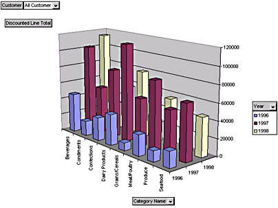
Figure 10.6 PivotChart exercise
What is the largest sales quarter, by Category, presented on the chart? (Hint: Move the mouse cursor over the tops of the bars on the chart to read the data values for each bar.)
Answer
Microsoft English Query
Microsoft English Query is a tool that allows users to ask questions in plain English, without having to know Transact-SQL. English Query is
- A natural-language extension to Transact-SQL
- Compliant with Microsoft Component Object Model (COM) specifications
- Easily interfaced with Web-based applications
Sample ASP Web pages are installed with English Query. These demonstrate clearly how you can create easy-to-use query applications on a Web site. This allows users who do not know how to create their own queries to query the data warehouse by using a Web browser.
Additional information on how an English Query application is created can be found in Chapter 11,"Using Microsoft English Query to Query Warehouse Data."
Third-Party Products
OLE DB for OLAP has gained wide support as the standard for multidimensional data processing. Many vendors offer end-user tools that work with any OLE DB for OLAP data provider such as SQL Server and OLAP Services. A listing of these vendors can be found on the Microsoft Web site at www.microsoft.com/data/oledb/olap.
Lesson Summary
Data analysis tools are a vital part of your data warehouse implementation because these are the tools by which users will derive the full benefit of the data warehouse. Users must be able to easily and quickly retrieve useful information from the data warehouse. This lesson has introduced you to Microsoft Excel 2000, which is one of the more popular tools that uses the PivotTable Service to connect to an OLAP Server and put the power of the data warehouse in the hands of users.
EAN: 2147483647
Pages: 114