Tools - R - S
Tool 157: Radar Chart
| AKA | Spider Chart, Dimensions Map |
| Classification | Analyzing/Trending (AT) |
Tool description
A radar chart is a very useful indicator of the status quo in relation to an ideal state or a vision. It can be used to verify gaps in operational performance, benchmark one unit against the other, show current trends, display percent completion, or reflect on overall organization's strengths and weaknesses.
Typical application
-
To visually display existing gaps in both current and planned organizational performance.
-
To show shifts in the organization's strengths and weaknesses.
-
To perform a reality check against an ideal state or vision.
-
To report trends in resource allocations or progress made.
Problem-solving phase
| → | Select and define problem or opportunity |
| → | Identify and analyze causes or potential change |
| Develop and plan possible solutions or change | |
| Implement and evaluate solution or change | |
| → | Measure and report solution or change results |
| Recognize and reward team efforts |
Typically used by
| 1 | Research/statistics |
| Creativity/innovation | |
| Engineering | |
| Project management | |
| Manufacturing | |
| 4 | Marketing/sales |
| Administration/documentation | |
| Servicing/support | |
| 3 | Customer/quality metrics |
| 2 | Change management |
before
-
Affinity Diagram
-
Brainstorming
-
Data Collection Strategy
-
Benchmarking
-
Organization Readiness Chart
after
-
Gap Analysis
-
Storyboarding
-
Project Prioritization Matrix
-
Consensus Decision Making
-
Force Field Analysis (FFA)
Notes and key points
-
The scale of assessment for a radar chart is measured from the center of the chart as follows:
-
0 to 50 percent (identifies gaps, completion percent)
-
SD - D - A - SA [checks for team agreement—ratings are strongly disagree (SD), disagree (D), agree (A), strongly agree (SA)].
-
Step-by-step procedure
-
STEP 1 Reach consensus on the themes or elements to be measured with the radar chart.
-
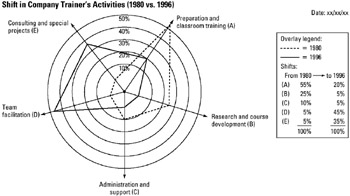
STEP 2 Collect or verify the data to be plotted. See example Shift in Company Trainer's Activities (1980 vs. 1996).
-
STEP 3 Prepare a flip chart displaying the radar chart with appropriate scaling along the spokes.
-
STEP 4 Plot the 1980 data as shown; then plot the 1996 data using encoded lines connecting every marked location on each spoke.
-
STEP 5 Check that all data has been plotted as scaled on each spoke.
-
STEP 6 Provide legend, indicate other supporting information, and date the radar chart.
Example of tool application
EAN: 2147483647
Pages: 326
- Chapter VI Web Site Quality and Usability in E-Commerce
- Chapter IX Extrinsic Plus Intrinsic Human Factors Influencing the Web Usage
- Chapter XI User Satisfaction with Web Portals: An Empirical Study
- Chapter XII Web Design and E-Commerce
- Chapter XVI Turning Web Surfers into Loyal Customers: Cognitive Lock-In Through Interface Design and Web Site Usability