Tool 133: Pie Chart
| AKA | Circle Chart, Distribution Ratio, Area Graph |
| Classification | Analyzing/Trending (AT) |
Tool description
A pie chart presents data very efficiently and is useful for general comparison of parts or ratios. The circular graph illustrates the relationship of the various parts, each part representing a percentage of the whole.
Typical application
-
To display the relative contributions of different subcategories of data.
-
To identify ratios or proportions.
-
To establish priorities for action.
-
To focus on problems or causes.
Problem-solving phase
| → | Select and define problem or opportunity |
| → | Identify and analyze causes or potential change |
| Develop and plan possible solutions or change | |
| → | Implement and evaluate solution or change |
| → | Measure and report solution or change results |
| Recognize and reward team efforts |
Typically used by
| 1 | Research/statistics |
| Creativity/innovation | |
| Engineering | |
| 2 | Project management |
| Manufacturing | |
| 3 | Marketing/sales |
| Administration/documentation | |
| 4 | Servicing/support |
| 5 | Customer/quality metrics |
| Change management |
before
-
Frequency Distribution (FD)
-
Checksheet
-
Observation
-
Surveying
-
Focus Group
after
-
Two-directional Bar Chart
-
Demographic Analysis
-
Cost-Benefit Analysis
-
Pareto Chart
-
Presentation
Notes and key points
-
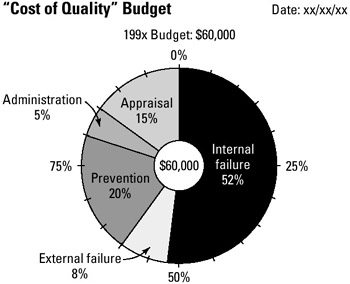
The parts of a pie chart must total 100 percent. Group small percentage items and label them "other." Draw no more than 10 parts, using alternate fill patterns or colors.
Step-by-step procedure
-
STEP 1 Collect the data and verify accuracy. See example Cost of Quality Budget.
-
STEP 2 Identify data categories and determine percentage for each.
-
STEP 3 Draw circle for the pie chart; include a small circle in the center to represent the whole.
-
STEP 4 Label each part (category) and indicate its percentage.
-
STEP 5 Use different shading, fill patterns, or color for parts. Date the pie chart.
Example of tool application
EAN: 2147483647
Pages: 326