Section 4.4. Length Units
4.4. Length UnitsMany CSS properties, such as margins, depend on length measurements to properly display various page elements. It's no surprise, then, that there are a number of ways to measure length in CSS. All length units can be expressed as either positive or negative numbers followed by a label (although some properties will accept only positive numbers). You can also use real numbersthat is, numbers with decimal fractions, such as 10.5 or 4.561. All length units are followed by a two-letter abbreviation that represents the actual unit of length being specified, such as in (inches) or pt (points). The only exception to this rule is a length of 0 (zero), which need not be followed by a unit. These length units are divided into two types: absolute length units and relative length units. 4.4.1. Absolute Length UnitsWe'll start with absolute units because they're easiest to understand, despite the fact that they're almost unusable in web design. The five types of absolute units are as follows:
Of course, these units are really useful only if the browser knows all the details of the monitor on which your page is displayed, the printer you're using, or whatever other user agent might apply. On a web browser, display is affected by the size of the monitor and the resolution to which the monitor is setand there isn't much that you, as the author, can do about these factors. You can only hope that, if nothing else, the measurements will be consistent in relation to each otherthat is, that a setting of 1.0in will be twice as large as 0.5in, as shown in Figure 4-3. Figure 4-3. Setting absolute-length left margins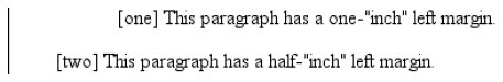 4.4.1.1. Working with absolute lengthsIf a monitor's resolution is set to 1,024 pixels wide by 768 pixels tall, its screen size is exactly 14.22 inches wide by 10.67 inches tall, and it is filled entirely by the display area, then each pixel will be 1/72 of an inch wide and tall. As you might guess, this scenario is a very, very rare occurrence (have you ever seen a monitor with those dimensions?). So, on most monitors, the actual number of pixels per inch (ppi) is higher than 72sometimes much higher, up to 120 ppi and beyond. As a Windows user, you might be able to set your display driver to make the display of elements correspond correctly to real-world measurements. To try, click Start If you're a Mac Classic user, there's no place to set this information in the operating systemthe Mac Classic OS (that is, any version previous to OS X) makes an assumption about the relationship between on-screen pixels and absolute measurements by declaring your monitor to have 72 pixels to the inch. This assumption is totally wrong, but it's built into the operating system, and therefore pretty much unavoidable. As a result, on many Classic Mac-based web browsers, any point value will be equivalent to the same length in pixels: 24pt text will be 24 pixels tall, and 8pt text will be 8 pixels tall. This is, unfortunately, slightly too small to be legible. Figure 4-4 illustrates the problem. Figure 4-4. Teensy text makes for difficult reading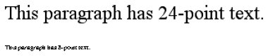 In OS X, the built-in assumed ppi value is closer to Windows: 96ppi. This doesn't make it any more correct, but it's at least consistent with Windows machines. The Classic Mac display problem is an excellent example of why points should be strenuously avoided when designing for the Web. Ems, percentages, and even pixels are all preferable to points where browser display is concerned.
Despite all we've seen, let's make the highly suspect assumption that your computer knows enough about its display system to accurately reproduce real-world measurements. In that case, you could make sure every paragraph has a top margin of half an inch by declaring p {margin-top: 0.5in;}. Regardless of font size or any other circumstances, a paragraph will have a half-inch top margin. Absolute units are much more useful in defining style sheets for printed documents, where measuring things in terms of inches, points, and picas is common. As you've seen, attempting to use absolute measurements in web design is perilous at best, so let's turn to some more useful units of measure. 4.4.2. Relative Length UnitsRelative units are so called because they are measured in relation to other things. The actual (or absolute) distance they measure can change due to factors beyond their control, such as screen resolution, the width of the viewing area, the user's preference settings, and a whole host of other things. In addition, for some relative units, their size is almost always relative to the element that uses them and will thus change from element to element. There are three relative length units: em, ex, and px. The first two stand for "em-height" and "x-height," which are common typographical measurements; however, in CSS, they have meanings you might not expect if you are familiar with typography. The last type of length is px, which stands for "pixels." A pixel is one of the dots you can see on your computer's monitor if you look closely enough. This value is defined as relative because it depends on the resolution of the display device, a subject we'll soon cover. 4.4.2.1. em and ex unitsFirst, however, let's consider em and ex. In CSS, one "em" is defined to be the value of font-size for a given font. If the font-size of an element is 14 pixels, then for that element, 1em is equal to 14 pixels. Obviously, this value can change from element to element. For example, let's say you have an h1 with a font size of 24 pixels, an h2 element with a font size of 18 pixels, and a paragraph with a font size of 12 pixels. If you set the left margin of all three at 1em, they will have left margins of 24 pixels, 18 pixels, and 12 pixels, respectively: h1 {font-size: 24px;} h2 {font-size: 18px;} p {font-size: 12px;} h1, h2, p {margin-left: 1em;} small {font-size: 0.8em;} <h1>Left margin = <small>24 pixels</small></h1> <h2>Left margin = <small>18 pixels</small></h2> <p>Left margin = <small>12 pixels</small></p> When setting the size of the font, on the other hand, the value of em is relative to the font size of the parent element, as illustrated by Figure 4-5. Figure 4-5. Using em for margins and font sizing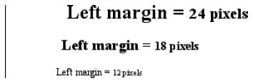 ex, on the other hand, refers to the height of a lowercase x in the font being used. Therefore, if you have two paragraphs in which the text is 24 points in size, but each paragraph uses a different font, then the value of ex could be different for each paragraph. This is because different fonts have different heights for x, as you can see in Figure 4-6. Even though the examples use 24-point textand therefore, each example's em value is 24 pointsthe x-height for each is different. Figure 4-6. Varying x-heights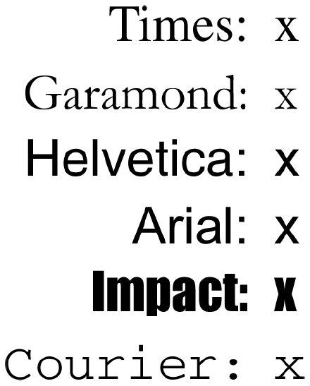 4.4.2.2. Practical issues with em and exOf course, everything I've just explained is completely theoretical. I've outlined what is supposed to happen, but in practice, many user agents get their value for ex by taking the value of em and dividing it in half. Why? Apparently, most fonts don't have the value of their ex height built-in, and it's a very difficult thing to compute. Since most fonts have lowercase letters that are about half as tall as uppercase letters, it's a convenient fiction to assume that 1ex is equivalent to 0.5em. A few browsers, including Internet Explorer 5 for Mac, actually attempt to determine the x-height of a given font by internally rendering a lowercase x and counting pixels to determine its height compared to that of the font-size value used to create the character. This is not a perfect method, but it's much better than simply making 1ex equal to 0.5em. We CSS practitioners can hope that, as time goes on, more user agents will start using real values for ex and the half-em shortcut will fade into the past. 4.4.2.3. Pixel lengthsOn the face of things, pixels are straightforward. If you look at a monitor closely enough, you can see that it's broken up into a grid of tiny little boxes. Each box is a pixel. If you define an element to be a certain number of pixels tall and wide, as in the following markup: <p> The following image is 20 pixels tall and wide: <img src="/books/2/885/1/html/2/test.gif" style="width: 20px; height: 20px;" alt="" /> </p> then it follows that the element will be that many monitor elements tall and wide, as shown in Figure 4-7. Figure 4-7. Using pixel lengths Unfortunately, there is a potential drawback to using pixels. If you set font sizes in pixels, then users of Internet Explorer for Windows previous to IE7 cannot resize the text using the Text Size menu in their browser. This can be a problem if your text is too small for a user to comfortably read. If you use more flexible measurements, such as em, the user can resize text. (If you're exceedingly protective of your design, you might call that a drawback, of course.) On the other hand, pixel measurements are perfect for expressing the size of images, which are already a certain number of pixels tall and wide. In fact, the only time you would not want pixels to express image size is if you want them scaled along with the size of the text. This is an admirable and occasionally useful approach, and one that would really make sense if you were using vector-based images instead of pixel-based images. (With the adoption of Scalable Vector Graphics, look for more on this in the future.) 4.4.2.4. Pixel theorySo why are pixels defined as relative lengths? I've explained that the tiny boxes of color in a monitor are pixels. However, how many of those boxes equals one inch? This may seem like a non sequitur, but bear with me for a moment. In its discussion of pixels, the CSS specification recommends that in cases where a display type is significantly different than 96ppi, user agents should scale pixel measurements to a "reference pixel." CSS2 recommended 90ppi as the reference pixel, but CSS2.1 recommends 96ppia measurement common to Windows machines and adopted by modern Macintosh browsers such as Safari. In general, if you declare something like font-size: 18px, a web browser will almost certainly use actual pixels on your monitorafter all, they're already therebut with other display devices, like printers, the user agent will have to rescale pixel lengths to something more sensible. In other words, the printing code has to figure out how many dots there are in a pixel, and to do so, it may use the 96ppi reference pixel.
Because of this potential for rescaling, pixels are defined as a relative unit of measurement, even though, in web design, they behave much like absolute units. 4.4.2.5. What to do?Given all the issues involved, the best measurements to use are probably the relative measurements, most especially em, and also px when appropriate. Because ex is, in most currently used browsers, basically a fractional measurement of em, it's not all that useful for the time being. If more user agents support real x-height measurements, ex might come into its own. In general, ems are more flexible because they scale with font sizes, so elements and element separation will stay more consistent. Other element aspects may be more amenable to the use of pixels, such as borders or the positioning of elements. It all depends on the situation. For example, in designs that traditionally use spacer GIFs to separate pieces of a design, pixel-length margins will produce an identical effect. Converting that separation distance to ems would allow the design to grow or shrink as the text size changeswhich might or might not be a good thing. |
 Settings
  Control Panel. In the Control Panel, double-click Display. Click the Settings tab, and click Advanced to reveal a dialog box (which may differ on each PC). You should see a section labeled Font Size; select Other, and then hold a ruler up to the screen and move the slider until the onscreen ruler matches the physical ruler. Click OK until youre free of dialog boxes, and you're set.
 The Definitive Guide")
EAN: 2147483647
Pages: 130