Enclosing the Links
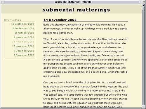
| Since we've experimented with styles that give the sidebar links an open, airy appearance, let's try a different approach: enclosing the links in a box and making them into button-like objects. To do this, we'll return to an earlier version of the project and build from there. ChangesWe're going to replicate the file we had at the time Figure 5.3 was created and make five changes. First, we'll take the border off the h4 and change its text color so that the rule looks like this: h4 {font-size: 1em; margin: 0; padding: 0.33em 0 0; color: rgb(50%,50%,35%);} Second, we'll simplify the sidebar by removing its background image and padding. div#sidebar {float: left; width: 23%; margin: 2em 0 0 2%;} Third, we'll change the list's right-side double border to a one-pixel solid boxed border. #sidebar ul {list-style: none; margin: 0; padding: 0 0 10px; border: 1px solid rgb(73%,73%,58%); text-align: right;} Fourth, we'll remove the left margin from the links. #sidebar a {text-decoration: none; padding: 0 0.5em 0 0; border-bottom: 1px solid rgb(84%,84%,69%);} Finally, we'll reduce the hover styles on links to a simple change of the text and background colors; the declarations that changed the border color, added some padding, and inserted a background image are all removed. #sidebar a:hover {color: rgb(10%,20%,0%); background: #FFF;} The cumulative effect of these changes is shown in Figure 5.10. Figure 5.10. After a number of changes, the sidebar looks quite a bit different.
Boxed LinksWe've created a box that surrounds the links entirely, but let's take the boxy look a bit further and actually box in each of the links. Doing this is as simple as changing the bottom border to a full border and adjusting the padding so that the link text doesn't get too close to the borders. #sidebar a {text-decoration: none; padding: 0 0.25em; border: 1px solid rgb(84%,84%,69%);} At this point, we probably don't want the links right-aligned because that would put the link borders adjacent to the border set for the list. Instead we'll center them, which will get the edges of the links away from the list's border. So that the h4's text will also center-align, we'll apply text-align to the sidebar div and remove it from the list. Aligning Blocks
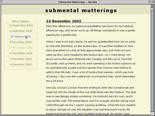
div#sidebar {float: left; width: 23%; margin: 2em 0 0 2%; text-align: center;} #sidebar ul {list-style: none; margin: 0; padding: 0 0 10px; border: 1px solid rgb(73%,73%,58%);} Now we just need a way to separate the links from each other. To do that, the easiest thing would be to restore the bottom borders of the list items and adjust the padding so that it's a little more balanced, as we see in Figure 5.11. #sidebar li {padding: 0.5em 0; border-bottom: 1px solid rgb(84%,84%,69%);} Figure 5.11. Boxing in the links with borders.
Straddling the LinesIn examining Figure 5.11, an idea that suggests itself is to shift the links downward so that they sit "on top" of the list-item borders. By doing this, we can make it look like each link is a small placard strung with taut wire between the sides of the list. We might choose to do this with a negative margin, except we can't: The lists are inline, and top and bottom margins don't have any effect on the layout of an inline element. Fortunately, relative positioning does affect inline layout, so we'll use that instead. We know the list items contain only the links, and each has an em of padding (half on top, half on the bottom). Since we want to remove all of the potential variables from the situation, we'll set the line-height of the list items to be 1em rather than leave it up to the browser default. #sidebar li {padding: 0.5em 0; line-height: 1em; border-bottom: 1px solid rgb(84%,84%,69%);} Now we can offset the links the appropriate amount. Thanks to our line-height and padding values, we know each list item is 2em tall. We want to shift the links downward by half that, so: #sidebar a {text-decoration: none; padding: 0 0.25em; border: 1px solid rgb(84%,84%,69%); position: relative; top: 1em;} Top or Bottom?
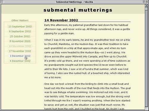
Now each link will be offset downward by an em. This means that the list-item borders will cut right through them because the links (like any element) have a transparent background by default. Let's use the same background colors as the body itself. This will give us the result shown in Figure 5.12. #sidebar a {text-decoration: none; padding: 0 0.25em; border: 1px solid rgb(84%,84%,69%); background: rgb(95%,95%,80%); position: relative; top: 1em;} Figure 5.12. Using relative positioning and backgrounds on the links.
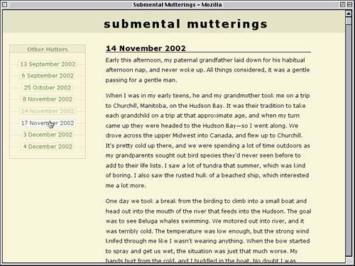
Pretty cool, although there's a slight problem: The last link in the list is too close to the bottom of the box. In fact, the only reason it isn't jutting out of the list is that the list has 10 pixels of bottom padding. If we change this to equal the height of the list items, it will give us the space we need. #sidebar ul {list-style: none; margin: 0; padding: 0 0 2em; border: 1px solid rgb(73%,73%,58%);} At this stage, all we really need is a bit of finishing for the sidebar's title, "Other Mutters." We could leave it as is, but it looks a bit odd just sitting on top of the box. The solution: Put it into a box of its own, one that matches up with the border around the list. div#sidebar {float: left; width: 23%; margin: 2em 0 0 2%; text-align: center;} #sidebar h4 {border: 1px solid rgb(73%,73%,58%);} #sidebar ul {list-style: none; margin: 0; padding: 0 0 2em; border: 1px solid rgb(73%,73%,58%);} Since the h4 now has a bottom border (along with all the other sides) and the list has a top border and the two are adjacent it will create the illusion that there is a two-pixel border between the title and the links. To get rid of it, we can remove either the top border from the list or the bottom border from the heading. Since we're already here, let's do the latter. #sidebar h4 {border: 1px solid rgb(73%,73%,58%); border-bottom: none;} Now, for a last little touch, let's darken the background of the title just a bit. This will give it a subtle visual punch that doesn't overwhelm other pieces of the layout. #sidebar h4 {border: 1px solid rgb(73%,73%,58%); border-bottom: none; background: rgb(90%,90%,75%);} This change is enough to call the second half of the project done, so we'll call a halt to the styling. The end result is given in Listing 5.4 and illustrated by Figure 5.13. Listing 5.4. The "Boxed Links" Style Sheet html {margin: 0; padding: 0;} body {font: 80% Verdana, Arial, Helvetica, sans-serif; margin: 0; padding: 0; background: rgb(95%,95%,80%); color: black;} h1 {font-size: 200%; text-transform: lowercase; letter-spacing: 3px; margin: 0; padding: 0.66em 0 0.33em 29%; background: rgb(85%,85%,70%);} h3 {font-size: 1.33em; margin: 0; padding: 0; border-bottom: 1px solid black;} h4 {font-size: 1em; margin: 0; padding: 0.33em 0 0; color: rgb(50%,50%,35%);} h1, h3, h4 {line-height: 1em;} p {line-height: 1.5; margin: 0.5em 0 1em;} div#entry {margin: 2em 10% 1em 30%; padding: 0;} div#sidebar {float: left; width: 23%; margin: 2em 0 0 2%; text-align: center;} #sidebar h4 {border: 1px solid rgb(73%,73%,58%); border-bottom: none; background: rgb(90%,90%,75%);} #sidebar ul {list-style: none; margin: 0; padding: 0 0 2em; border: 1px solid rgb(73%,73%,58%);} #sidebar h4, #sidebar ul {margin: 0 6px 0 0;} #sidebar li {padding: 0.5em 0; line-height: 1em; border-bottom: 1px solid rgb(84%,84%,69%);} #sidebar a {text-decoration: none; padding: 0 0.25em; border: 1px solid rgb(84%,84%,69%); background: rgb(95%,95%,80%); position: relative; top: 1em;} #sidebar a:link {color: rgb(20%,40%,0%);} #sidebar a:visited {color: rgb(58%,68%,40%);} #sidebar a:hover {color: rgb(10%,20%,0%); background: #FFF;} Figure 5.13. Finishing up the sidebar's appearance.
|

EAN: 2147483647
Pages: 109