Open and Airy
| For our first approach, we'll create a set of styles that place visible separators between some spread-out links. That is, we'll push the links apart vertically and then drop separators in between each link. SeparationThe first thing we'll do is spread apart the links by padding the list items that contain them. A little top and bottom padding should do the trick nicely. Uneven Padding?
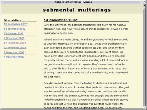
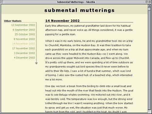
#sidebar ul {list-style: none; margin: 0; padding: 0;} #sidebar li {padding: 0.5em 0 0.25em;} </style> That's really all we need to do to spread the links apart. The nice thing about this approach is that, if we ever decide the links need to be further apart (or closer together), all we have to do is change the padding value. And now for the separators. This is as simple as adding a bottom border to each of the list items. #sidebar li {padding: 0.5em 0 0.25em; border-bottom: 1px solid rgb(84%,84%,69%);} By creating a solid border with a color that's a blend of the shades used for the background and the bottom border on the "Other Mutters" heading, we can create a nicely subtle effect like that shown in Figure 5.3. Figure 5.3. Separating the links with borders on the list items.
The links are nicely spaced out and separated, but the colors need some work; that blue just does not go with the lovely earth tones we're using for the rest of the design. And the underlines have to go, too. Let's do that first. Color Blending
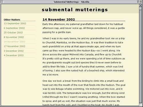
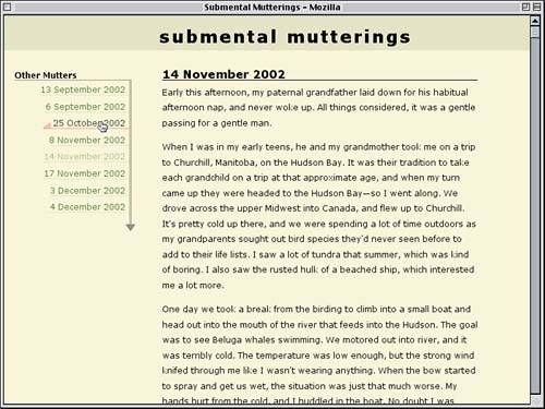
#sidebar li {padding: 0.5em 0 0.25em; border-bottom: 1px solid rgb(84%,84%,69%);} #sidebar a {text-decoration: none;} </style> Now all we need are some good colors to complement the rest of the design. Green and tan often go well together, so let's try that combination. #sidebar a {text-decoration: none;} #sidebar a:link {color: rgb(20%,40%,0%);} </style> That's a pretty good choice, so we'll pick a variant color for visited links. Let's assign such links a color halfway between rgb(20%,40%,0%) and the body's background color of rgb(95%,95%,80%). This is illustrated in Figure 5.4, where the link for the current entry takes on the visited color. (After all, it's the current page, so it's been visited.) #sidebar a:link {color: rgb(20%,40%,0%);} #sidebar a:visited {color: rgb(58%,68%,40%);} </style> Figure 5.4. Unvisited and visited links are given more complementary colors.
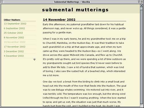
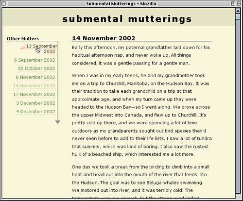
That's pretty much all we need to do to make these links fit in with the design. It's just a beginning, of course; there is an almost infinite number of ways we could alter the markup to meet design needs. Arrow StyleTo spice up the sidebar a little bit, let's add some arrow graphics. In doing this, we'll need to adjust the sidebar styles, but as we'll see, that's easy enough to do. Let's add an arrow image to the bottom-right corner of sidebar's background. div#sidebar {float: left; width: 23%; margin: 2em 0 0 2%; background: url(arrow.gif) 100% 100% no-repeat;} Having done this, we need to provide enough space for the arrow to stick out past the bottom of the last list item. Some bottom padding exactly equal to the height of the image should just do the trick, as shown in Figure 5.5. div#sidebar {float: left; width: 23%; margin: 2em 0 0 2%; padding: 0 0 15px; background: url(arrow.gif) 100% 100% no-repeat;} Figure 5.5. An arrow is added to the bottom-right corner of the sidebar.
The immediate problem that jumps out is that the link separators stick out past the arrow's centerline, which doesn't really work here. We'll need to push the right edge of the links back a bit, and a close scrutiny of the arrow reveals that there are six pixels from its right edge to its centerline. Therefore, we'll need to give the list itself a margin of that length. If we're going to do that, we'll also need to adjust the "Other Mutters" h4 so that its margin is the same as the list's. The Case for Grouping
#sidebar ul {list-style: none; margin: 0; padding: 0;} #sidebar h4, #sidebar ul {margin: 0 6px 0 0;} #sidebar li {padding: 0.5em 0 0.25em; border-bottom: 1px solid rgb(84%,84%,69%);} Now we'll tie the links and the arrow together. Thanks to the way the arrow graphic is constructed, with a three-pixel-wide centerline, this is as easy as adding a border that's the appropriate width, style, and color. #sidebar ul {list-style: none; margin: 0; padding: 0; border-right: 3px double rgb(50%,50%,35%);} A quick check reveals that the arrow seems a little too close to the links; the effect is a bit cramped. Thus, we'll extend the list border and push the arrow downward by adding some bottom padding to the list, as illustrated in Figure 5.6. #sidebar ul {list-style: none; margin: 0; padding: 0 0 10px; border-right: 3px double rgb(50%,50%,35%);} Figure 5.6. Merging the list's border with the sidebar's background image.
How does this work? Since the background image sits inside the sidebar's padding, and the list sits inside that same padding, any increase in the height of the list (such as through additional padding) will increase the height of the sidebar and thus push the arrow image downward. The bottom padding also extends the list's right border, so it remains visually merged with the background image. Styling the LinksOur arrow styles are pretty nifty, but we aren't done yet. Let's move the link text over to the right and make modifications based on that change. First we'll align the text. #sidebar ul {list-style: none; margin: 0; padding: 0 0 10px; border-right: 3px double rgb(50%,50%,35%); text-align: right;} This will jam the text right up against the right border, which we don't really want. We could set a margin on the list items, but that would separate the bottom borders from the double border on the right, so that's out. We could also give the list items right padding, but let's set right padding on the links themselves instead. #sidebar a {text-decoration: none; padding: 0 0.5em 0 0;} Why set the padding? Because our next step will actually be to remove the borders from the list items. For the moment, we'll do this by simply commenting out the border-bottom declaration. #sidebar li {padding: 0.5em 0 0.25em; /* border-bottom: 1px solid rgb(84%,84%,69%); */} So you're probably wondering, why are we taking away the separators we already created? Because we're going to tackle the problem by another route. Instead of bordering the list items, we're going to border the links themselves. The result is shown in Figure 5.7. #sidebar a {text-decoration: none; padding: 0 0.5em 0 0; border-bottom: 1px solid rgb(84%,84%,69%);} Figure 5.7. Shifting the borders to the links results in an interesting variation.
Does that last change look familiar? It should: The border style we applied to the links is the same as what we just commented out of the list items' rule. There are obvious differences between the two approaches. When the list items had the borders, they ran from one side of the sidebar to the other. That's because list items generate block-level boxes, much as paragraphs and divs do. The links, on the other hand, generate inline boxes, which means the borders will only run underneath the text itself. That's true even if the link wraps to multiple lines. The effect is still potentially very useful because, with this new approach, we can style the borders differently when the link is hovered. That's something we couldn't do in Explorer when the list items were bordered. So let's add in a rule that will change both the text and the border color when a link is in the hover state. Arbitrary Hovering
#sidebar a:visited {color: rgb(58%,68%,40%);} #sidebar a:hover {color: rgb(10%,20%,0%); border-color: rgb(98%,48%,40%);} </style> This alone might suffice because it darkens the text and reddens the border on whatever link is being hovered. We can take it further, though, by adding a background image to the link when it's hovered. We can only put the image in the link background, so we'll use a half-arrow graphic called arrow2.gif. This will be placed in the lower-left corner of the link. #sidebar a:hover {color: rgb(10%,20%,0%); border-color: rgb(98%,48%,40%); background: url(arrow2.gif) 0 100% no-repeat;} As with the sidebar's arrow, we need to insert enough padding for the background to appear and not be overlapped by text. Since we only need that padding when the background image appears, we'll just increase the link padding during the hover. This has the effect shown in Figure 5.8. #sidebar a:hover {color: rgb(10%,20%,0%); border-color: rgb(98%,48%,40%); background: url(arrow2.gif) 0 100% no-repeat; padding-left: 15px;} Figure 5.8. Adding in hover effects makes the links more interactive.
Remember that these effects work well because the links aren't wrapping to multiple lines. In settings in which wrapping is likely, another design approach would probably be better. However, let's do our best to guard against potential wrapping problems. Suppose one of the links had content that was between 0 and 15 pixels more narrow than the list itself. In that case, the padding that is applied on hover would cause line wrapping, which means the link could radically change in appearance between the hovered and nonhovered states. We could prevent any wrapping with white-space: nowrap, but that might force links to stick out of the sidebar completely, which isn't acceptable. Therefore, we'll replace the 15-pixel padding with an invisible equivalent: a 15-pixel margin on the sidebar links. #sidebar a {text-decoration: none; padding: 0 0.5em 0 0; margin-left: 15px; border-bottom: 1px solid rgb(84%,84%,69%);} We want that left margin to effectively be replaced by the padding when a sidebar link is hovered, so we need to remove the margin in the hover state. #sidebar a:hover {color: rgb(10%,20%,0%); border-color: rgb(98%,48%,40%); background: url(arrow2.gif) 0 100% no-repeat; padding-left: 15px; margin-left: 0;} This won't prevent links from wrapping, but it will prevent reflowing. If the link and its margin fit, so will the hovered link and its padding, as we can see in Figure 5.9, where the browser window has been narrowed. Figure 5.9. Trading off margin for padding keeps the links from unexpectedly reflowing.
With that change, we have the style sheet shown in Listing 5.3. Listing 5.3. The "Open Links" Style Sheet html {margin: 0; padding: 0;} body {font: 80% Verdana, Arial, Helvetica, sans-serif; margin: 0; padding: 0; background: rgb(95%,95%,80%); color: black;} h1 {font-size: 200%; text-transform: lowercase; letter-spacing: 3px; margin: 0; padding: 0.66em 0 0.33em 29%; background: rgb(85%,85%,70%);} h3 {font-size: 1.33em; margin: 0; padding: 0; border-bottom: 1px solid black;} h4 {font-size: 1em; margin: 0; padding: 0.33em 0 0; border-bottom: 1px solid rgb(50%,50%,35%);} h1, h3, h4 {line-height: 1em;} p {line-height: 1.5; margin: 0.5em 0 1em;} div#entry {margin: 2em 10% 1em 30%; padding: 0;} div#sidebar {float: left; width: 23%; margin: 2em 0 0 2%; padding: 0 0 15px; background: url(arrow.gif) 100% 100% no-repeat;} #sidebar ul {list-style: none; margin: 0; padding: 0 0 10px; border-right: 3px double rgb(50%,50%,35%); text-align: right;} #sidebar h4, #sidebar ul {margin: 0 6px 0 0;} #sidebar li {padding: 0.5em 0 0.25em; /* border-bottom: 1px solid rgb(84%,84%,69%); */} #sidebar a {text-decoration: none; padding: 0 0.5em 0 0; margin-left: 15px; border-bottom: 1px solid rgb(84%,84%,69%);} #sidebar a:link {color: rgb(20%,40%,0%);} #sidebar a:visited {color: rgb(58%,68%,40%);} #sidebar a:hover {color: rgb(10%,20%,0%); border-color: rgb(98%,48%,40%); background: url(arrow2.gif) 0 100% no-repeat; padding-left: 15px; margin-left: 0;} We still aren't done, though that's only the first half of the project. |
EAN: 2147483647
Pages: 109